Logo Design for ILYA GREEN

Abdelouahed Rizqi


The Brand & Its Purpose
ILYA GREEN is a Moroccan company that distributes agricultural fertilizers to farmers across the country. They supply quality fertilizers that help crops grow stronger and stay protected from diseases. The whole point is to give Morocco's farmers better tools for healthier, more productive harvests.
The Brand Values
Three things matter most to ILYA GREEN. Growth is about helping both crops and farmers thrive. Greenery represents those lush, healthy fields that come from proper care. And nature shows their respect for natural processes—they want to work with the environment, not fight it. These values make it clear they're serious about sustainable farming.
The Challenge
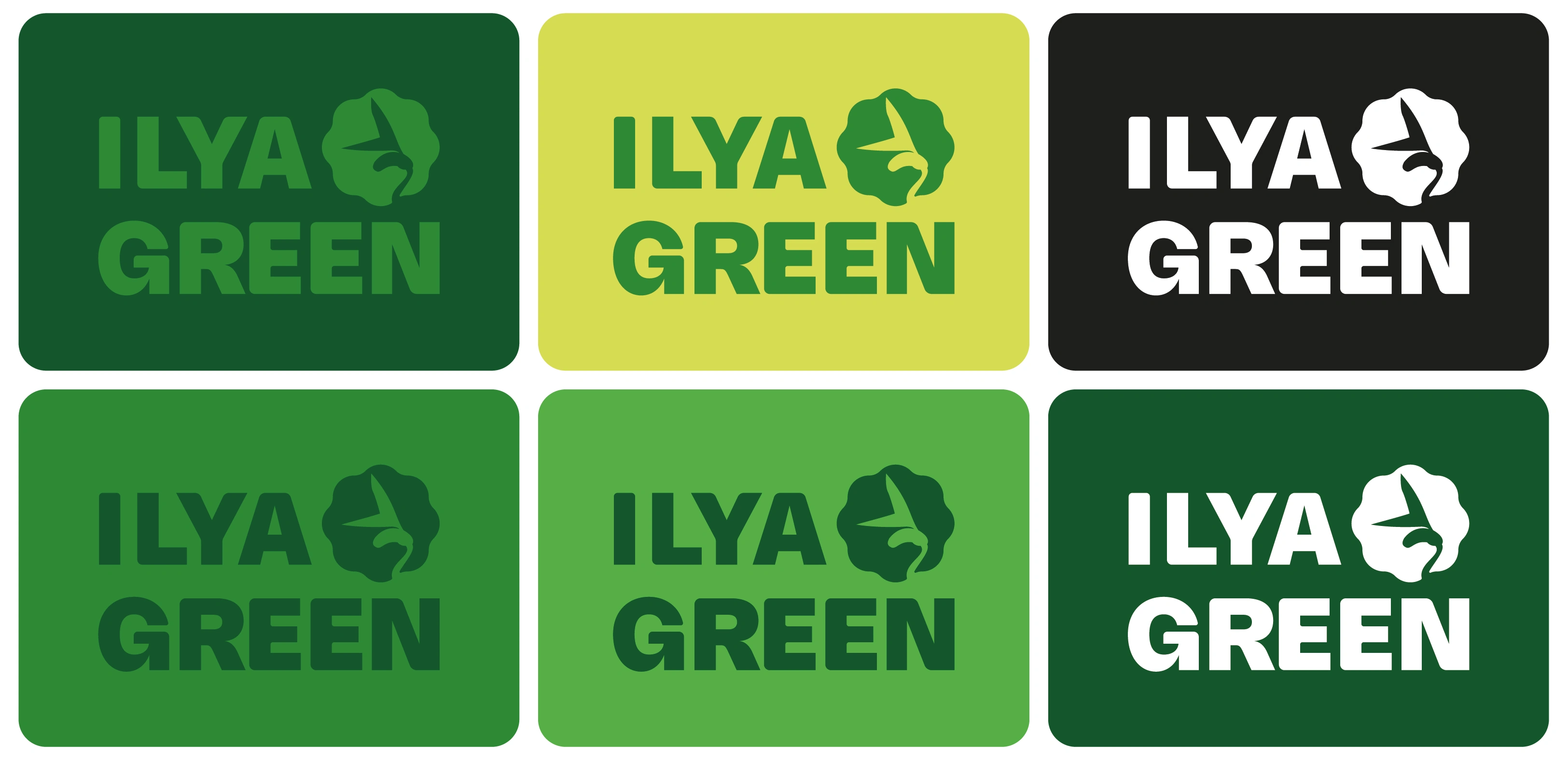
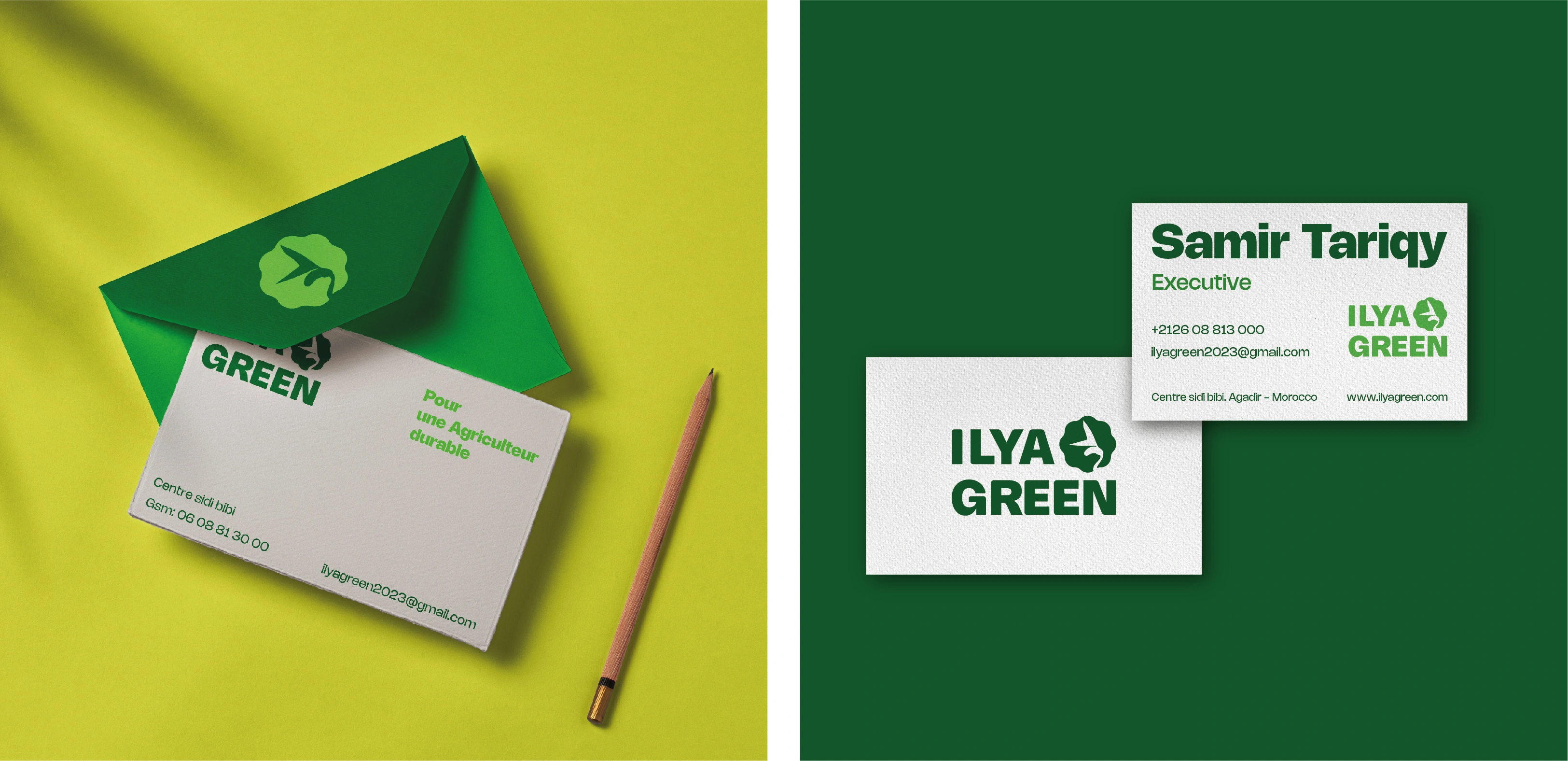
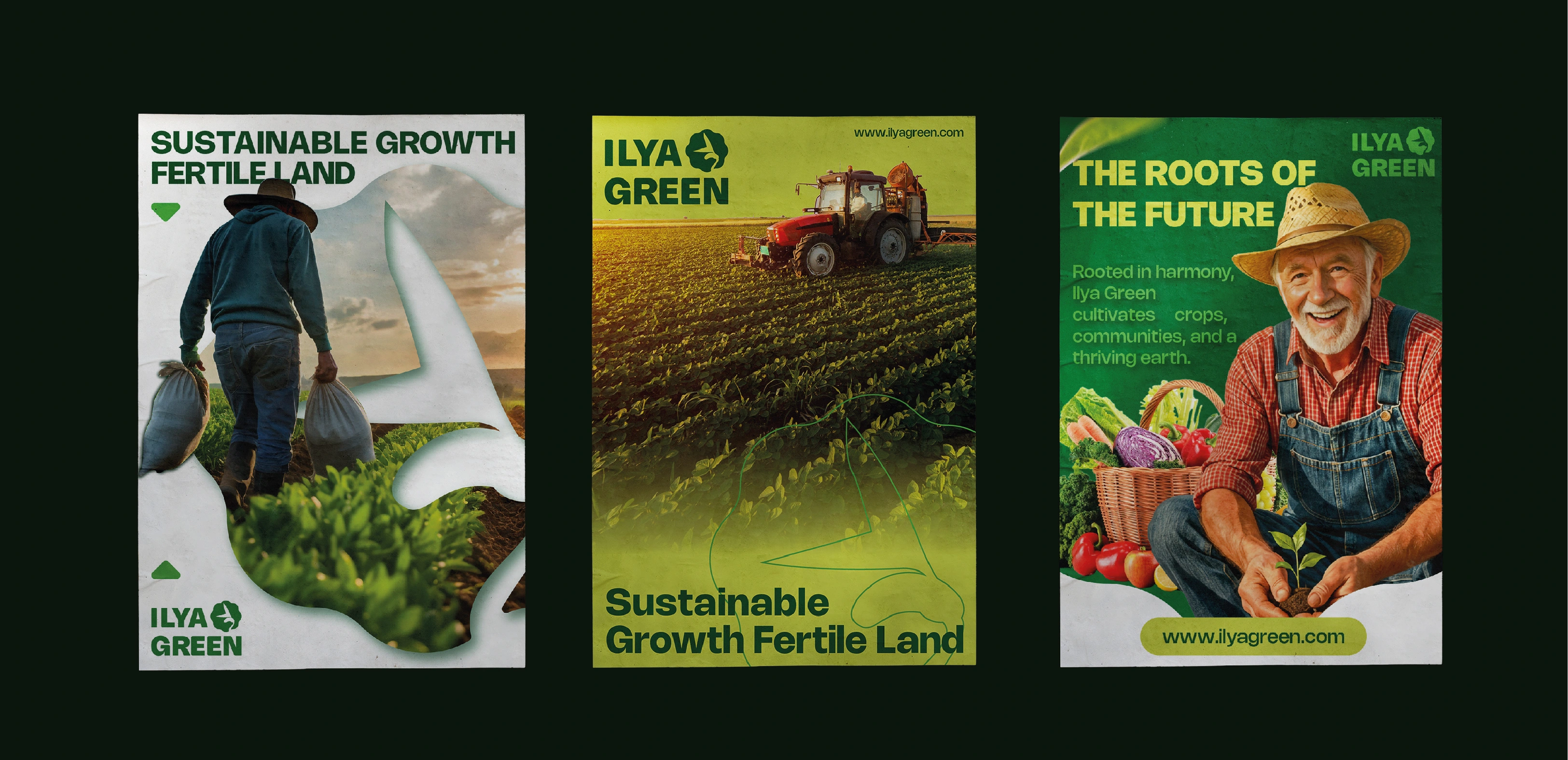
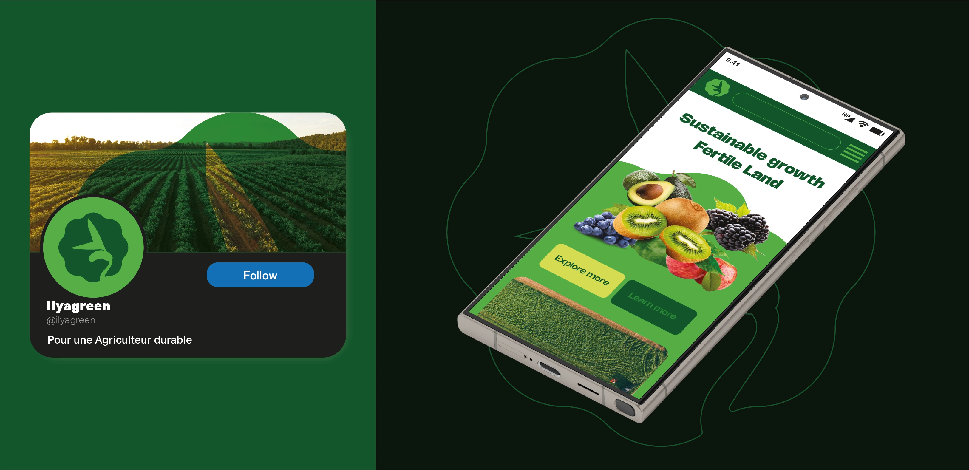
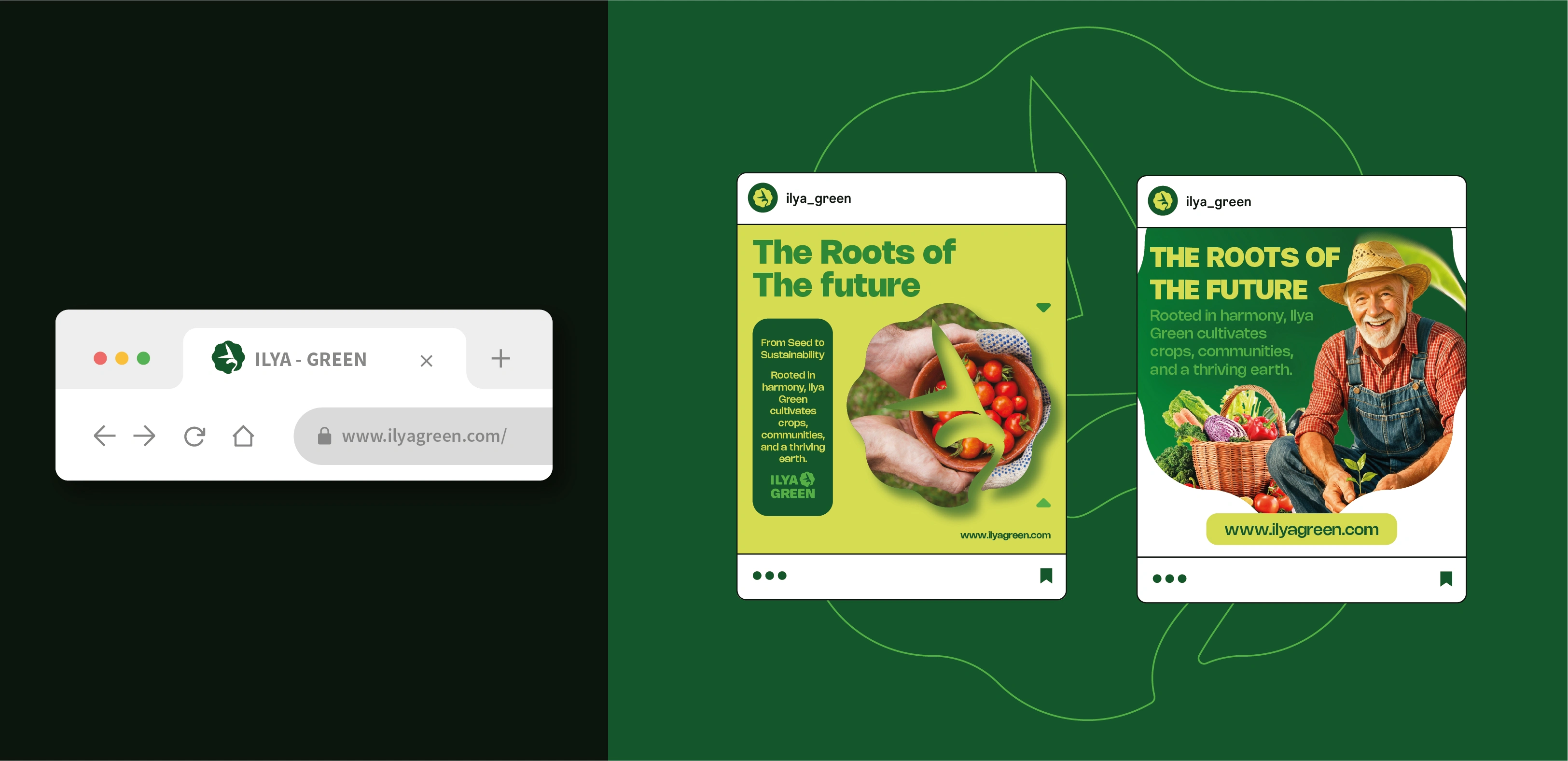
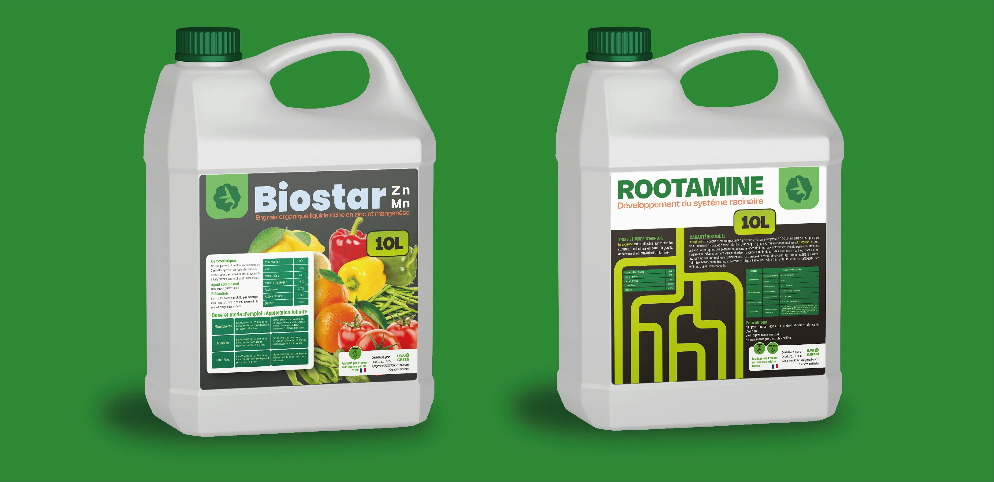
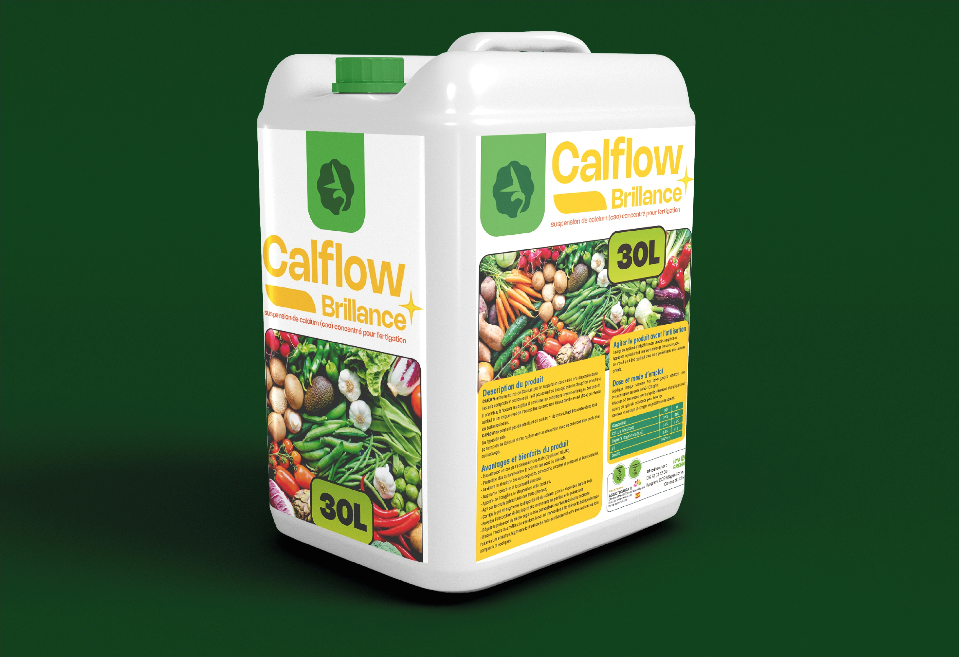
The brand needed a logo that packed a lot of meaning into something clean and simple. It had to show what they do, match their values, and be easy to spot from a distance. Plus, it needed to look good on everything—fertilizer bags, trucks, business cards, you name it. And most importantly, it had to connect with farmers in a way that felt trustworthy and approachable.
The Solution
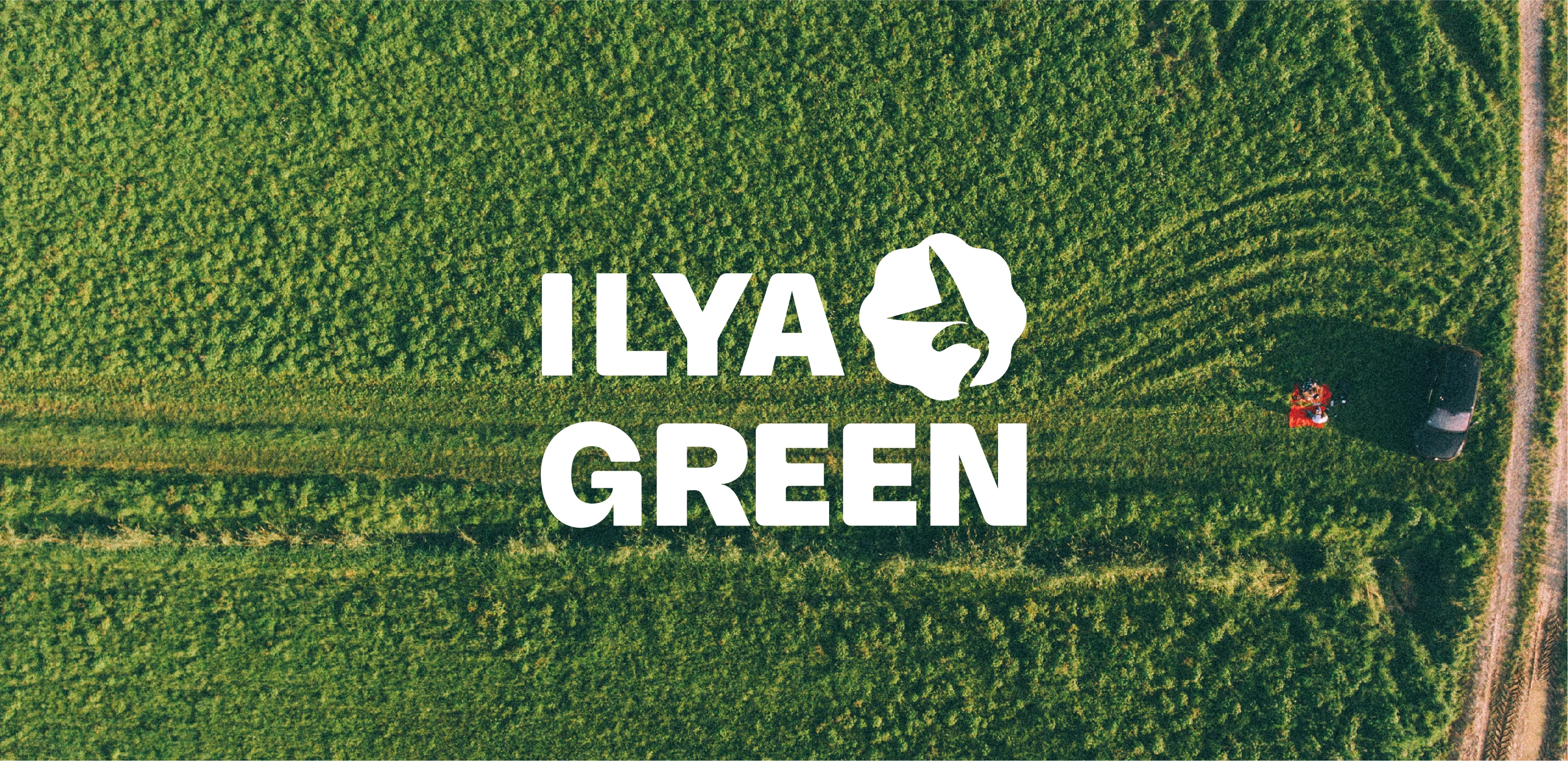
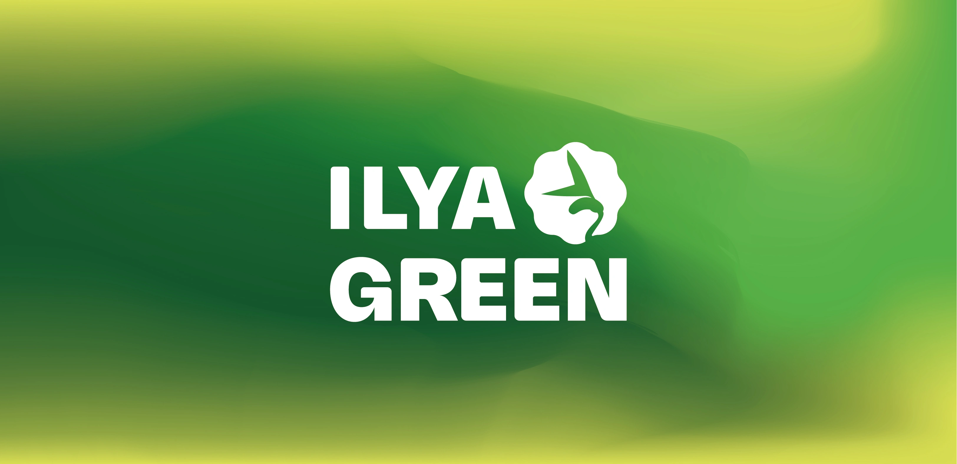
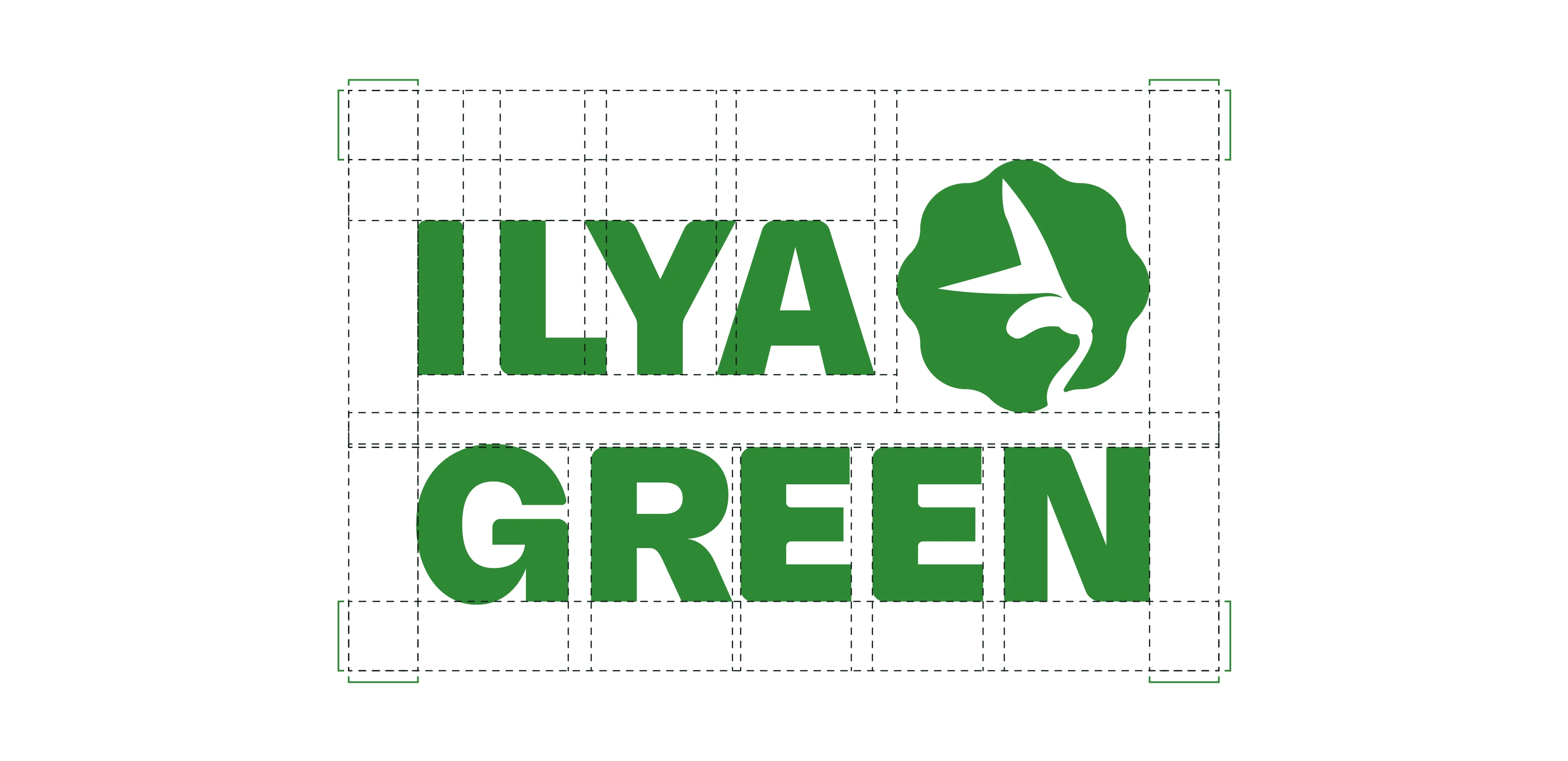
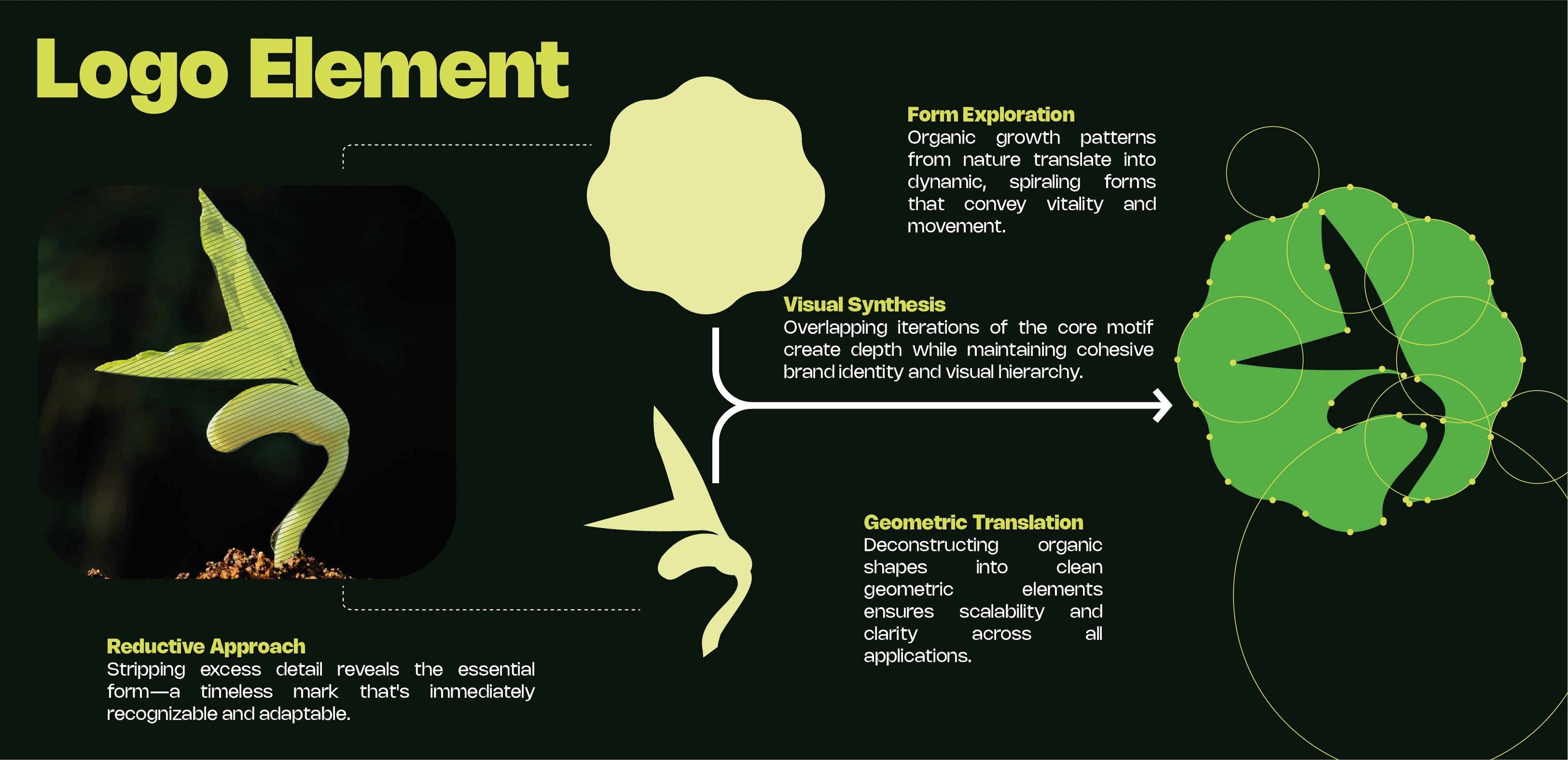
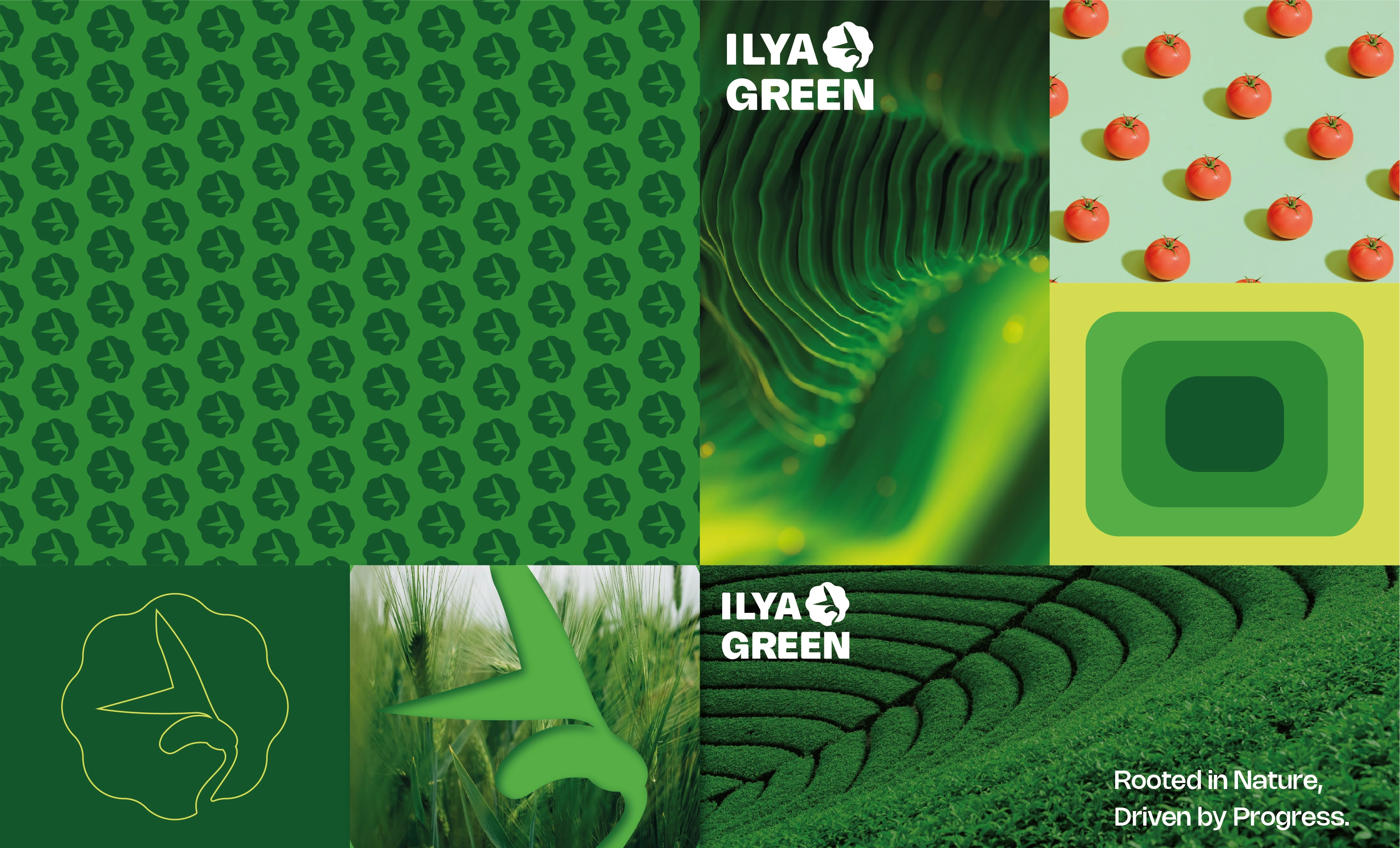
The answer came from simplifying a seedling down to its essence and placing it inside a circular octagon. This paired the organic feel of the seedling with the stability of geometric shapes. Starting from an actual seedling photo, the design got stripped down and refined until only the most important elements remained—nothing extra, just what the brand needed.
Logo Explanation: The Seedling
The seedling sits at the center of everything. It's the perfect symbol for what ILYA GREEN does—nurturing growth from the very beginning. Those curved stems and unfurling leaves capture that moment of life pushing through soil, full of energy and promise. And because it's simplified, it stays readable whether it's on a tiny label or a billboard.
Logo Explanation: The Circular Octagon
The frame isn't just decoration—it adds real meaning. Eight sides hint at balance and completeness, ideas that fit naturally with sustainable agriculture. But by rounding it into a circle, the shape stays fluid and organic instead of rigid. It creates a badge-like quality that suggests certification and quality, while balancing the softness of the seedling with something more structured.
Design Impact
The logo delivers on what the brand needed. It's memorable, versatile enough for any application, and tells the story quickly. Someone sees it and gets it—this company helps things grow. It has enough polish to feel professional but enough simplicity to stick in your mind. That balance was the whole goal.

THANKS FOR YOUR TIME
Like this project
Posted Aug 13, 2026
Designed a meaningful and versatile logo for ILYA GREEN, a Moroccan fertilizer company.