LearnForge - Online Learning Platform UI/UX Design
Diyoke Stanley N.
Overview
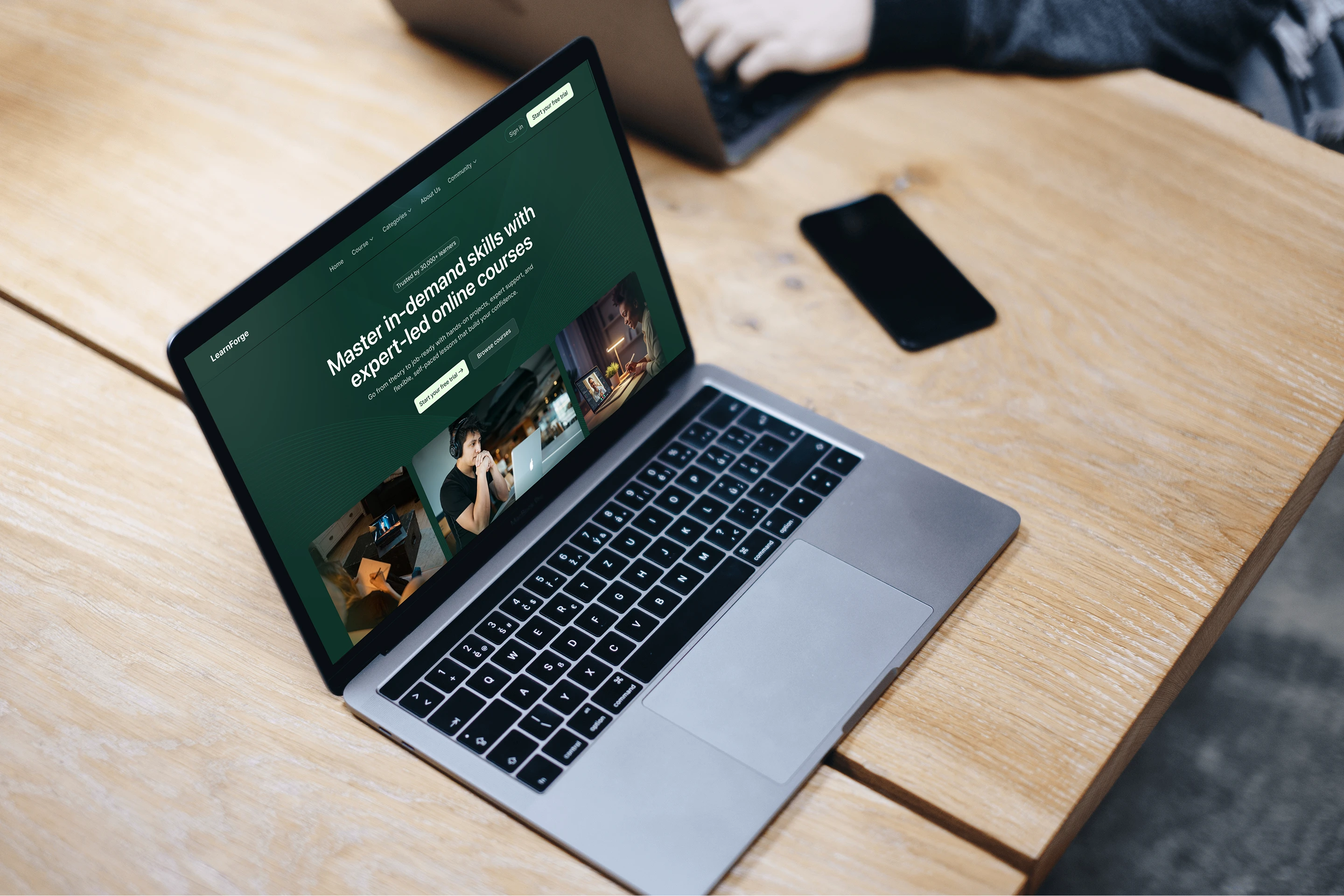
LearnForge: E-Learning Platform UI/UX
Most e-learning platforms overwhelm users the moment they land. Too many courses, too little guidance, and no clear reason to trust the platform with their time or money.
LearnForge was designed to solve exactly that.
Every decision, from the calming teal-green palette, to the 4-step learning process visualization, to strategically placed testimonials and partner logos, was made to move a hesitant visitor toward enrollment without friction.
Course cards surface only what matters: duration, modules, student count, and ratings. The result is a clean, credible interface that feels less like a course marketplace and more like a platform professionals actually want to be part of.
Problem Statement
E-learning platforms struggle to convert visitors into enrolled students. Users arrive with intent but leave without acting, overwhelmed by cluttered interfaces, unclear course information, and no compelling reason to trust the platform. The lack of structure and social proof creates hesitation at every step of the journey.
Solution
LearnForge was designed to eliminate that hesitation at every touchpoint. A calming teal-green palette reduces cognitive load on arrival. A 4-step learning process visualization gives users a clear picture of what to expect. Course cards were stripped down to only the information that drives decisions: duration, modules, ratings, and student count. Testimonials and partner logos were placed strategically to build trust before the user reaches a CTA. The result is a friction-free path from discovery to enrollment.
Like this project
Posted Mar 3, 2026
An e-learning UI engineered around one goal: converting visitors into enrolled students through intentional layout, clear information and trust-driven design.
Likes
0
Views
3
Timeline
Jan 3, 2026 - Jan 15, 2026
Clients
Client