Pumpcade Design System: one kit, every page

View completed workpumpcade-design-system.netlify.app
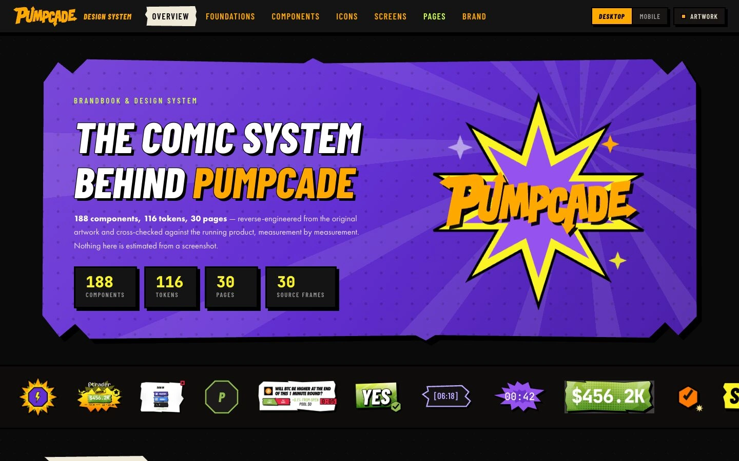
Comic energy, built to scale
Pumpcade's illustrated brand had a strong voice and no rules. A product team could not build from it without losing that voice.
We turned it into a documented design system: type, colour, icons, components and rules, published as a live site the team builds from.
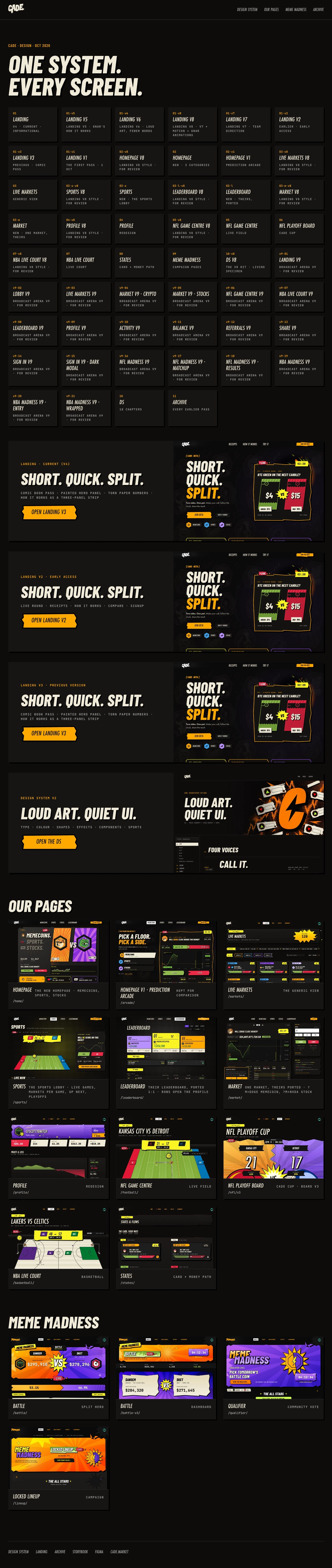
The design system site, top to bottom
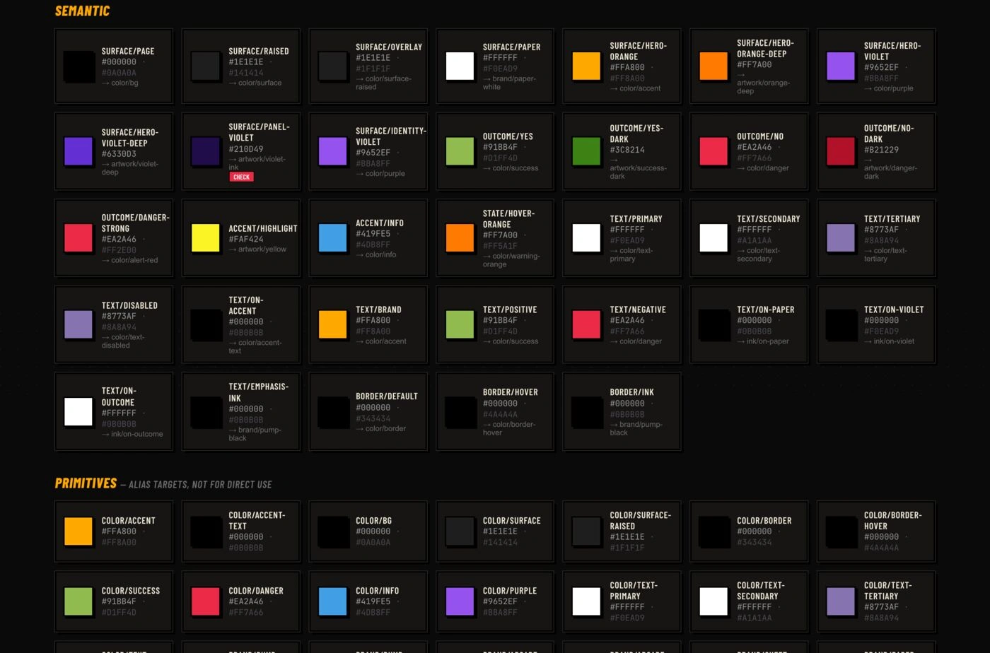
Colour tokens, semantic and primitive
Foundations first
Colour tokens in two layers, primitive and semantic, so a theme can change without touching a component. A type scale from display to body, tuned for comic headlines that still read on a phone.
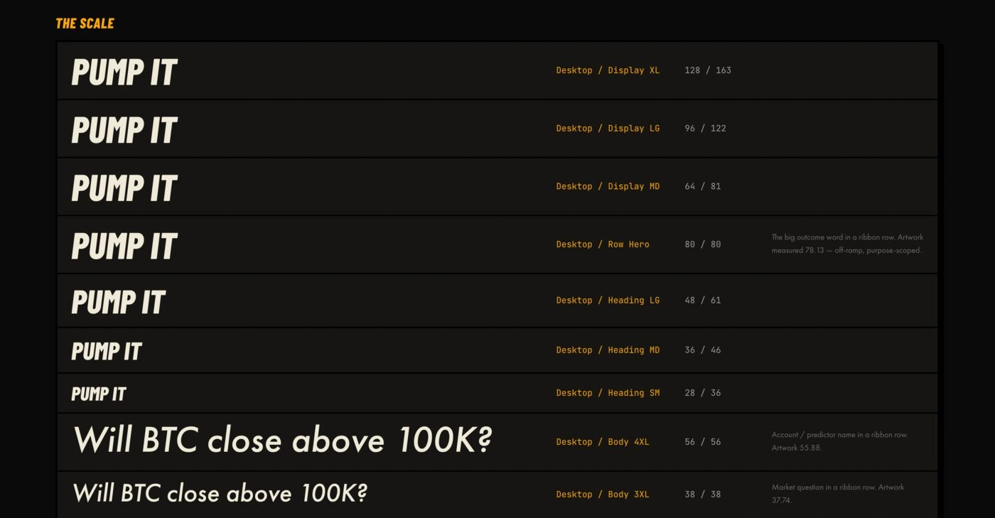
Type scale, display to body
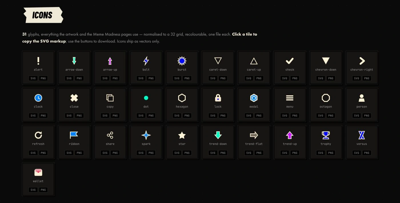
Icon set, one glyph per component
Icons and the brand kit
One glyph per component, drawn in the same hand as the illustrations. The brand kit packs logos, colourways and usage rules in one place.
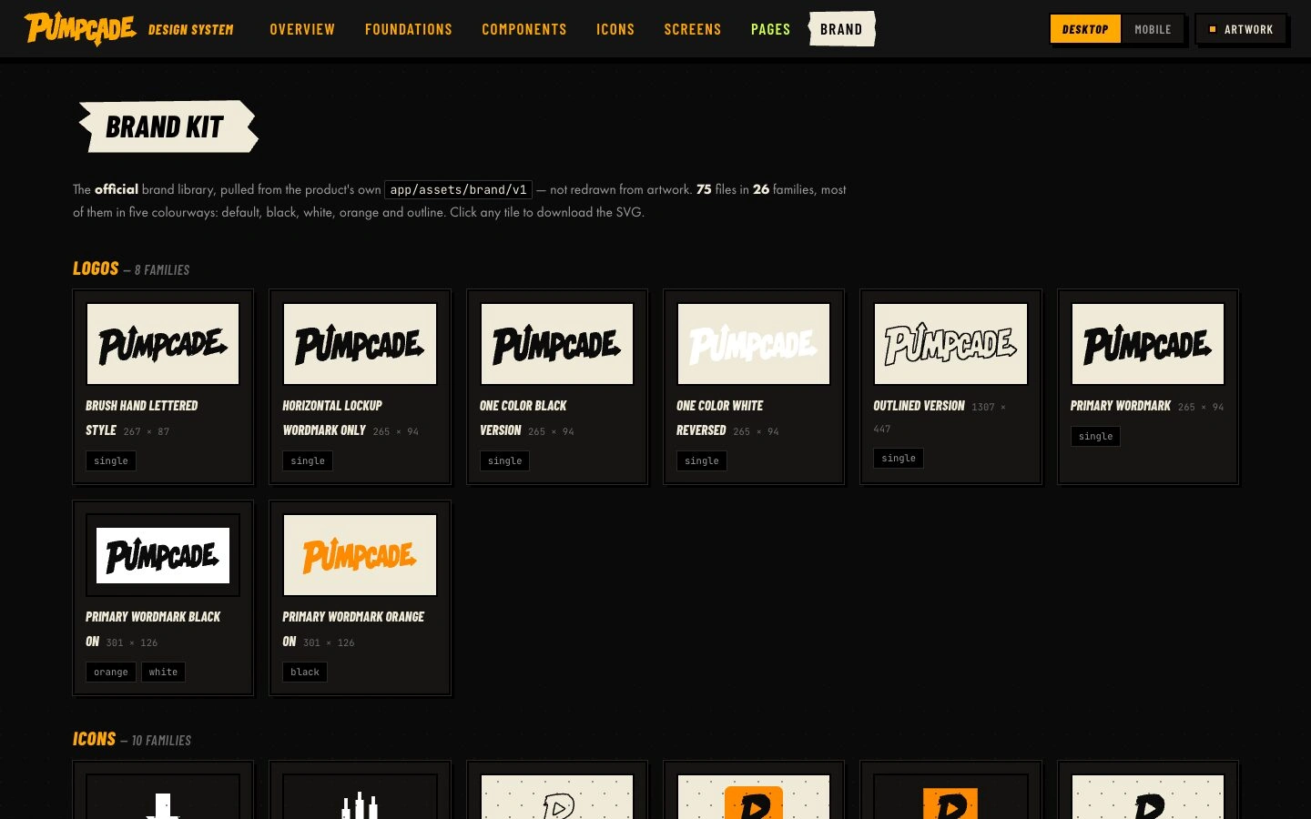
Brand kit
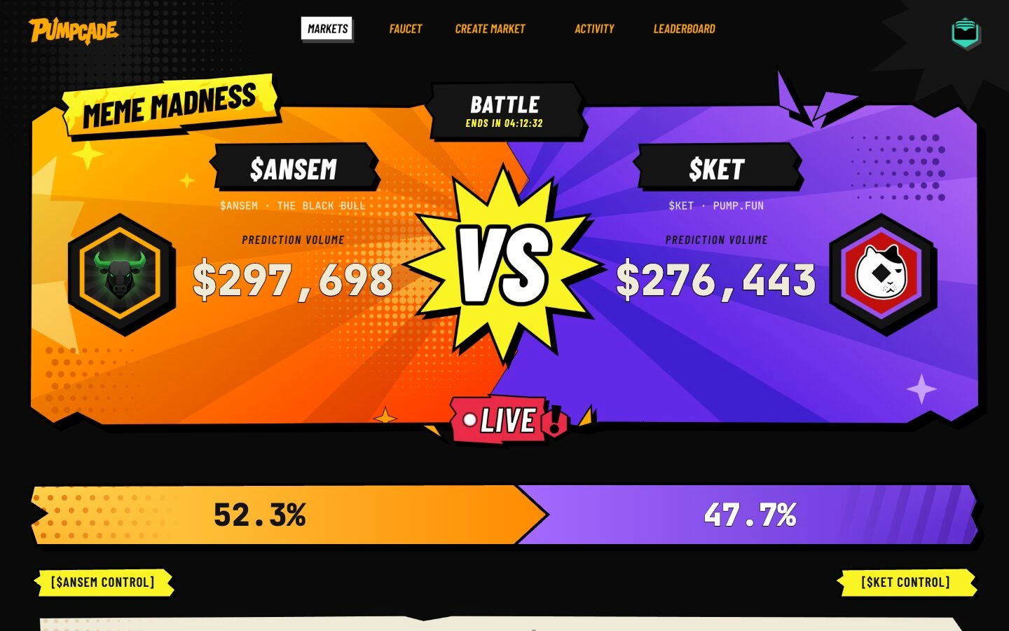
A battle page, built from the system
One kit, every page
Battles, qualifiers and market cards reuse the same components. New pages ship in days because the decisions are already made.
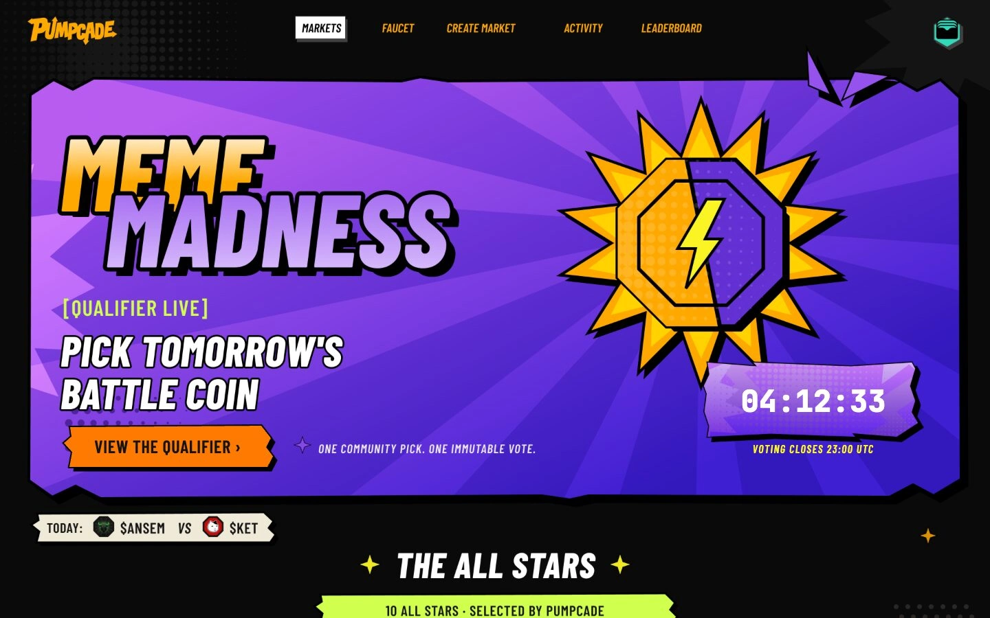
A qualifier page, from the same kit
What we shipped
Design system site: overview, foundations, components, icons, screens, pages
Primitive and semantic colour tokens, type scale, icon set
Brand kit and usage rules
Game pages built from the system
Live: pumpcade-design-system.netlify.app
0 likes · 1 view · Oct 28, 2026
A comic-book brand turned into a documented design system: tokens, type, icons, components and rules, as a live site a product team builds from.