DNDN Logistics Brand Identity Development
Pramodh Ramesh

Client: DNDN Logistics
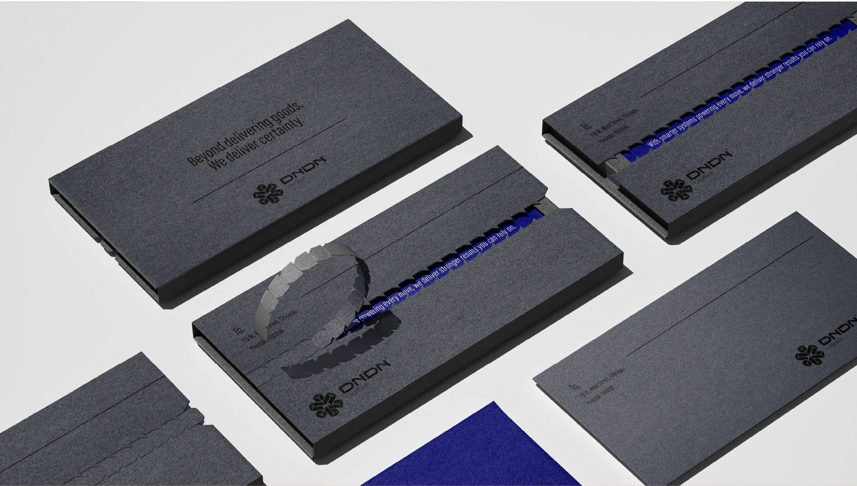
Scope: Brand Identity, Visual Direction, Packaging & Label System
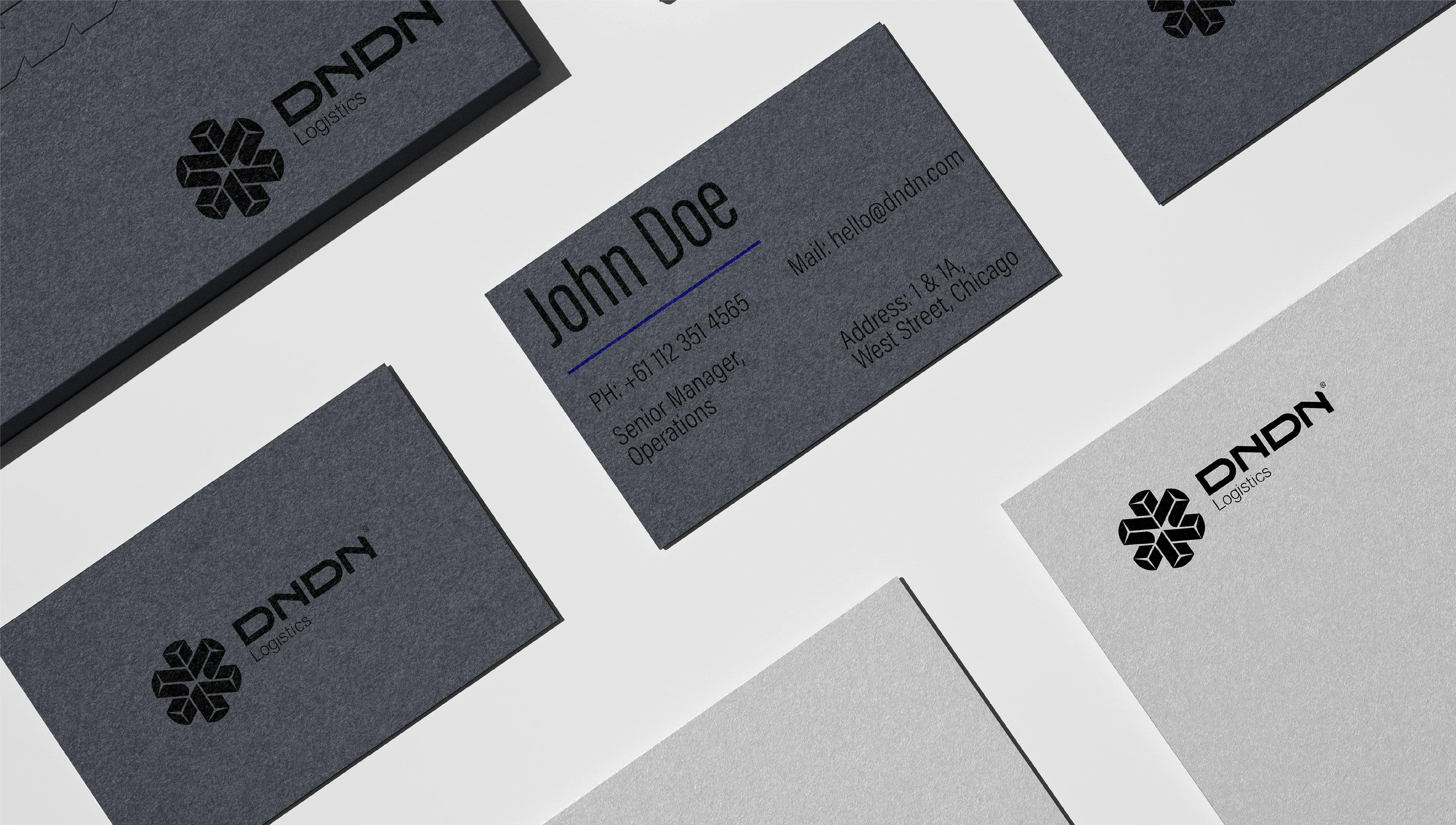
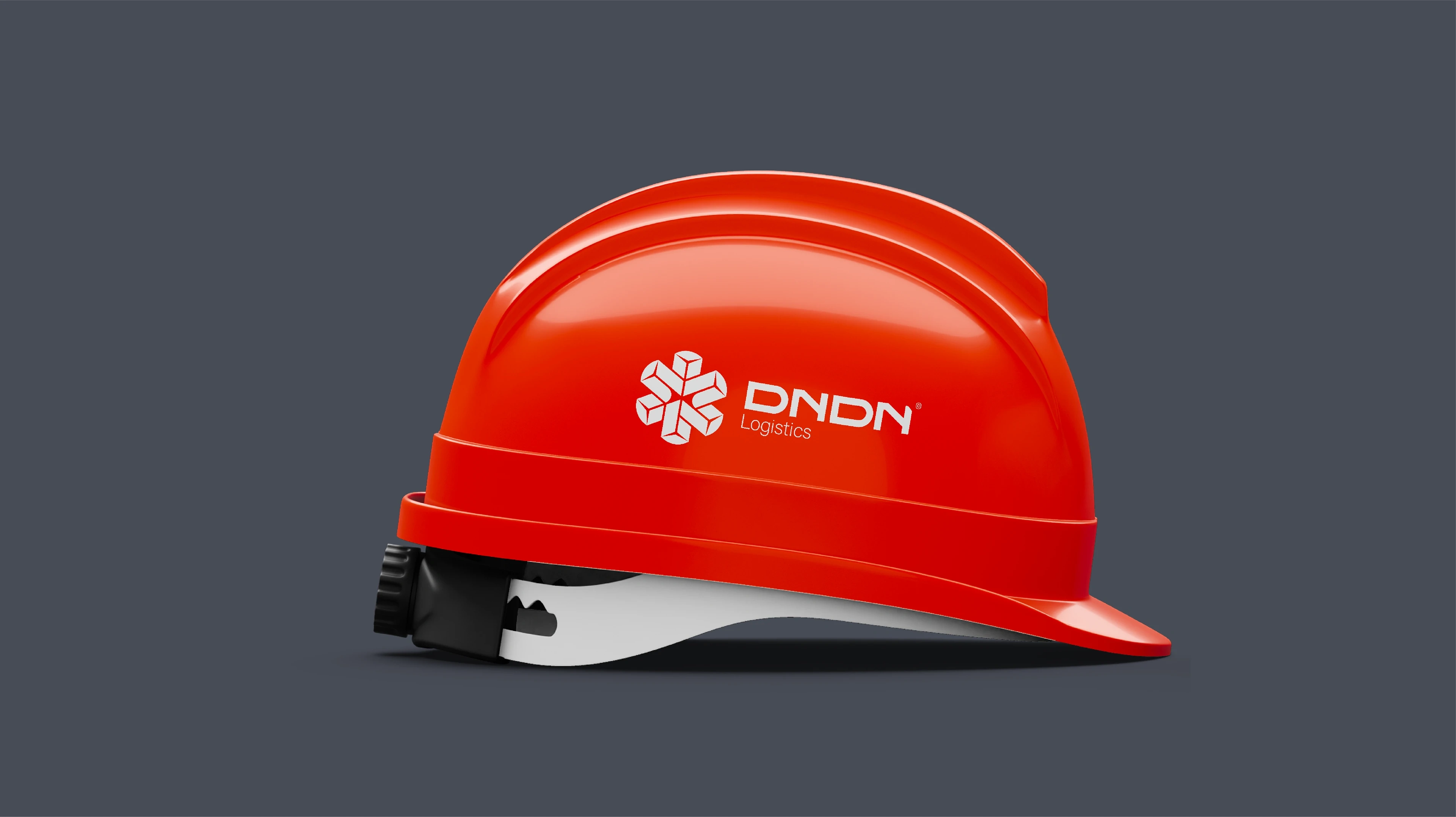
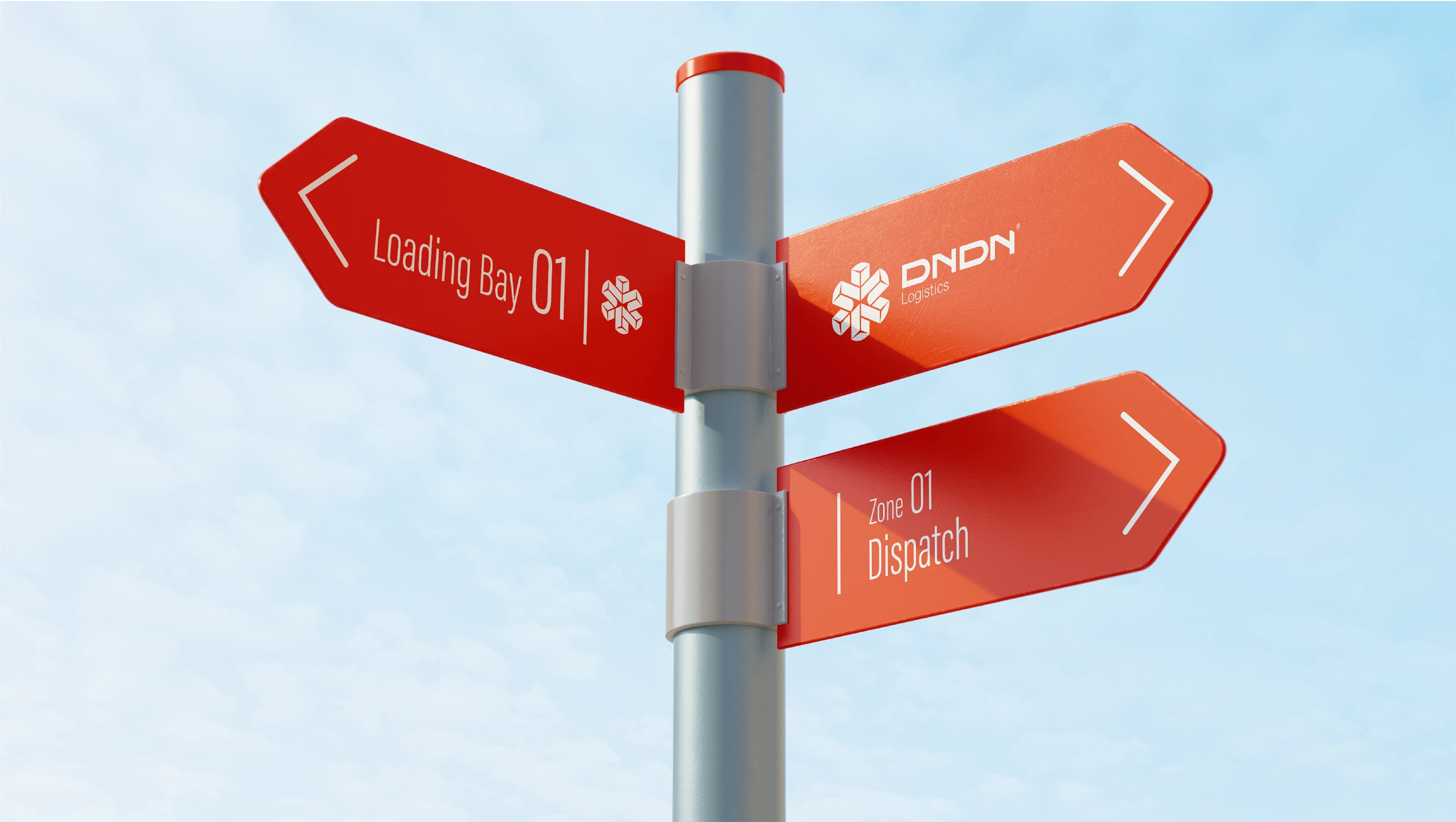
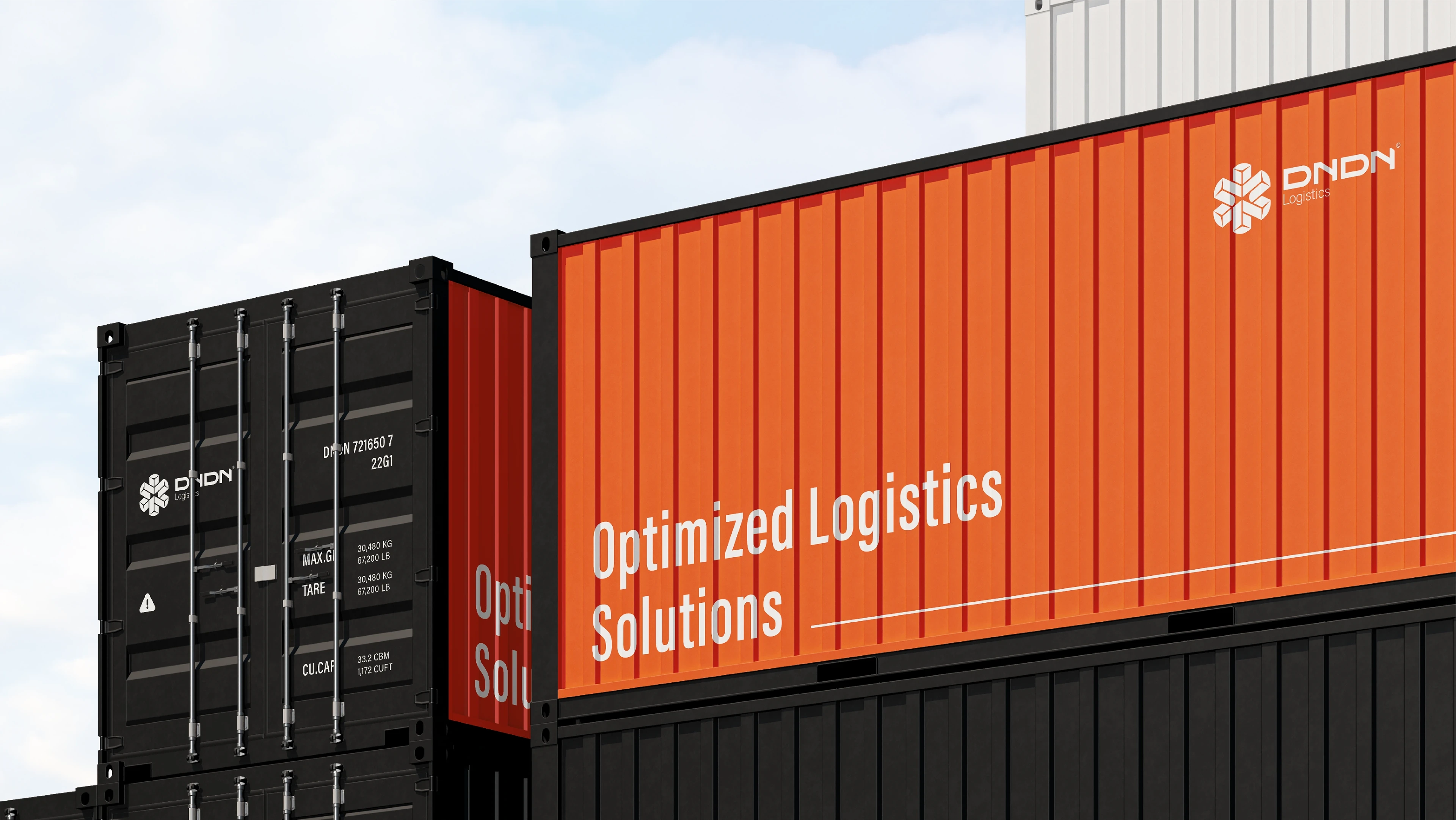
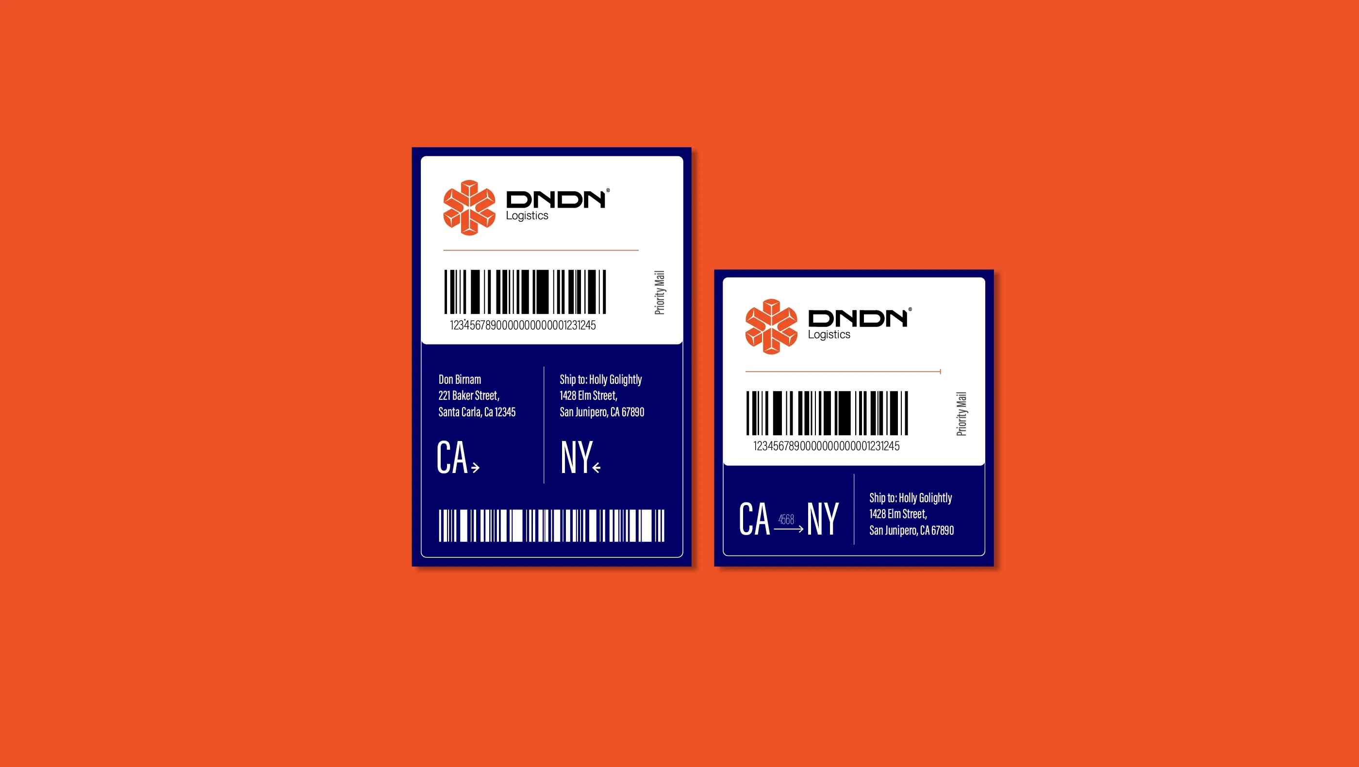
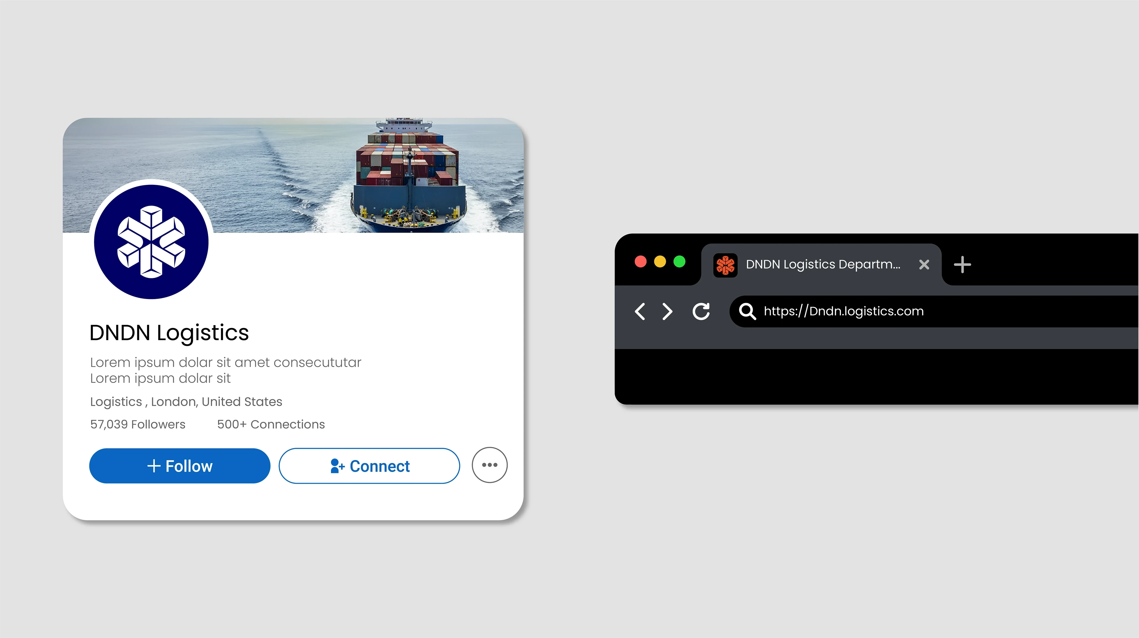
DNDN Logistics connects businesses across countries with fast and reliable movement of goods. The brand identity reflects a disciplined structure and a modular design approach — enabling consistency across labels, packaging, vehicles, and digital interfaces.
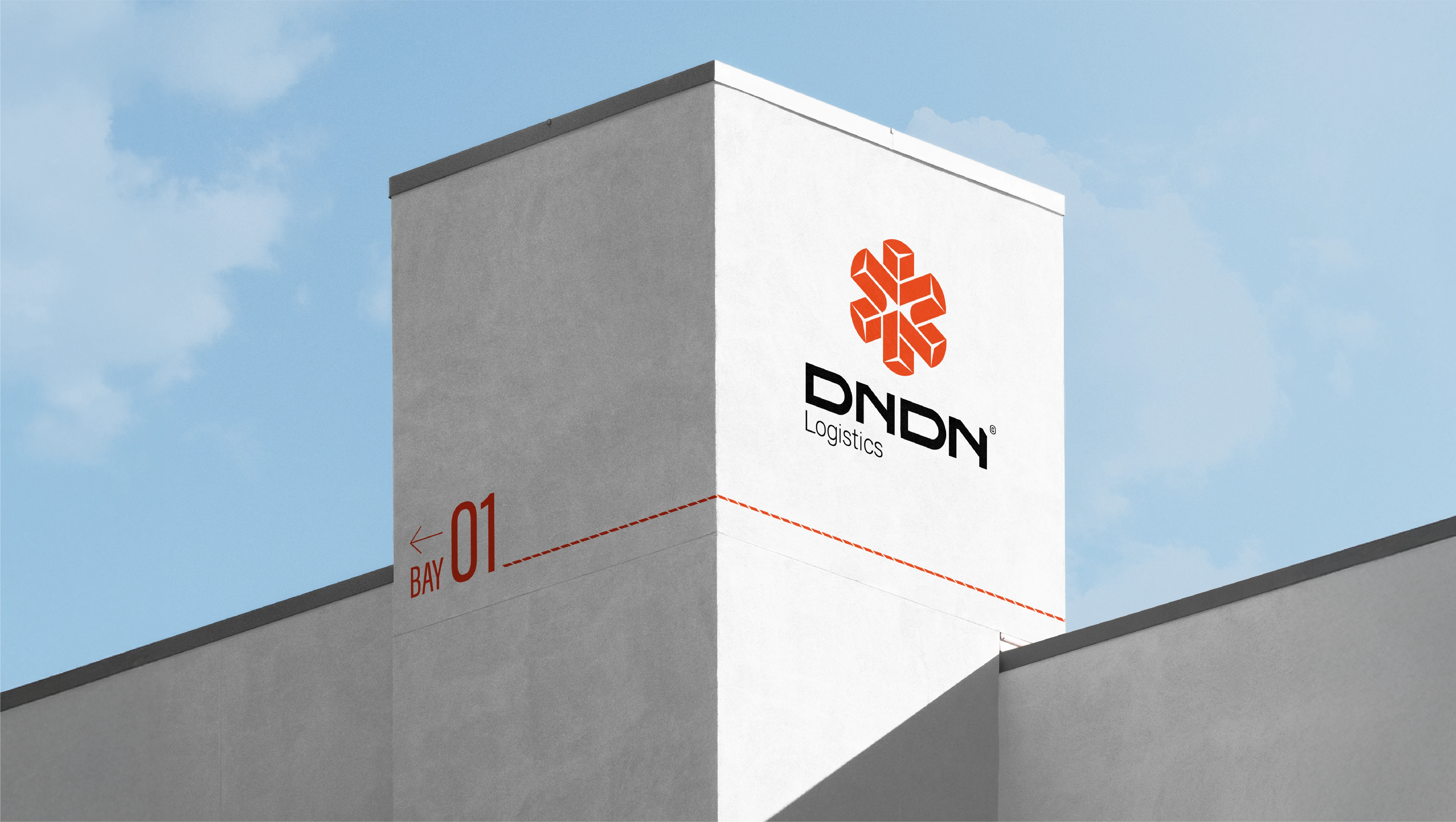
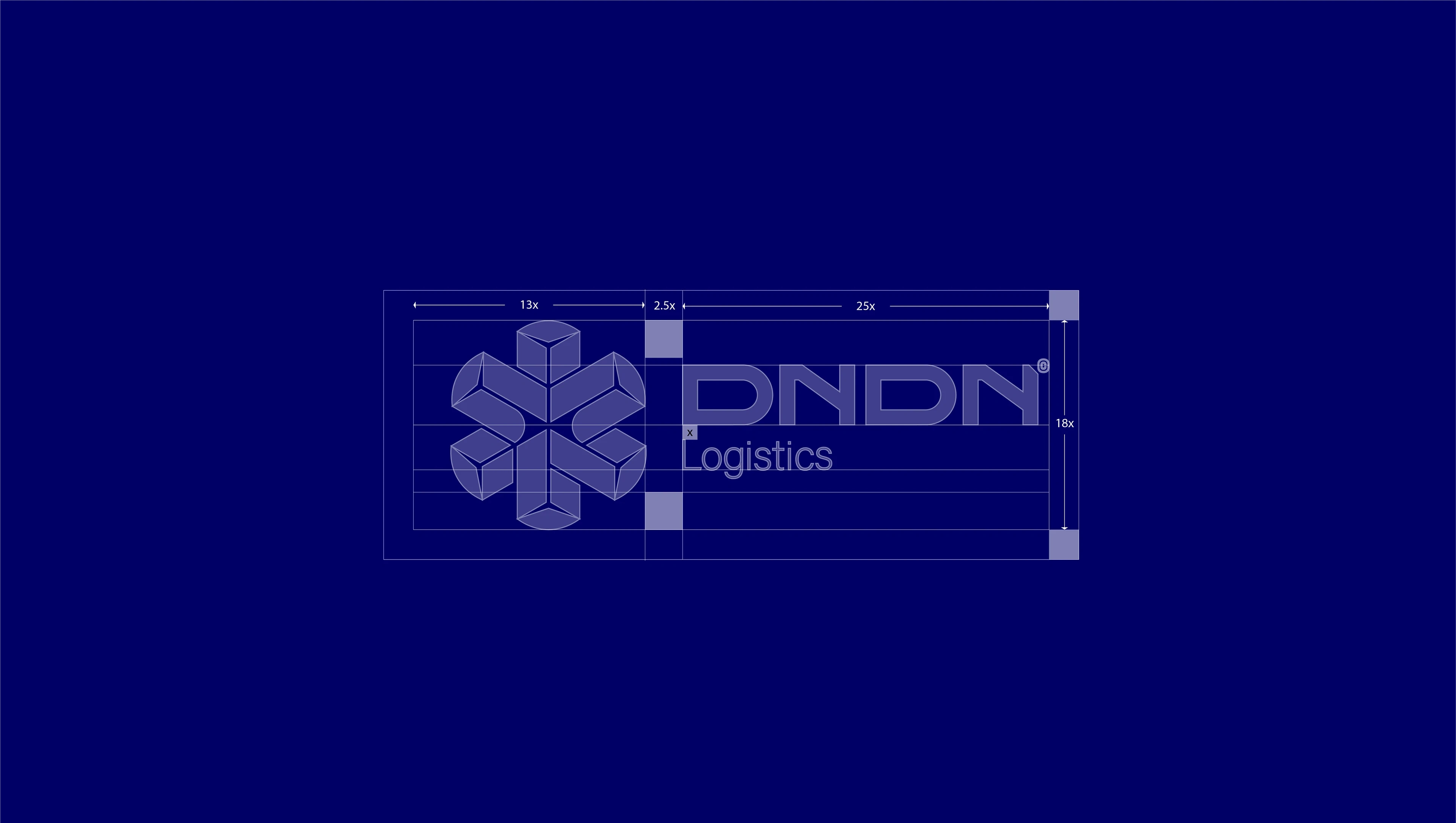
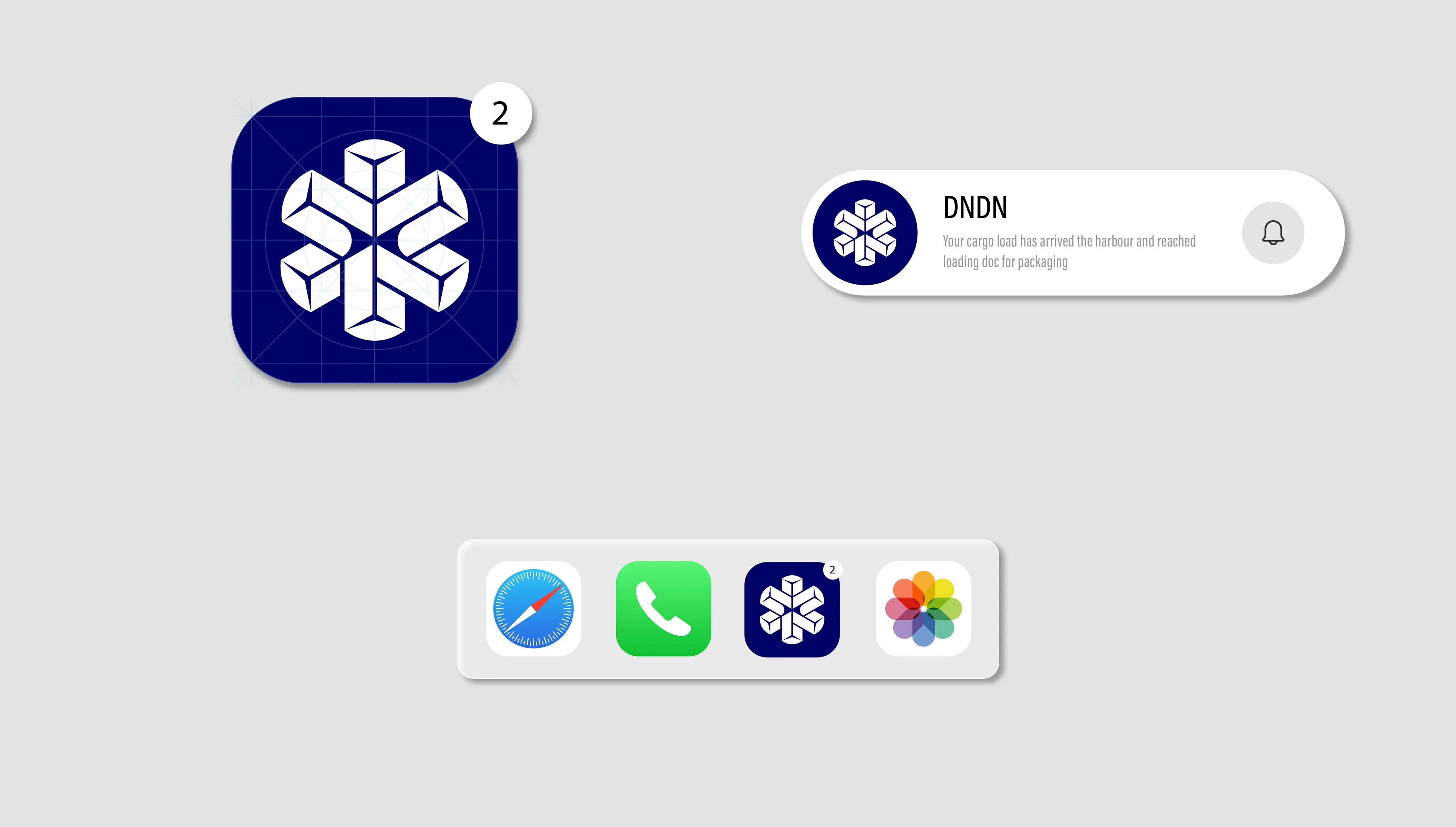
The symbol is constructed from intersecting directional forms derived from concrete tetrapod commonly found in harbors around the world, representing protection, interconnection, and controlled movement.
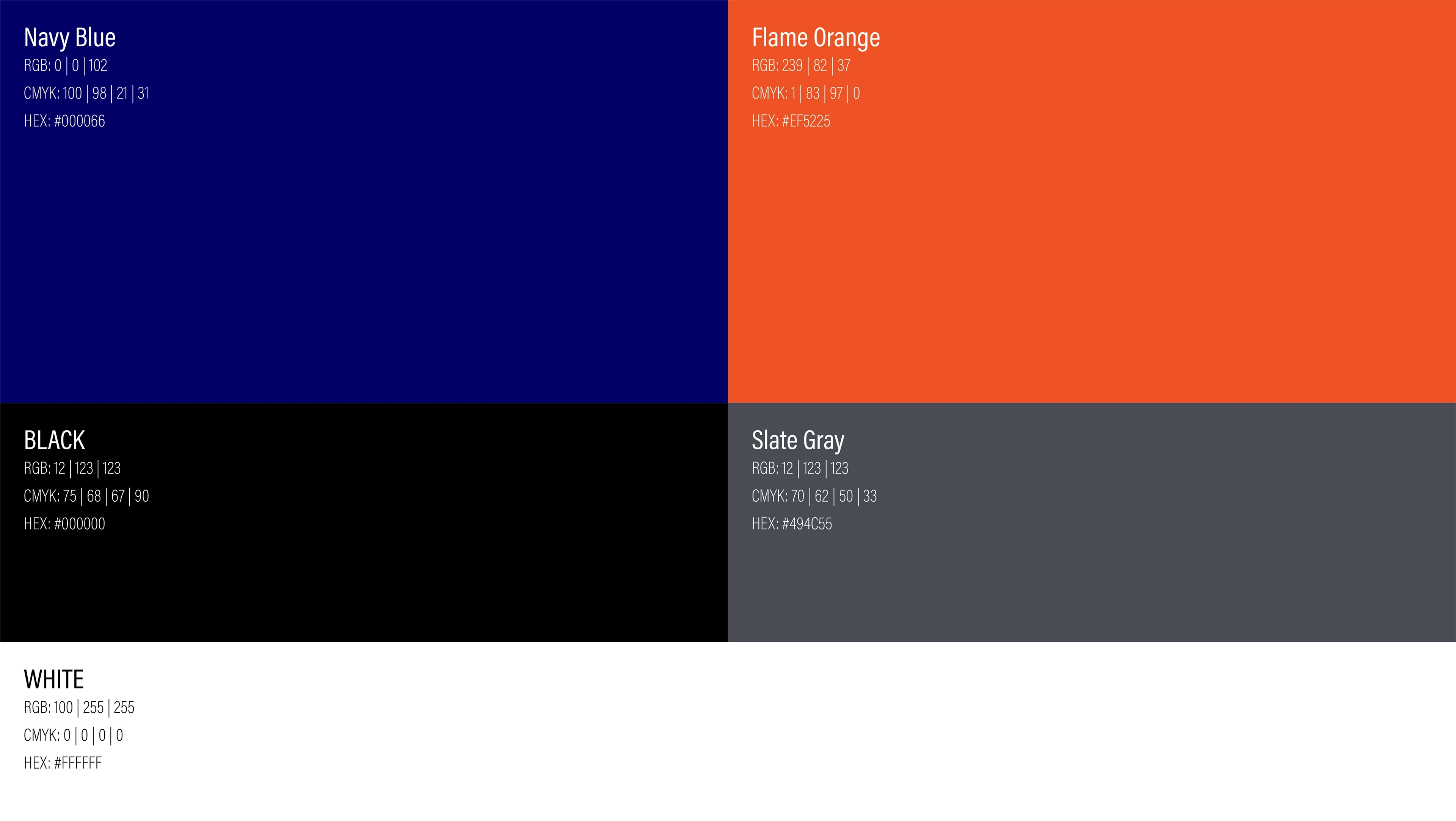
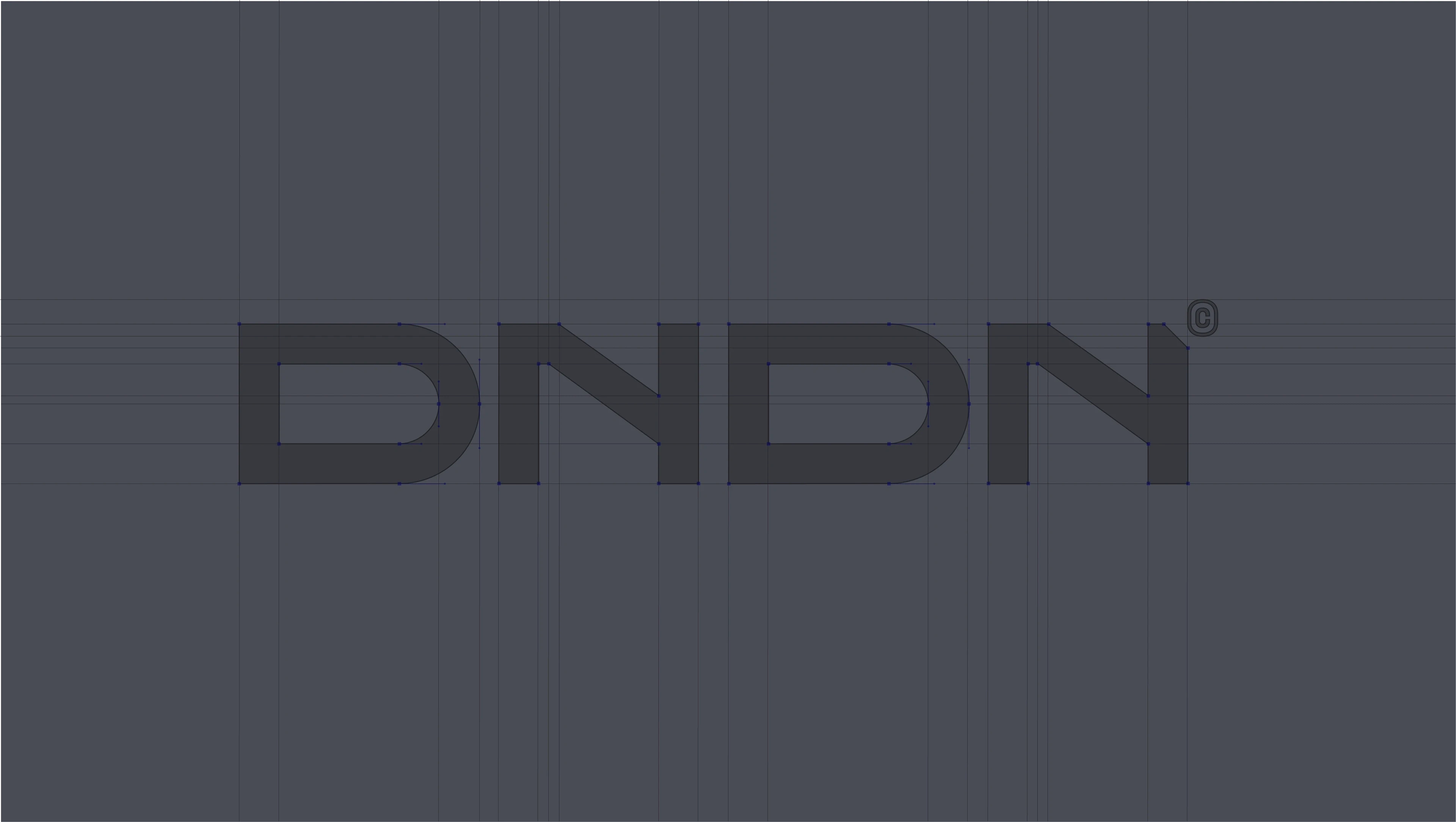
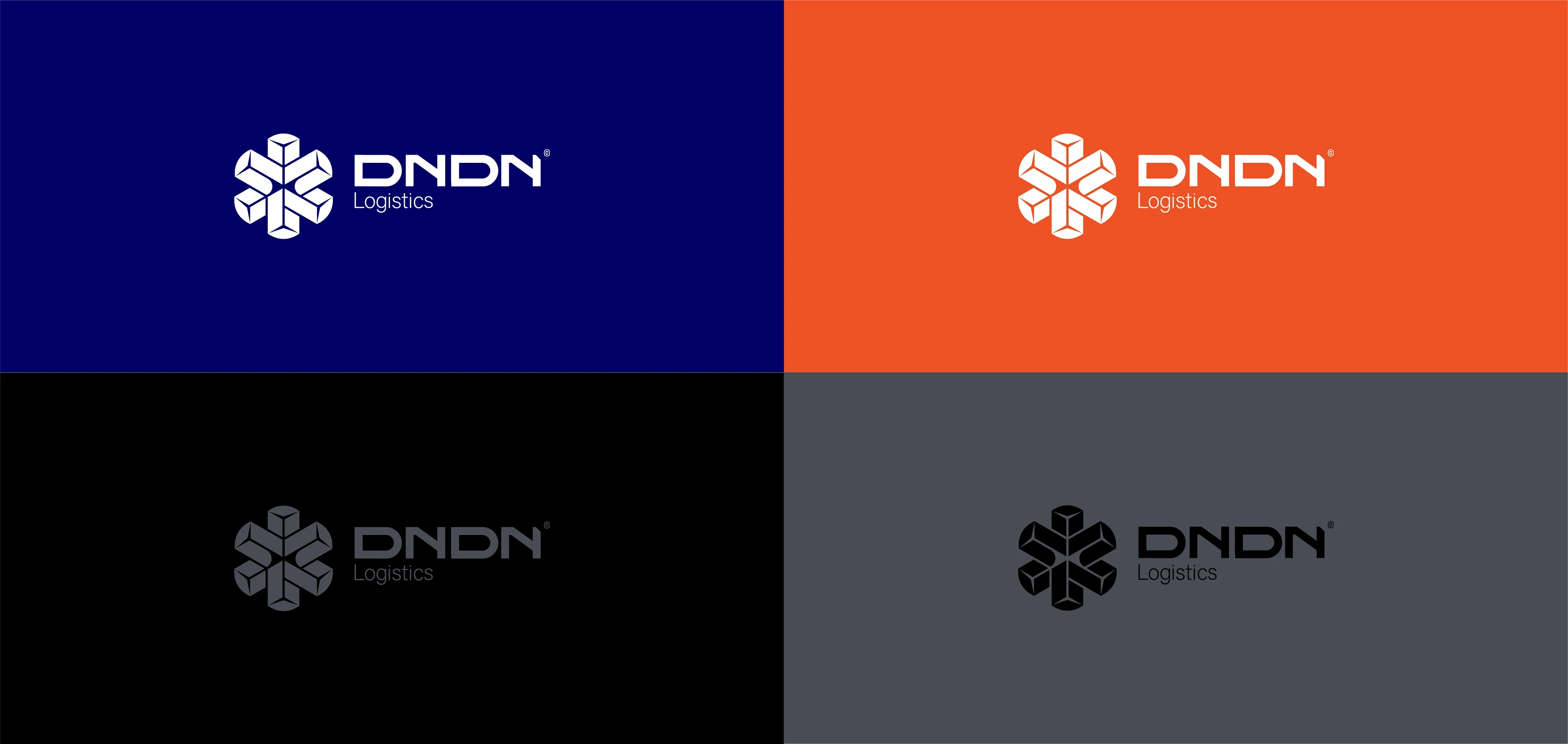
A minimal color palette and industrial typography support instant readability and recognition.


Like this project
Posted Dec 5, 2025
Crafted a modern brand identity for DNDN Logistics, translating efficiency and reliability into a strong visual system across logo and packaging.