Milo Performance & Education
Romario Dudok van Heel
MILO PERFORMANCE & EDUCATION
Building a Brand as Strong as Its Mission
CLIENT OVERVIEW
Milo is more than a training institute—it’s a movement. Founded by experts with a hunger for knowledge and growth, Milo provides accredited courses and training programs that seamlessly blend science with practice. Their team of 15 industry leaders has built a reputation for raising the standard in fitness education.
But while Milo was growing fast, their brand wasn’t keeping up.
THE CHALLENGE
When Milo approached me, they were deep into a rebranding process, but something was missing:
→ There was no clear strategic direction—just an assortment of design choices from a previous agency.
→ The leadership team was undergoing a major vision shift, restructuring the company and launching new products.
→ They had outgrown their identity, and their brand no longer reflected their ambition.
The big question was: How do we build a brand that truly represents who Milo is and where they are headed?
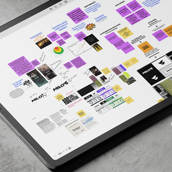
MY APPROACH
Strategy Before Design
Rather than jumping straight into visuals, I led a deep strategic dive to uncover Milo’s core identity. My approach always follows four steps to achieve a strong cohesive brand, that truly resonates with both the organisation and their costumers.

01. Brand Discovery & Research
I conducted in-depth interviews with key stakeholders to:
→ Align the brand with the leadership’s new vision
→ Identify differentiation points in the fitness education market
→ Study competitors and industry trends to shape a unique positioning
This process uncovered a powerful insight: Milo’s philosophy of continuous growth wasn’t reflected in their brand.
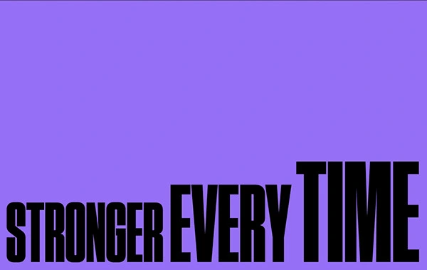
02. Brand Strategy: A Story Rooted in Strength
At the core of Milo’s identity is the principle of progressive overload—a training method based on gradual, continuous growth. Inspired by their namesake, Milo of Croton, who grew stronger every day by carrying a calf until it became a bull, this became the foundation of their new brand story.
→ Core Idea: “Stronger Every Time”—a concept that embodies both physical and intellectual growth.
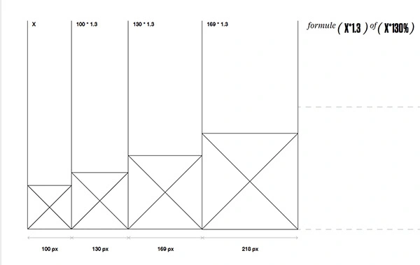
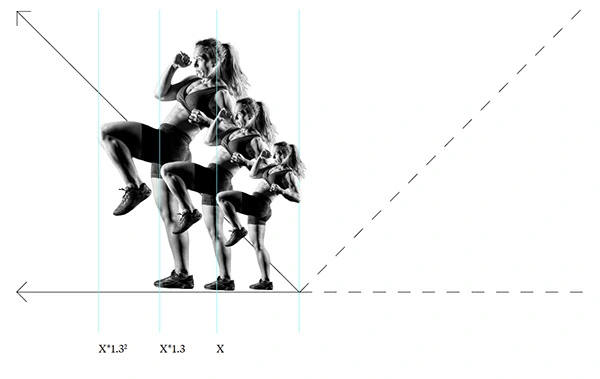
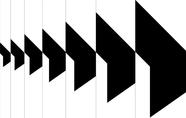
→ Visual Strategy: A design system that mirrors the concept of progressive overload, reinforcing growth, mastery, and resilience.
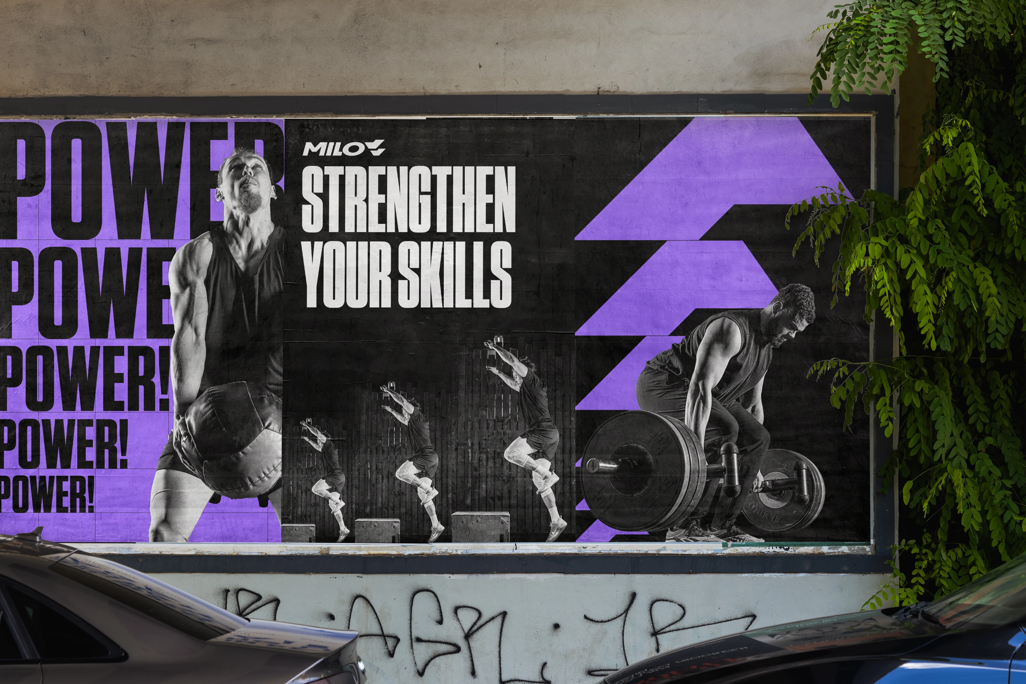
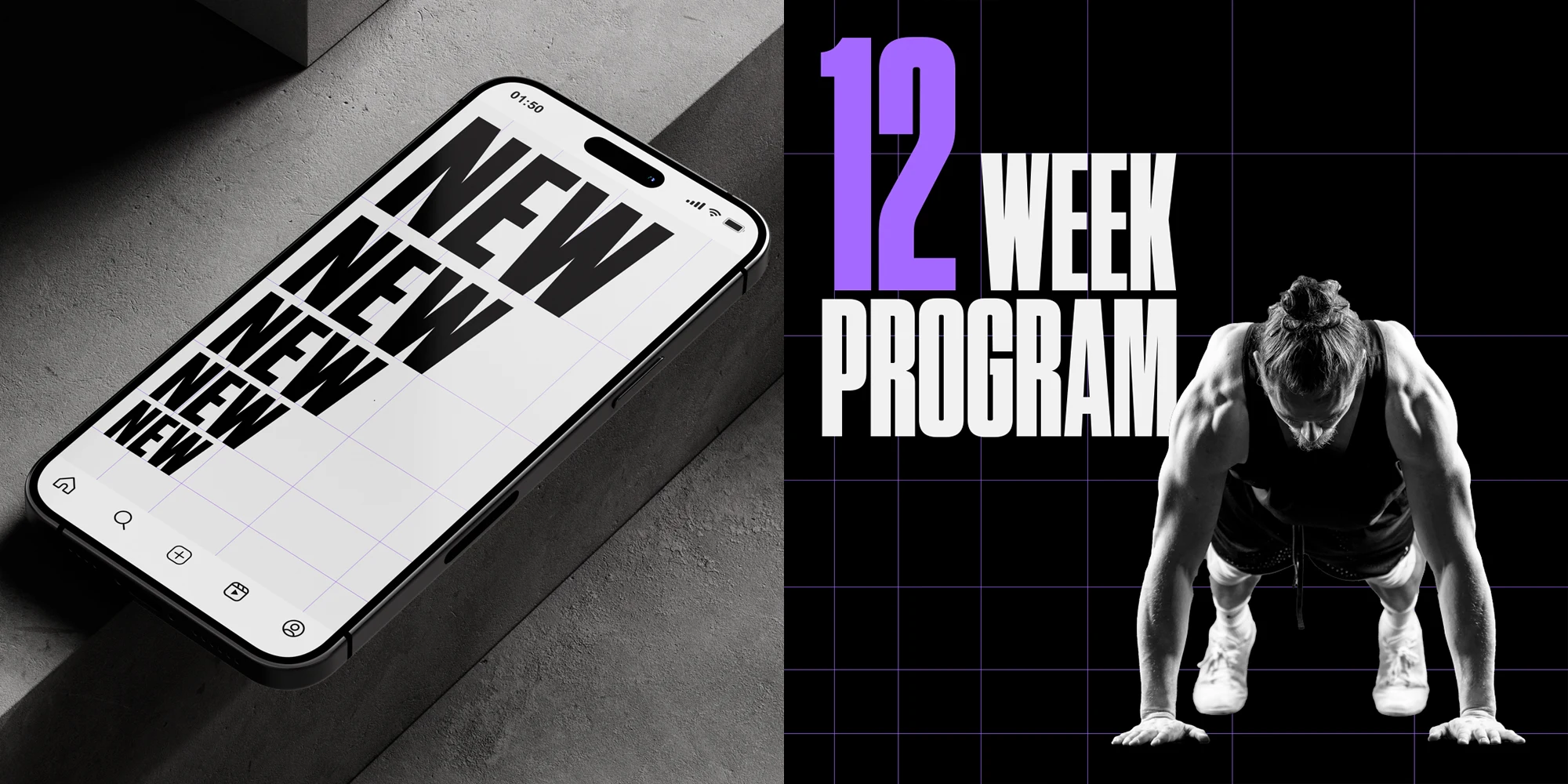
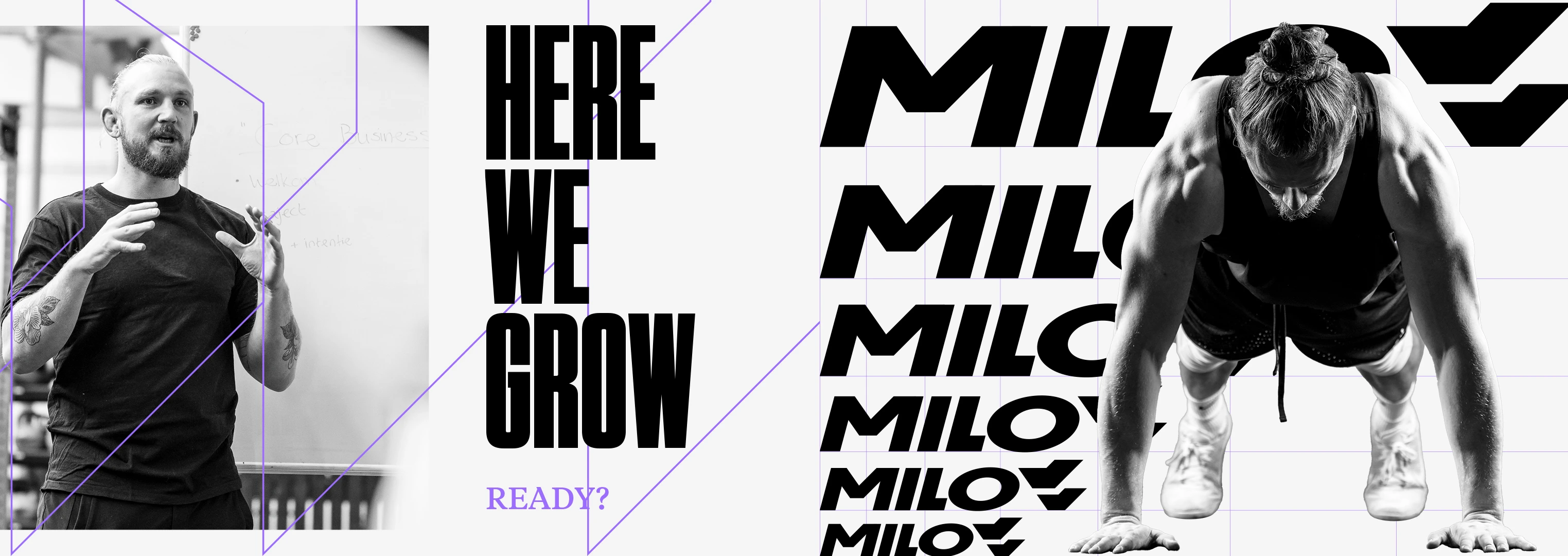
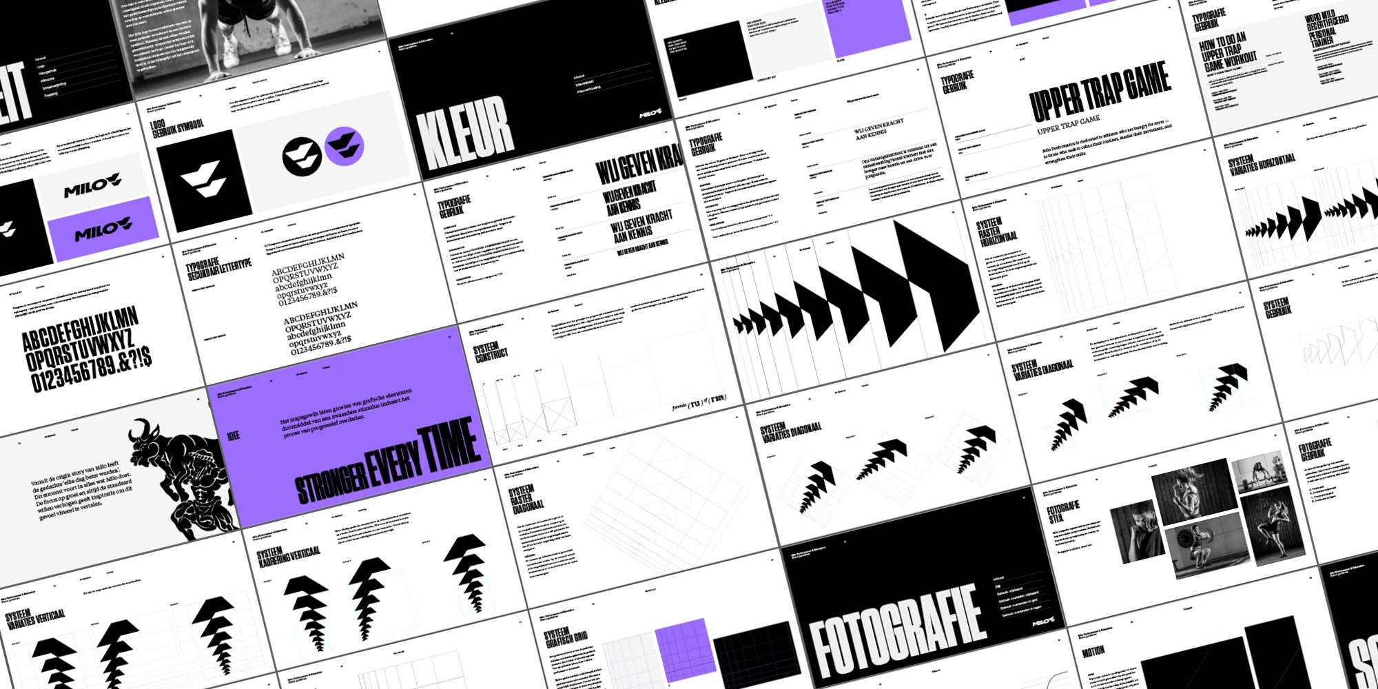
03. Visual Identity: Translating Growth into Design
Once the strategy was in place, I built a cohesive and meaningful brand identity:
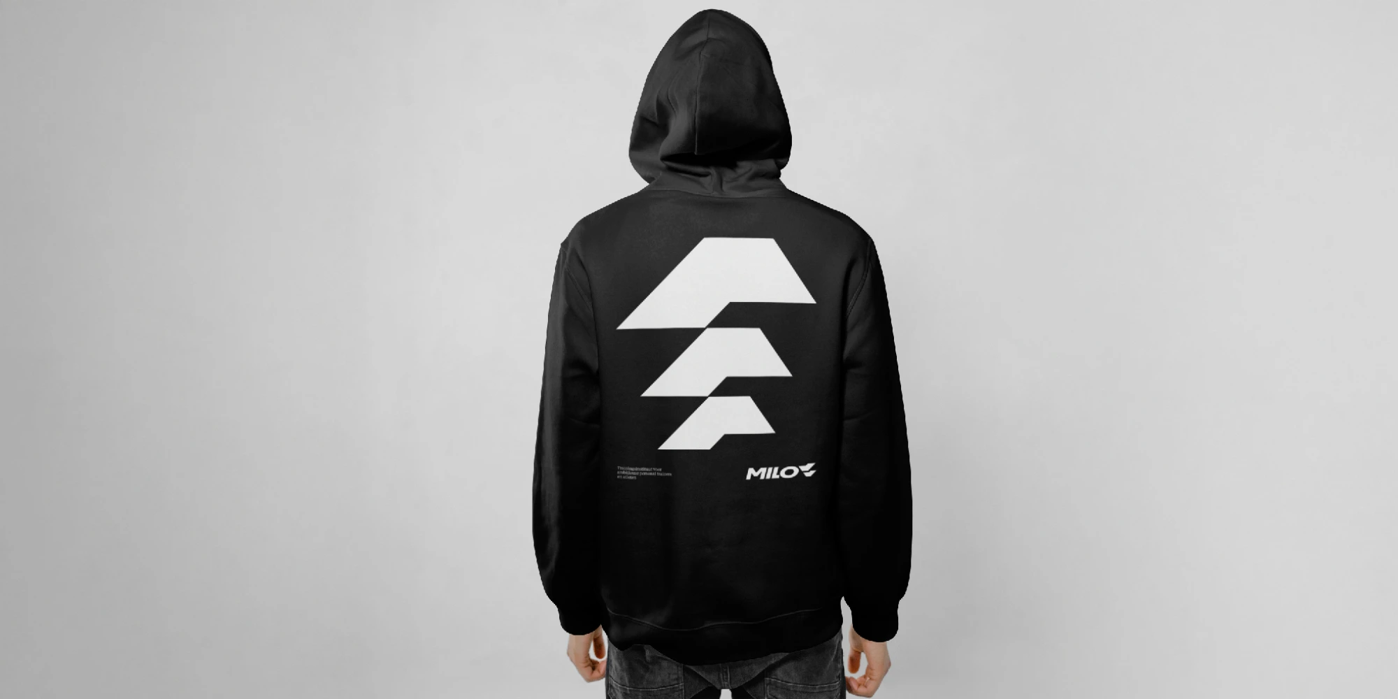
→ Logo Refinement – A redesigned, more balanced logo that reflected the brand’s strength and precision.
→ Scaling System (1.3x Growth) – A visual metaphor for progressive overload, applied across all brand elements.
→ Color & Typography – A distinctive color system:
→ Education: Monochrome base with purple highlights (expertise & knowledge).
→ Performance: Strong contrast using black and purple (strength & energy).
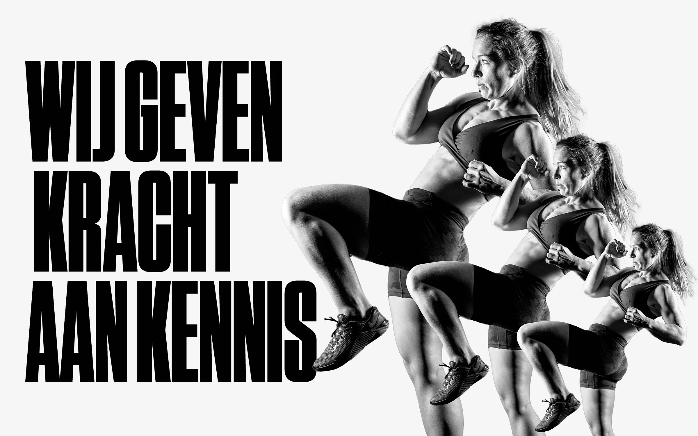
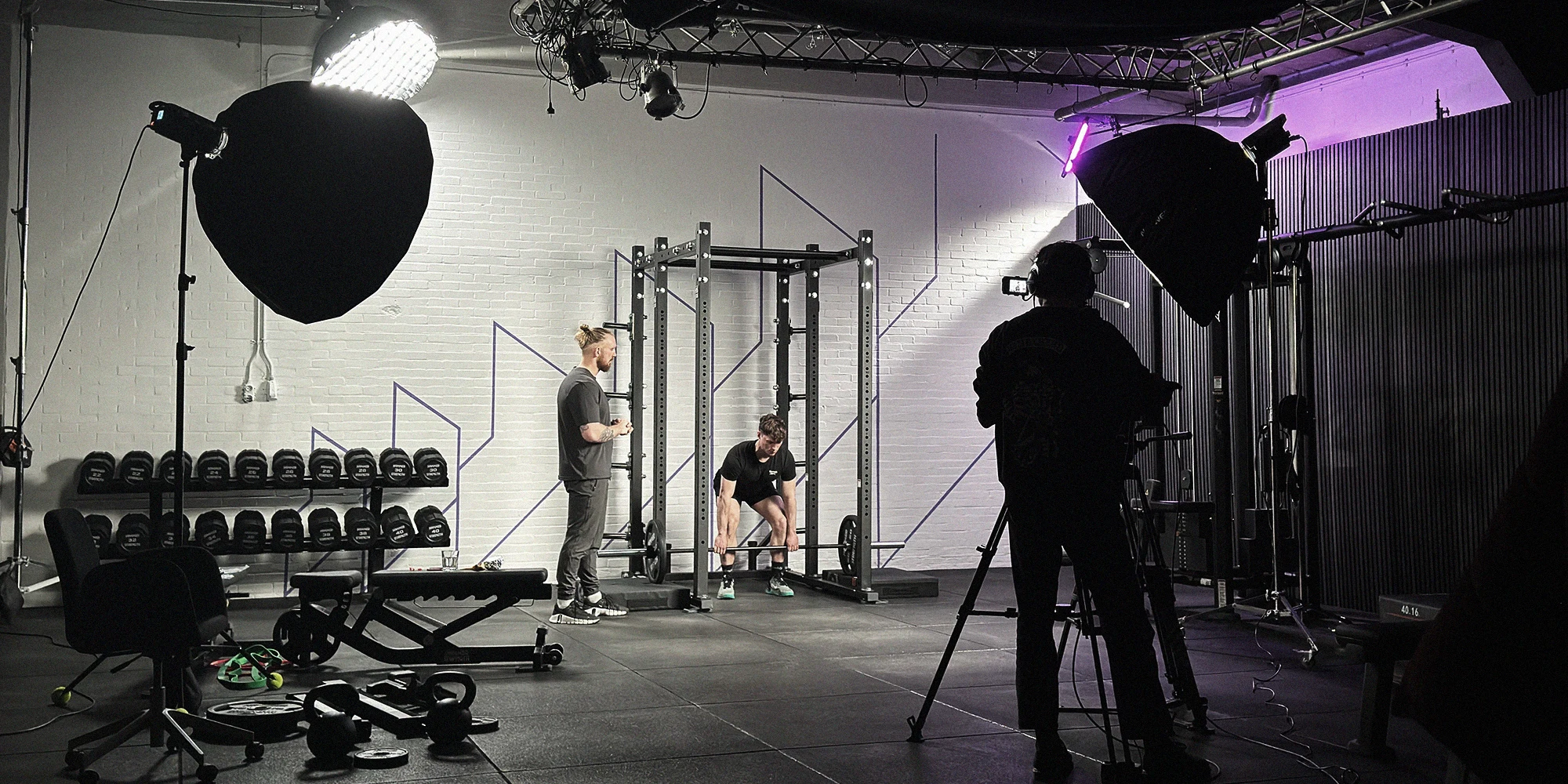
→ Photography & Motion Design – A high-impact visual style that reinforces growth and movement.
04. Implementation: Bringing the Brand to Life
As Creative Director, I ensured the seamless execution of the new brand across multiple platforms:
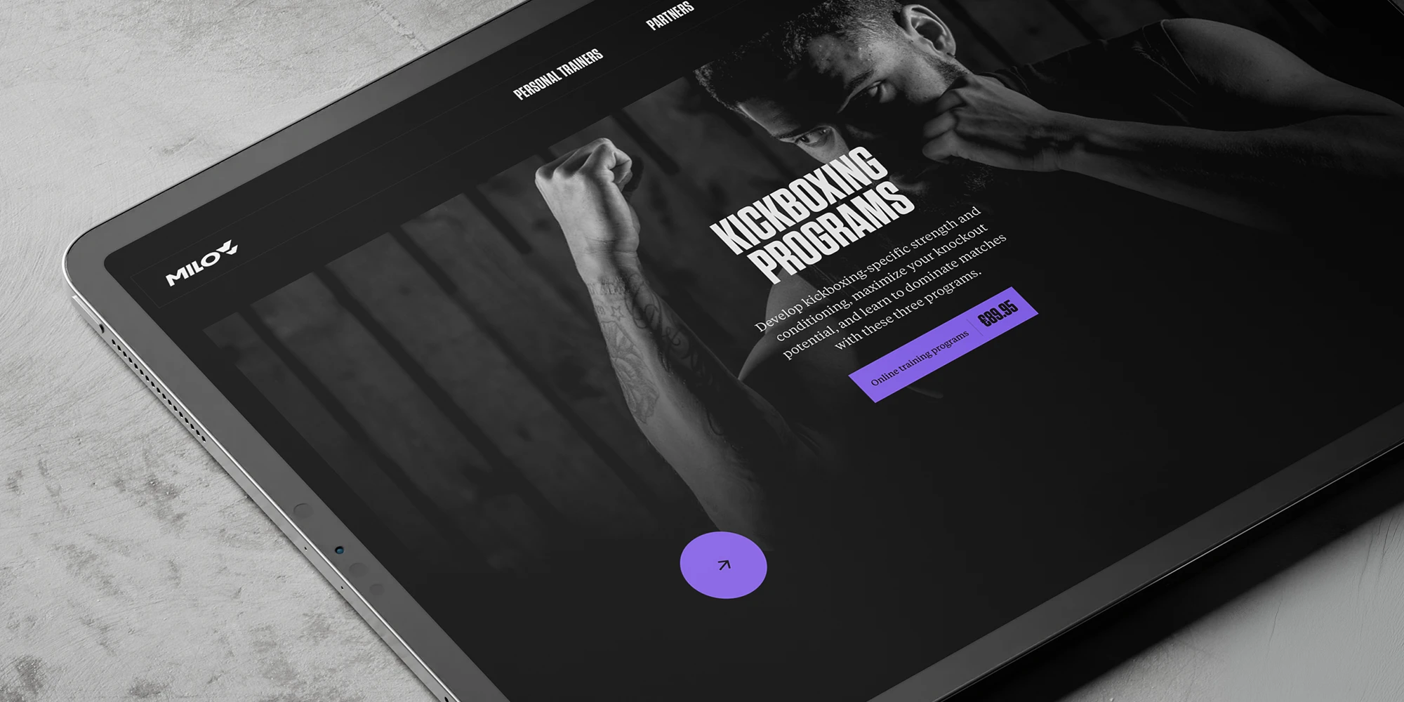
→ Website – A restructured digital presence reflecting the brand’s evolution.
→ Online Course Platform (LearnDash) – A cohesive learning environment.
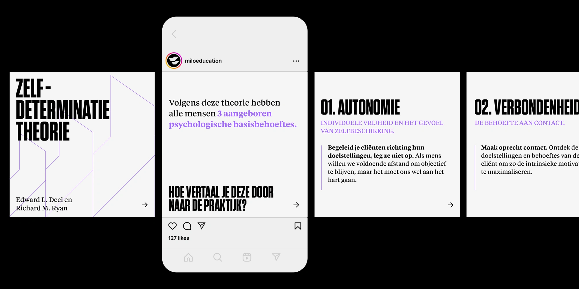
→ Instagram Strategy & Templates – A visual (motion) content system designed for engagement.
→ Testimonial Videos – Highlighting real impact and transformation.
→ App UI – Extending the brand’s identity into the digital experience.
→ Video Production (500+ video's) – Story-driven motion content reinforcing the brand narrative.
THE OUTCOME
A Brand with Purpose & Power
By aligning Milo’s visual identity with its mission, we built more than just a brand—we created a movement. Now, every design choice is intentional, strategic, and deeply connected to their philosophy of continuous growth.
TESTIMONIAL
"Before working with Romario, we were in the middle of a rebrand without a clear strategic direction. We had new visual elements, but we lacked a strong foundation—the ‘why’ behind our choices.
What stood out to me from the start was Romario’s commitment to research. With previous agencies, I often felt like they didn’t truly understand me—as if they wanted to dive in without first grasping what drives my business. With Romario, it was completely different. He asked questions I hadn’t even considered. He immersed himself so deeply in our brand that, in the end, he could articulate our story better than I could myself. And that’s exactly why he got to the core.
Romario not only helped us establish that foundation but also challenged us to make sharp, deliberate choices: who are we as a brand, and why do we do what we do? Because of this depth—and his strategic approach—our vision is now crystal clear and tangible in everything we do. From brand identity to positioning, everything aligns.
The result is a brand that is not only visually stronger but also fully resonates with our mission. The collaboration was intensive, thoughtful, and exactly what we needed to take Milo to the next level."
Wouter Middelbos
Founder, Milo Performance & Education
If your brand has outgrown its identity, let’s build something that reflects its future.
Like this project