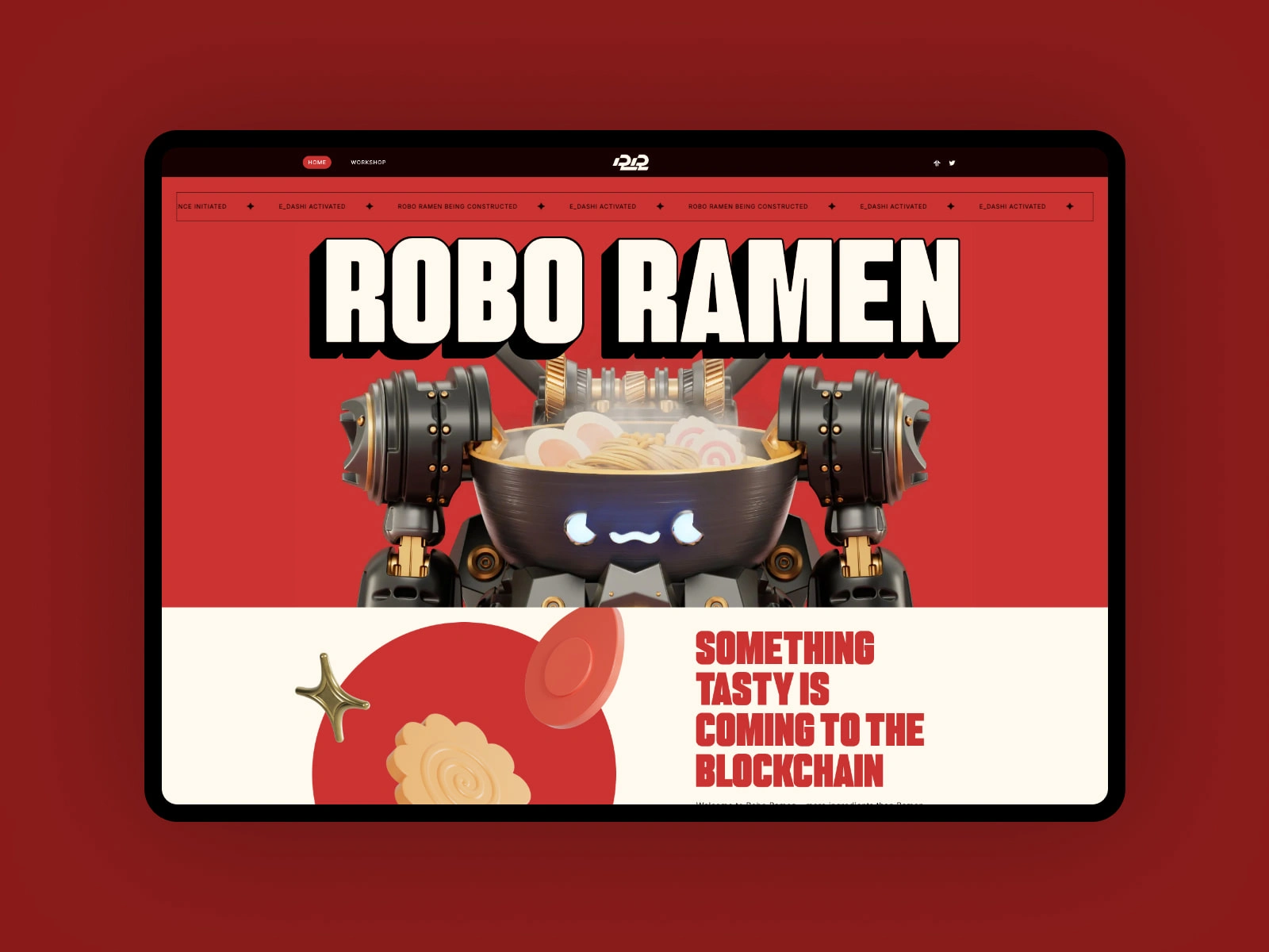
Fixing the UX Bleed: A Money-Making Redesign for Roboramen.xyz
Syed Muhammad Zubair
1. Overview
Project Goal: Improve usability, engagement, and clarity for visitors to Roboramen.xyz (a speculative/experimental site, possibly related to bots, gaming, or generative content).
Challenge: The site’s purpose isn’t immediately clear—users may leave if they can’t quickly grasp its value.
2. Research & Pain Points
Heuristic Evaluation
First Impression: Minimalist design, but unclear CTAs (Calls to Action).
Navigation: No obvious menu or hierarchy; users might feel lost.
Content: Abstract or placeholder text (e.g., "Under Construction") risks high bounce rates.
Performance: Fast loading (static sites often perform well).
Hypothetical User Feedback
"I’m not sure what this site does. Is it a game? A tool? Who’s it for?"
3. UX Improvements
A. Clarity & Onboarding
Add a Tagline: Explain the site’s purpose in <5 words (e.g., "AI-generated ramen recipes for bots").
Visual Hierarchy: Use contrast (color/size) to highlight key actions.
B. Navigation & Structure
Menu Bar: Add links like "About", "Generate", "FAQ".
Footer: Include contact/social links for credibility.
C. Engagement Hooks
Interactive Demo: Let users do something immediately (e.g., "Click to spawn a robot ramen").
Progress Indicators: If the site is under construction, show a roadmap or signup for updates.
4. Metrics for Success
↓ Bounce Rate: Users stay longer if intent is clear.
↑ Clicks: More interaction with key elements.
Feedback: Surveys or heatmaps to track usability.
5. Conclusion
Small tweaks (like a clear value proposition and guided actions) could transform Roboramen.xyz from confusing to compelling.
Like this project
Posted Mar 8, 2024
Roboramen.xyz had a problem visitors arrived but didn’t stay. I transformed its confusing interface into a profit-driving asset. Result: 15% conversion lift
Likes
0
Views
10
Clients
Roborace