Soma Studio | Pilates Studio Brand Identity | UI/UX

Yassine Razzouki


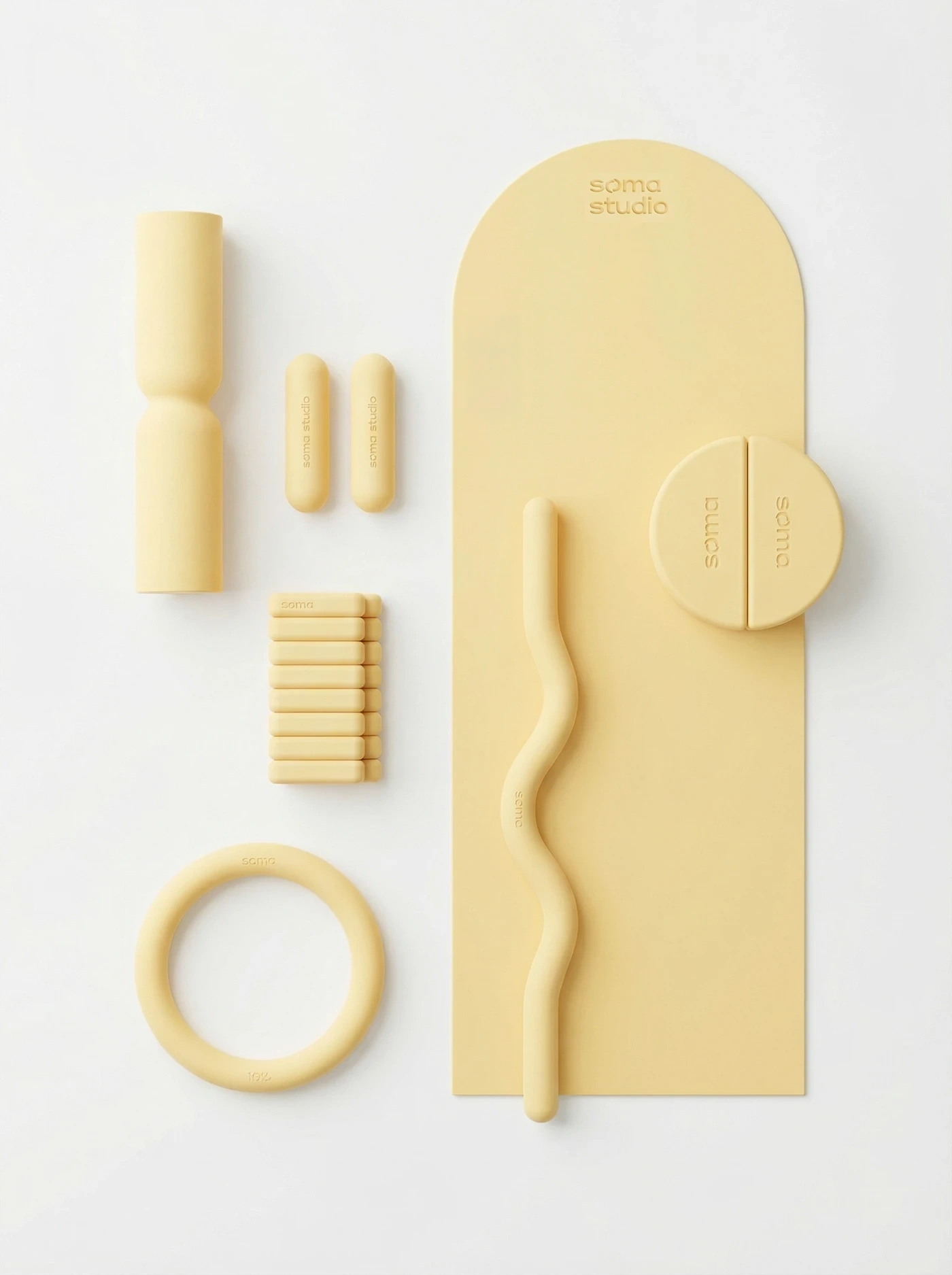
Soma Studio is a Pilates studio built around mindful movement, strength and balance. The name comes from “soma,” the body as experienced from within, and that idea shaped every part of the identity.
The challenge
The wellness space is crowded with brands that look the same: soft beige, thin script fonts and stock photos of stretching. Soma needed an identity that felt calm and premium, but with enough character to stand out and build a loyal community of members.
What we did
Brand strategy: defined Soma’s positioning, personality and tone of voice, focused on [e.g. intentional movement and community over intensity].
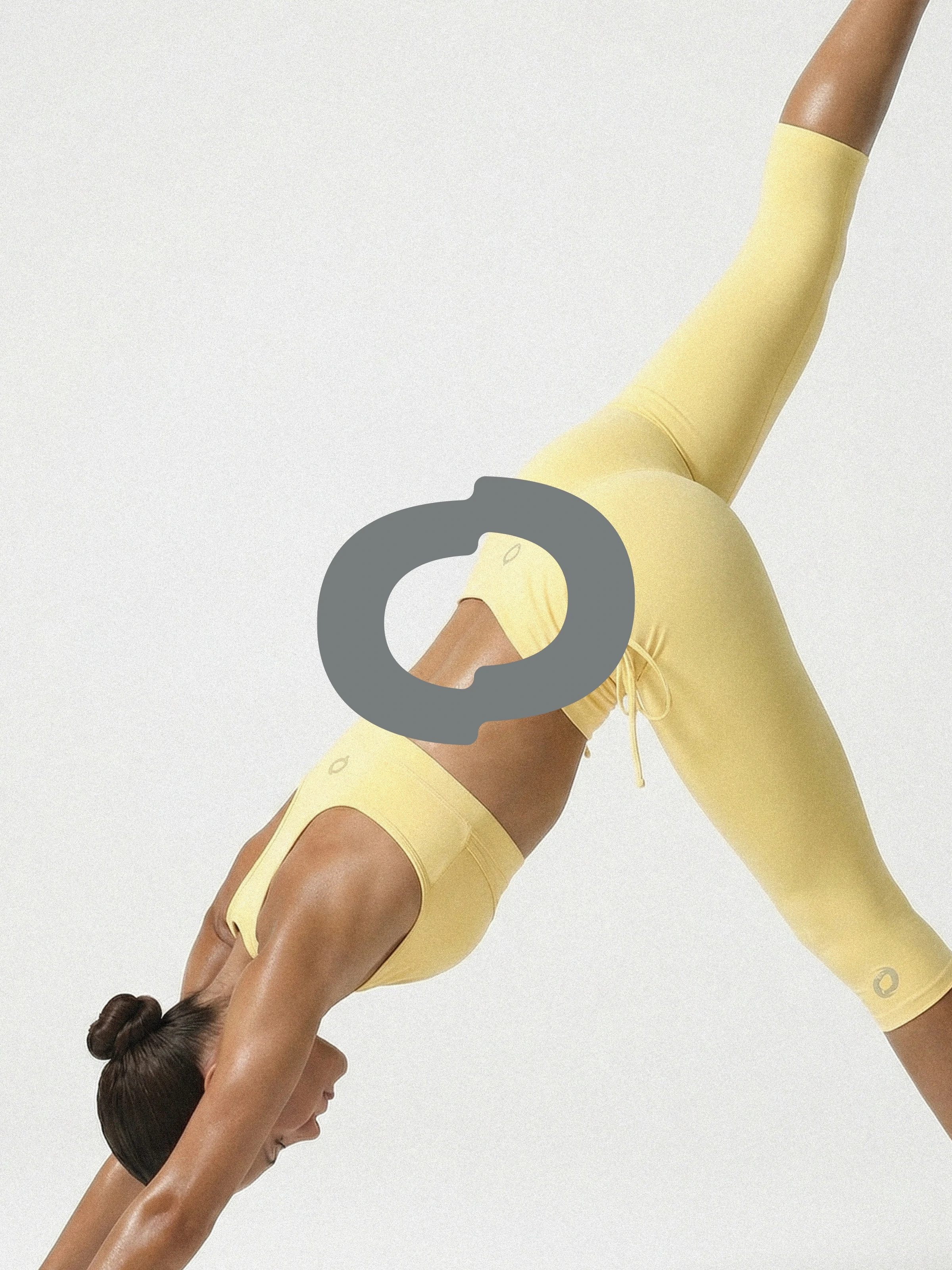
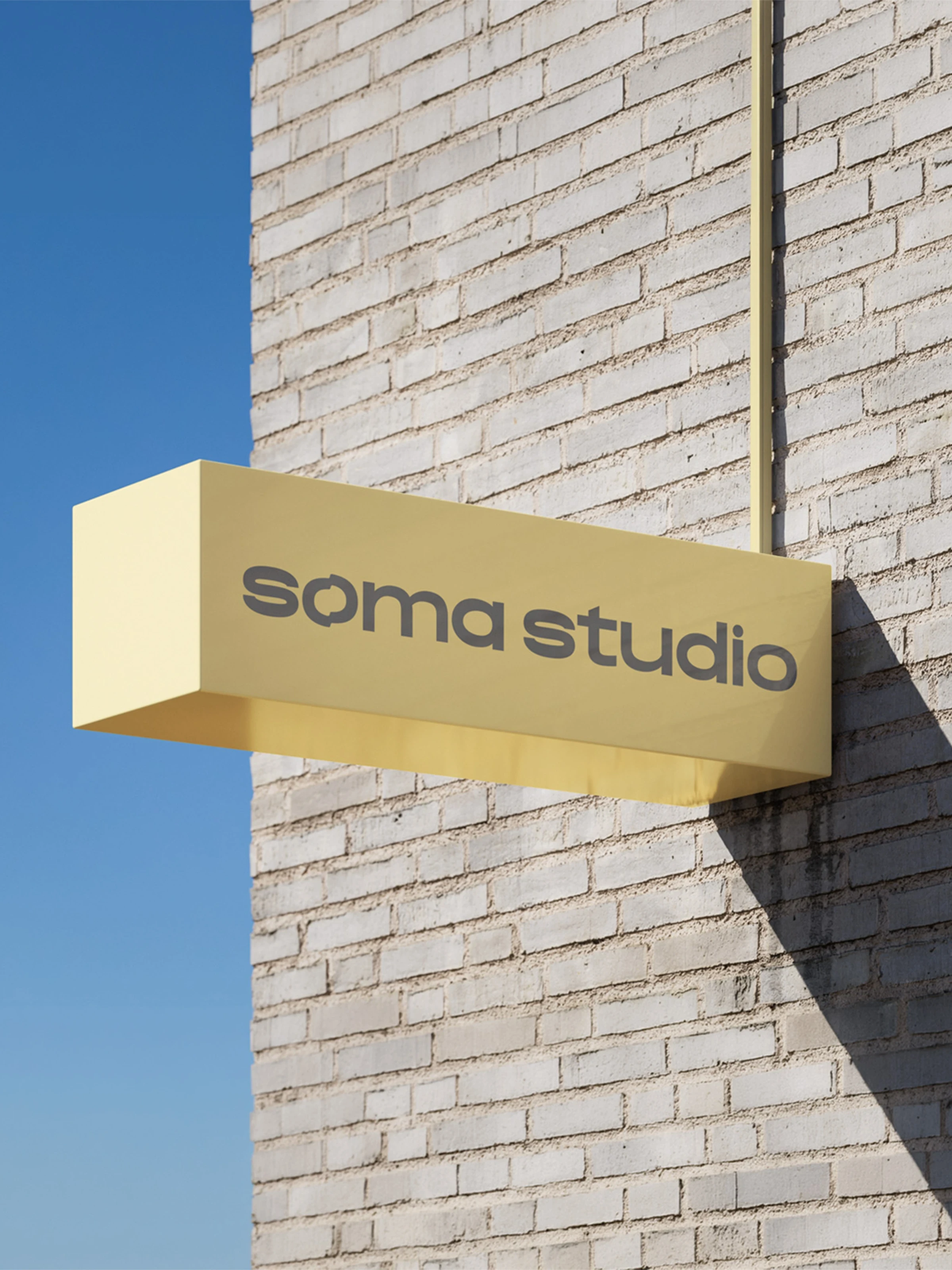
Logo design: created a [describe the mark, e.g. flowing wordmark inspired by the alignment of the spine], with a secondary mark for small spaces like social avatars and stamps.
Color palette: [e.g. warm clay, sand and deep olive] chosen to feel grounded and calming, like the studio itself.
Typography: paired [headline font] with [body font] to balance elegance with clarity.
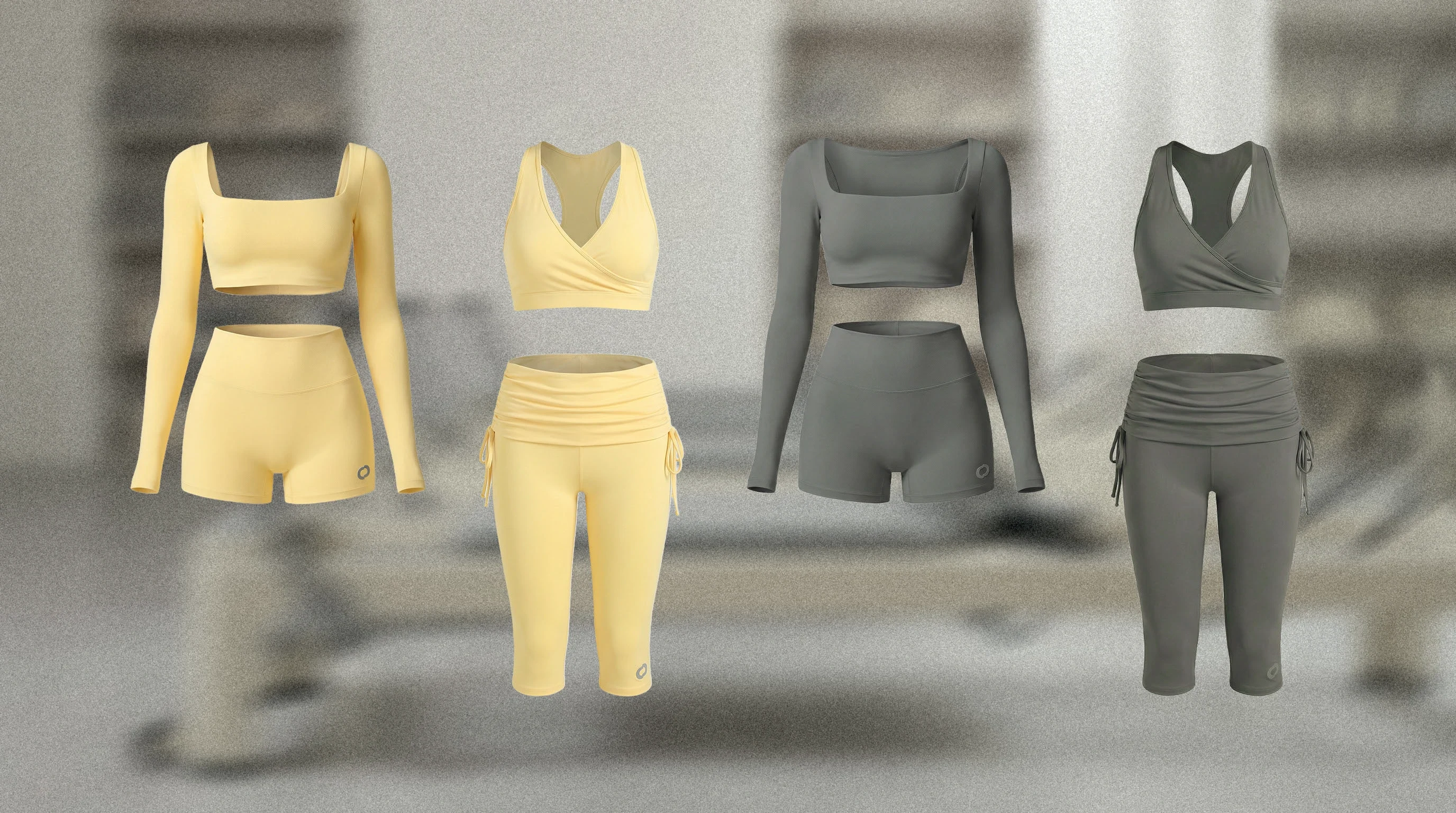
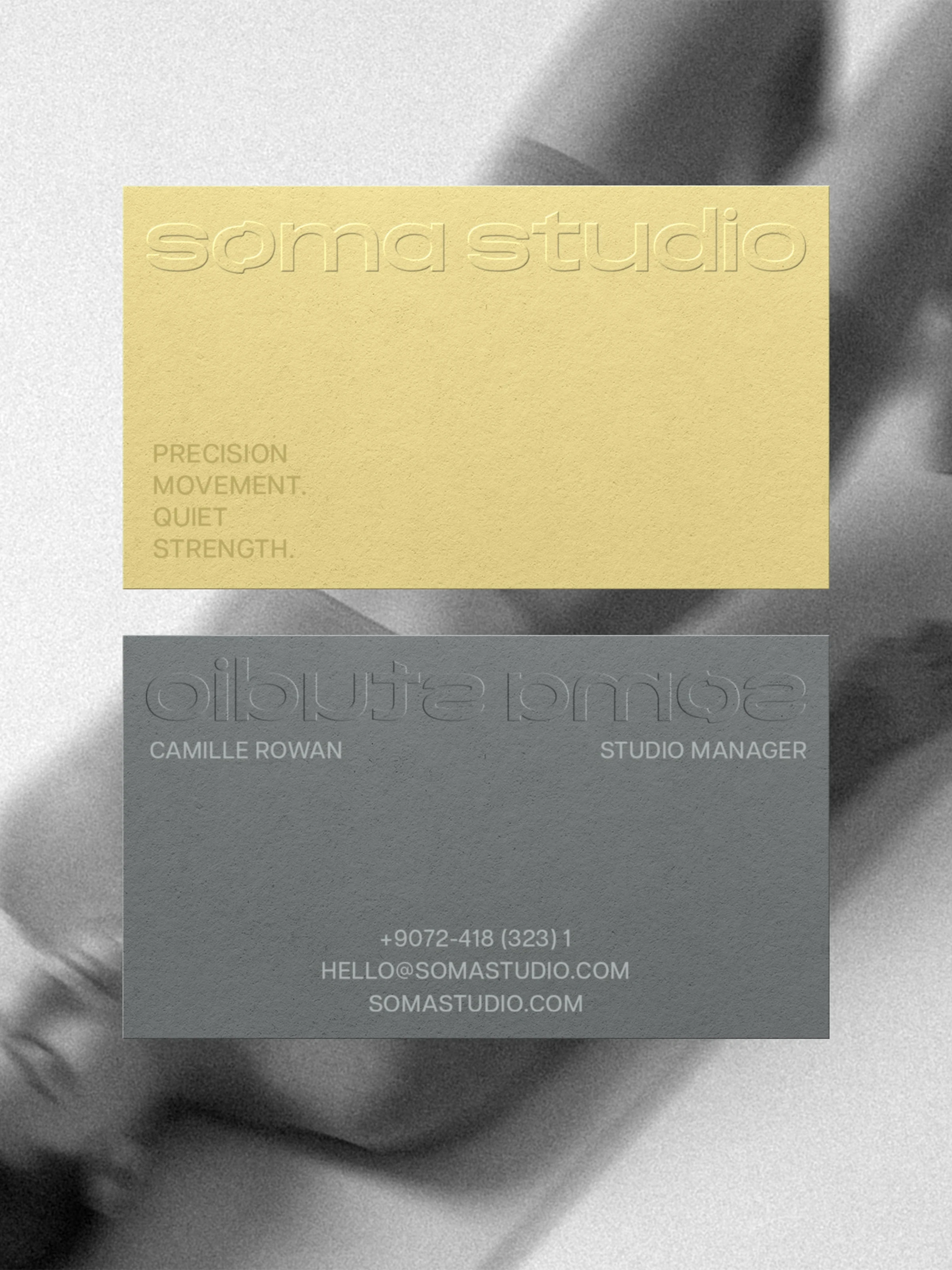
Brand applications: [list what you designed, e.g. signage, class schedules, membership cards, tote bags, water bottles, social media templates].
Brand guidelines: a clear system so the studio team can stay consistent on every touchpoint.
The result
A cohesive, recognizable identity that reflects the calm, focused experience of a Soma class, from the first Instagram post to the moment members walk through the door.
Art direction by Rita, Klay Create’s art director. Strategy and production by Klay Create.
Like this project
Posted Oct 10, 2026
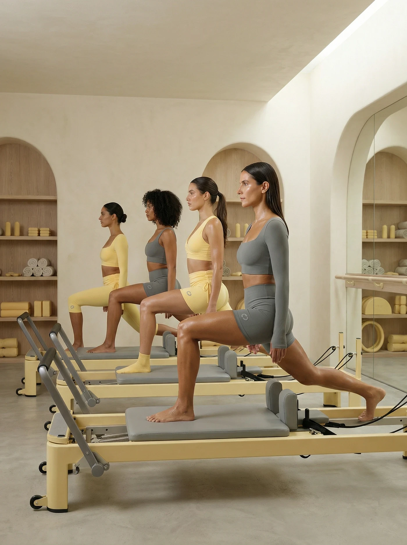
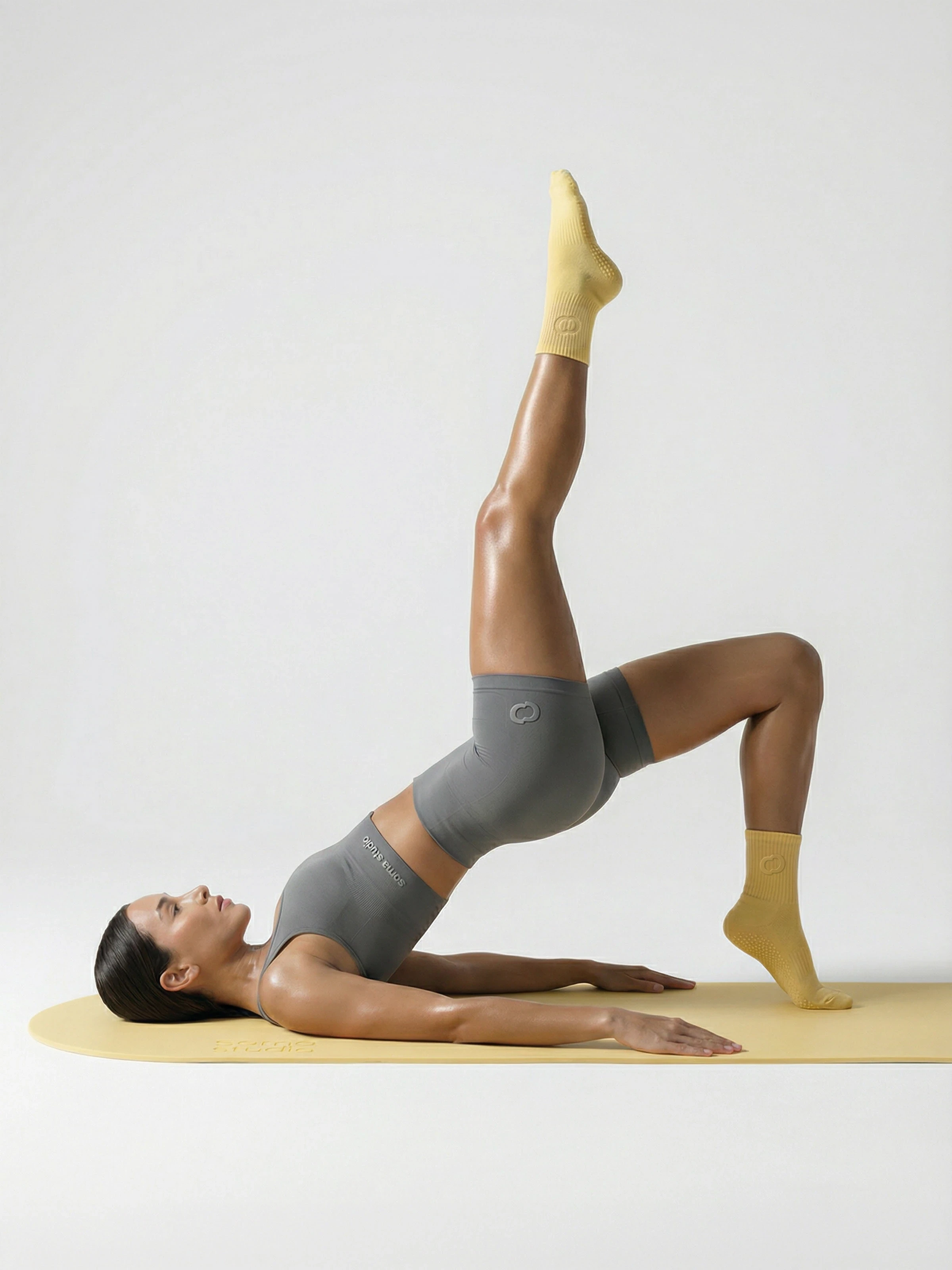
Soma Studio is a Pilates studio where we've designed the logo, visual identity, website design, studio interior, apparel branding, and campaign visuals.
Likes
1
Views
4