Klyrova: Brand Identity and Product Design for an AI Business

Yassine Razzouki


The challenge
Business intelligence tools often overwhelm the people they're meant to help. Dense charts, endless metrics and technical language make it hard to see what's actually happening in a business. Klyrova needed an identity and interface that felt powerful enough for enterprise teams, yet calm and clear enough for anyone to understand at a glance. The brand also had to make AI feel trustworthy and human, not cold or intimidating.
The brand concept
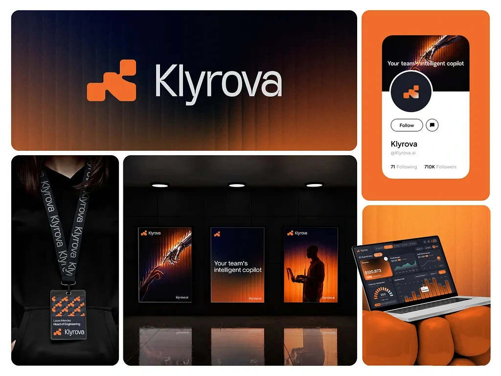
The logo mark is built from stacked, interlocking blocks that step upward, a visual metaphor for scattered data points coming together into structure and growth. Its geometric form suggests precision and building, while the rounded corners keep it approachable. Paired with a clean, modern sans-serif wordmark, the logo feels confident and technical without being rigid.
Visual language
The palette pairs deep black with a vivid, energetic orange. Black represents depth, focus and the complexity of raw data. Orange represents insight, the moment clarity breaks through. Throughout the identity, soft orange gradients glow out of darkness, with subtle vertical line textures that evoke data streams and signals. Together they create a premium, cinematic atmosphere that sets Klyrova apart from the blue-dominated world of enterprise software.
Imagery
The campaign visuals explore the relationship between human intuition and machine intelligence. A robotic hand reaching toward a human one captures the idea of AI as a partner, not a replacement. Silhouettes of people working, lit by warm orange light, place the human at the center of every decision. The tagline, "Your team's intelligent copilot," ties it together.
Product interface
The dashboard is designed around clarity, hierarchy and real-time interpretation. An AI Summary panel sits at the top, explaining performance in plain language before users even look at a chart. Key metrics like revenue, profit margins and customer satisfaction are displayed as bold, scannable figures, supported by trend lines, bar charts and gauges that show change over time. The dark interface keeps attention on the data, while orange highlights guide the eye to what needs action.
Brand applications
The identity extends across the full brand ecosystem: social media profiles, out-of-home poster campaigns, employee badges and lanyards with a custom pattern built from the logo mark, and the product interface itself. Every touchpoint shares the same language of dark depth and glowing orange insight, creating a consistent experience from first impression to daily use.
The result
Klyrova's identity shows how AI can simplify complex decision-making. It positions the platform as precise, confident and modern, while keeping people at the heart of the story. The brand doesn't just look like enterprise software; it feels like a smarter way to understand a business.
Like this project
Posted Oct 8, 2026
Klyrova is an AI-driven business intelligence platform that turns operational and financial data into clear, actionable insights.