Experimental Portfolio Website — Unconventional Layout Design
Ather Waseem
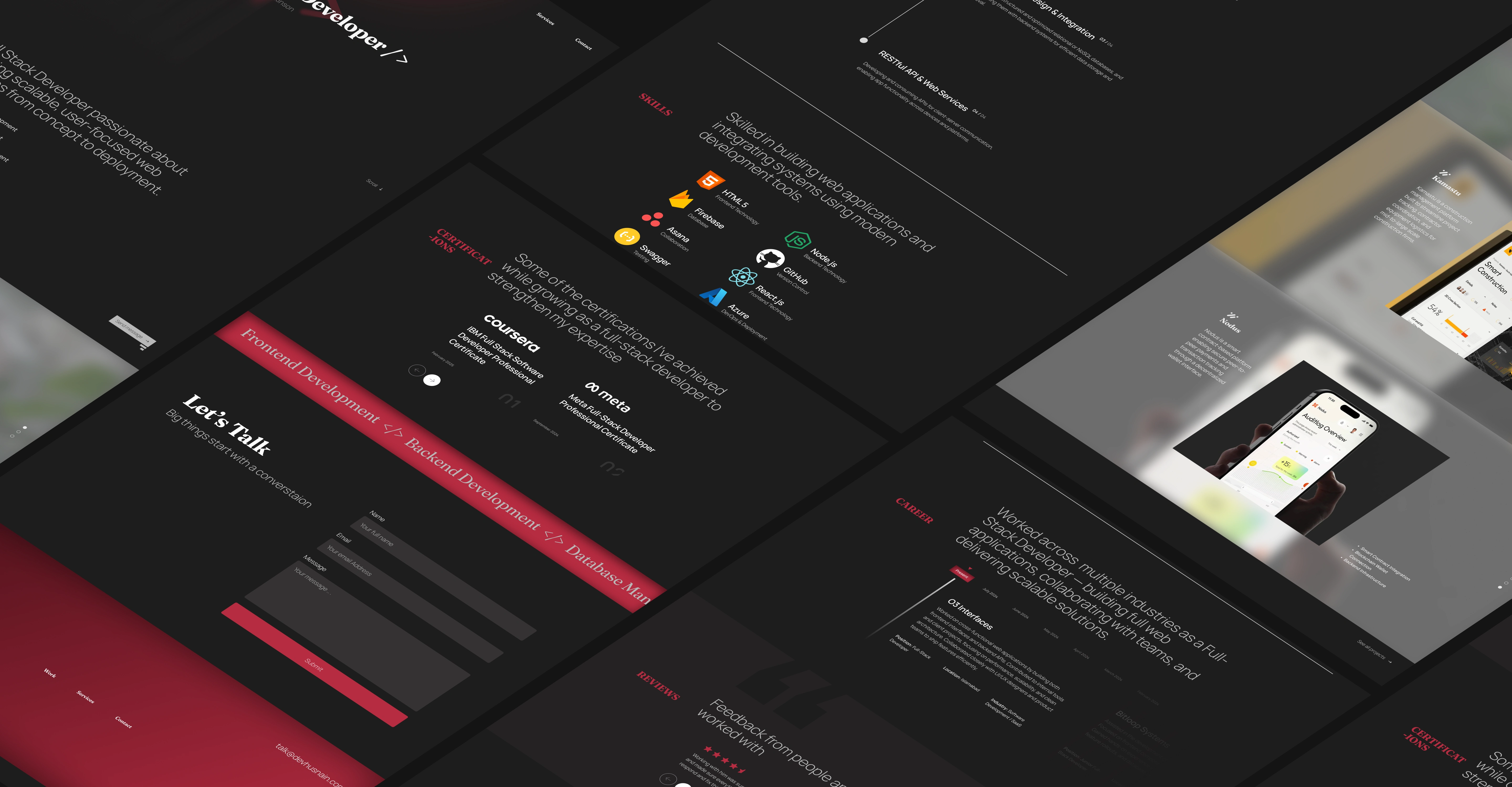
Most portfolio websites follow the same formula — hero, about, work, contact. This one doesn't.
Experimental Portfolio Website — Unconventional Layout Design
The Challenge
Designing a portfolio that feels distinctive without sacrificing usability. The goal was to break conventional grid patterns while keeping navigation intuitive and the work front and center.
What Was Designed
Unconventional layout structure that avoids standard section templates
Custom typography hierarchy built in Figma to guide the eye through the page
Micro-animations prototyped in Jitter to add character without distraction
Design handed off via Zeplin for clean developer implementation
Outcome
A portfolio website with a layout that immediately signals creative confidence — one that a visitor remembers because it looks unlike anything they've seen before.
Like this project
Posted Dec 14, 2025
A portfolio website that breaks standard grid conventions — designed for a creative professional who wanted a layout that stands out and reflects their work's unconventional nature.
Likes
0
Views
1