Typography-Driven Wine Identity for Pura Sonrisa
Alfredo Hinojosa
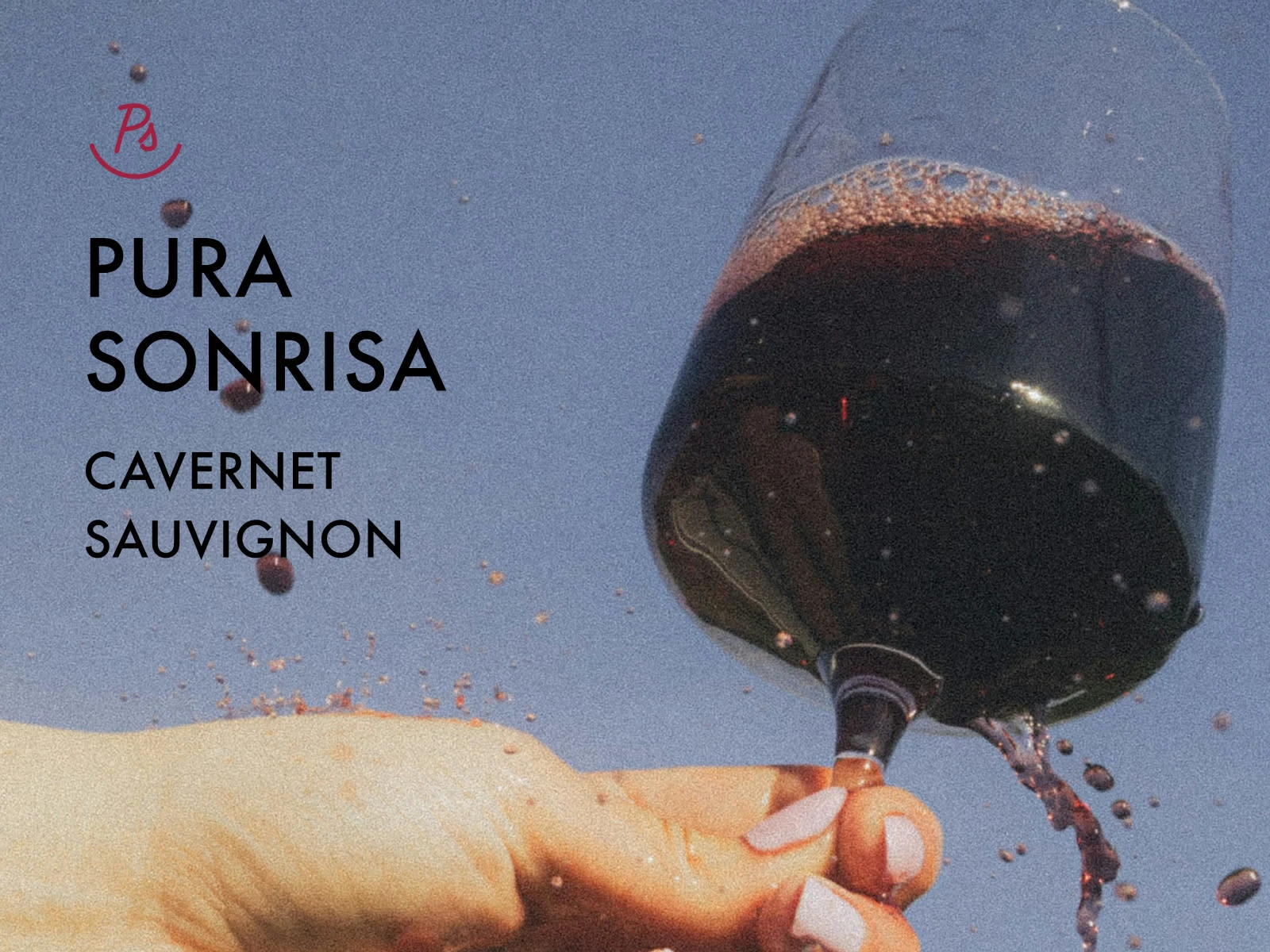
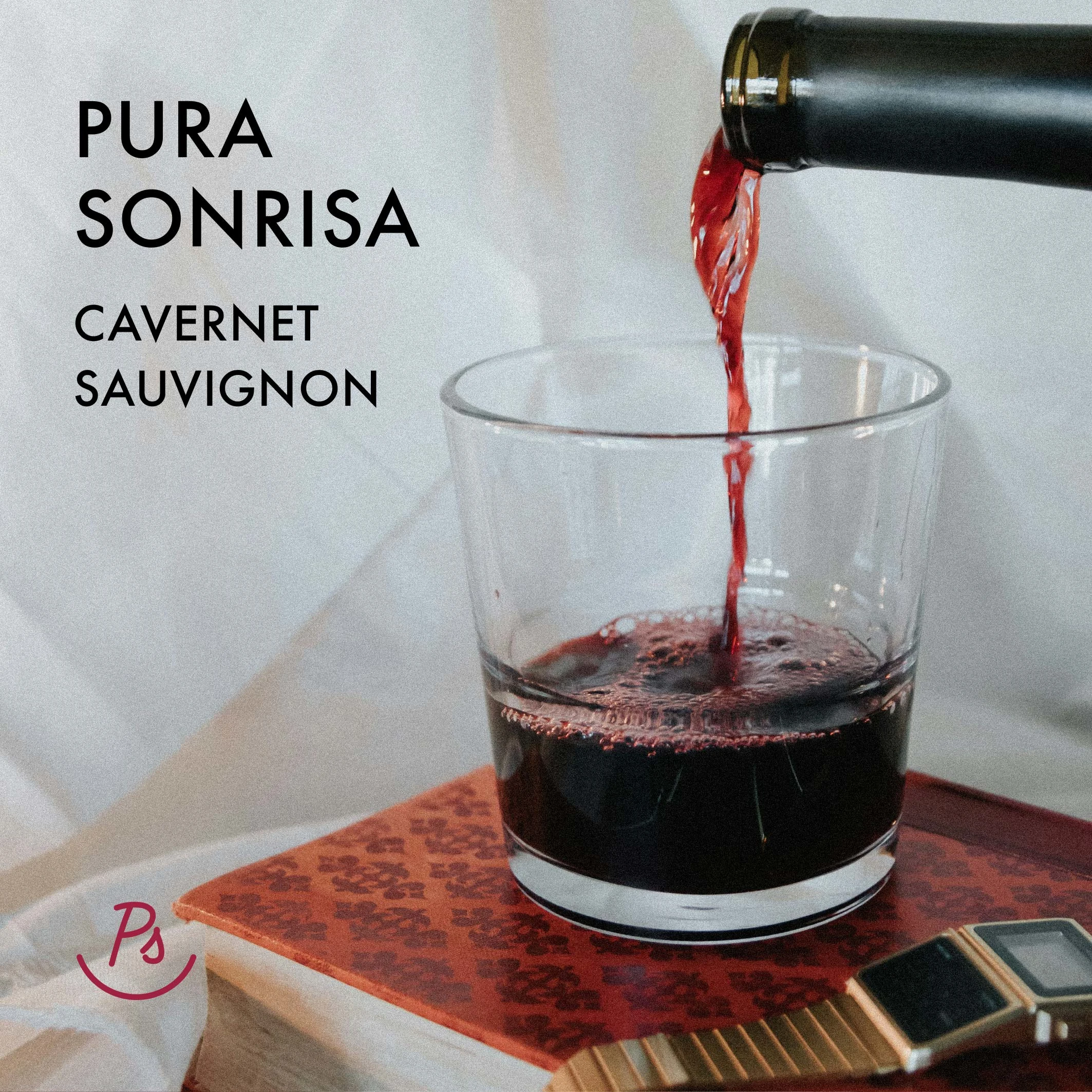
Pura Sonrisa
Pura Sonrisa is a wine project where each batch features a new poem written by the owner.
Logo & symbol
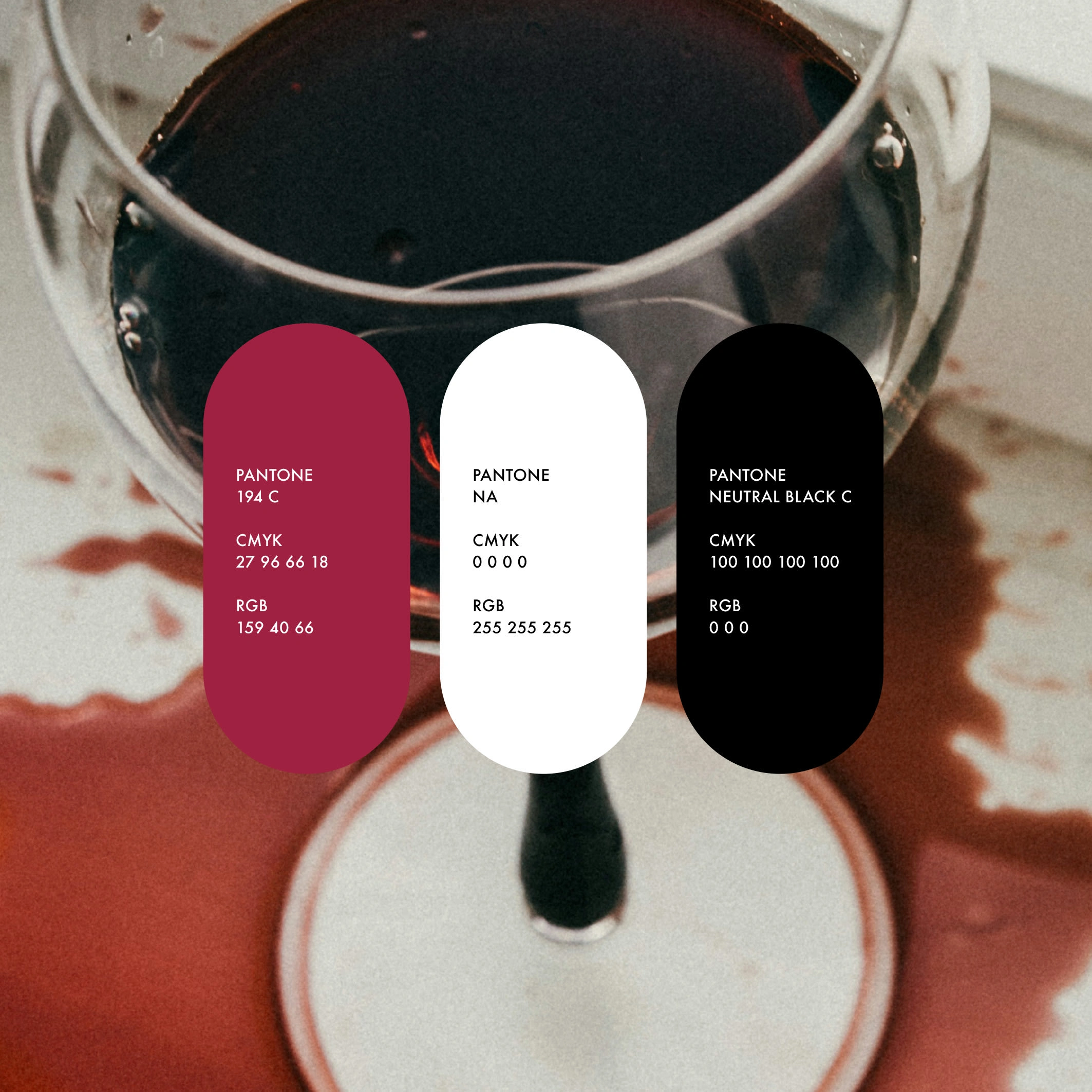
Colors
The client needed to develop a visual identity that simplified the existing complex label, elevated the overall presentation, and moved away from the traditional “aged barrel” wine aesthetic. The solution was a clean, minimal and typographic label, featuring illustrative photography with a harsh flash aesthetic for posters that allows each poem to stand out while maintaining a consistent, approachable design.
The outcome: A distinctive and adaptable label that highlights the owner’s poetry, brings freshness to every batch, and reinforces the wine’s unique personality.
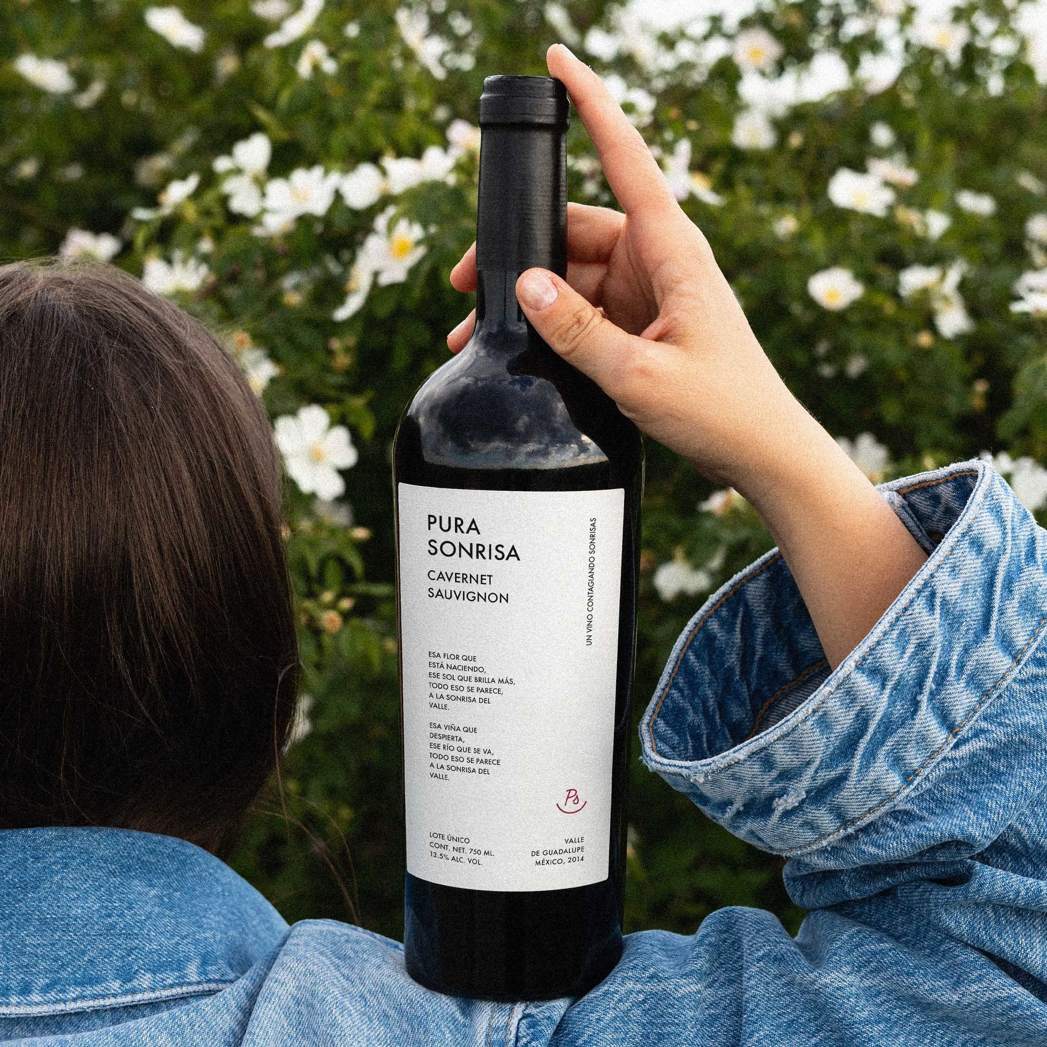
Label
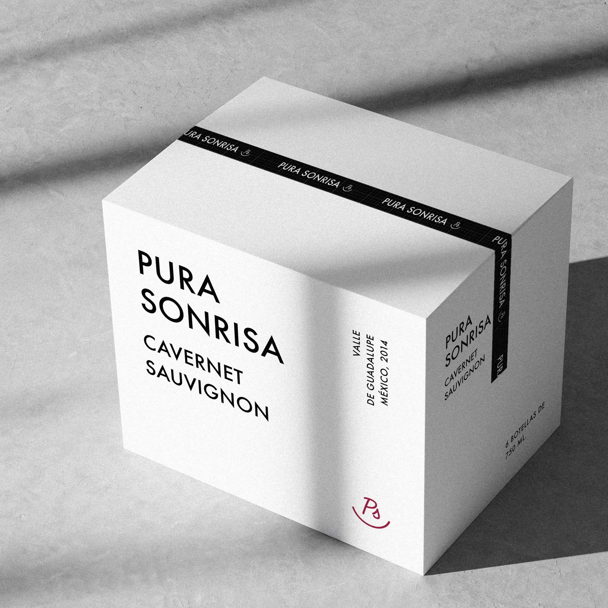
Wine box
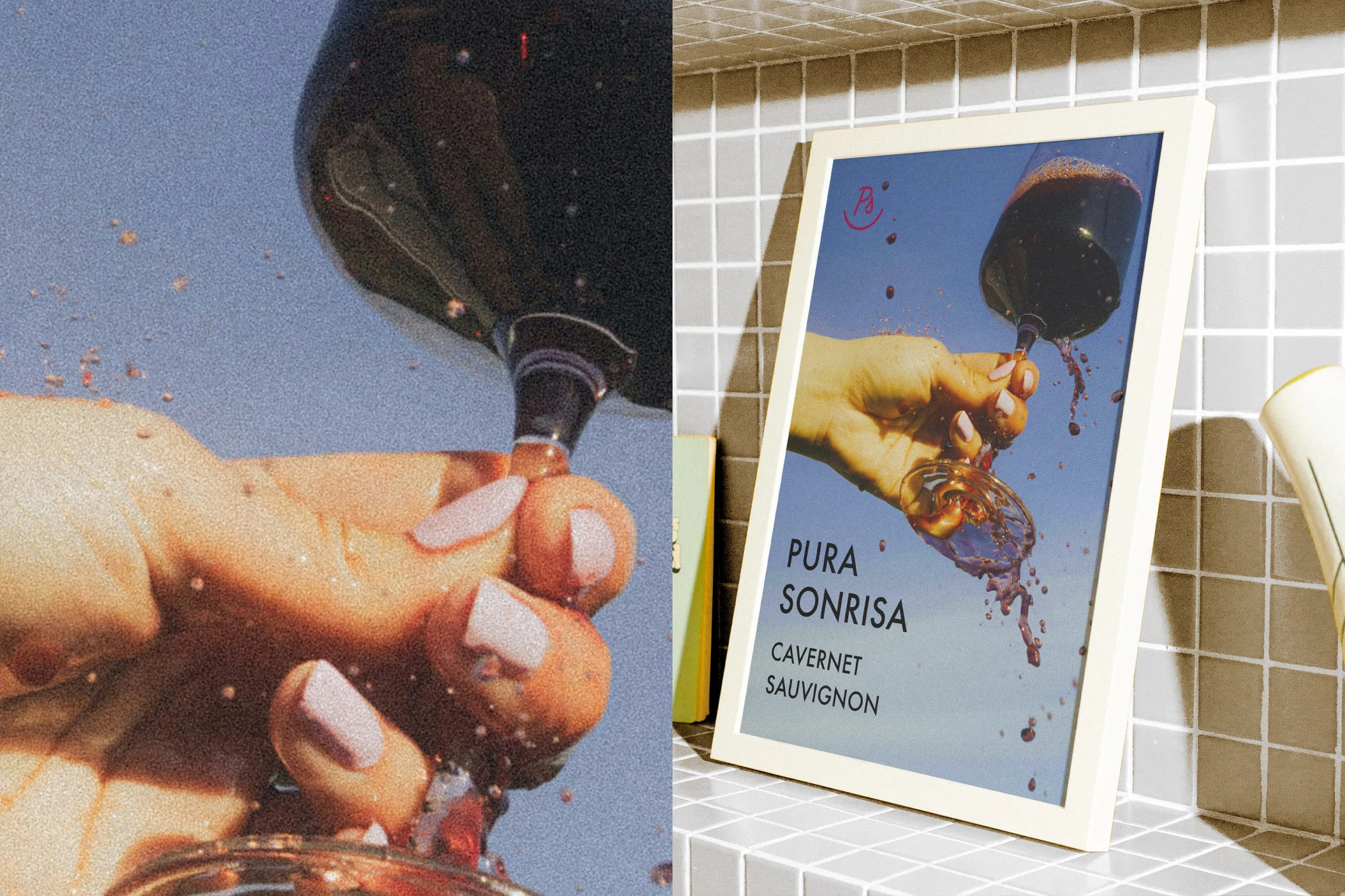
Poster
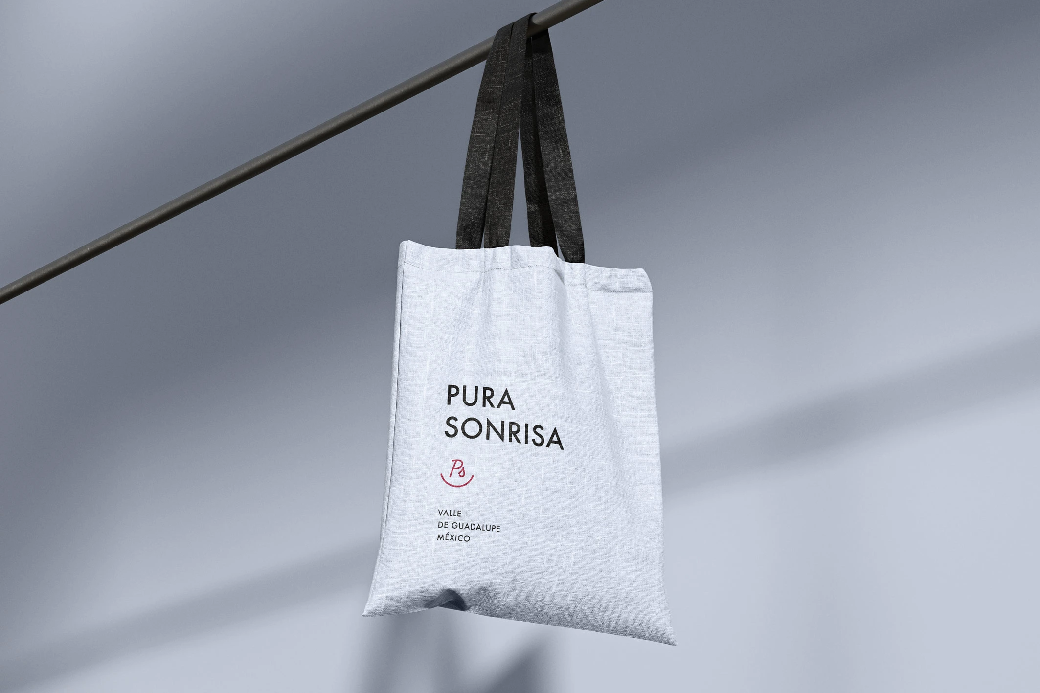
Tote bag
Like this project
Posted Oct 15, 2025
Minimal, poetry-focused branding for Pura Sonrisa, breaking from barrel-aged aesthetics with stark flash photography and clean labels that celebrate each batch.
Likes
0
Views
4