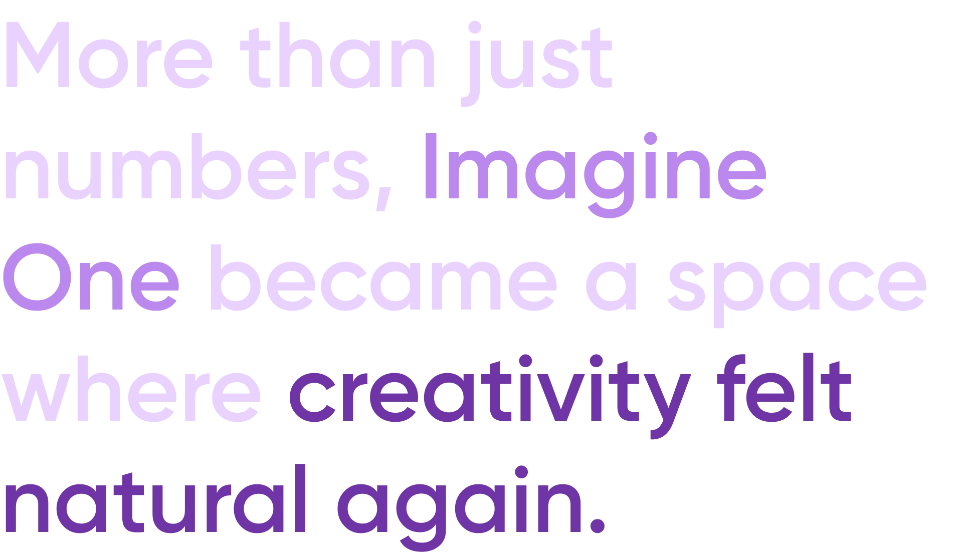
Imagine One: Unifying Creative Studios
Tayyab Abbas
Brief
Imagine One unifies all of ImagineArt’s fragmented AI studios into one seamless, intuitive platform—designed to give creators a clean, spacious, and empowering environment to generate anything they imagine with ease.
Project Overview
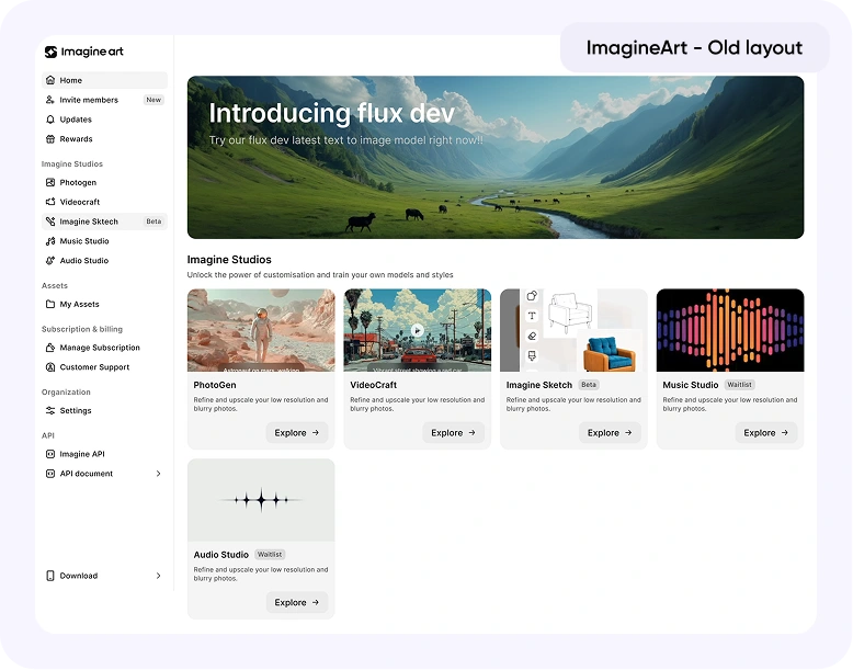
Before Imagine One, ImagineArt was a powerful but fragmented AI content generation platform. It featured multiple studios: Image, Video, Music, and Audio, and solutions that enabled end-to-end content creation like short videos with captions or avatar based clips.
Despite its capabilities, users rarely ventured beyond their primary studio. Each studio had a distinct design language and workflow, fragmenting the user journey and diluting the creative experience.
Task at hand
Create a single, seamless interface that allows users to generate anything, from images to videos to music, in one place, without friction or confusion.
I worked on Imagine One alongside our CTO: Abdullah Rafique, our Product Manager: Saad Ahmed, and as part of the Product Design Team with Khadija Umer and myself.
Together, we set out to unify ImagineArt into one coherent creative ecosystem.

Problem
Creators were losing momentum switching between different studios and interfaces.
Even though the workflow naturally flowed from image to video creation, the disjointed design made this process cumbersome.
Key challenges:
Fragmented user experience
Inconsistent UI and UX
High cognitive load
Intimidating prompt systems
We needed to craft a connected, intuitive, and inspiring creation environment that preserved creative flow while simplifying control.
Process & Design Thinking
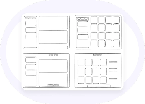
1. Wireframing & Early Experiments
I began with exploratory wireframes, testing layouts that gave users control through a dedicated left panel, much like competitors in the market.
However, user tests quickly revealed its weaknesses:
Occupied too much editor space
Distracted from the creative canvas
Felt cognitively heavy for creators
“Creators want to see their creations, not their settings.”
Even after multiple refinements, the approach failed to feel natural. It was time to rethink the structure entirely. We wanted Imagine One to feel natural in user’s creative flow.
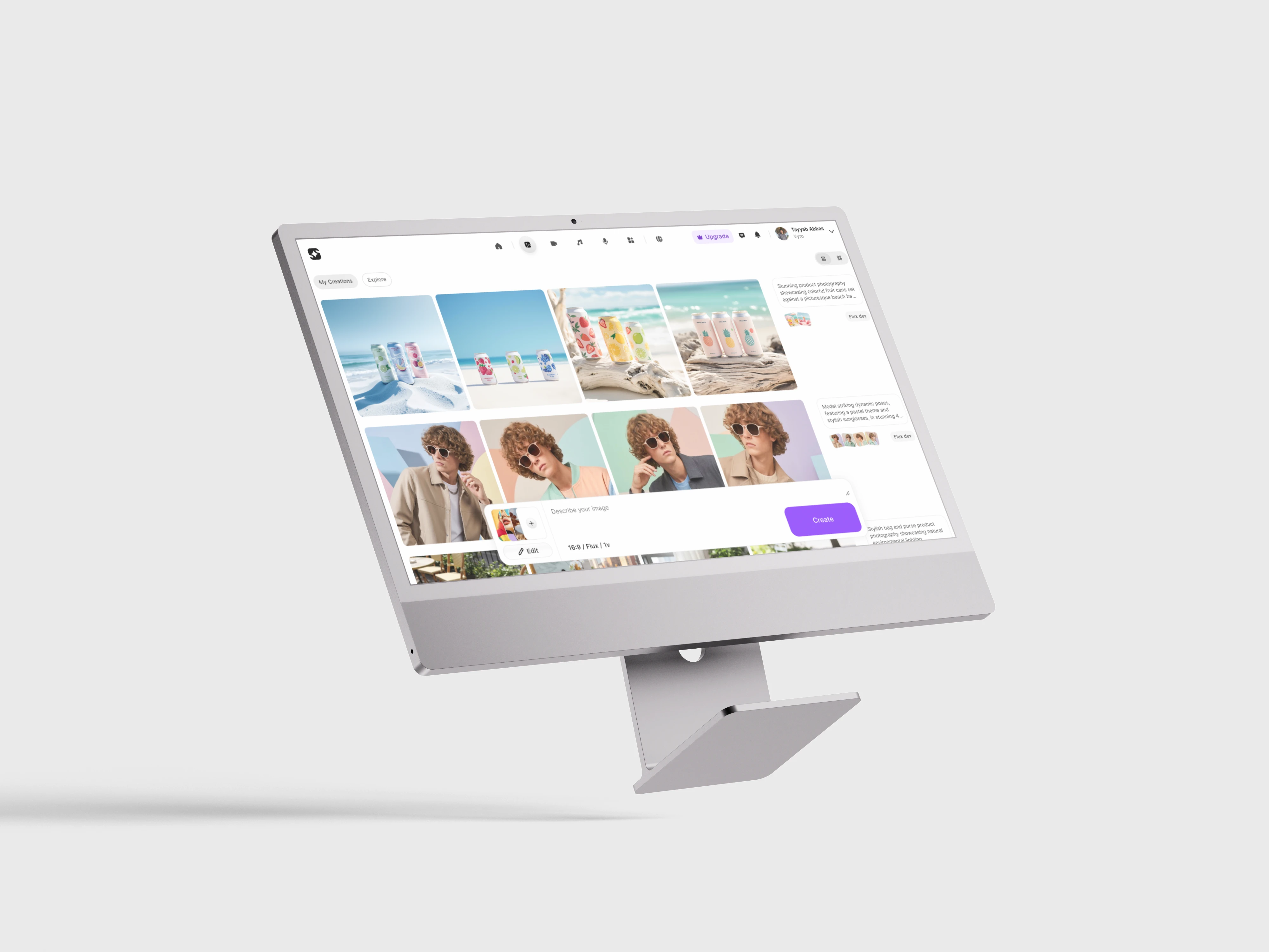
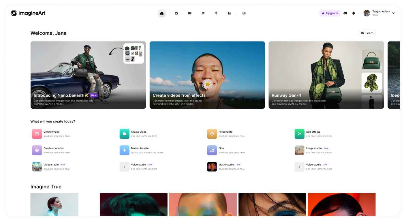
2. The Breakthrough: Editor-First Simplicity
The key realization was that creators spend 95% of their time in the editor.
So, I reimagined the interface around that principle: the editor must feel light, spacious, and immersive.
We removed the left panel and relocated all controls within the prompt box, keeping the focus on the creative canvas.
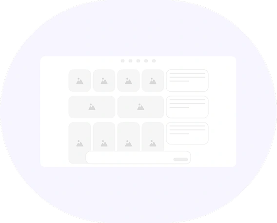
I also introduced grid customization within the editor:
List Grid: organizes generations by prompts.
Masonry Grid: displays only the generated assets for inspiration and review.
This redesign made the workspace feel calm and creative again.
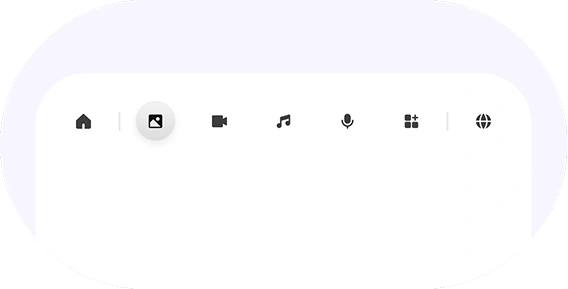
3. Unified Experience Across Studios
All studios were moved under a single top navigation bar, allowing seamless switching between modalities without changing environments.
The editor remained visually and functionally consistent across image, video, and music generation, a key step in reducing friction and helping users explore more naturally.
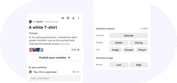
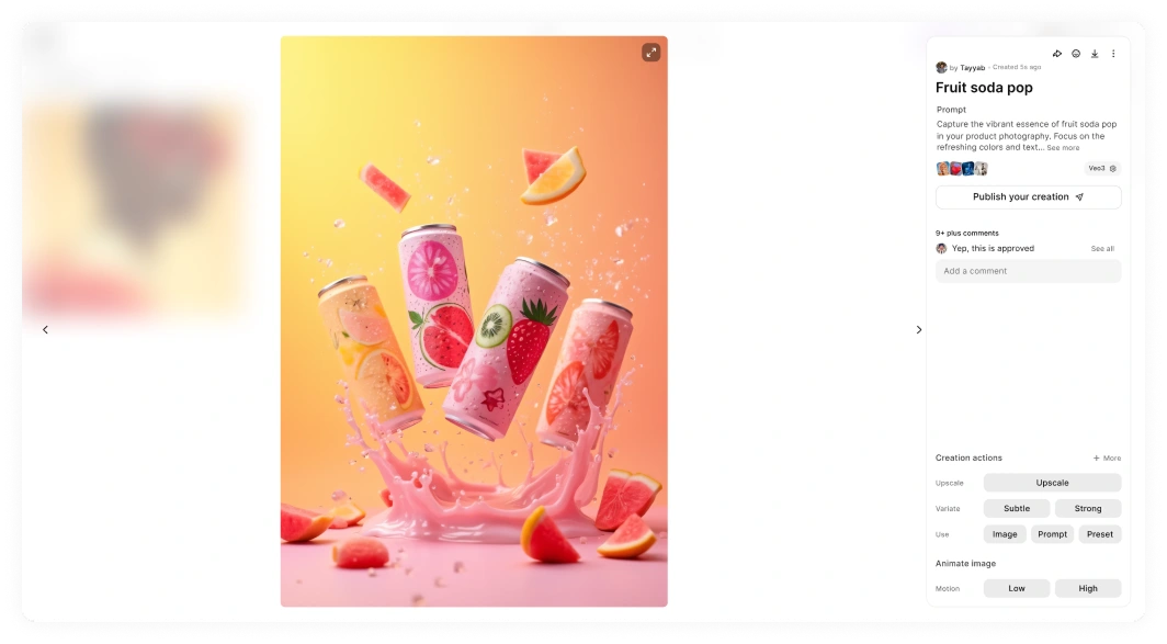
4. Image Full View Experience
The asset full view was designed to be both informative and inspiring.
Users could instantly see:
Who created the asset
Its technical properties
How it can be reused or edited
The result was a minimalist, elegant view that users could appreciate visually, not just functionally.
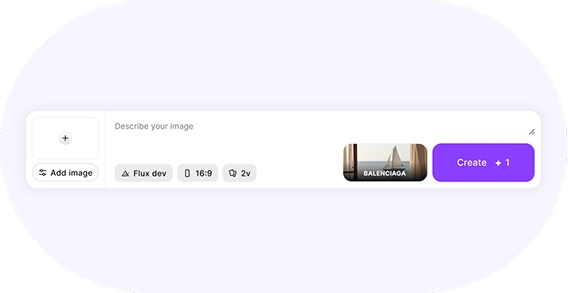
5. Refined Prompt Experience
The prompt box, the heart of creation, went through numerous iterations to strike the perfect balance between power and simplicity.
We refined:
Contextual guidance (tooltips, microcopy)
Responsive resizing for focus
Integrated style controls within the box itself
We weren’t just solving a problem, we were shaping a new creative standard.
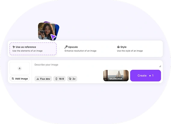
6. Drag-and-Drop Magic
While collaborating closely with our team, we brainstormed a feature that became a user favorite: drag-and-drop actions.
Users could drag images (from local files or within the editor) into the prompt box
A smart action sheet appeared dynamically, allowing them to:
Use the image as a reference
Upscale it
Style from it instantly
It transformed the workflow into something playful, intuitive, and delightfully fast.
A feature so natural that even our own team uses it daily.
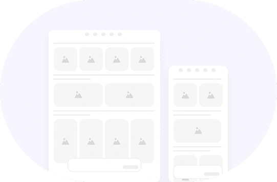
7. Responsive by Design
From the start, Imagine One was crafted to work fluidly across all devices.
Desktop, tablet, and mobile experiences were designed to feel equally complete, ensuring creators could stay productive anywhere.
Design System
After the Mid-fi wireframes were done, it was time we finalized our design system. Hence I derived:
Color Styles
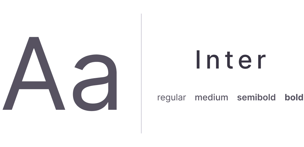
Typography
Iconography
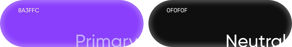
Color Styles
I collaborated with my design lead to choose color for the design system. We chose our main colors after an extensive research and trial and error. This is the resultant color palette and from these we derived different shades of our color styles

Typography
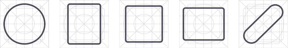
Iconography
These icons were sourced from the Streamline Icons library. After importing them, we aligned each icon to our internal icon grid to ensure visual consistency across the system.
Previously, when creating icons, we followed a simple rule of maintaining at least 3px padding within a 24px frame. However, despite this approach, certain icons still appeared visually uneven due to their varying shapes.
Through further research, we adopted a more structured grid system designed to accommodate different icon geometries. Rectangular icons are aligned to the grid’s rectangular boundaries, while square and circular icons follow their respective shape-specific constraints.
This approach ensured optical balance and consistency across all icon types.
Results
Final Screens
Editor UI
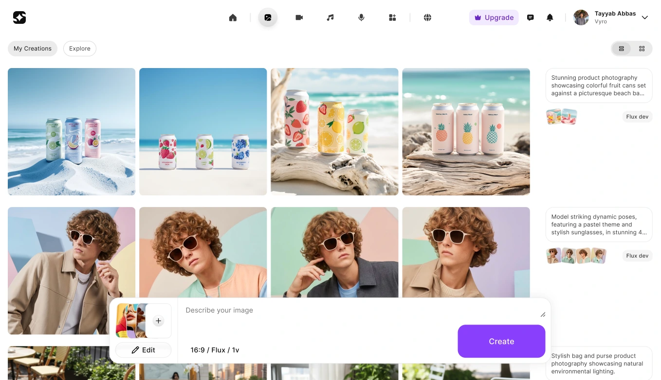
Image Full view
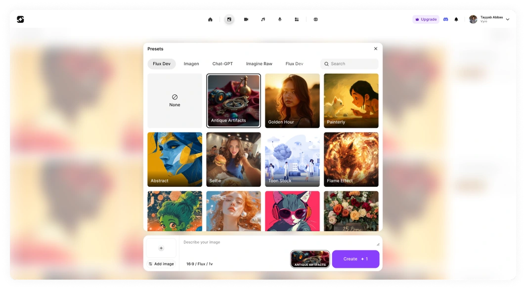
Presets
Home
Feedback
The response to Imagine One was overwhelmingly positive.
Users immediately felt the difference. Bringing all studios into a single, unified environment removed friction and simplified the most common creative workflow:
Text → Image → Video
What was once fragmented became seamless.
Users could move forward and backward between steps without context switching, without re-learning interfaces, and without losing momentum.
The experience finally matched the way creators actually think and work.
For me, the biggest success wasn’t just metrics, it was behavior change. Imagine One became our default in-house AI image generation platform.
Team members who were previously loyal to other tools, tools they were comfortable and efficient with, switched to Imagine One organically. That shift validated everything. Because ultimately:
“If we don’t use the product we’re building,
why would we expect others to?”
Internal adoption wasn’t forced. It happened because the product felt better. Cleaner. Faster. More intuitive. And that was the moment we knew we had built something meaningful.
My Learning
1. Speed is Everything
In the AI industry, features evolve overnight.
We learned to move fast, ship lean, and iterate quickly, without compromising user experience or skipping research.
2. Always Prioritize the User
Sometimes the right decision means changing direction late in the process. If something risks confusing or tiring the user, it’s worth rethinking.
3. Subtraction is the Real Innovation
AI gives users incredible control, but too much control can overwhelm. Design excellence lies in removing the unnecessary, leaving only what enhances creativity.
Imagine One wasn’t just about merging studios. It was about merging experiences, turning complexity into simplicity, power into elegance.
For me, it reaffirmed one truth about product design:
Great design doesn’t just make tools easier to use, it makes users feel more capable, creative, and confident.
Like this project
Posted Apr 5, 2026
Unified ImagineArt studios into Imagine One, a seamless and intuitive content generation platform.