Lens + Dema: design systems coding agents can follow

Rob Gungor


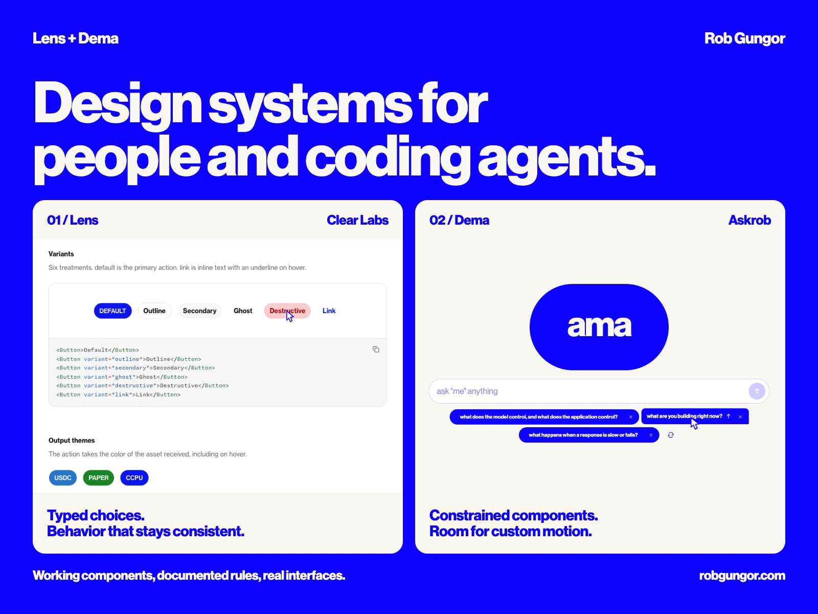
At Clear Labs, coding agents were adding UI faster than I could keep its styling consistent. A new screen could introduce a font outside the scale, a one-off width or a color that failed in the other theme. Written guidance left too many choices open. I needed the shared design decisions to live in the components people were actually using.
I designed and built Lens for Clear Labs and applied the same approach to Dema, the system behind my Askrob site. My work covers typed design tokens and reusable React components, a live reference, and authoring rules backed by checks. Lens serves Clear Labs' products. Dema keeps Askrob's blue and cream identity. For a SaaS team, this approach can turn a recurring UI fix into a shared component that the next feature reuses.
Turn a design decision into a named choice
Lens separates raw values from semantic tokens. Box and Text accept named choices for spacing, color and typography. A background has a role in the interface, with its value defined in the system.
A change can then happen in the shared definition rather than in every screen that happens to use the same color. Light and dark values live together in Lens color tokens, so a component selects its role once.
Dema uses the same principle with its own names and scale:
This produces a real section and heading. Changing that padding to
"13px" fails type checking. The API makes the available choices explicit.Give the coding agent an authoring contract
Lens includes instructions for imports, token use, semantic markup, component states and migration. Adding a component also means adding its reference page, props entry and tests. The work arrives with the information the next author needs.
Custom lint rules catch bypasses such as raw colors and arbitrary styling on Box and Text. Dema's shared components also reject arbitrary className and style props, with negative type tests for unsupported choices. A missing option becomes a component decision that I can review.
Keep the reference connected to the implementation
Lens renders working examples and extracts prop tables from actual types. Dema renders the components Askrob imports, with copyable examples and source links. Both let someone inspect a control before using it.
The reference includes behavior. Lens button variants expose hover states and output themes. Its BayerBackground lets a pointer paint a trail that fades. Askrob's question buttons share Dema's tokens, while their custom interaction stays with the chat feature.
Check what the browser actually paints
During Dema's migration, background and border shorthands lost their paint during compilation. Layout dimensions still passed. I added checks for those shorthand forms and browser checks for rendered color as well as geometry.
The same distinction matters in visual review. An editorial pill can pass a collision check and still feel cramped. Its line break, leading and padding need separate decisions. Dema's current rule starts editorial leading at 0.94 and requires checking the visible letterforms at full size and as a thumbnail.
Make migration possible inside a working product
Lens moves existing UI across as the relevant files are touched. Temporary bridges support the earlier Tailwind product code, including Clear's swap interface. Feature-specific behavior can stay local while shared decisions move into the system.
The delivered work is a component library, a live reference, authoring guidance and checks for actual failure modes. It builds on my earlier client work at Brainbase, where I refined the Figma-to-component workflow and led the frontend team building a shared library. Lens and Dema show the code and agent-guidance side of that work directly.
If your team keeps rebuilding the same controls or correcting inconsistent UI, I can take that work from shared design decisions into components used by the product. The first scope can focus on the screens you already need to ship. Ask what I would keep, repair, or replace in your system.
Like this project
Posted Oct 1, 2026
Typed React components, live references and authoring rules that make UI decisions reusable across a working product.