Building a Design System For a Creative Marketplace
Dhika Design
Background
I joined https://www.rrgraphdesign.com/ in 2020 as their first dedicated product design hire. I observed their design teams were working off their version of a style guide and component library. With no shared language to create a cohesive user experience, all products were built by relying on design sense. This leads to:
Discrepancies between design mockups and the final products.
Inconsistencies between current designs and legacy designs or between projects.
Increased design and development effort due to re-creating components and patterns from scratch.
"How do we build a consistent design language on our platform?"
PROCESS
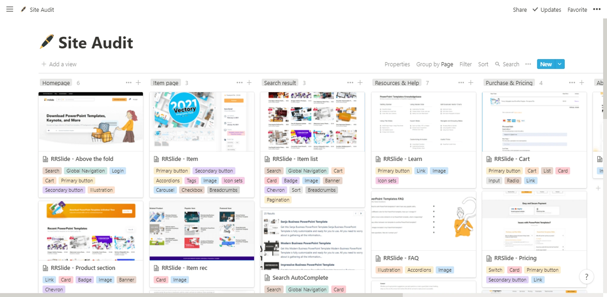
1. Audit
We created a Notion's board to audit existing processes, features, and UI components across all our products.
2. Research
We conducted market research and asked ourselves,
"What were other companies doing with their design systems that we can learn from?"
We looked at Adobe Spectrum, Ant Design, Intuit Quickbooks, and Mailchimp design systems. We wanted to take the best practices from those great design systems and see how they organized and displayed their content.
3. Define
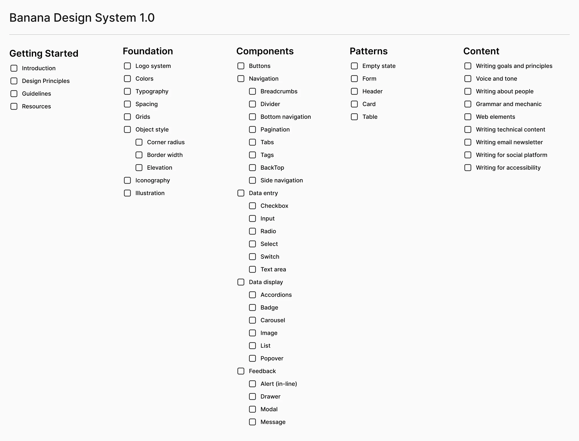
We created a checklist to define what we need based on our prior research and site audit.
4. Design
In Figma, we started creating a style guide and UI elements. To maximize workflow, we created a component and organized them based on our design system structure.
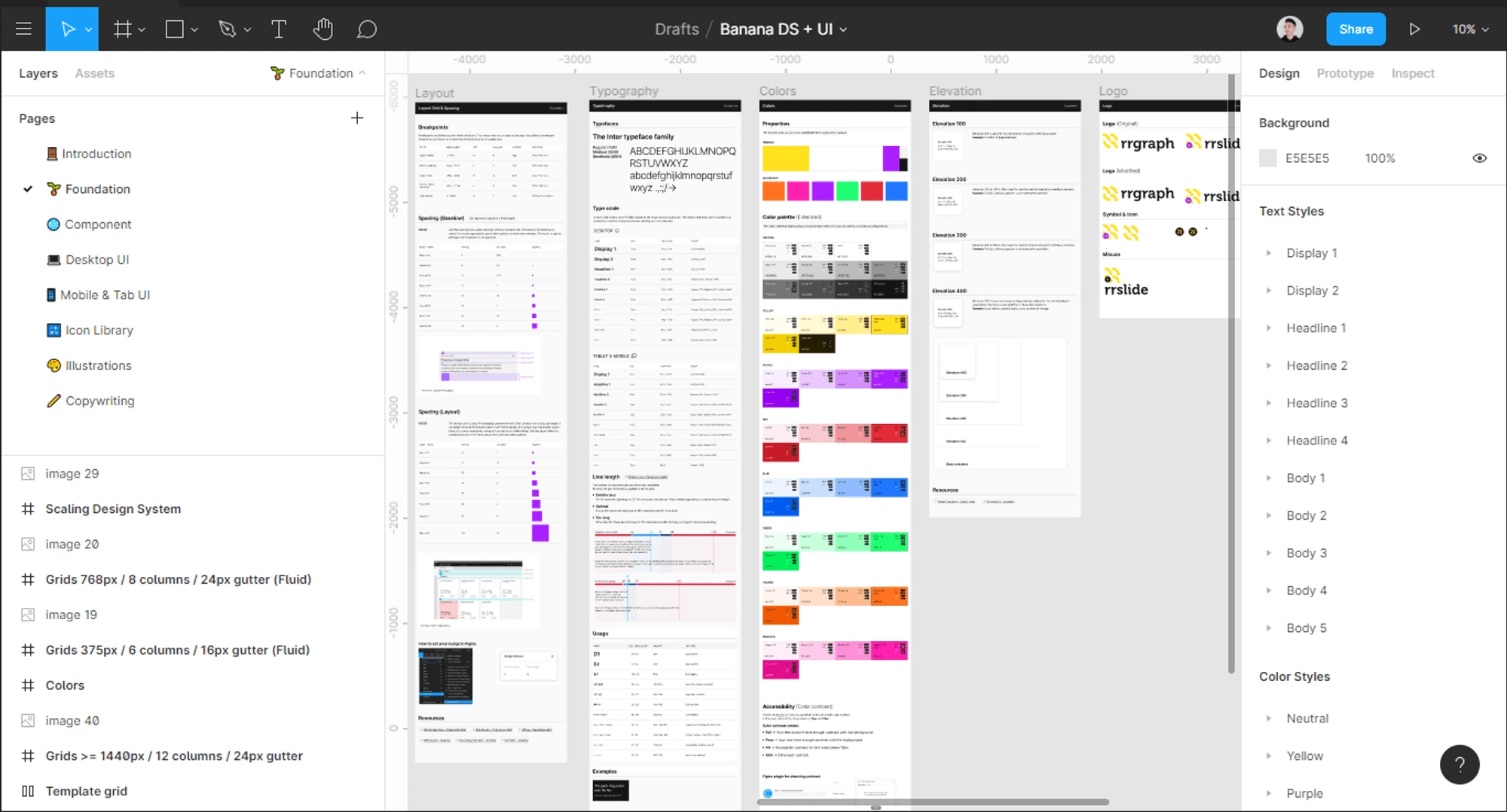
Foundation library on Figma
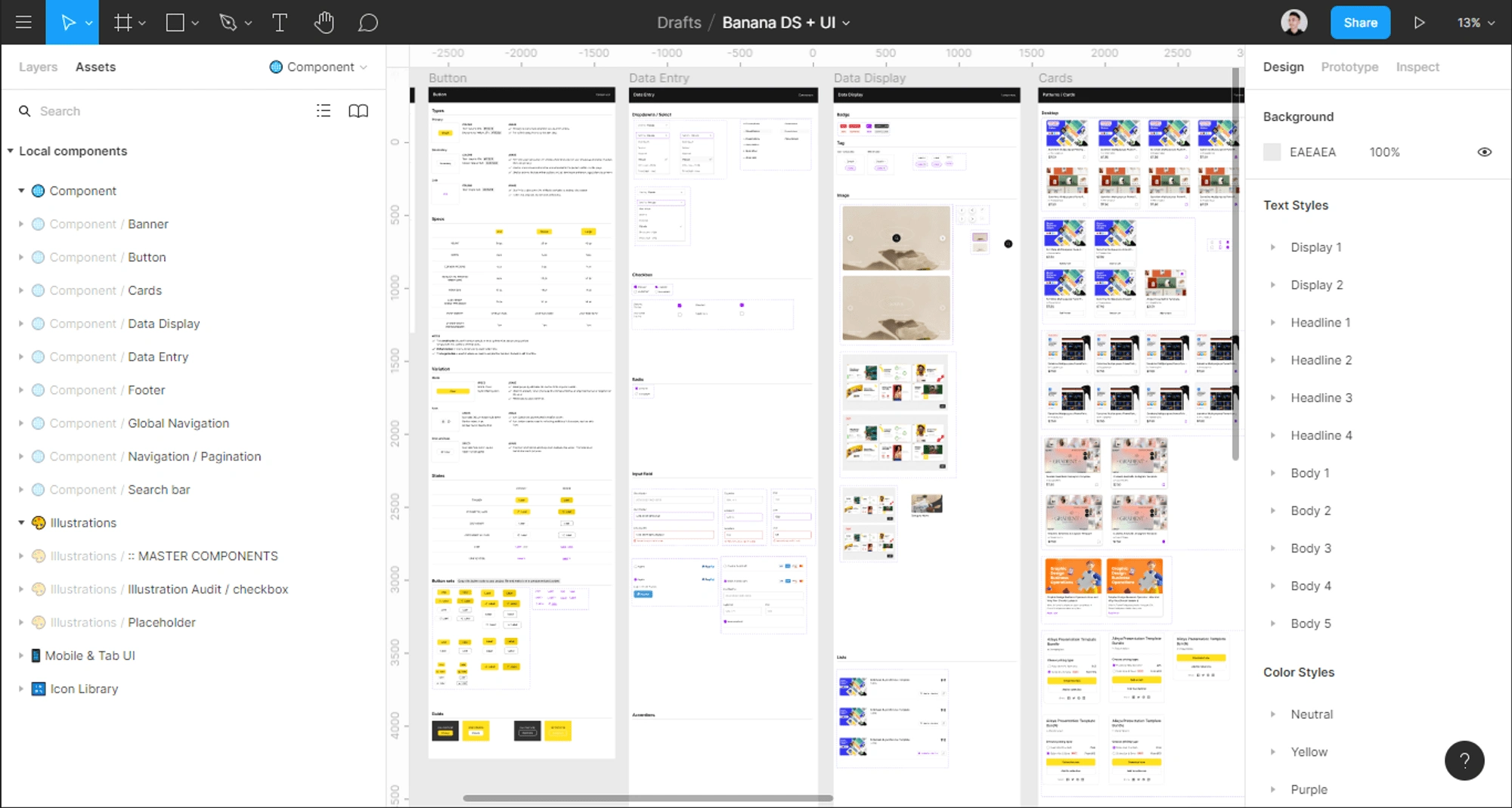
Component library on Figma
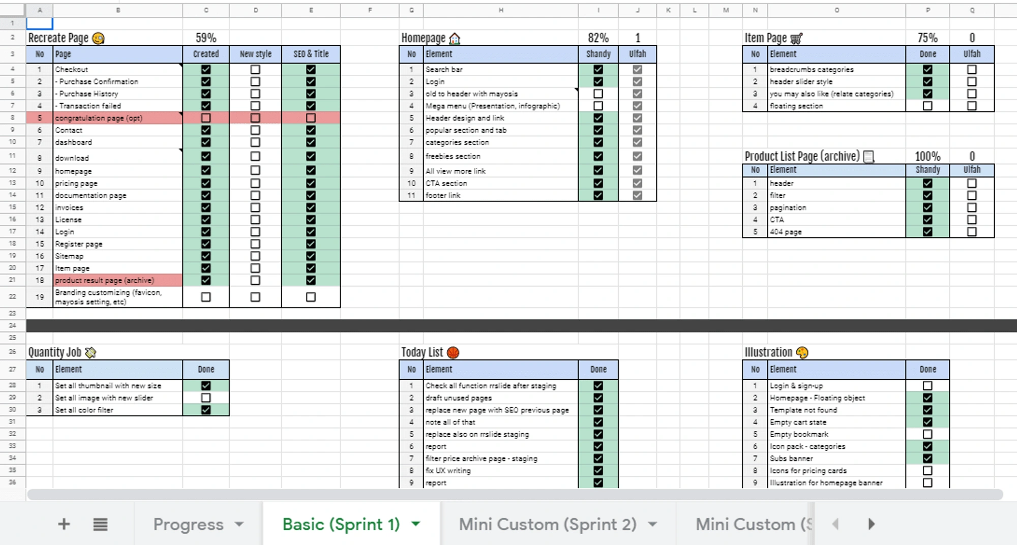
5. Plan and Implement
We made a weekly timeline based on what needed to be done and by who. This helps to keep stakeholders and everyone involved in the design system updated on progress, as well as facilitate resource allocation.
6. Document
Making the design system accessible is important so anyone can see and contribute. We hosted our design system on Frontify.com.
OUTPUT
Design System Thinking
The banana design system focuses on foundations and components, so as to allow more room for creativity in what designers do with the system, in marketing websites and products. Consistent patterns are of course important, but we kept them to a minimum and designed them to allow for flexibility.
Foundation 🌱
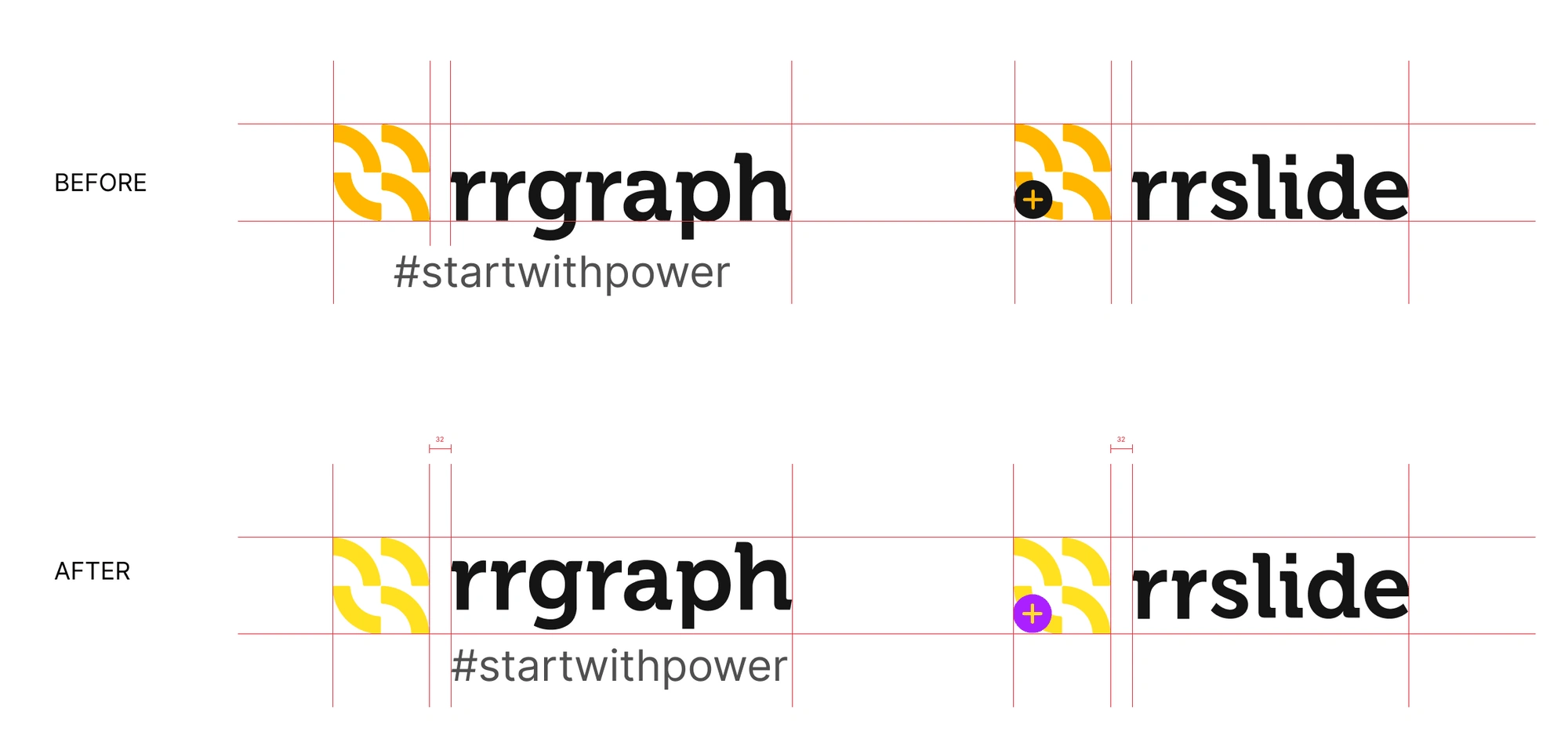
Logo
Versatility and alignment is our goal for this logo update. In addition, we changed the brand's color to be more yellowish as we wanted to show the brand's personality.
Colors
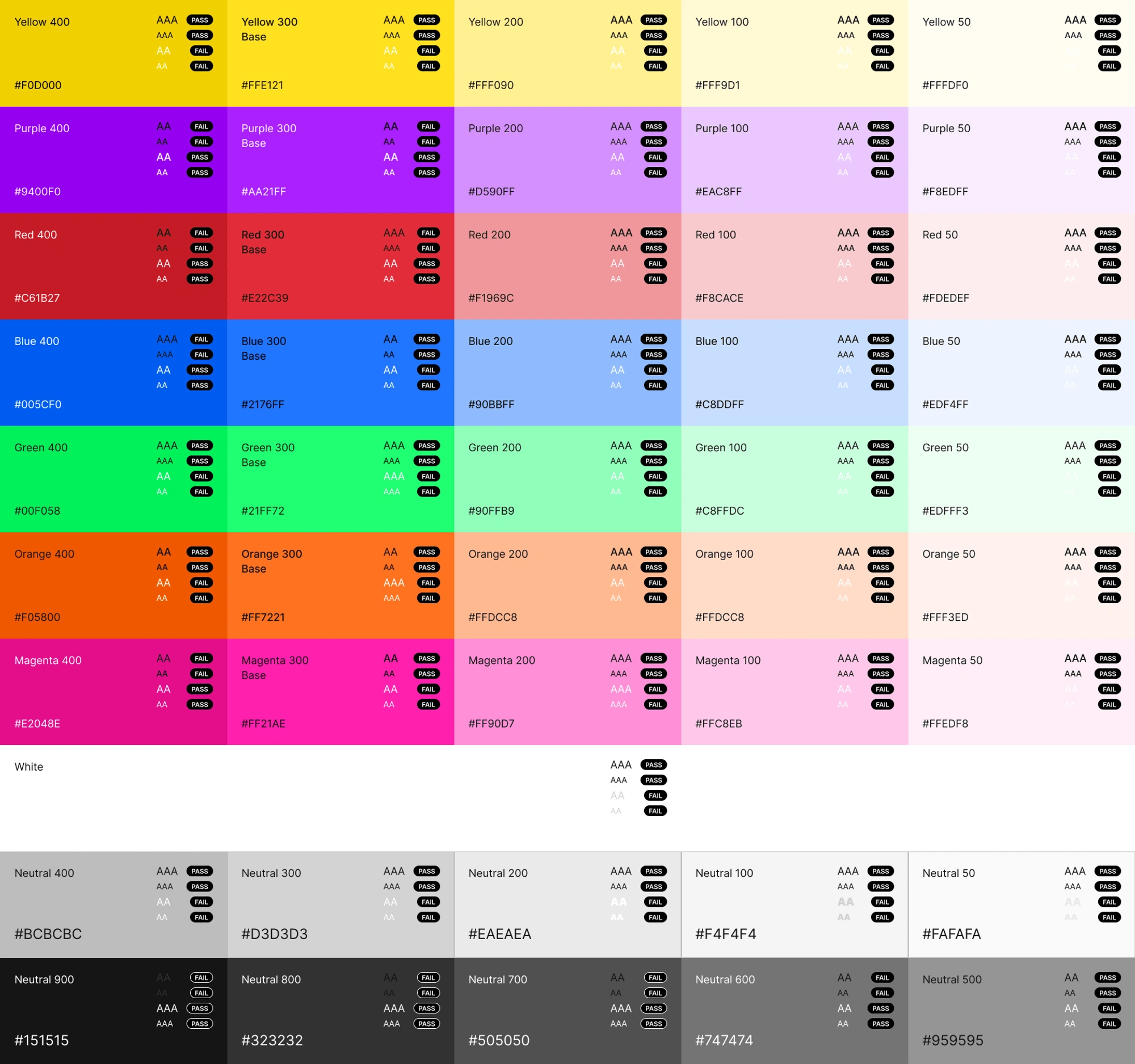
A new primary color palette has been created based on our new yellow color.
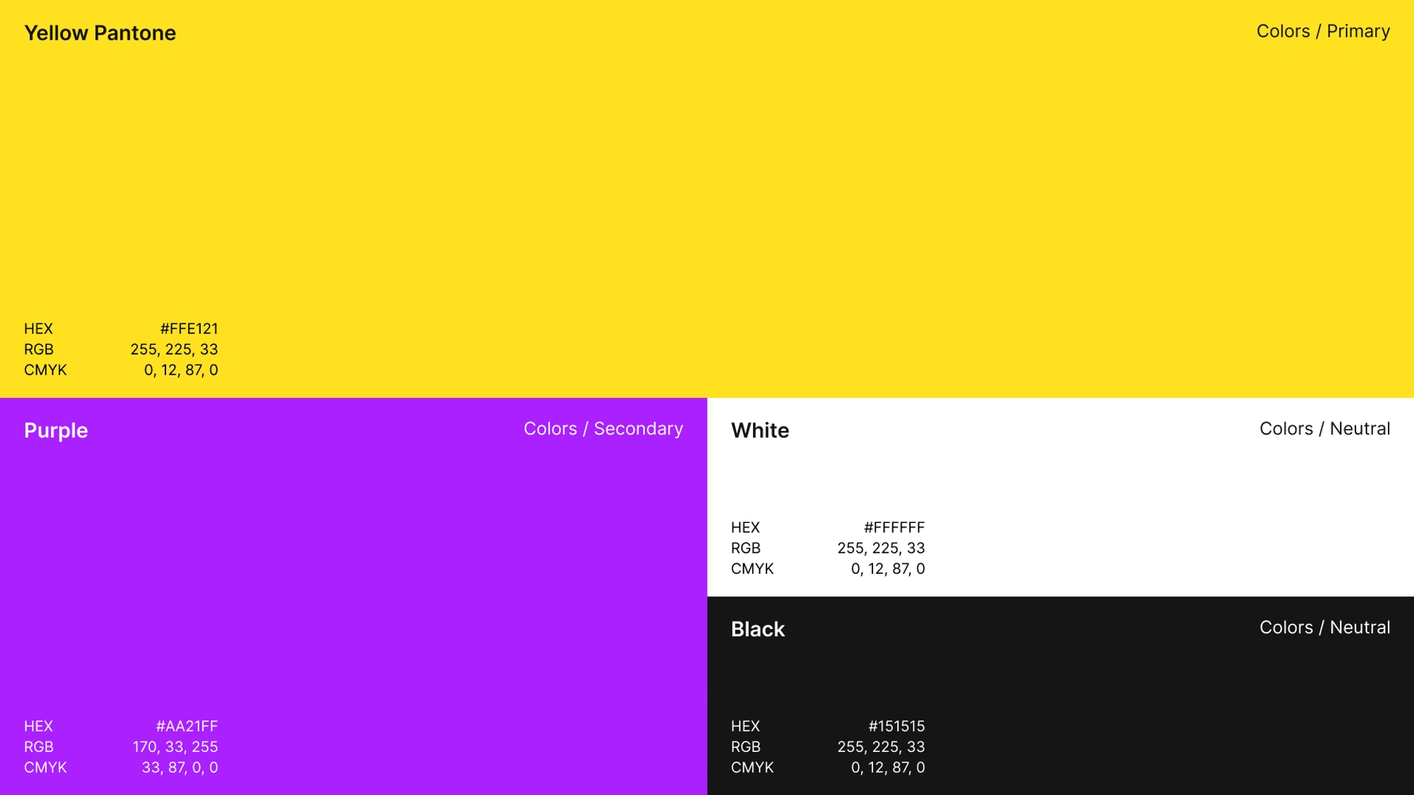
We created an extended color palette and checked the contrast ratio to make sure each color meets WCAG 2.1 guidelines.
Typography
The banana design system uses exclusively Inter, a simple and neat-looking font. It has a circular shape in several characters which gives us a friendly impression.
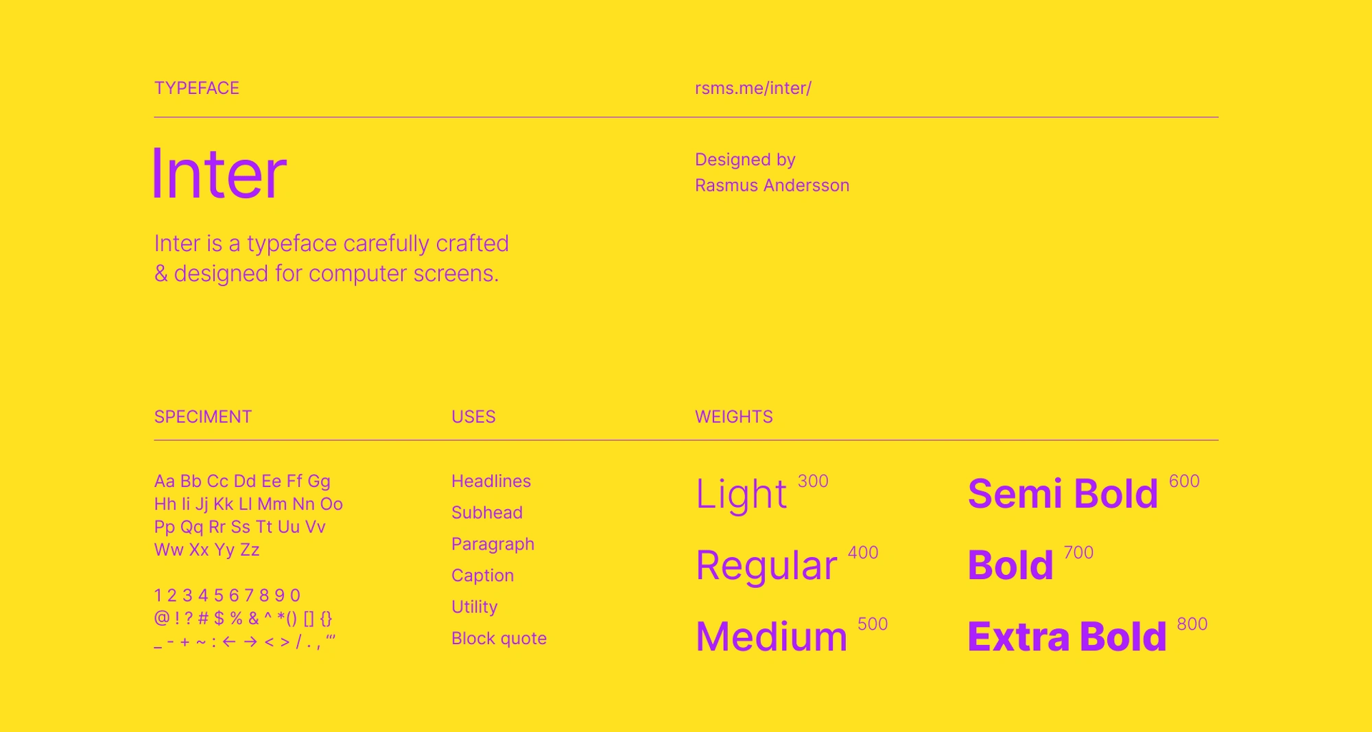
A module-type scale was carefully crafted to a ratio of 1.125 (major second)
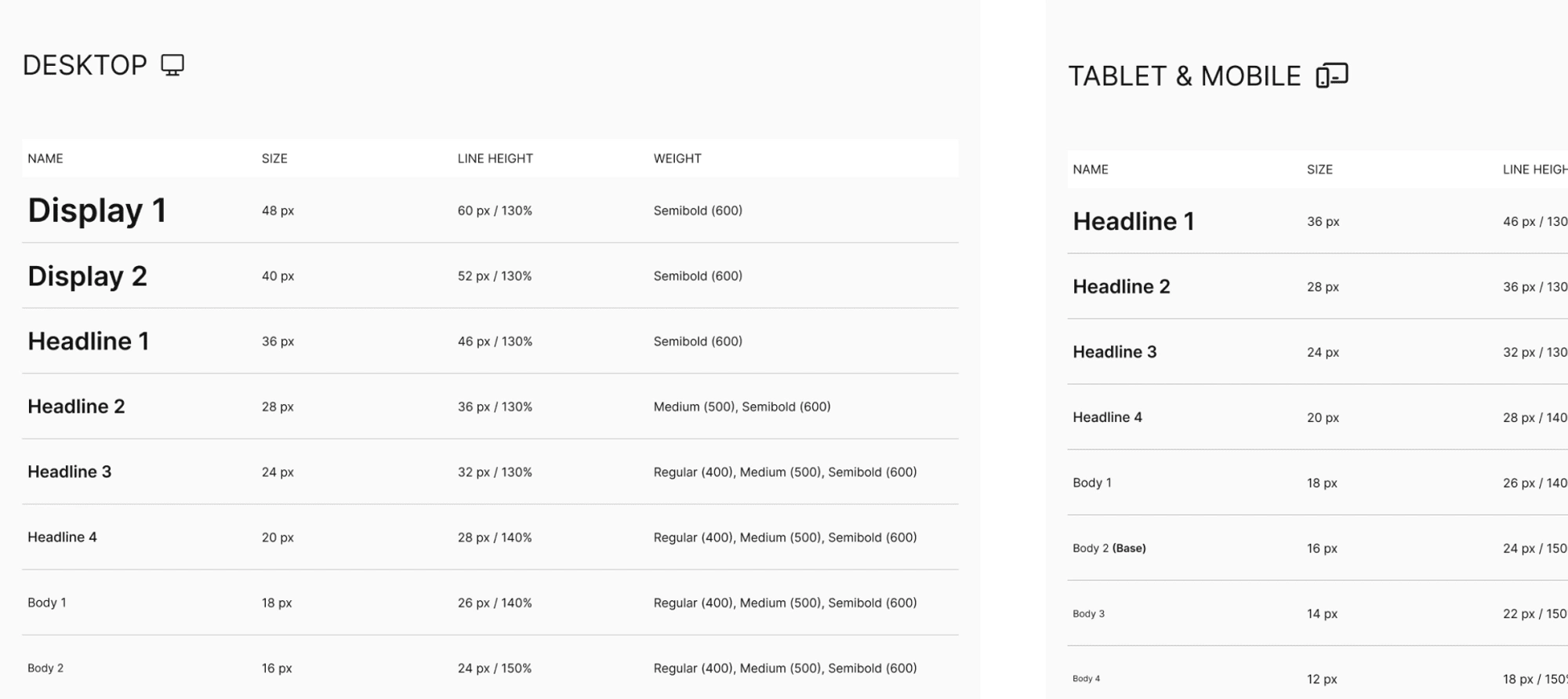
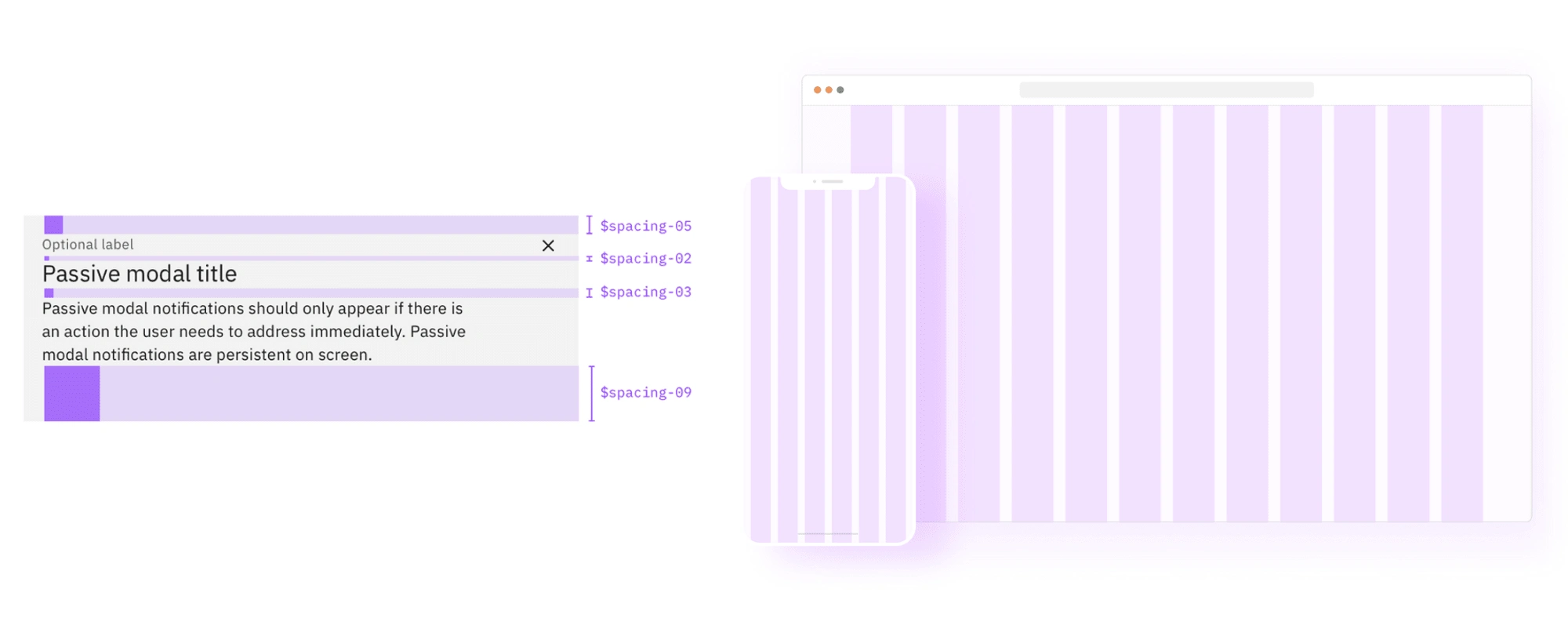
Spacing & Responsiveness
Consistent spacing makes an interface clear and easy to scan. Banana has two spacing scales; one for general spacing within components and the other for layout spacing.
Design responsively is also essential. We created a set of standard breakpoints to maintain layout integrity across screen sizes.
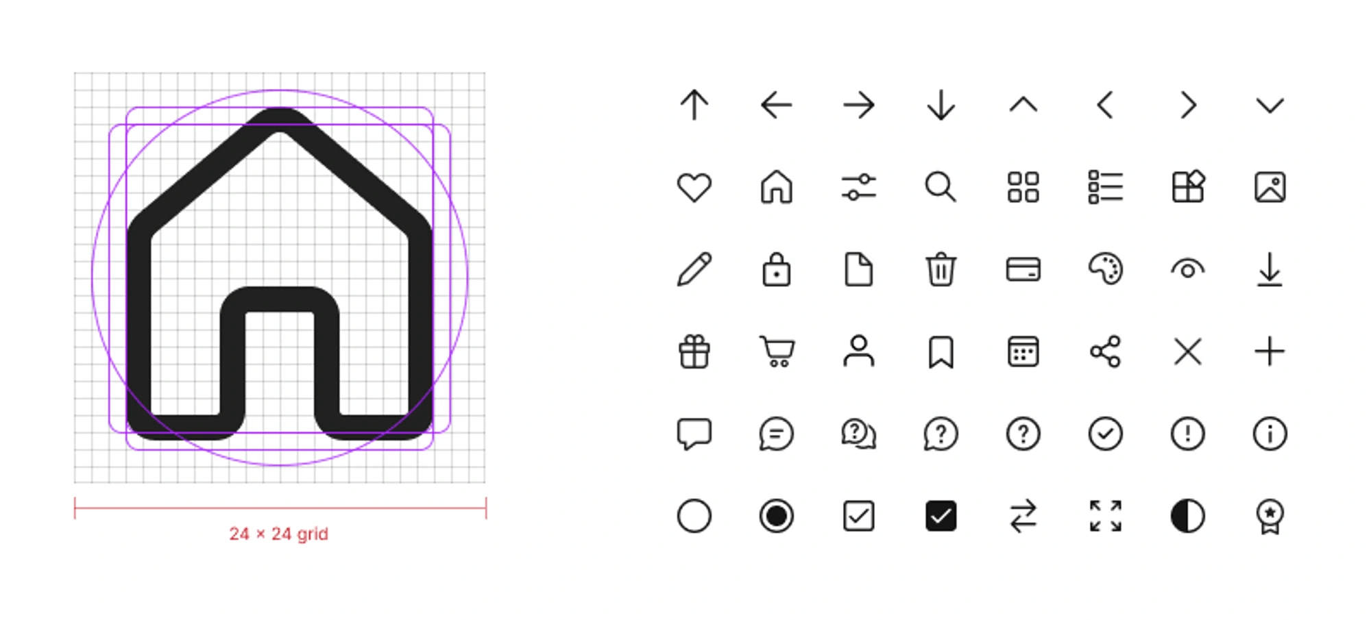
Iconography
Banana mostly uses the Microsoft Fluent UI system icon. With a rounded corner and outline style, it gives a friendly and modern look to the interface.
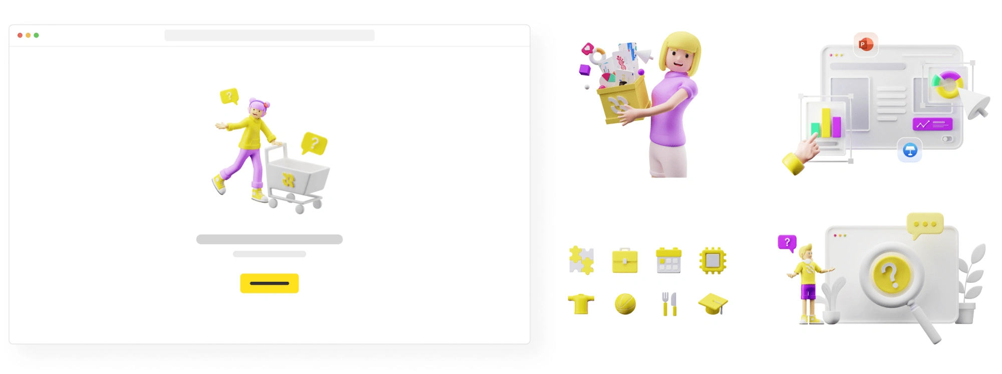
Illustrations
Using 3D illustration, we create an exciting and playful look and feel for our brand.
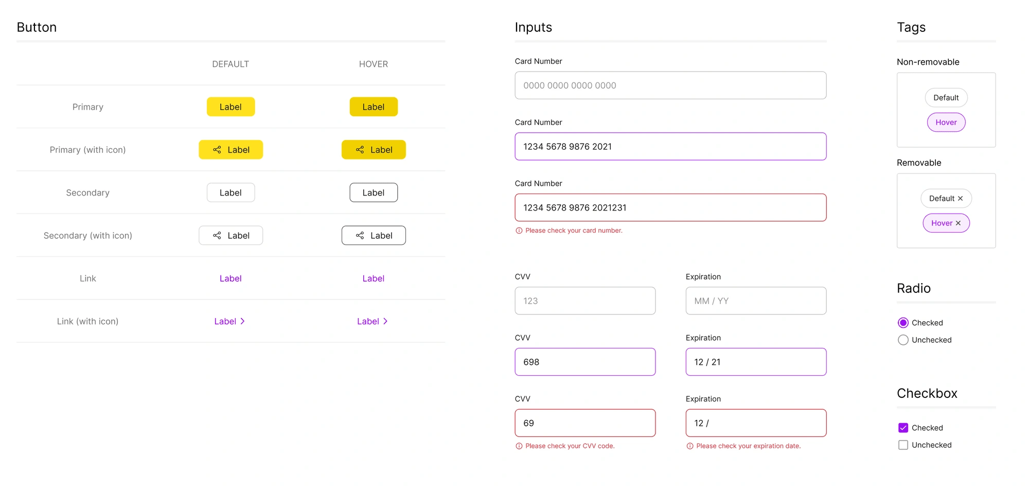
Components 💠
Components refer to distinctive UI elements that are used over and over throughout a product—normally actionable, sometimes to convey meaning.
Below is an example from Banana Design System.
Patterns 🧩
Patterns refer to recurring or ever-present elements or practices throughout a product.
Below is an example from Banana Design System.
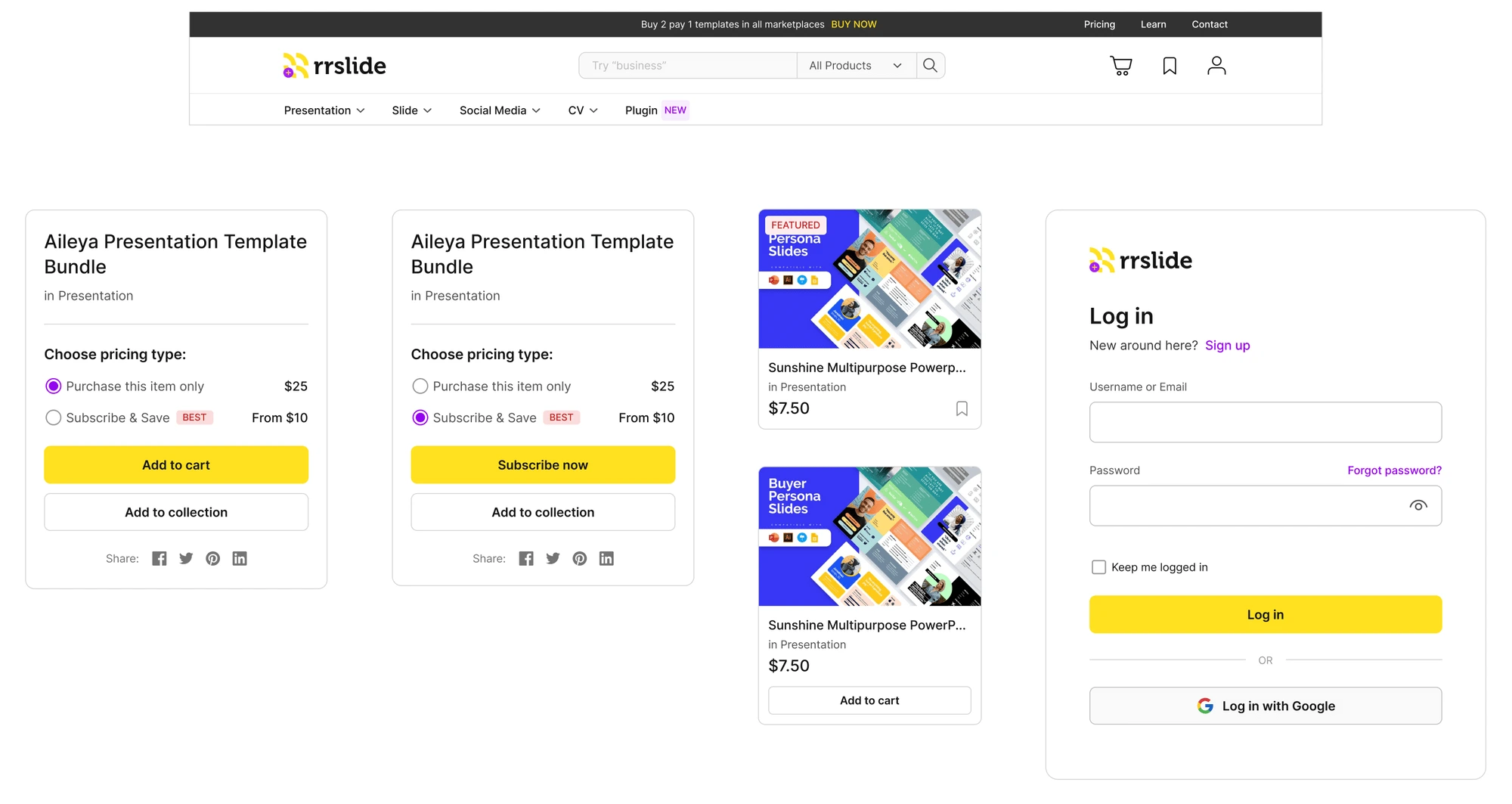
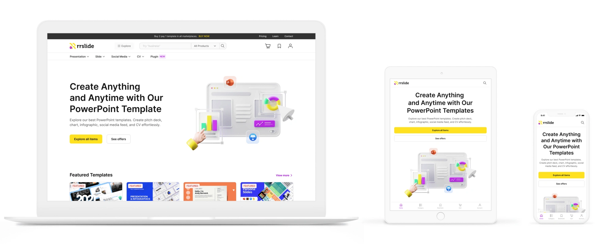
Putting it all together 🌈
Our internal tools are all data-heavy, and we have a marketplace that has a wide variety of items. Regarding our product being web-based, we knew that simplicity, readability, and load time are all paramount. That's why from early on we were striving for a clear and clean aesthetic.
Below is one of our products that has been using the design system.
TAKEAWAY
A design system is never done and these were just the very first baby steps. It’s already amazing to see the amount of impact it has across the whole team, ranging from the eagerness of engineers to create designs (who would otherwise be discouraged because they had to search for elements) up to the mentioned reduced decision fatigue.
OUTCOME
How do we measure its success? 🎯
Before we have a design system, we spent approximately 3 months (one quarter) building a web app using WordPress and without a framework. In some cases, we still rely a lot on third-party plugins which cost us more money. Hence, we defined the main goal of our design system and we came up with this one:
"Our design system will be a success if we manage to reduce development costs by 20% within a quarter."
Few things indicate that our goal has been achieved.
Shorten the time by 2 times to build simple components and complex patterns.
3 times faster to integrate components and patterns within a project, using the design system.
Reduced the third-party plugin usage by 70% for the WordPress sites.
For confidentiality reasons, I have omitted the actual values for these metrics.
Like this project
Posted Aug 12, 2023
Design system for building high-quality and consistent user experiences at RRGraph.
Likes
0
Views
9