Improving Transaction Forms for Better User Experiences
Background
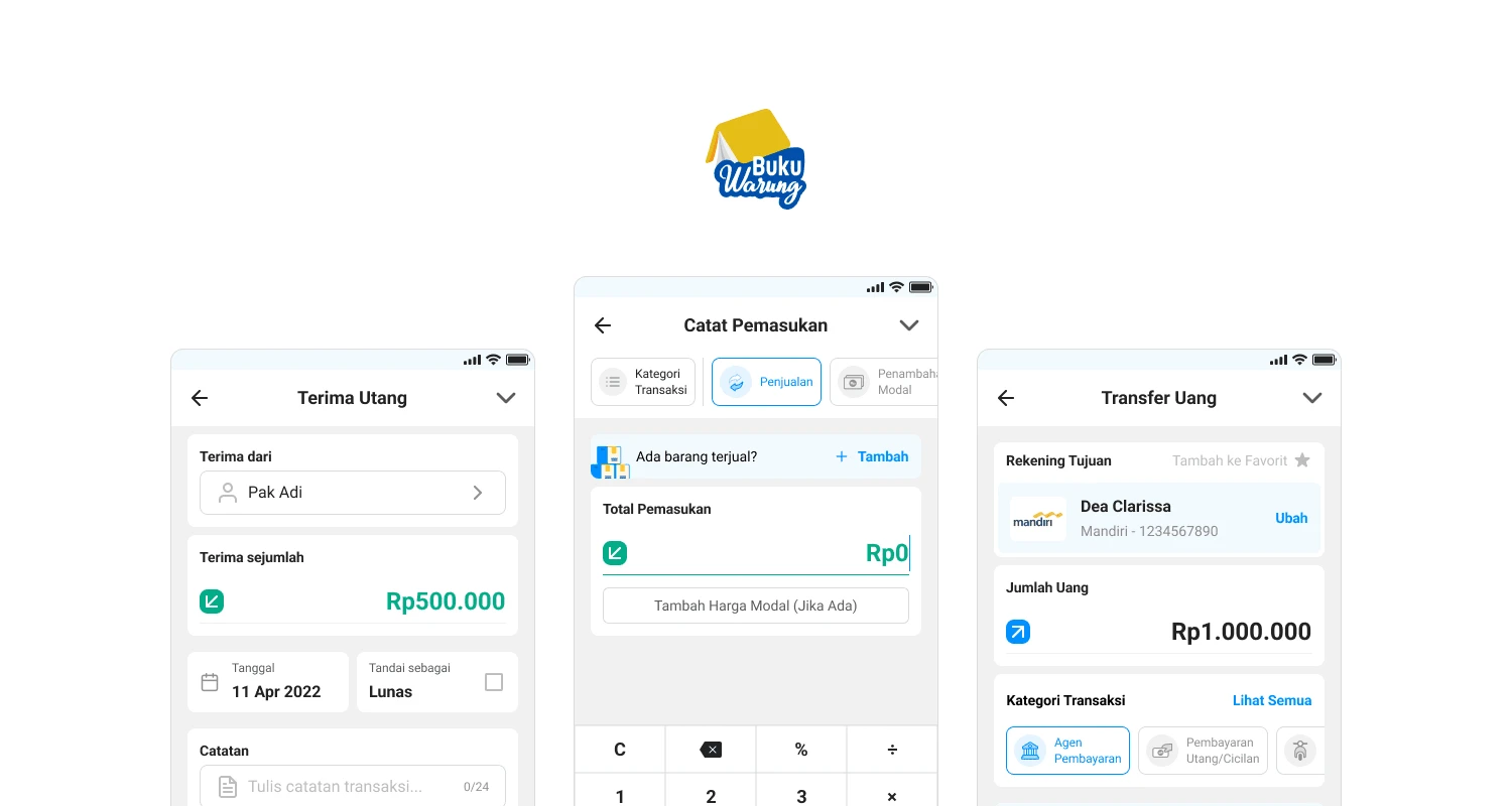
BukuWarung is a financial management app for small business owners in Indonesia. The app allows users to record transactions, manage inventory, and access financial reports. However, the lack of standardization in form design and data modeling made it difficult for users to navigate the app and capture all necessary information for each transaction, leading to inconsistencies and confusion among users.
Problems
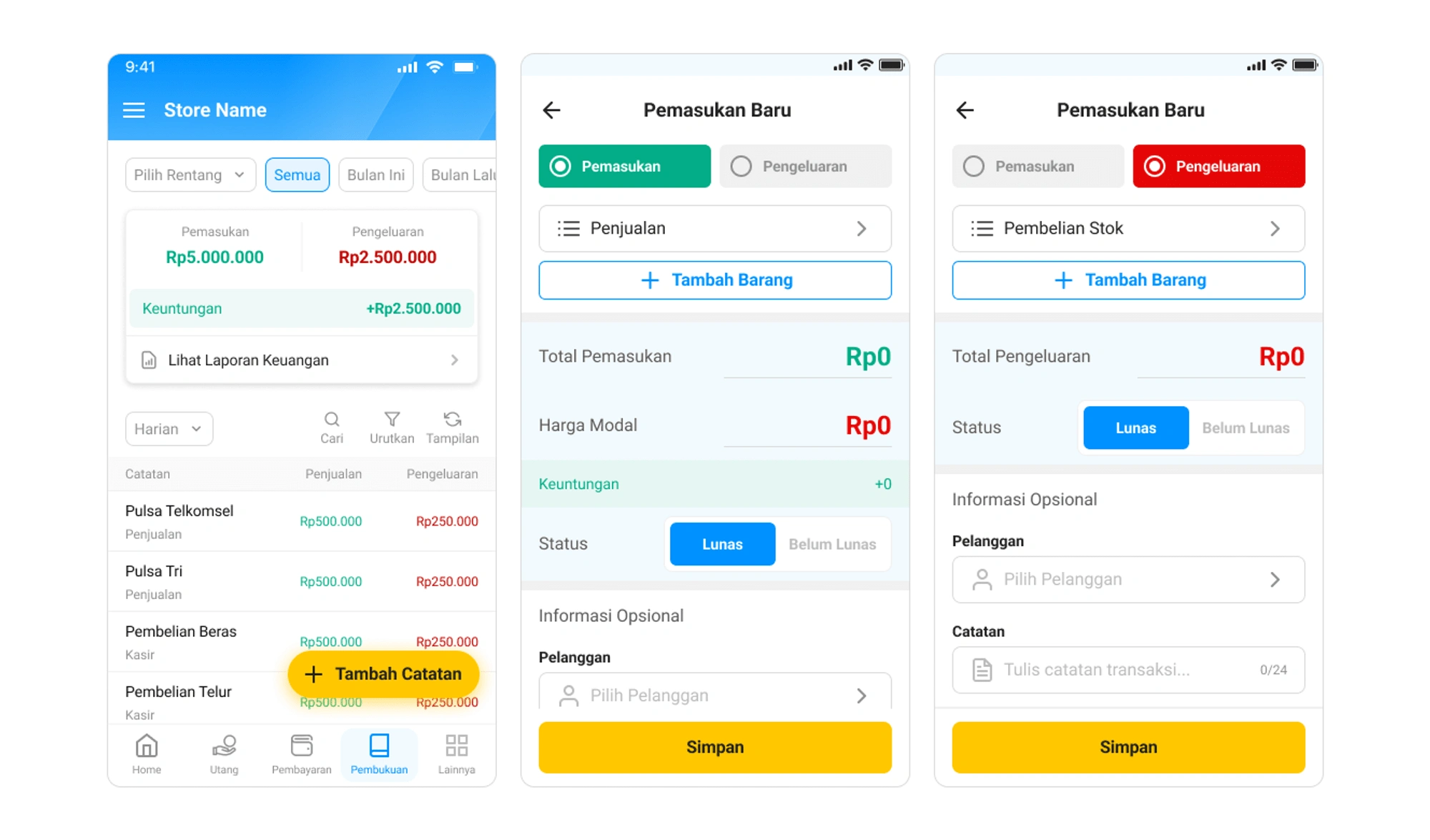
The lack of consistency in the data model resulted in incomplete and inaccurate transaction data, which made it difficult for business owners to understand their financial performance and make informed decisions. In addition, the inconsistent form design made it challenging for users to understand the app's functionality and complete transactions efficiently.
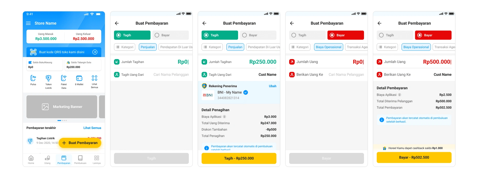
Old Form Design 📝
Bookkeeping feature
Payment feature
Approach
The project is divided into two iterations: standardization and contextualization.
A. Standardization
The 1st Iteration focuses on standardization, which involves improving the accounting and payment features in the app by understanding the user needs and optimizing the UI design at the same time.
The design and product teams conducted a study to observe feature users with accounting and payment personas, which yielded three key findings:
1. Header and type of record
Problem: We found that the record type switch in the header caused inconsistency and distracting visual experience for users.
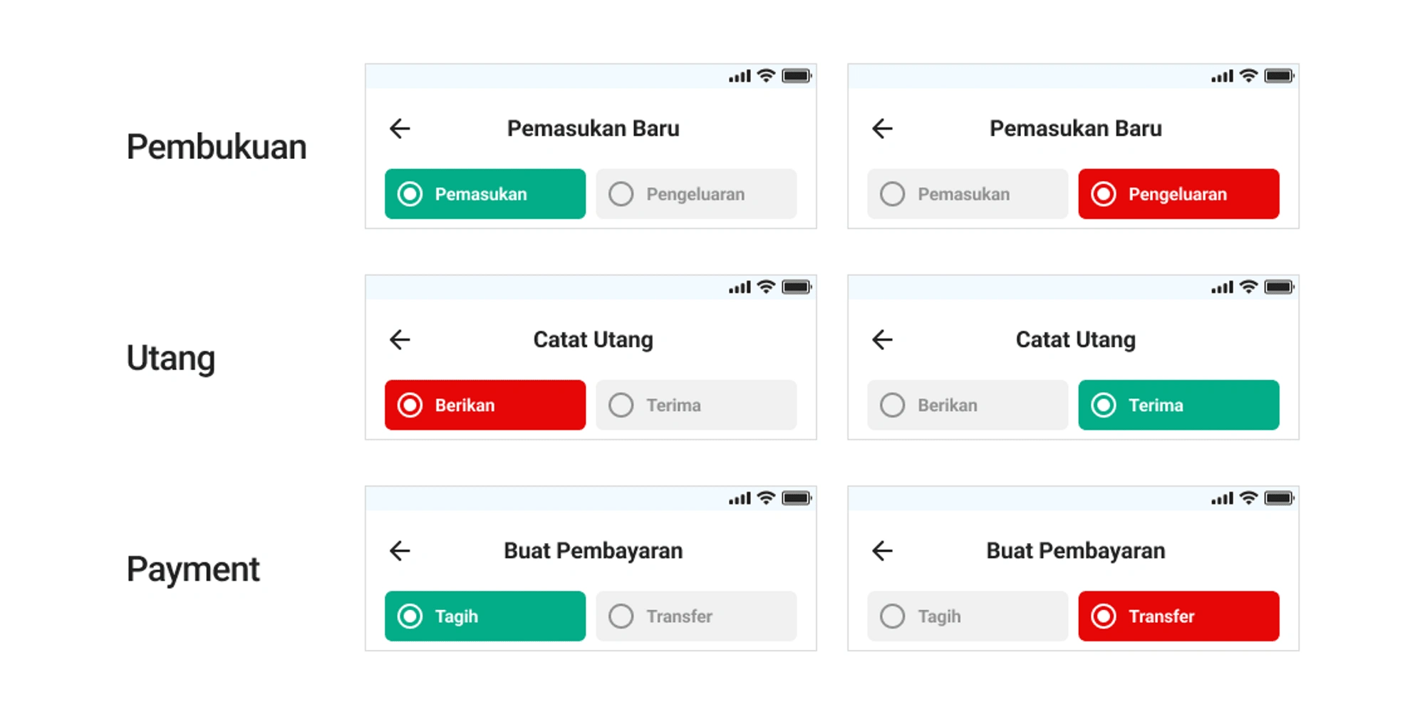
Solution: To address the inconsistency and distracting visual experience caused by the record type switch in the header, the design team moved it out of the page and into a bottom sheet selection. This solution provided a consistent user experience and eliminated the distraction caused by solid colors. An extra step was added gradually, which is better for further implementation in handling edge cases.


2. Category selection
Problem: We found that using a chip component for category selection in the payment feature resulted in better adoption than using a select component, according to data from Amplitude. However, in the accounting feature, using a select component caused confusion for users, leading to an inadequate conveyance of the category selection's importance.

Solution: To address confusion with using a select component for the accounting feature, the design team added an icon to the category selection chips to make it easier for users to visually recognize and select the category.

3. Page structure
Problem: The cluttered page structure and information hierarchy in the accounting and payment features make it difficult for users to understand the data points.
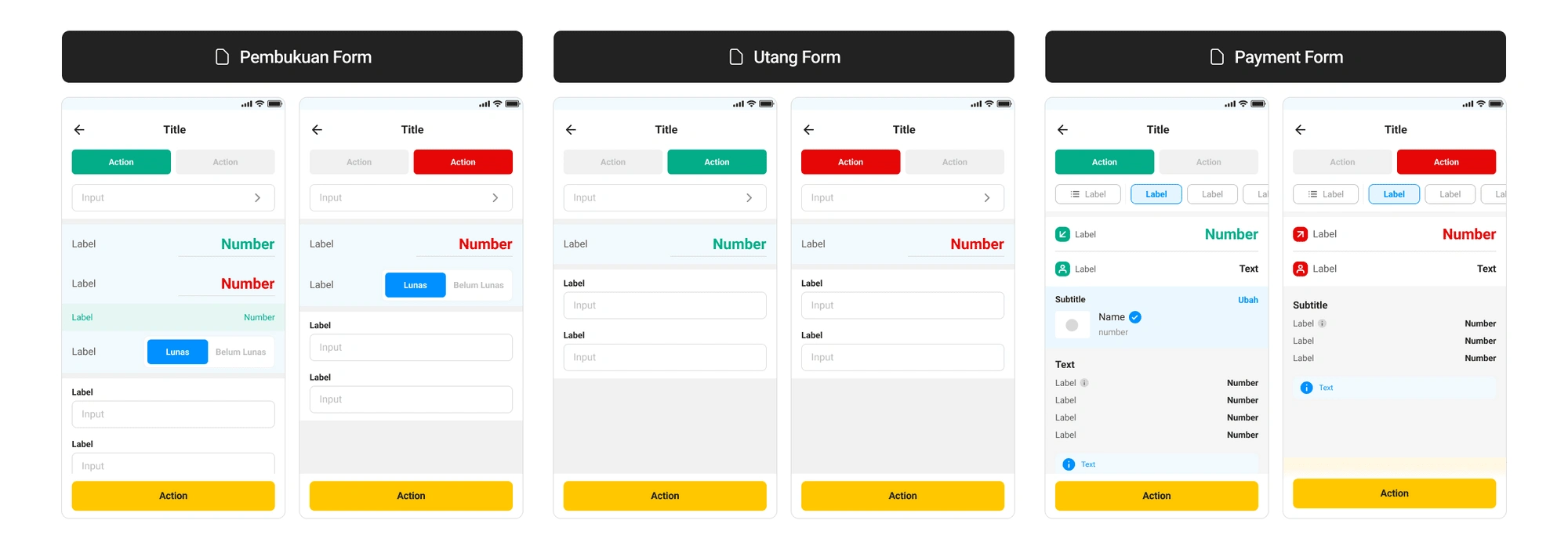
Solution: To resolve the cluttered page structure and information hierarchy in the accounting and payment features, the design team optimized the page size and hidden or deprioritized some inputs, employing the progressive disclosure principle. This approach helped users focus on the most important information and reduce cognitive load.
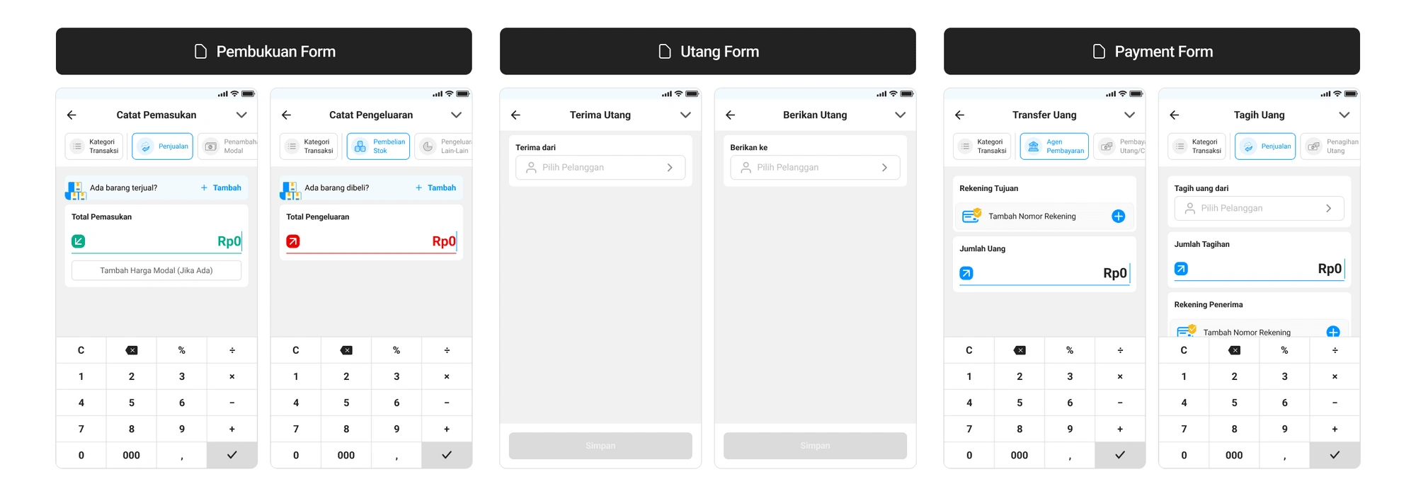
B. Contextualization
Problem: After the 1st iteration, the design team noticed that the standardized page structure for both accounting and payment features did not work well for the payment feature. An A/B test showed a high rate of user drop-offs during the payment onboarding process.

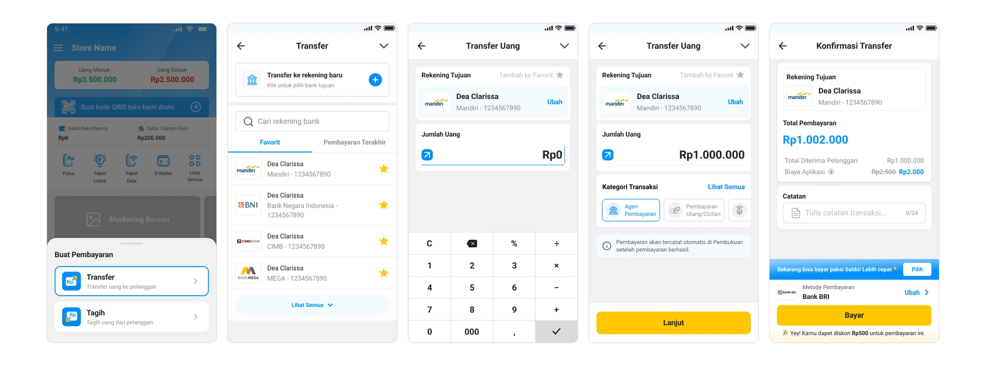
Solution: The 2nd Iteration aims to solve the problem by distinguishing the payment feature's page structure and flow from accounting features to cater to the different mental models of accounting and payment users. The potential solution is to employ progressive disclosure, where users add a bank account or recipient and enter the transfer amount on the same page. The rest of the form will be shown on the next page where users review and confirm the payment. For example New transfer flow
Outcome and Lessons Learned.
The standardization and contextualization of transaction forms and data models led to a significant improvement in user experience and data accuracy. The new design decreased user drop-offs during the payment onboarding process by 35%, and the completed payment rate increased by 25%. The design team learned the importance of involving all relevant stakeholders early on in the design process and considering the different mental models of users to optimize the app's functionality and usability.
What could be done differently?
To minimize unexpected outcomes from the standardization phase, specifically for the payment form, the design team could:
Involve all relevant stakeholders earliest in the design process to ensure everyone's perspectives are considered and aligned.
Consider conducting more extensive user testing during the early stages of the project to validate assumptions and reduce risks.
Use a more structured approach, such as design thinking or agile, to facilitate collaboration and communication among team members and stakeholders.
By implementing these changes, the design team can improve the design process and ultimately deliver better products that meet user needs and expectations.
Like this project
Posted Aug 12, 2023
Revamping the forms to get a clean data model through its consistent visual touchpoint.


