Bruno Paiva Architecture Studio Visual Identity

Sandrin Design


Bruno Paiva | Architecture Studio
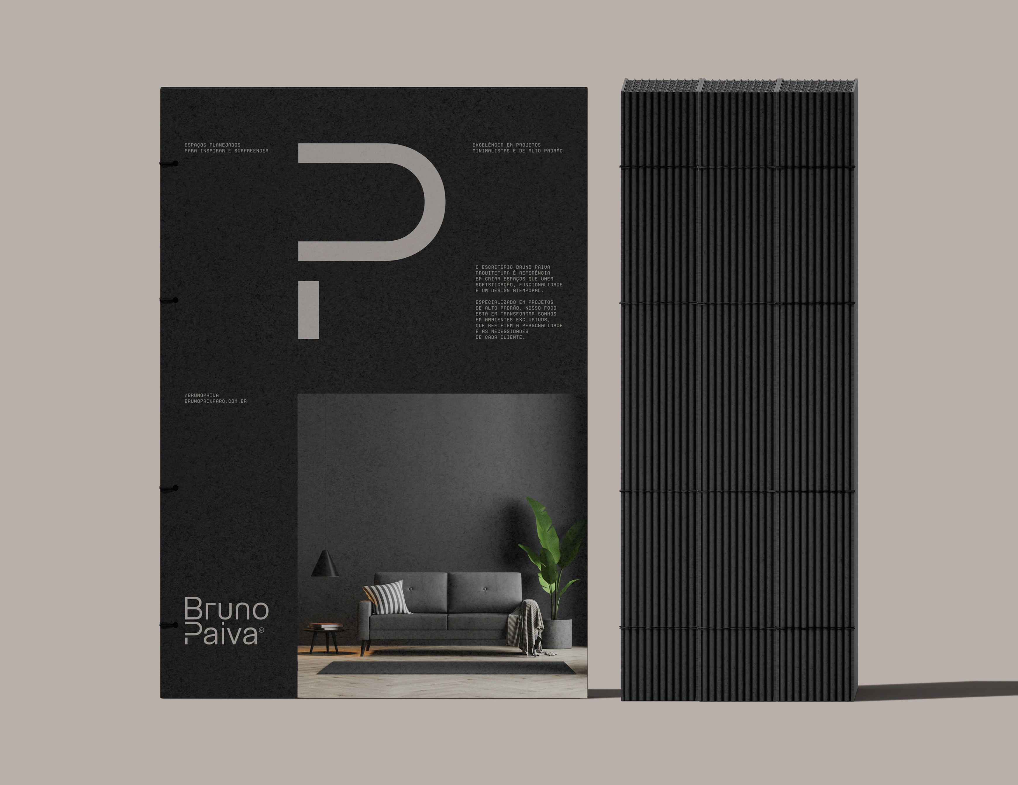
The Bruno Paiva brand represents the fusion of sophistication and functionality, reflecting the studio's commitment to minimalist, high-end projects. With a typographic visual identity, the brand is built on fine, striking lines that reveal the precision and care present in every detail of the projects it develops.
Bruno Paiva's identity embodies the architect's attentive and creative eye, transforming spaces into true habitable works of art. Each project is unique and designed to exceed expectations, fostering a connection between the environment and its inhabitants through innovative, contemporary and, above all, sophisticated solutions.
Concept
For Bruno Paiva, designing well means knowing how to reduce. That is why the brand springs from the meeting of refinement and practicality, reflecting a studio devoted to spaces that are lean, polished and built to last.
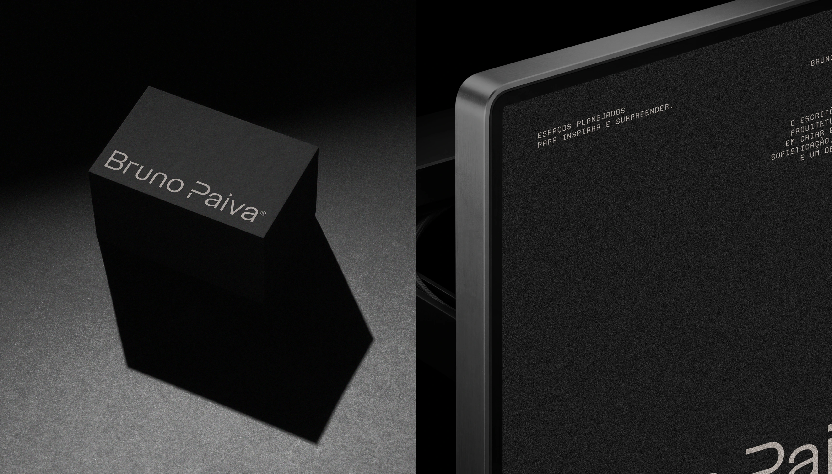
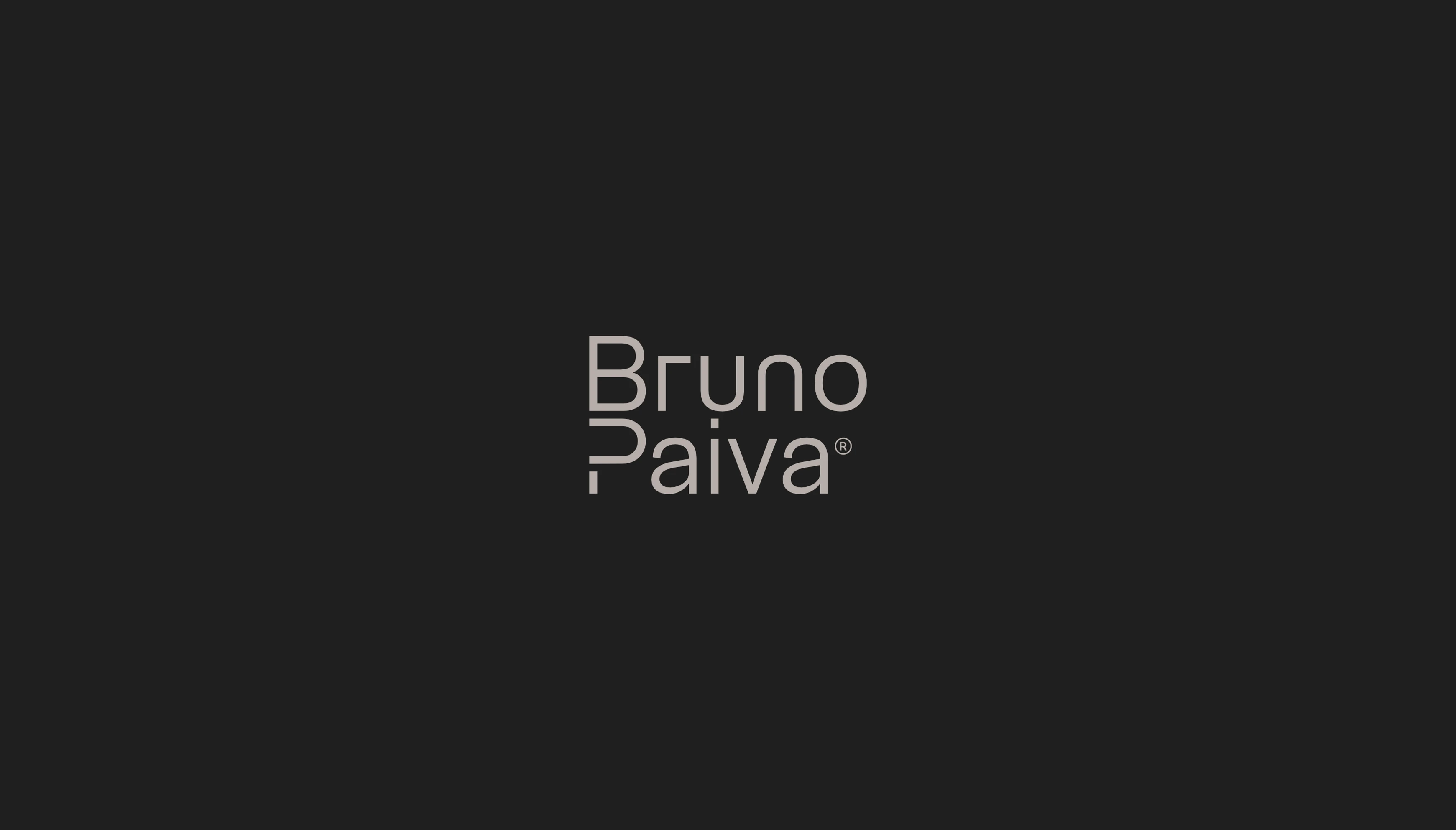
The brand's symbol is writing itself. Letters drawn with slender yet firm lines reveal the rigor of someone who designs with attention to every millimeter. It is a discreet signature that makes itself noticed without having to raise its voice.
This same restraint guides the studio's architecture. By eliminating the superfluous, the work celebrates what is essential: balanced proportions, harmonious compositions and a beauty that does not bow to trends. The letters, at once delicate and striking, express the constant dialogue between style, technical mastery and everyday use, the foundation of everything the studio builds.
Behind the name is an architect with a sensitive and inventive eye, who sees in every space the chance to create something artistic and, at the same time, fully livable. No project repeats another: each is born to surprise and bring people closer to the places where they live, with answers that are current, original and elegant.
Brand Applications
Bruno Paiva's identity was designed to adapt to different media without losing its signature: discreet, precise and recognizable at first glance.
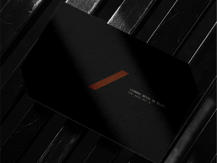
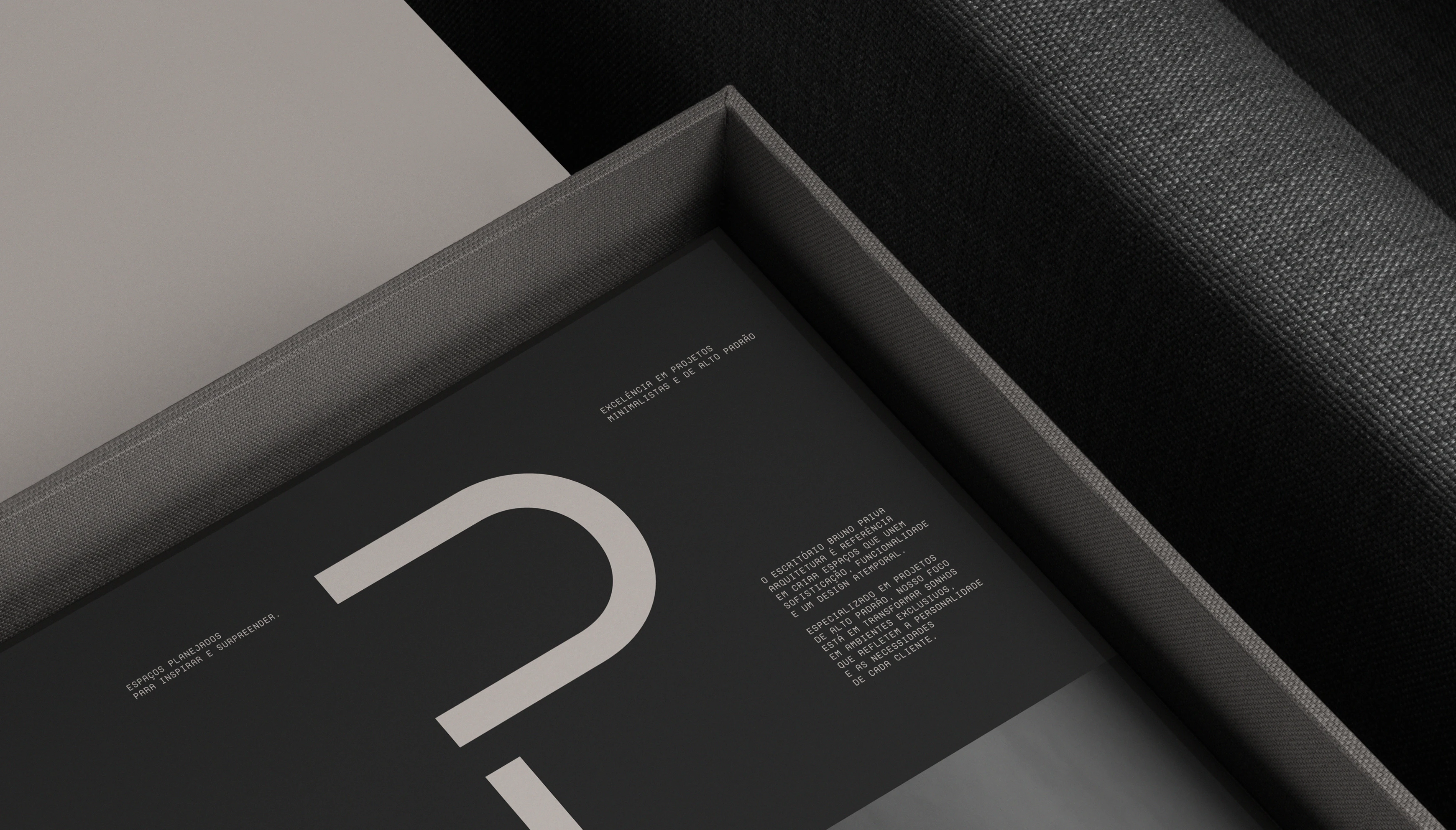
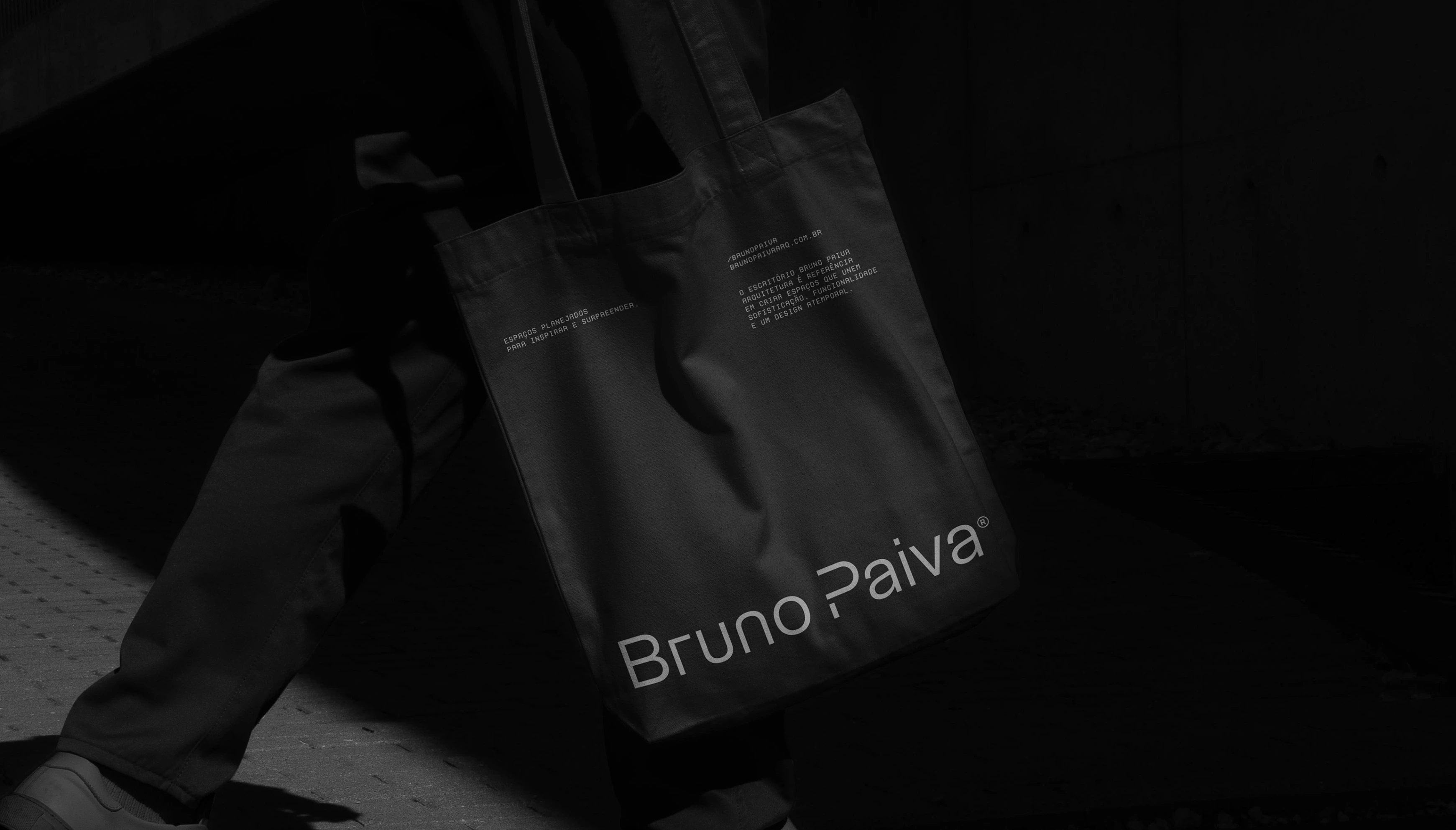
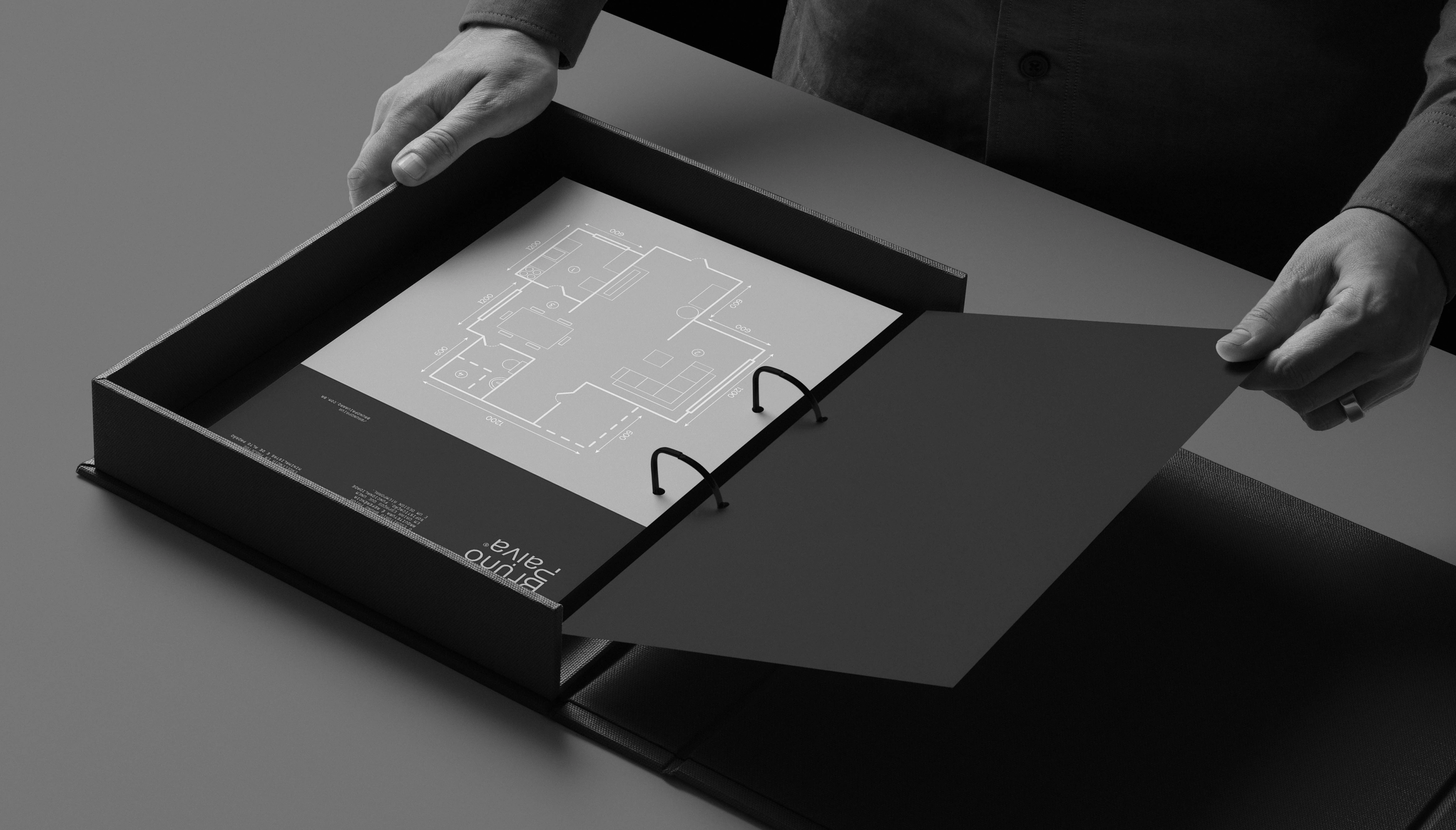
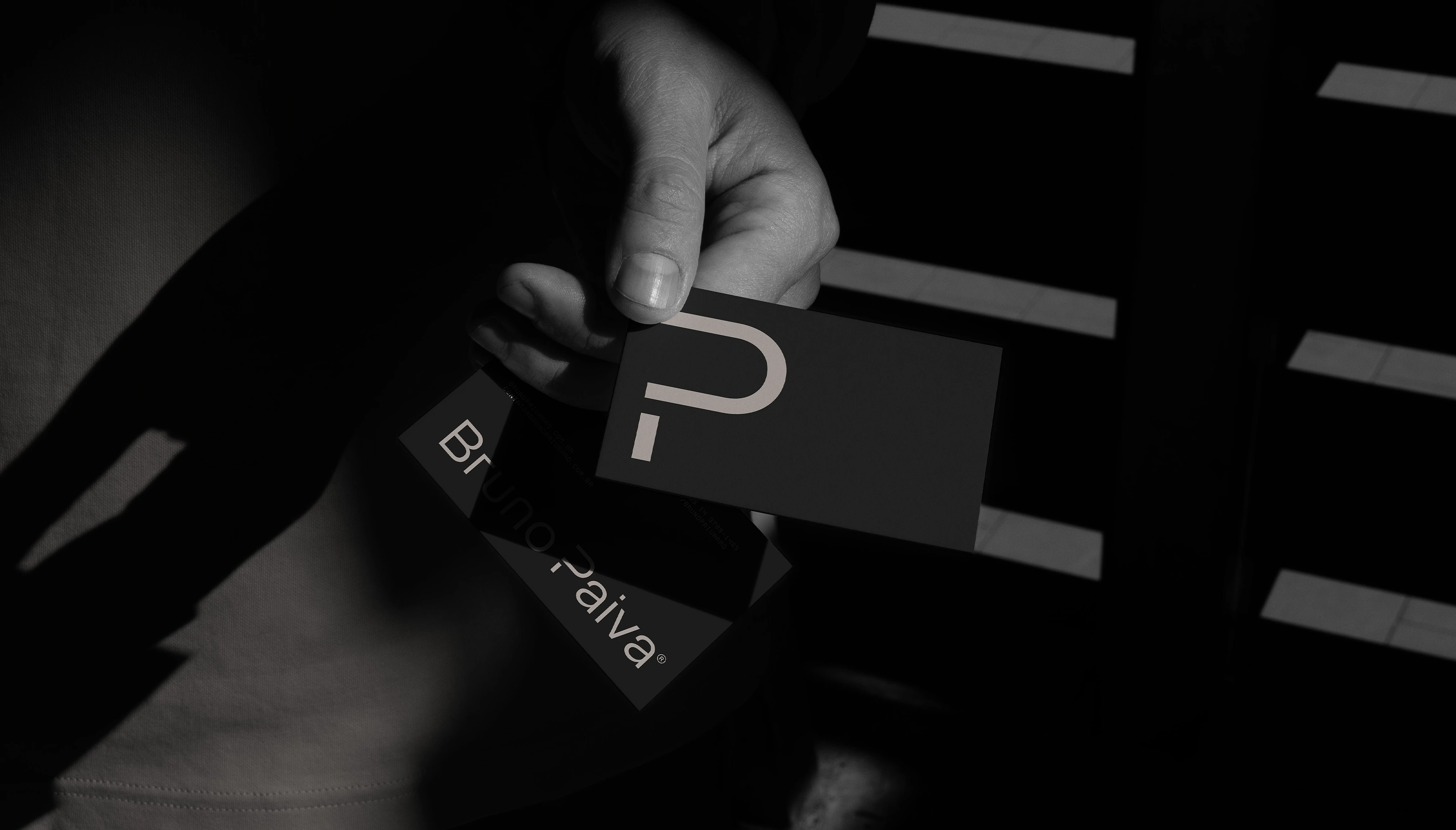
In institutional stationery, such as business cards, letterheads and envelopes, the typography takes center stage on clean surfaces, with high-grade paper stocks and subtle finishes that reinforce the care for detail. In projects and presentations, the brand appears with restraint on drawing sheets, proposals and portfolios, accompanying the content without competing with it.
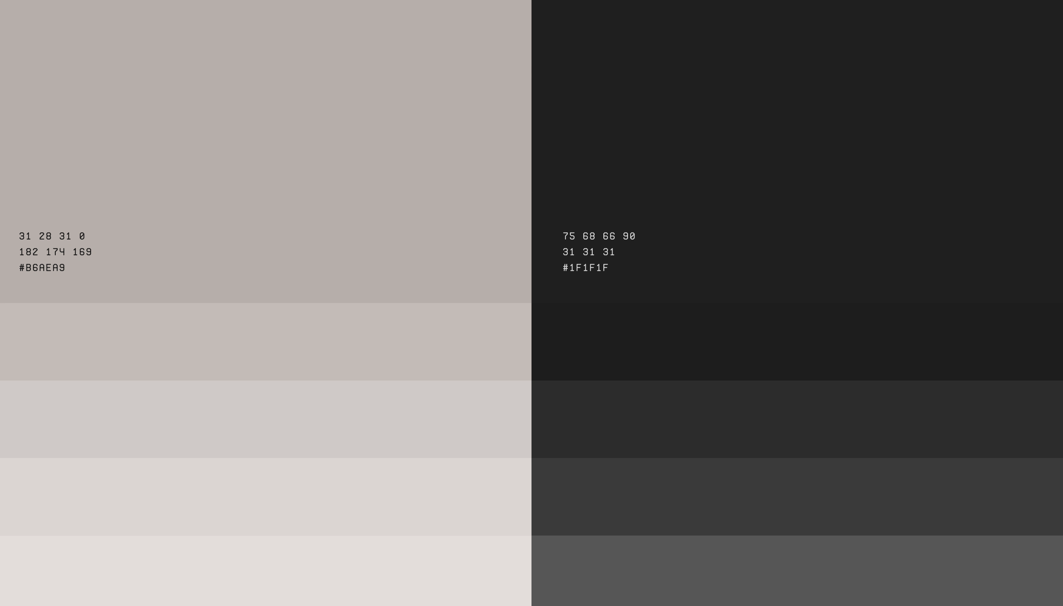
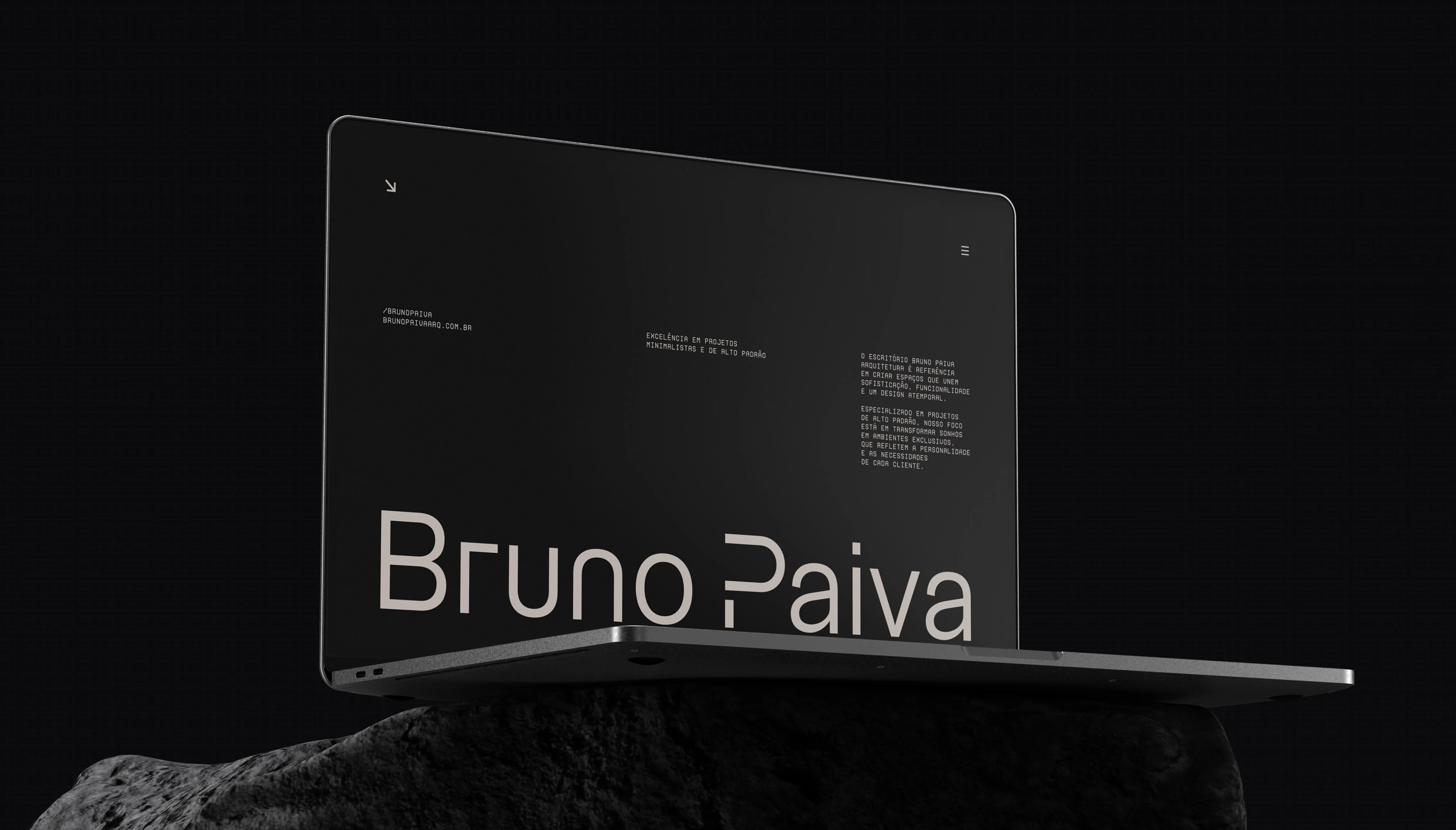
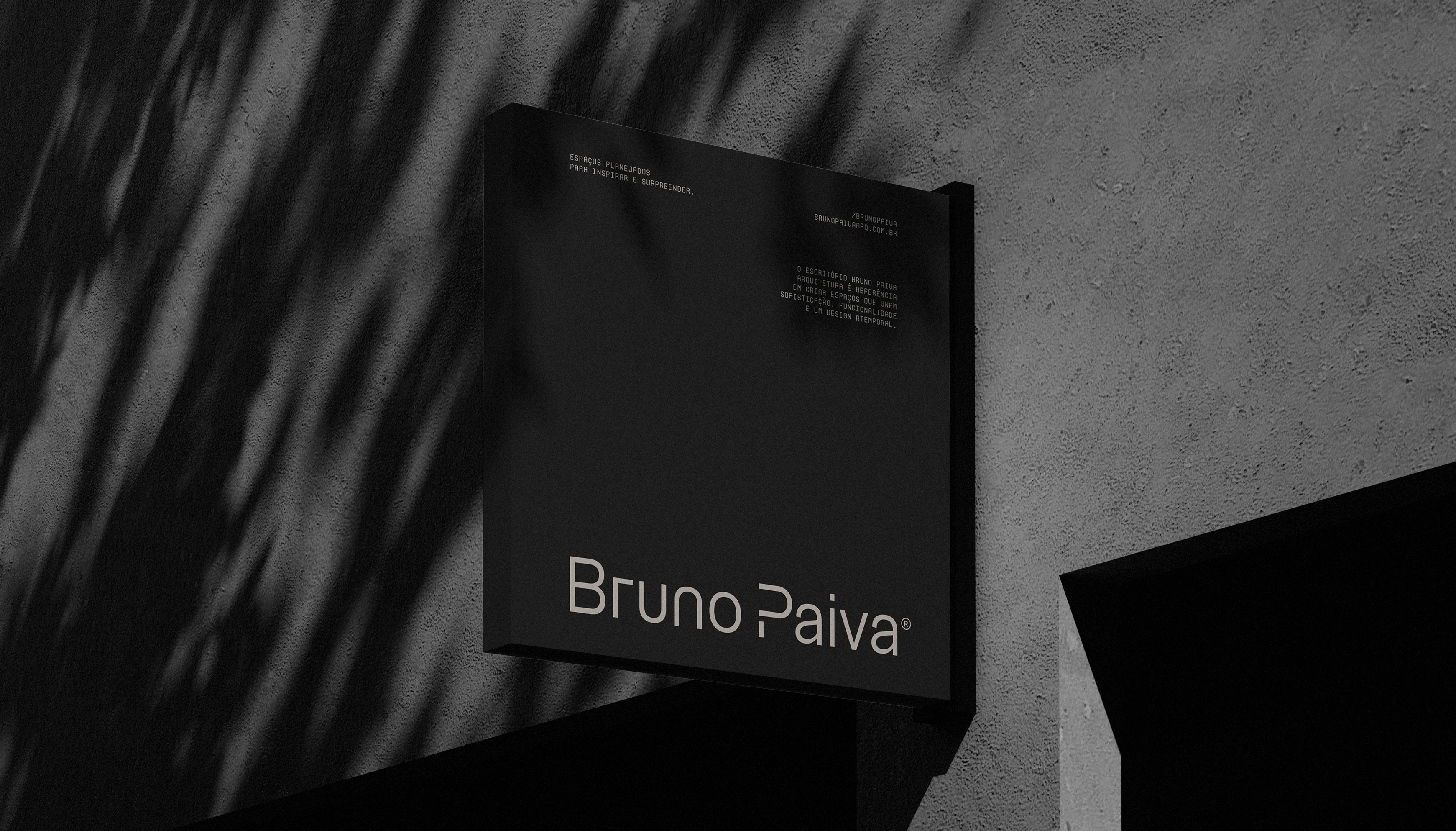
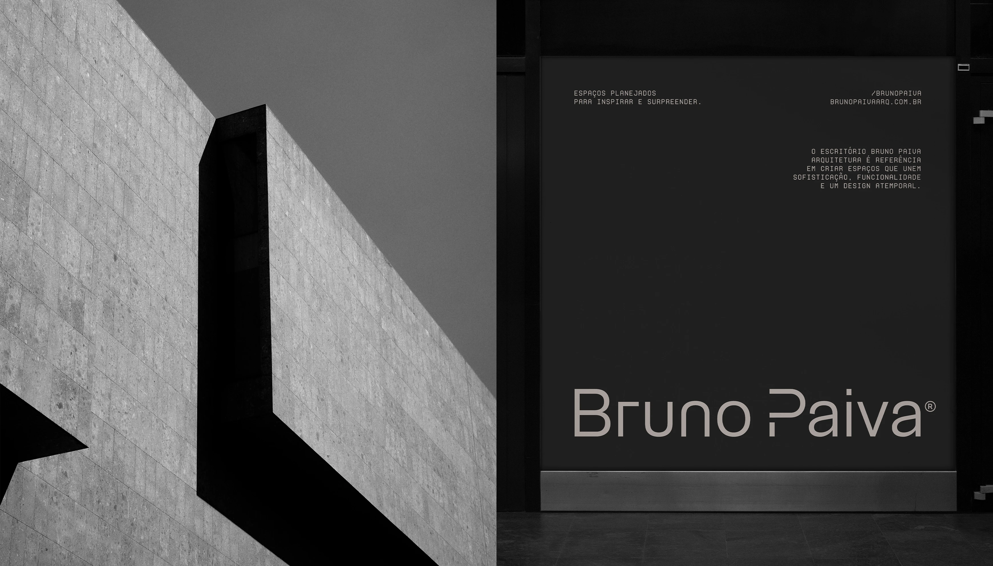
In the digital environment, the website and social media keep the same lightness, with generous white space, a restrained palette and layouts that highlight the project images. In construction sites and physical spaces, such as signage, façades and showroom materials, the brand blends into the architecture, signing the work with elegance and without excess.
In every application, the principle is the same: fewer elements, more intention.
Like this project
Posted Oct 4, 2026
Developed a minimalist visual identity for Bruno Paiva Architecture Studio.