ybot — Branding, Product, and Website Design
Kreativa Studio
3 collaborators
About the project
ybot—with a lowercase “y”—is an AI platform built for deskless workers, helping streamline everyday tasks through voice commands. It’s designed to make workflows smoother, keep things compliant, and support the people often left out of traditional tech setups.
We worked closely with the ybot team to shape a more refined, grown-up brand (their words!) and brought it to life with a custom website that highlights what makes ybot different in a fast-growing AI space.
📋 Roles: Visual Identity, Brand Support, UX/UI Design, Product Design
Defining the character of ybot with a single letter.
Designing the ybot logo was a super creative process—we went through a bunch of ideas before landing on a custom lowercase “y” that felt just right. It’s simple, recognizable, and designed to become a familiar icon for deskless workers everywhere.
We also made it dynamic, with an animated version that shifts between states—idle, listening, responding—so it feels alive and responsive. To tie it all together, we custom-drew the rest of the wordmark with clean, geometric shapes, adding a bit more personality to the brand.
For ybot, we put together a full guide with everything they’d need: logo rules, colors, type, patterns—all the stuff that keeps things looking sharp and consistent.
We picked PP Telegraf for the typeface—it’s clean, modern, and has just enough warmth to feel human. The color mix brings a nice balance: fresh blues for trust, orange for energy, and white to keep it all feeling light. We also added some fun graphic elements like pixel patterns and animated dots to give the brand a bit of movement and personality.
Expanding ybot's reach.
Leveraging the brand guide, we developed a diverse array of assets for ybot, encompassing both digital and traditional media. This includes everything from billboards and posters to social media content, pitch decks, and beyond.
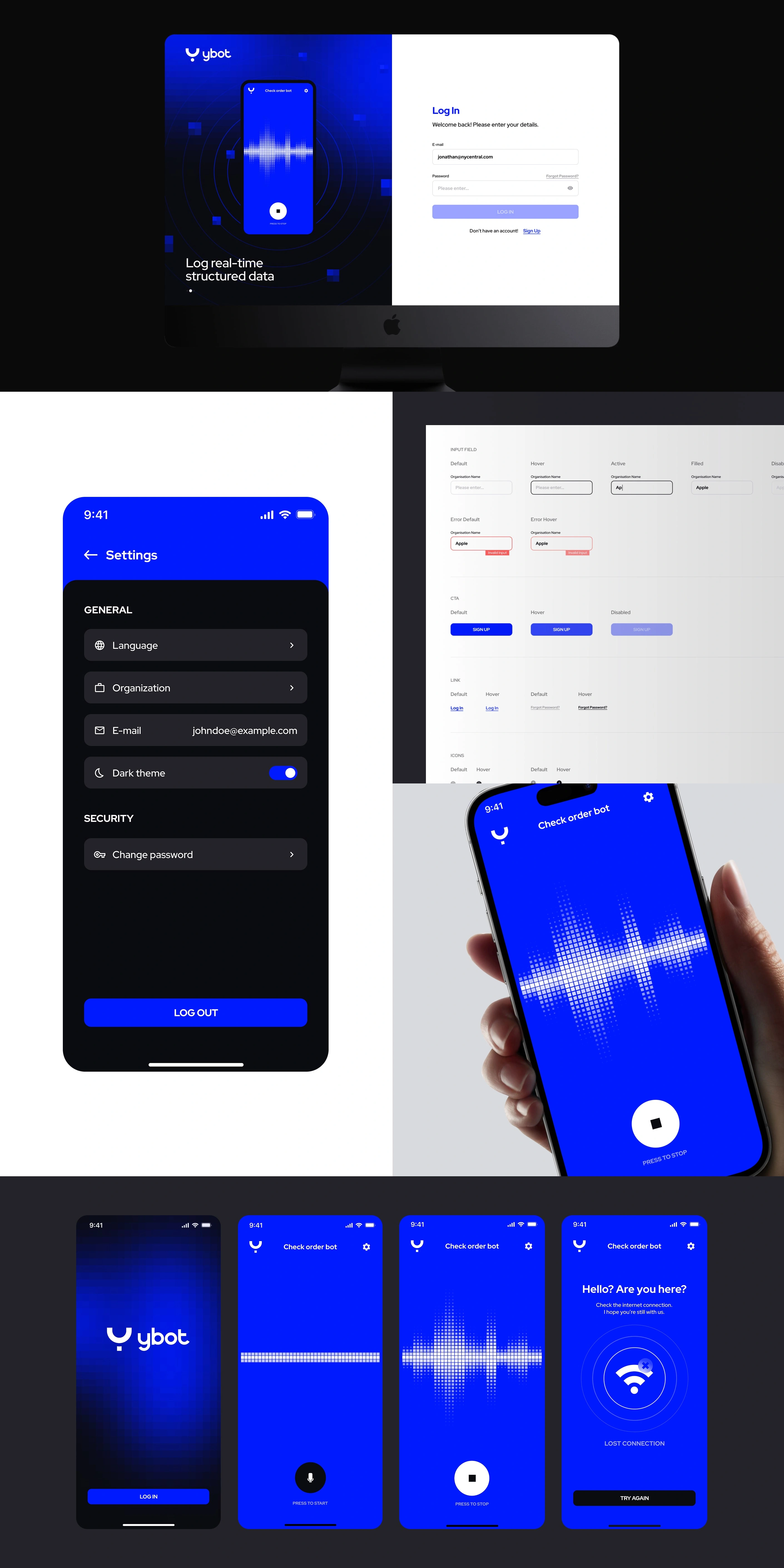
Bridging wireframes and design to shape ybot’s user journey and visual narrative.
We started shaping ybot’s user experience by taking a close look at the content and laying out some crystal-clear wireframes. This step helped us figure out what each page needs to do, the story we want to tell, and how we want people to move through the site, all before we even thought about the UI design itself.
From the start, we aimed to give ybot a futuristic feel that’s accessible today. By carefully choosing colors, creating unique icons, and designing a dynamic interface, we wanted to make sure ybot shines as a go-to for smooth and easy-to-use experiences.
Executing powerful automations in subtle ways.
At the heart of our efforts lies the functionality we’ve delivered to ybot’s users, especially through the dashboard where customers train bots and the app that helps the workforce complete tasks. This required a minimalist design strategy across different platforms, ultimately bringing sophisticated back-office capabilities right to the fingertips of front-line staff.
Bo and the whole Kreativa team are absolute weapons. Rebirthing ybot after being in stealth mode was a special project. We researched for months for an agency capable of absorbing our vision and technology that bore no likeness to anything else and thus required technical and out-of-the-box thinking. After rising to the top of our candidates, Kreativa took on the challenge, spending the time to really understand the impact we want to make, and put in experienced, quality creative work. They didn't just nail the brief, they made it personal – and the result shows.
— Tomer Garzberg, Co-Founder and CEO, ybot
Like this project
Posted Sep 27, 2025
A new visual identity, website, app, and various brand assets created for ybot, an AI-powered platform for deskless workers.
Likes
11
Views
79
Clients
ybot