THÉRAPEAU Brand Identity and Packaging Design

Izumo Kobu


01 — Introduction
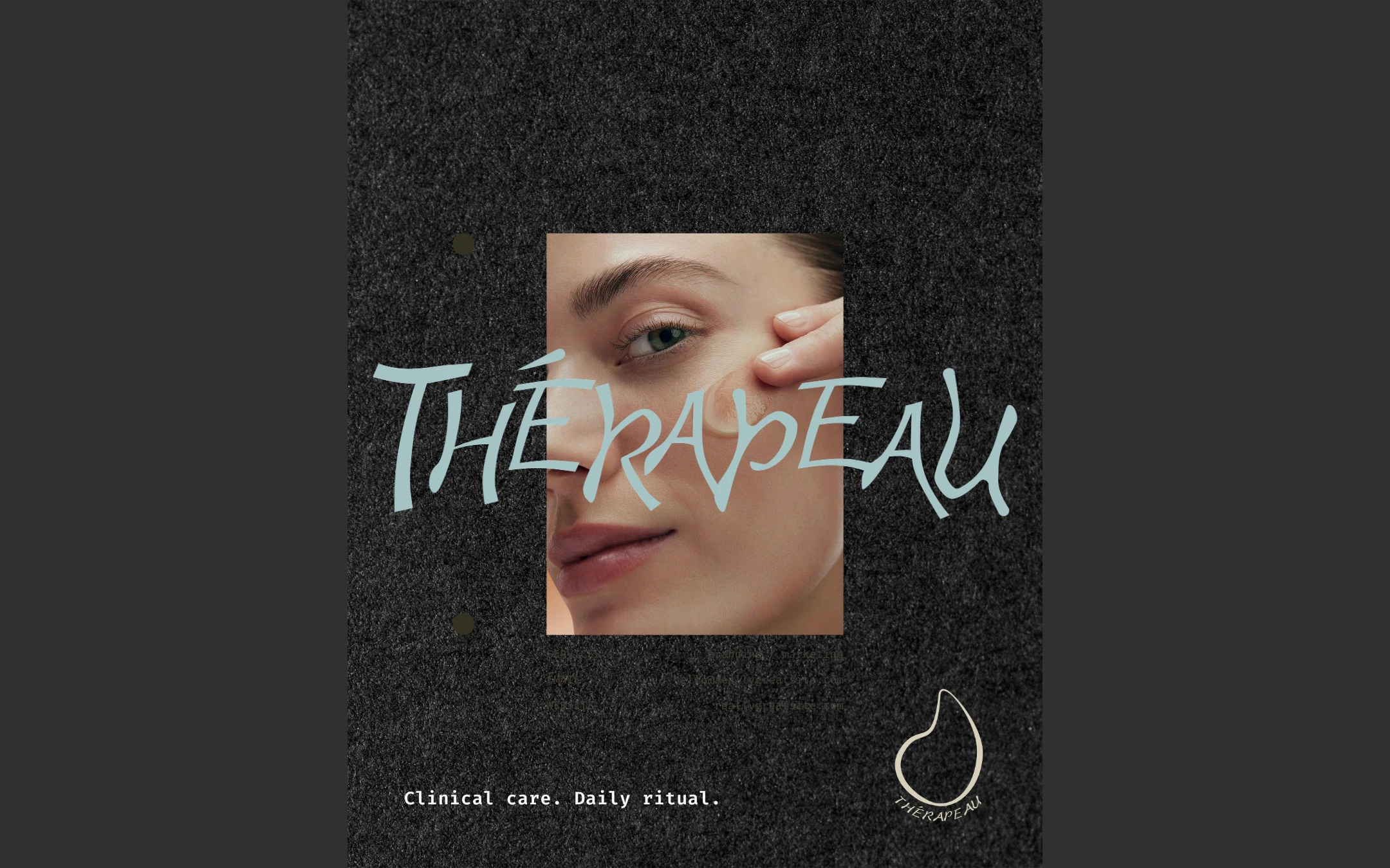
THÉRAPEAU is a premium skincare concept built around the idea of clinical care becoming part of everyday life. The identity combines a more expressive visual language with a calm, accessible approach to daily skincare.
02 — Brand Positioning
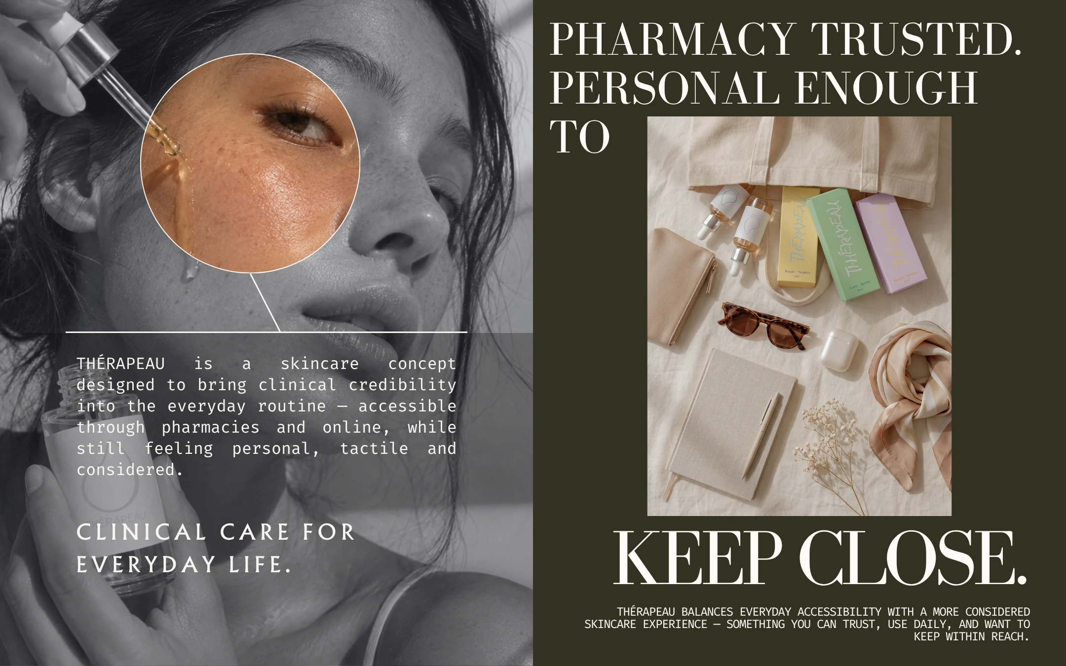
The brand is positioned between pharmacy credibility and personal ritual. THÉRAPEAU is designed to feel trustworthy and functional, while still being something people want to keep close and use every day.
03 — Colour & Logo System
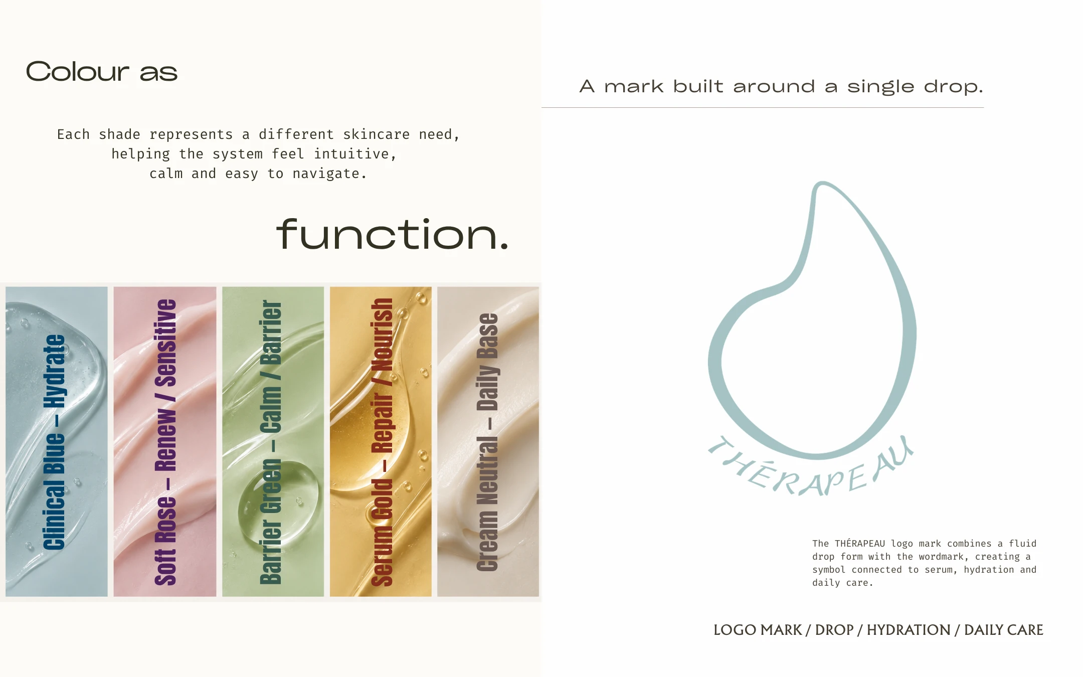
Colour helps organise the range by skincare need, making the system easier to understand at a glance. The drop-inspired logo mark reinforces the connection to serum, hydration and daily care while keeping the identity simple and recognisable.
04 — Wordmark & Texture Exploration
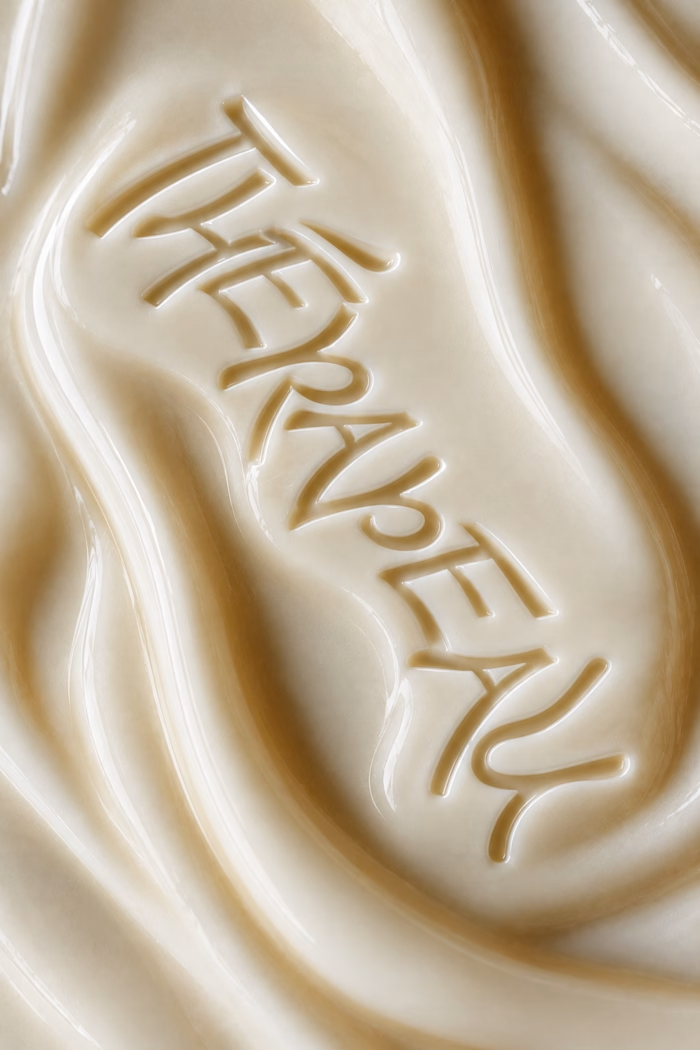
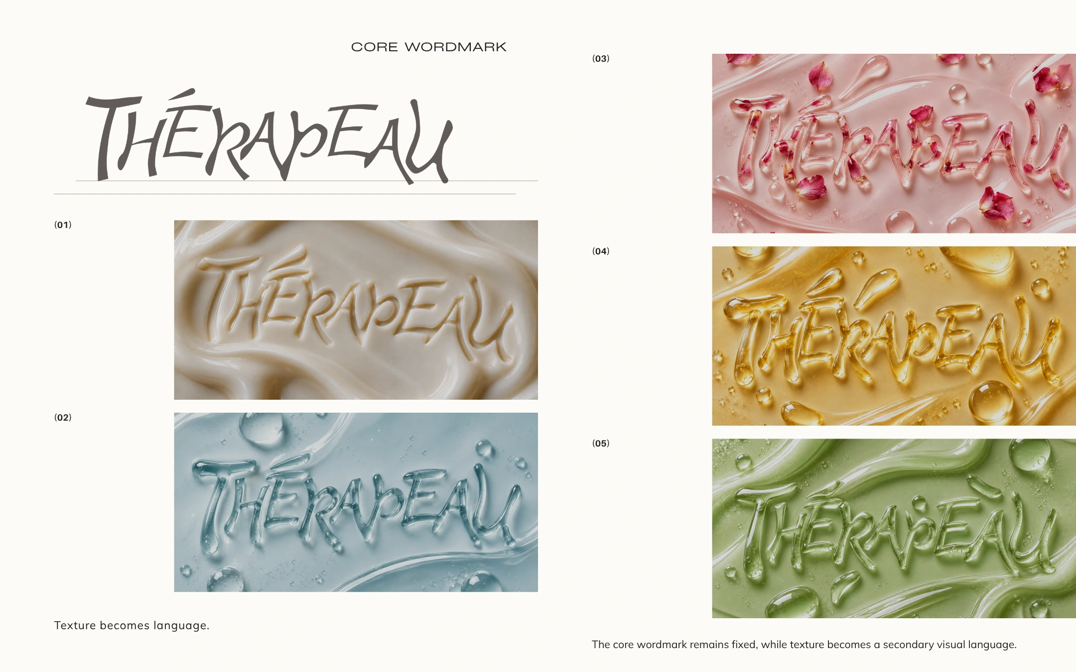
The core wordmark remains fixed, while texture becomes a secondary visual language. Serum, gel and cream were explored as material expressions of the identity, allowing the typography to feel more tactile, fluid and connected to the product itself.
05 — Packaging System
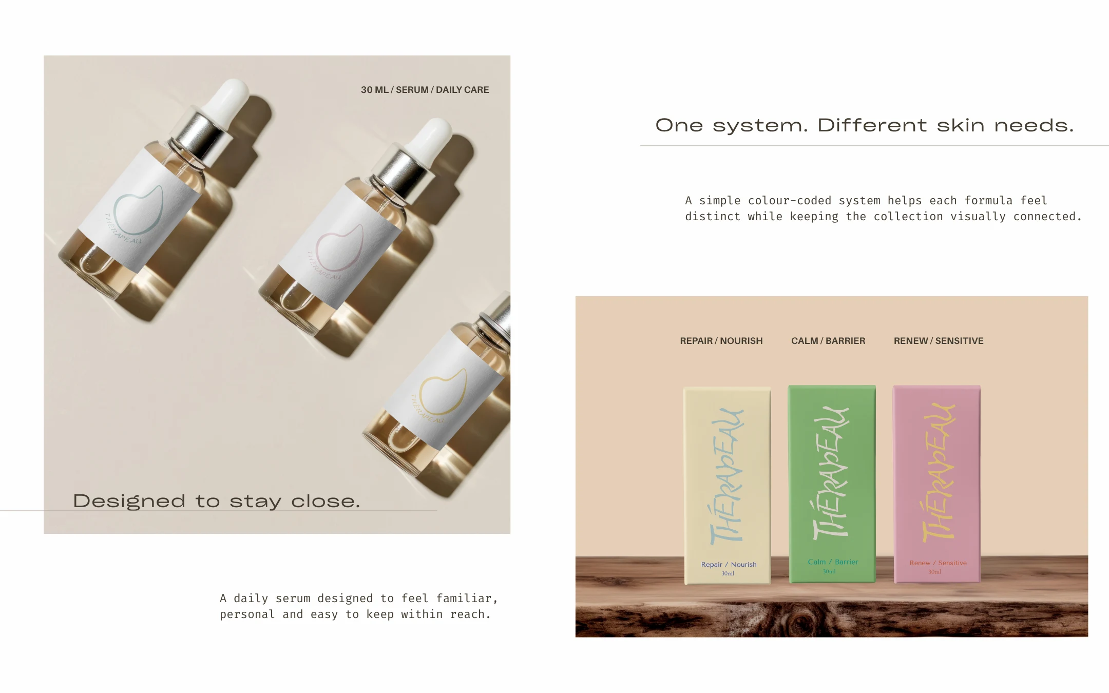
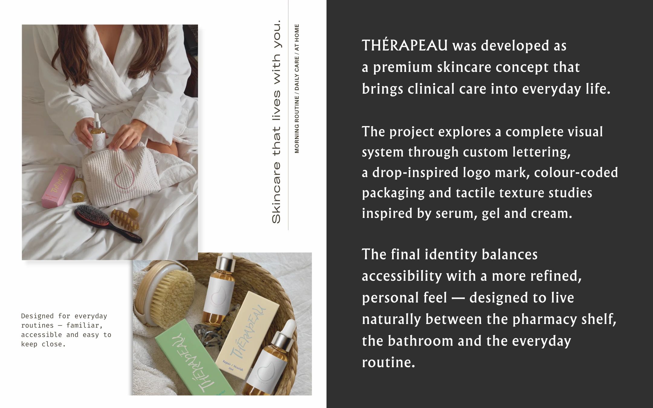
The packaging was developed as one connected system with different colour-coded treatments for each skincare need. The serum bottles and outer packaging share the same visual structure, creating consistency while keeping each product easy to distinguish.
06 — Everyday Use
The final identity was designed to move naturally into everyday routines. From the bathroom to the pharmacy shelf, THÉRAPEAU balances accessibility, functionality and a more personal, tactile skincare experience.
Like this project
Posted Oct 12, 2026
Created brand identity and packaging design for THÉRAPEAU.