REA SKIN | Brand Identity & Packaging Design
yara ashkar
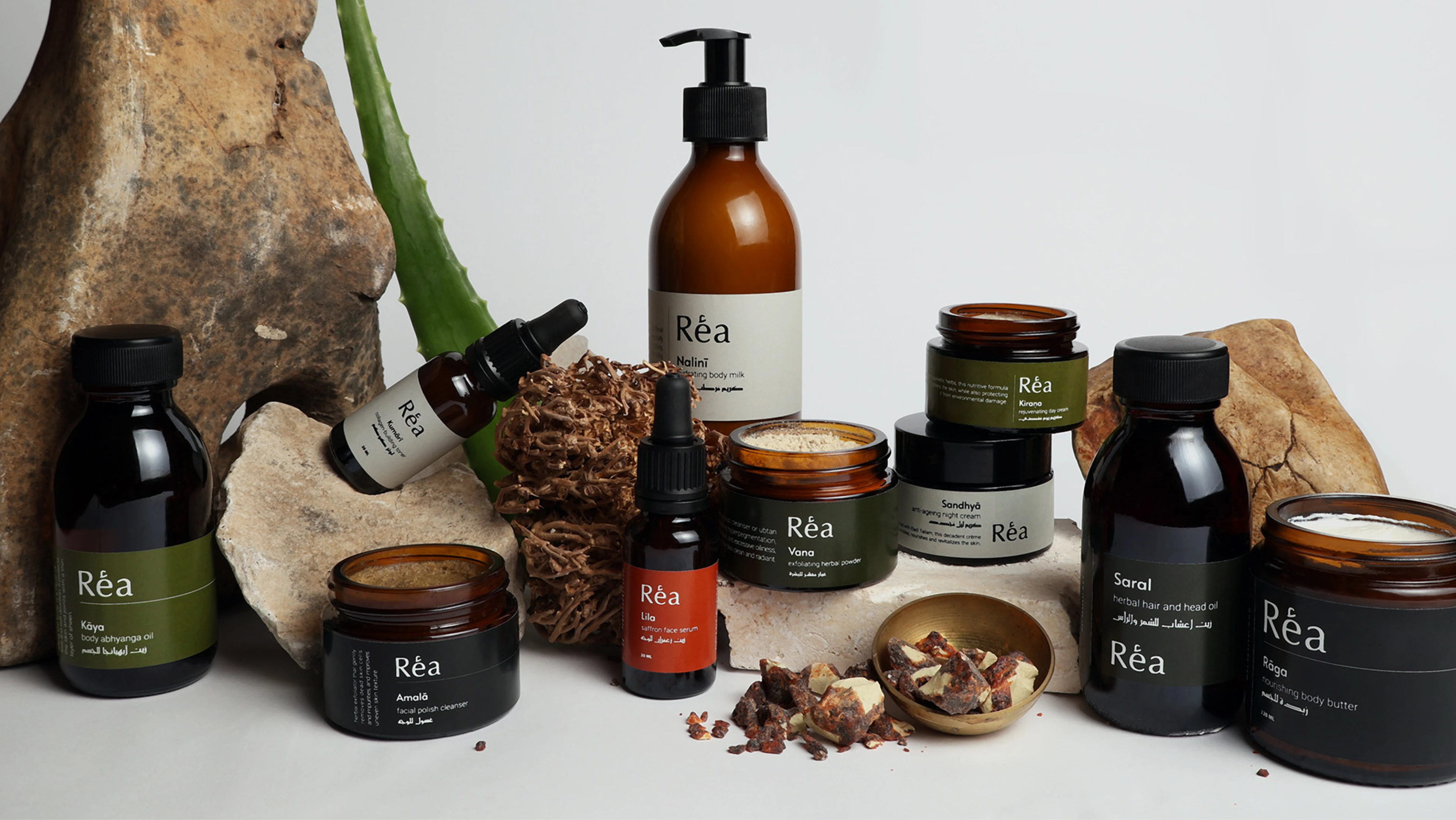
REA SKIN offers a modern take on Ayurvedic skincare, blending ancient wisdom with elegant simplicity. The line consists of ten products designed to tackle common issues in the natural skincare world, like greasiness, strong unpleasant scents, and complicated use, by delivering clean, lightweight, and effective formulas. Designed for ease and balance, REA SKIN makes effective natural skincare that is accessible and luxurious.
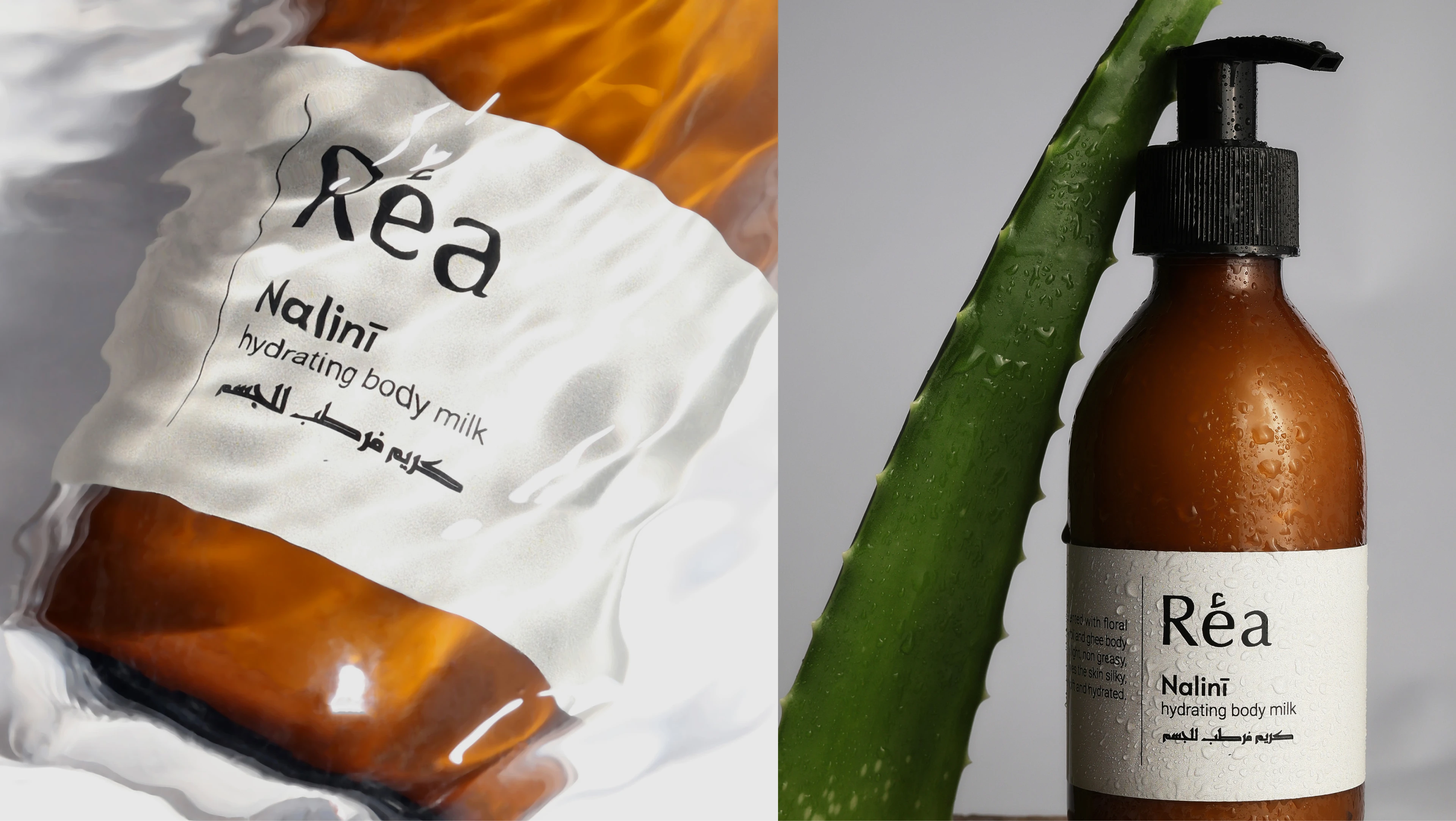
Nalini | Body Milk
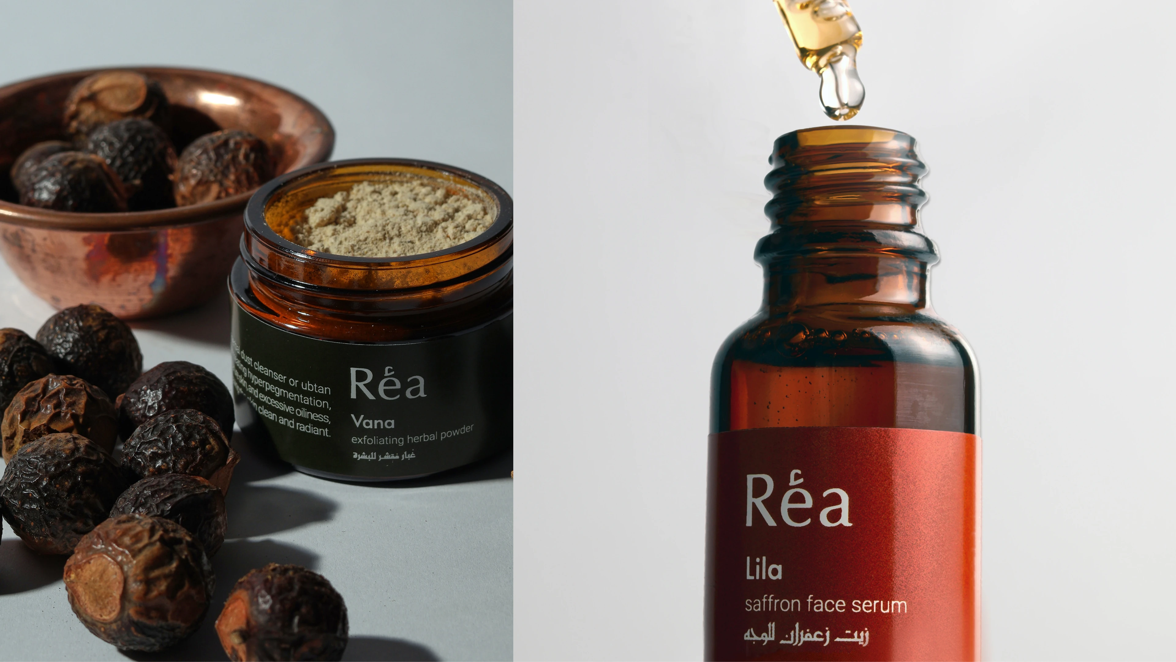
Vana Facial Dust, Lila Serum
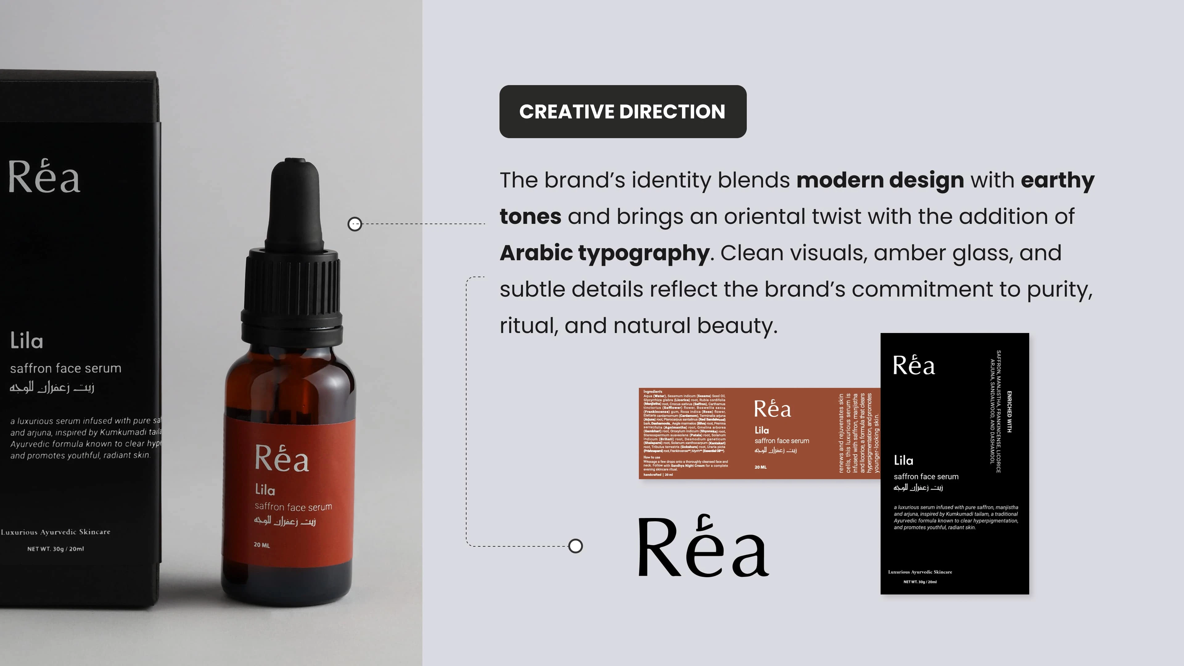
Creative Direction & Brand Identity
The brand identity is rooted in simplicity, tradition, and earthiness. Drawing inspiration from Ayurveda and traditional medicine, the visual language is clean and understated, allowing the authenticity of the products to shine. The color palette of warm ochres, deep greens, and rich clay, evokes the natural origins of each ingredient. Typography blends modern minimalism with cultural nuance, elegantly pairing English and Arabic scripts to reflect a bridge between heritage and contemporary self-care. REA’s creative direction embraces a grounded yet elevated aesthetic, where every detail from amber glass bottles to the spacious, intentional layout tells a story of purity, ritual, and timeless beauty.
Branding
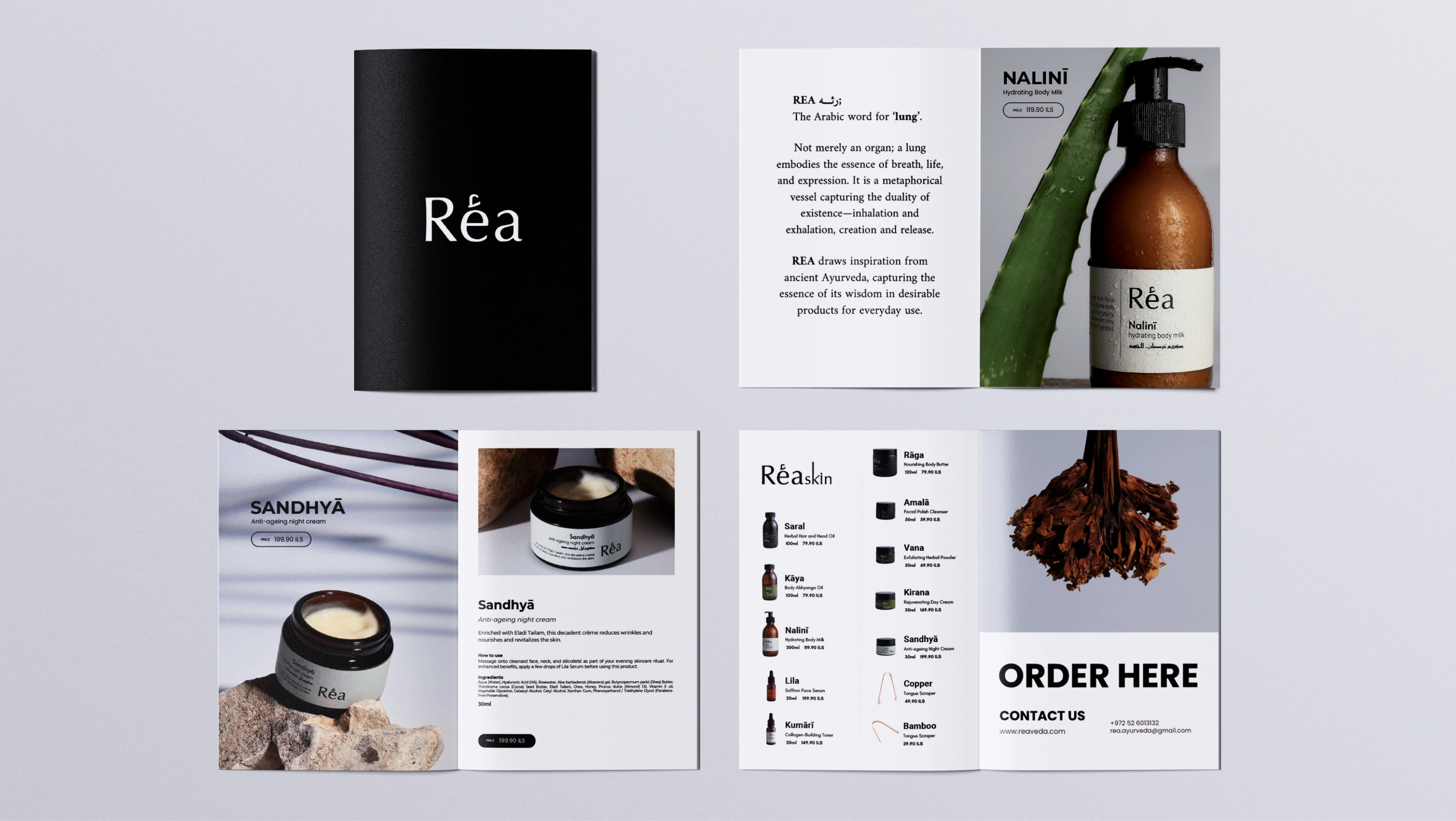
Product Catalog
Like this project
Posted Jun 30, 2025
Developed brand identity for REA SKIN, blending Ayurvedic tradition with modern aesthetics.
Likes
1
Views
10
Timeline
Jul 23, 2024 - Nov 20, 2024