Navigating Clutter to Clarity: A New Homepage for Teachoo
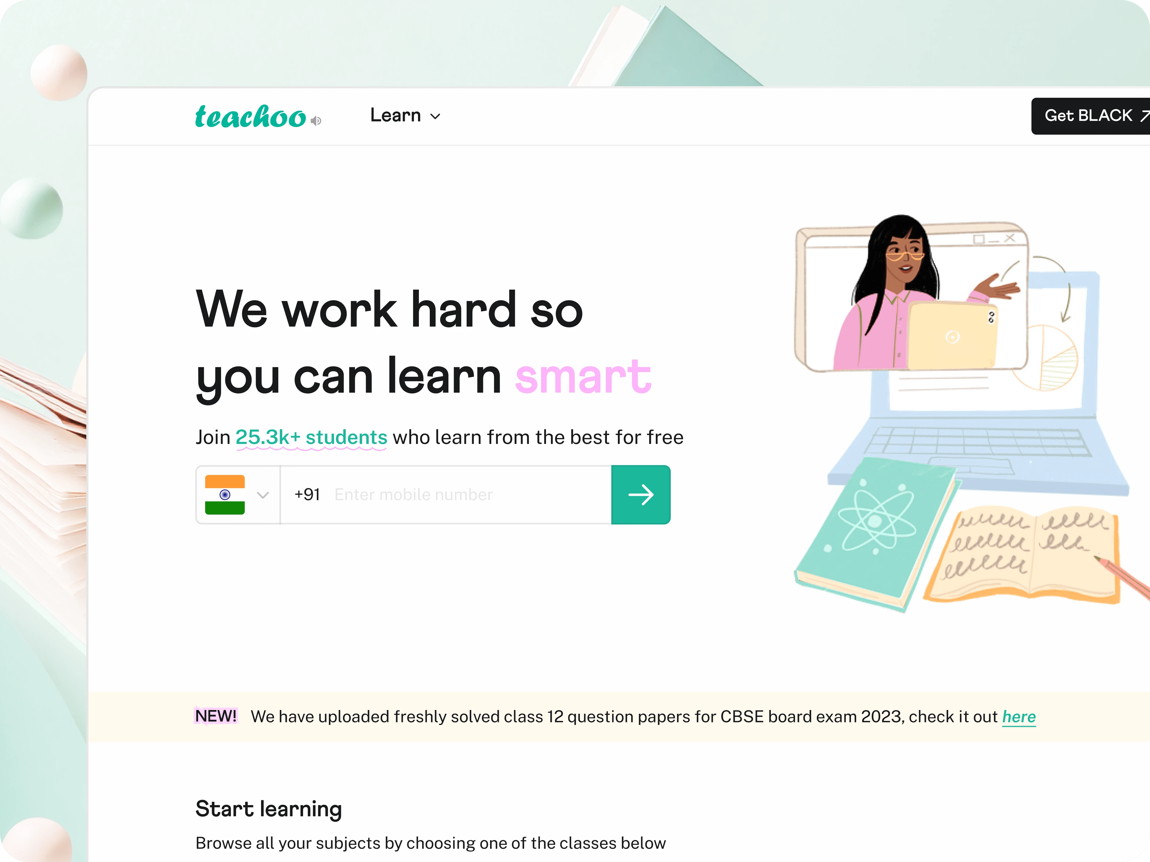
A snapshot of the freshly designed homepage
Teachoo is an online learning platform that offers comprehensive K-12 courses spanning subjects like Maths, Science and English; it also provides specialized training for Accounts and Finance professionals across India.
A homepage serves as a visual narrative, communicating the brand's value proposition and setting the tone for users to interact with the offered content or services.
But here's the catch – Teachoo's existing homepage was a bit messy. The cluttered design made it tricky for users to find important information, impacting sign-ups. With a new subscription model under way, the old homepage fell short. I served as solo designer on the team, constantly teaming up with the co-founders, the developer, and users throughout this project.
State of existing homepage with poor informational hierarchy and visual balance
Research & Discovery
An in-depth heuristic evaluation coupled with discussions with existing Teachoo users, uncovered a bunch of issues impacting the UX on the homepage. Following are some key insights:
A lack of proper hierarchy in the content made it challenging for users to comprehend the structure and locate information easily.
Without a compelling CTA, users kept dropping off after scrolling for some time - impacting both usability and engagement.
Users anticipate the search bar to query internal content, and the absence of a search API hindered users from efficiently obtaining relevant information, causing confusion and frustration.
Users, especially during critical times like board exams, seek easily accessible resources. Teachoo rolls out fresh content during these times but there was no clear way to discover these.
The homepage fell short in letting users know about its paid courses in Accounting & Finance. Clear and concise communication is crucial for users to understand the offerings and make informed decisions.
The low signup rate reflects a lack of persuasive design elements and cues on the homepage, failing to tap into psychological triggers like perceived value.
Brainstorming
Understanding Goals
Teachoo's mission is to be the go-to hub for learning. We delved into user challenges through card sorting, honing in on three key goals for the redesign:
Simplify user flow for efficient navigation
Align the page with evolving business goals
Minimize user uncertainty and reduce bounce rates caused by confusion
Refining Site Structure
Tackling the messy homepage navigation could fix a big chunk of our problems. We assessed the current structure of the page. Working closely with the key stakeholders and keeping insights collected from users in mind, we mapped out our priorities and rearranged elements. This resulted in a fresh IA that made way more sense for our users.
Defining Design Principles
With a good foundation in place, now, it was all about putting our plans into action and making things happen. We nailed down some visual principles to make sure our designs were cohesive and on point.

Inspiration & Explorations
Keeping the defined principles in mind, we checked out what other products were up to and tried to identify what elements were making their landing page experience pop, how they were structuring their content and boom! - we now had a fun moodboard going. Oh, and yeah, it is important to note that the moodboard keeps evolving throughout the design phase.
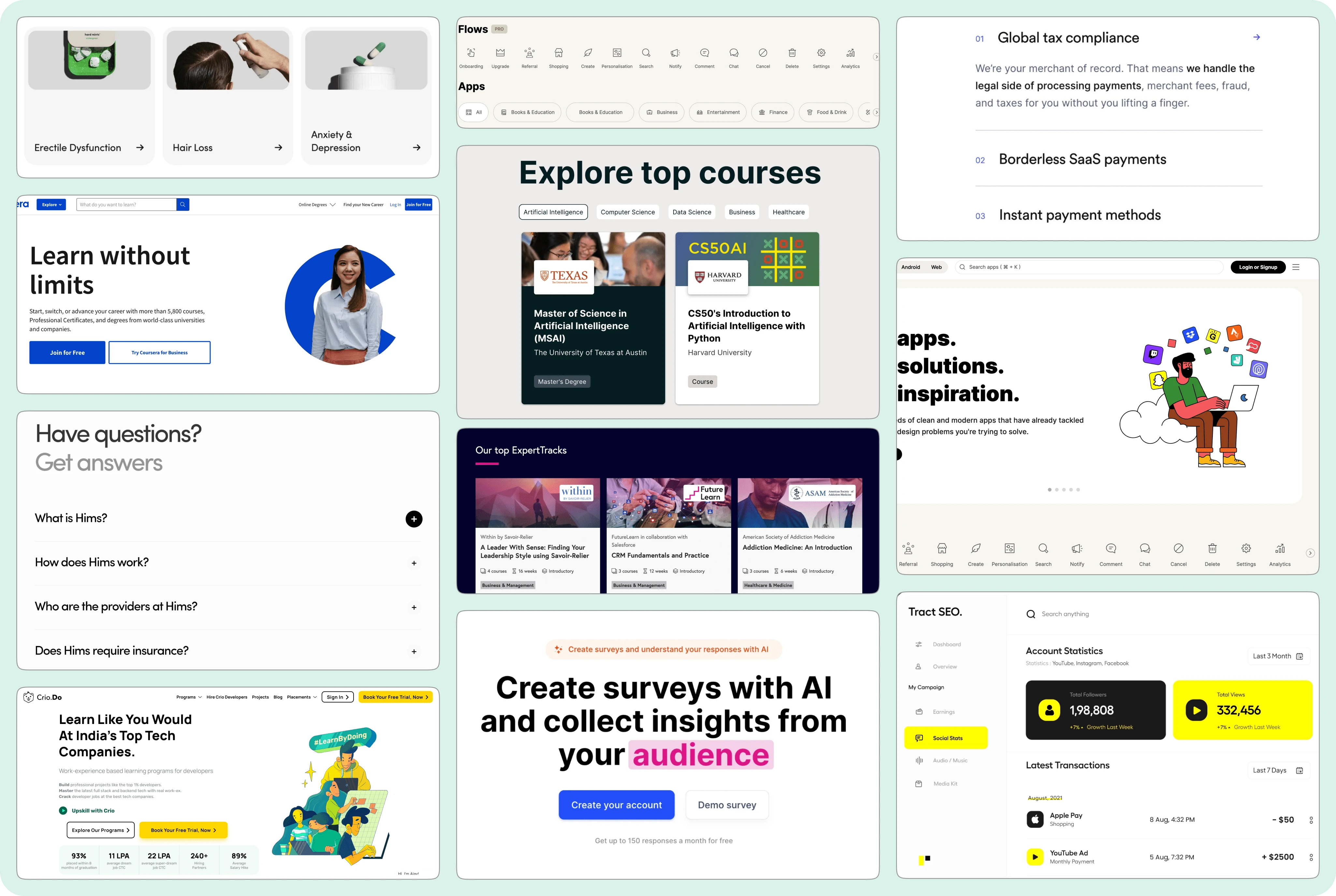
A sneak peek of the moodboard from one of the later iterations
We sectioned off the website and played around with different layouts in order to establish proper hierarchy between elements.
The New Experience
A prototype showcasing Teachoo's fresh new homepage look
Impact
Increased average session duration by 11% through streamlined navigation
Noticed a significant boost in user signups, contributing positively to our goals
Users reported a clear reduction in confusion, indicating the success of design choices in minimizing chaos
Clear communication of paid courses increased user awareness and interest
Learnings & Reflection
Thoroughly document your design decisions during each iteration. That way, you can always backtrack and recall why you ditched a certain design/iteration.
Being the sole UX designer can amplify the weight of your workload. Validating designs and finding the best solution can be very time-consuming. To streamline the process, it's crucial to prioritize tasks based on the importance of a feature.
Rapid iterations are key when working in fast-paced environments, particularly when key stakeholders have limited UX awareness. Pro tip: Sketching out your ideas on paper is far more convincing than drowning in lengthy discussions on ideas and approaches.
Like this project
Posted Dec 11, 2023
A visual upgrade for an edtech startup to elevate the online learning experience
Likes
0
Views
125

