Sukoon Brand identity design
Aakash Malhotra
SUKOON LOGO ANIMATION
Sukoon Kahani (Story)
The brand started humbly as a page on Instagram. On a mission to derive creativity by spreading joy during the lockdown. “You can get everything in life you want if you will just help enough other people get what they want.” Helping people stay motivated and engage in creative thinking! Spark creativity, learn to help others, and connect with their loved ones.
We kept going forward with our mission to spread motivation and engage people with poetry and quotes. “Inspiration does exist, but it must find you working.” Working day-night to build the brand's roots by being consistent and creative.
The brand's ability to engage people in creative ideas has been keen to reflect the image into the Brand's Identity that represents it on every label and packaging.
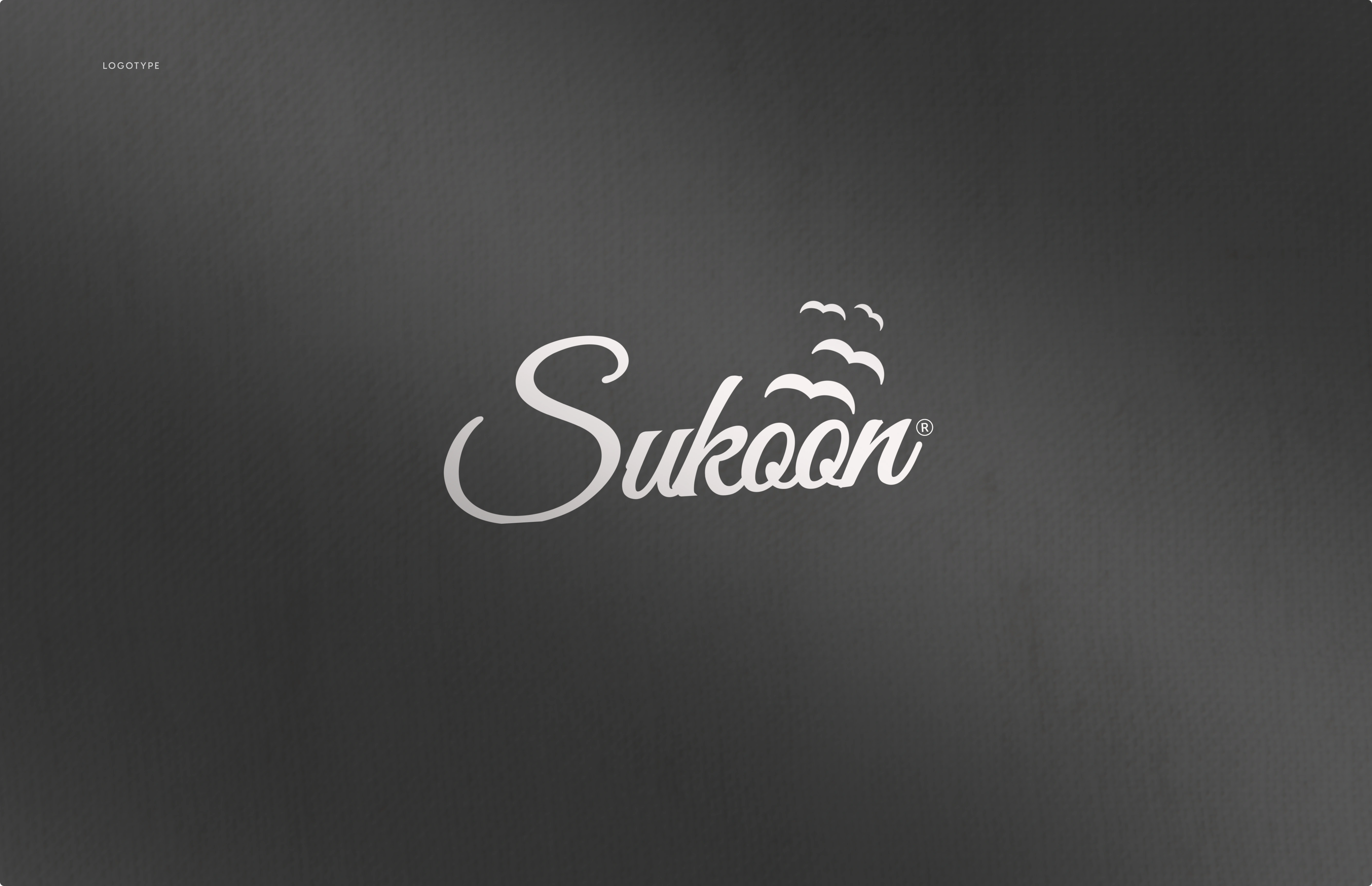
The word "Sukoon" is an emotion of peace the bliss when you don't feel any fear. Just comfort and calm in the heart of the brand, we made it possible to identify the brand with the same feelings and it reflects in the Logo perfectly.
LOGOMARK

BRANDMARK

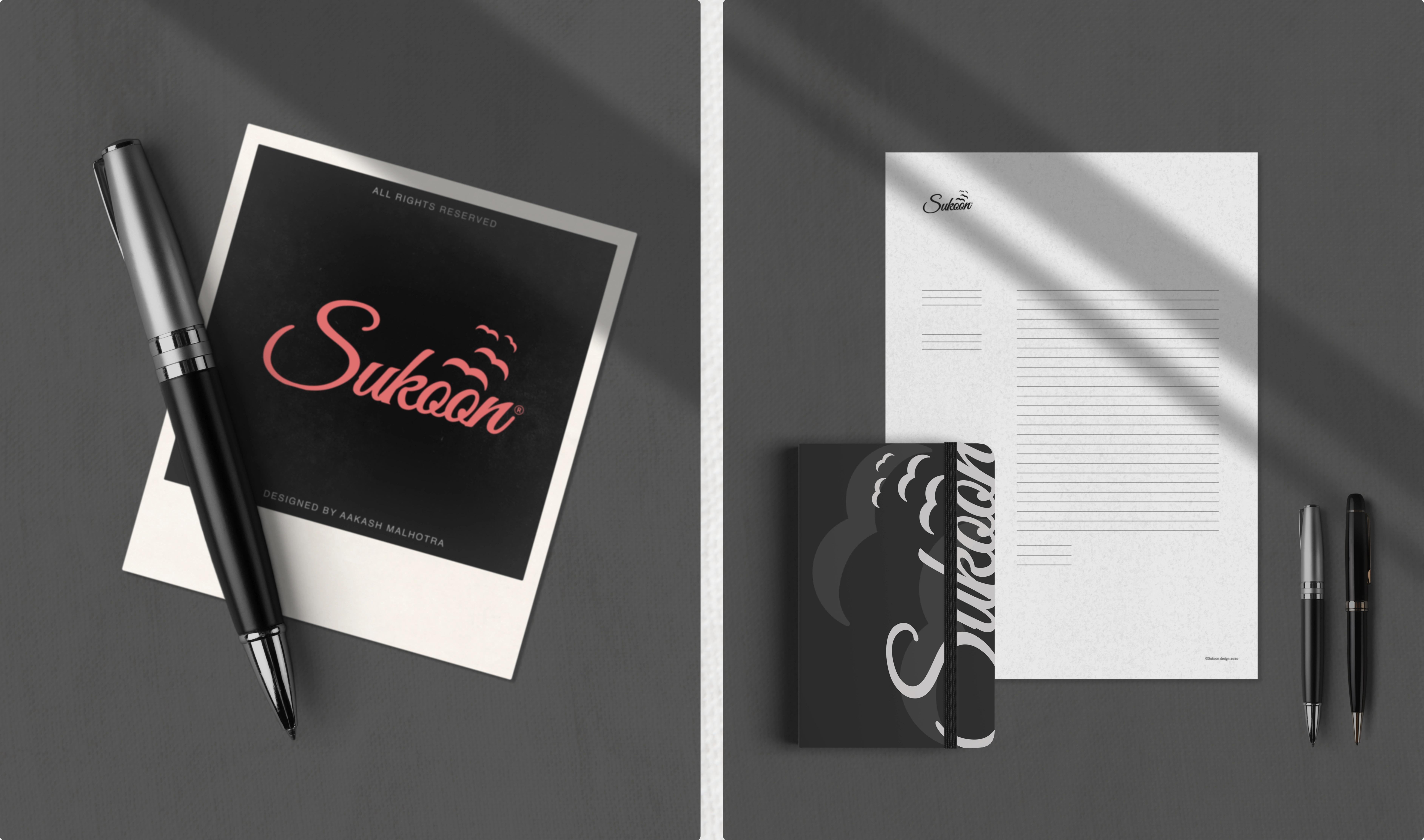
STATIONERY (PHOTOREAL MOCKUP)
That was through drawing and designing the letters of the logo in a way inspired by the integrated emotional experience, starting from the sun reflected in the letter 'S', the water point by which it's flowing showed in the logo, to the packaging, shipping, and export of products. So that we have a logo with connected letters that indicate the company’s connection to nature and its ability to communicate and tell a story.
The connection of letters to each other results in curves that resemble waves that are formed in the ocean, showing a scene of sunset and the emotion of calmness. All in a diagonal line that creates a sense of calm, relax, and joy.

SUKOON BANNER LARGE
Sukoon is a Hindi word that refers to peace and relaxation. This concept inspired us with an essential pillar in our visual identity, which is the possibility of extending the logo by tweaking the letter o, which distinguishes the logo and gives it the flexibility to suit and conform to various places in our identity.
ANIMATION

PHOTOREAL MOCKUPS

STATIONERY (PRODUCT DESIGN)

PACKAGING DESIGN
SUKOON SLIDE ANIMATION
SUKOON STATIONERY MOCKUP

PHOTOREAL MOCKUPS

BUSINESS CARDS

INSTAGRAM POSTS

UI DESIGN

UI DESIGN PHOTO

MAGAZINE COVER

MAGAZINE
Thanks for watching!
Don't forget to Appreciate and or criticize!
Instagram: Aakash Malhotra (@doitaakash) | Instagram
Have a project in mind? 👉 contactaakashmal@gmail.com
Like this project
Posted Jul 9, 2023
Sukoon is a local stationery brand based in Delhi, India. We assisted Sukoon in designing the brand’s identity to effectively communicate with their prospect.