Help Center Redesign

Mariia Rymar

Help Center Redesign
Making technical information easy to find, understand, and use.
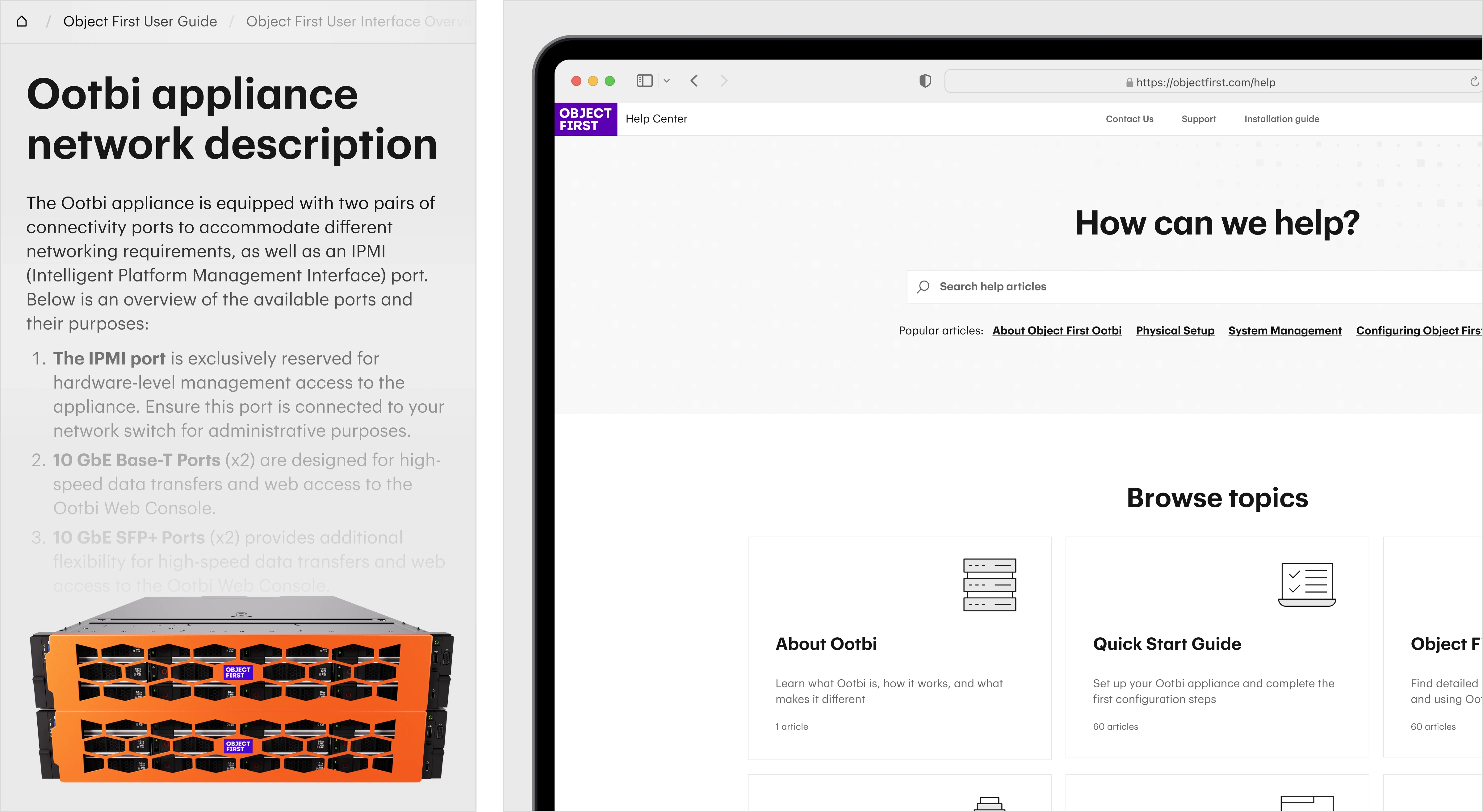
From a library of docs to an answer-finding system
The challenge was to help users find actionable answers faster, with less effort
Users struggled with finding information quickly:
Too much effort between question and answer.
Too many steps to reach the right information.
Complex hierarchy made relevant content hard to find.
What the best help centers already do
Six leading help centers were analyzed to understand how they approach search, navigation, content structure, and answer discovery.
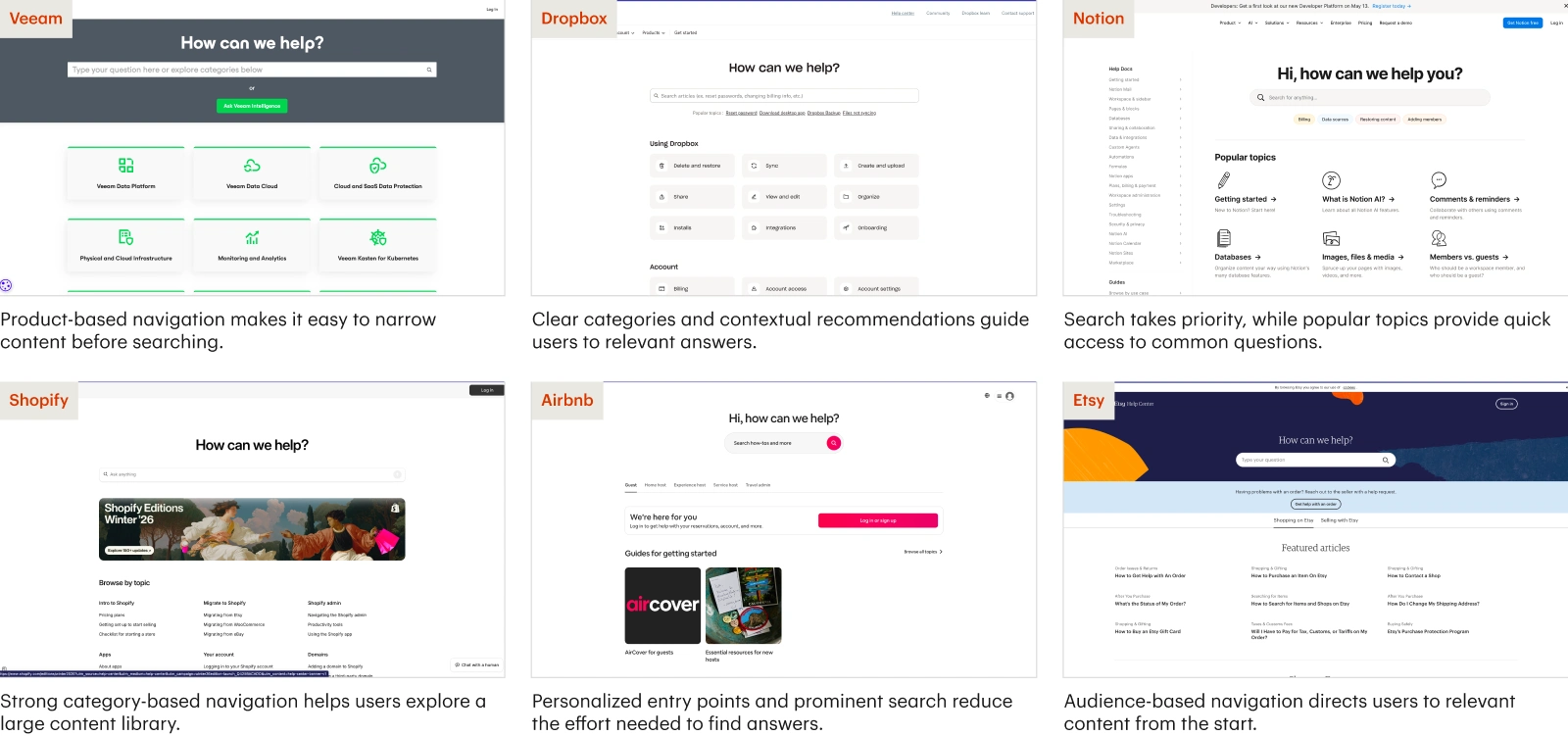
Competitor analysis
From structure to navigation iterating open
Low-fidelity wireframes helped us test content structure, navigation, and key user flows before moving into visual design.
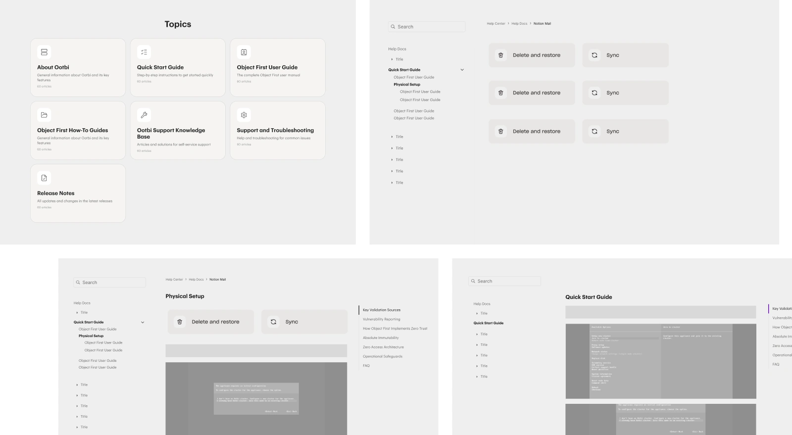
Wireframes
Numbers that confirm the redesign worked 🔥
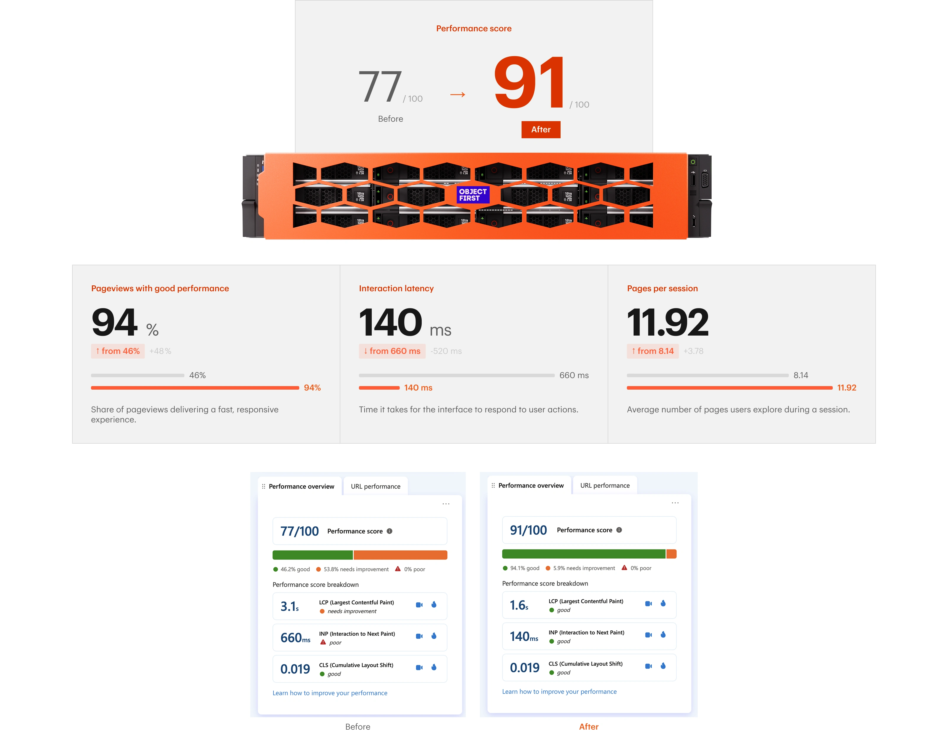
Same content - clearer experience
Before / After
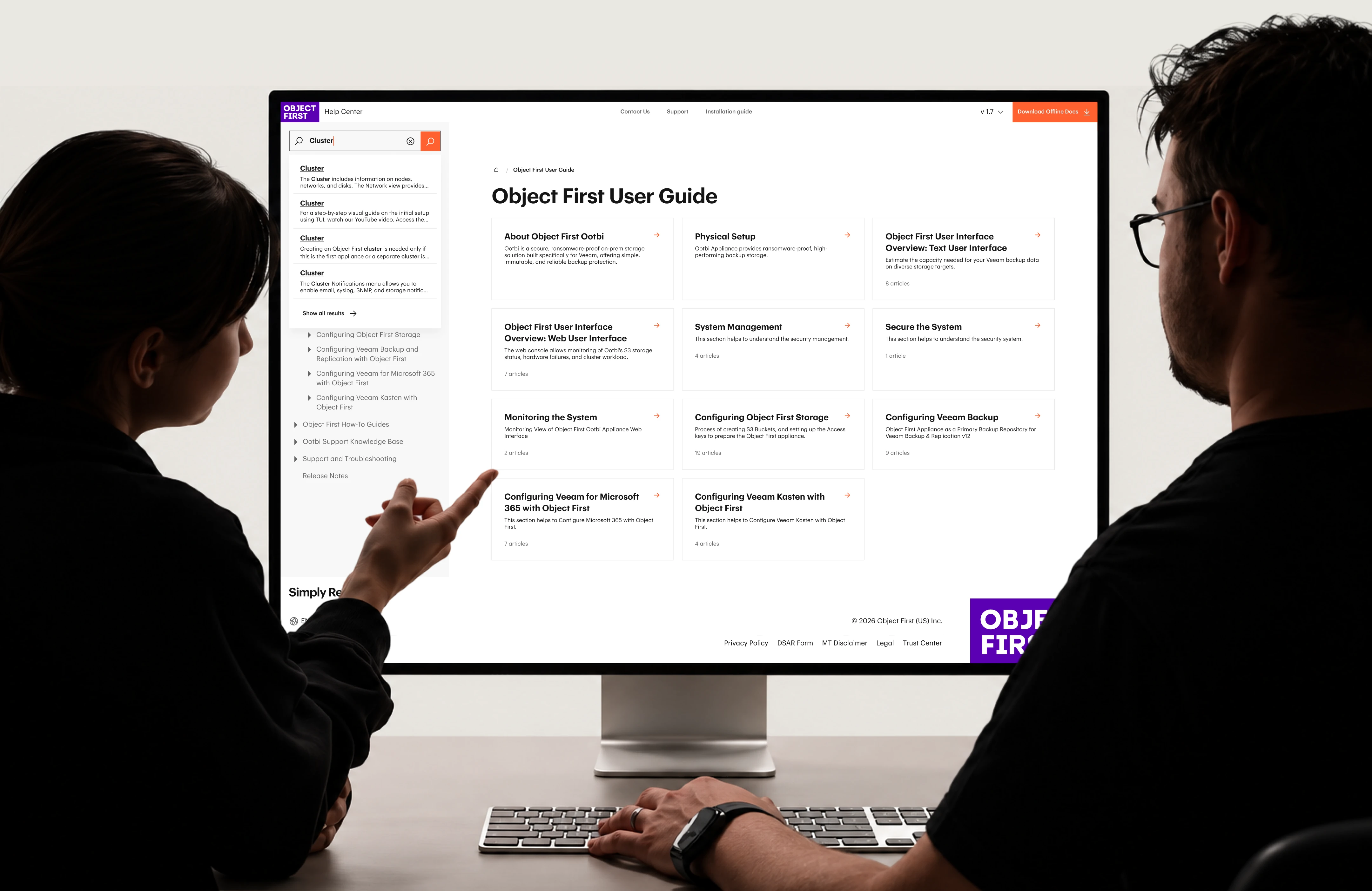
Find the right answer
Version, content type, and clear result previews help users understand what’s relevant before opening an article.
Version-aware results
Clear result context
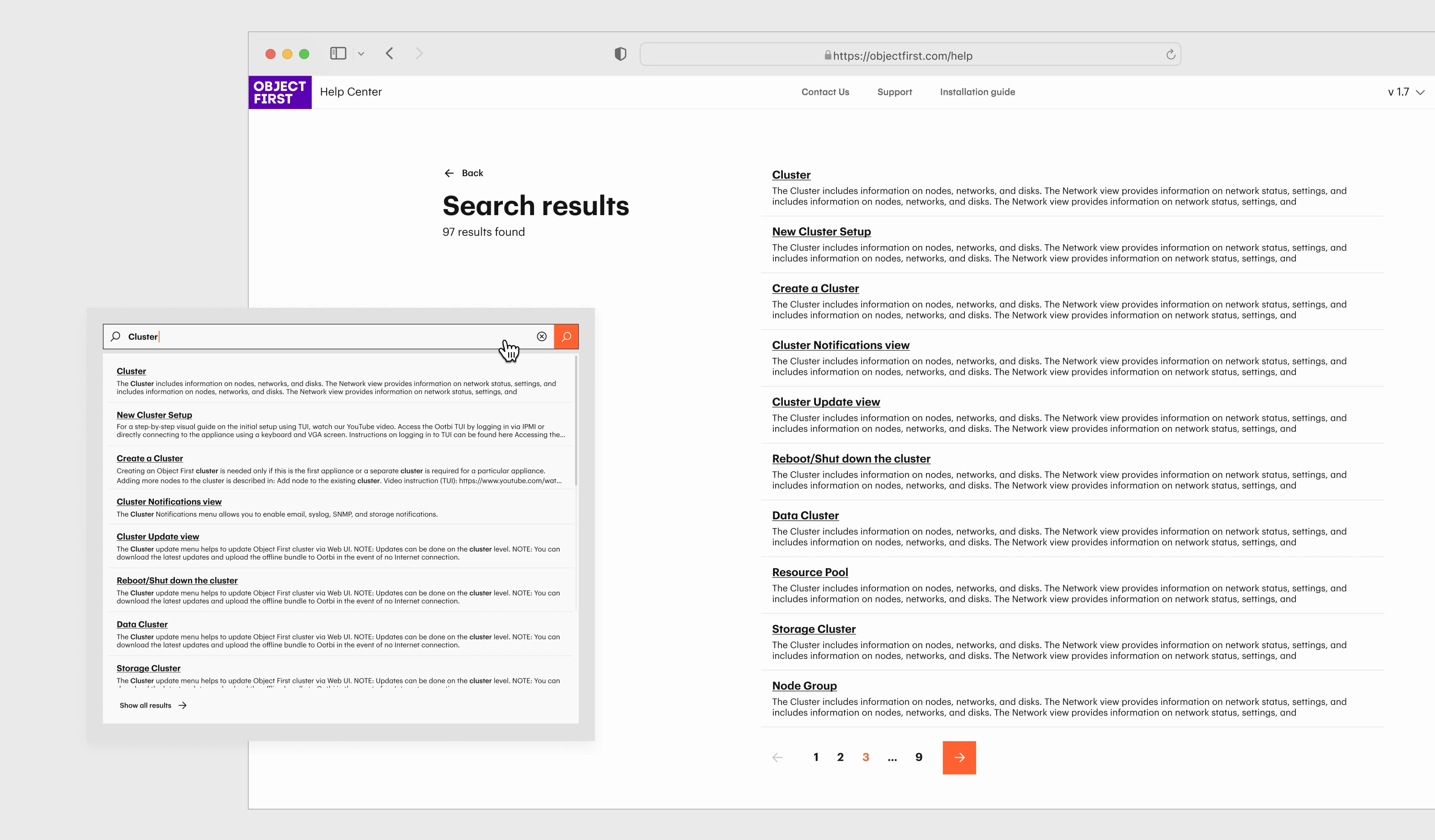
Search
A clear structure for every technical article
Each article follows the same flow: what you need, what to do, and how to solve common issues.
Article example
One system. Built for every page
Typography, color, navigation, and UI components come together as one consistent system across every article.
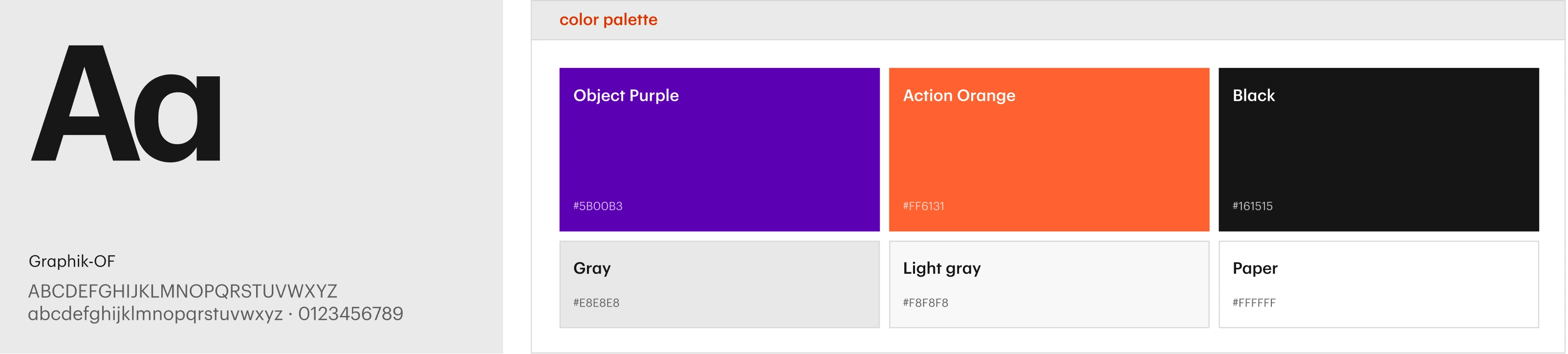
Color palette and Font
Components
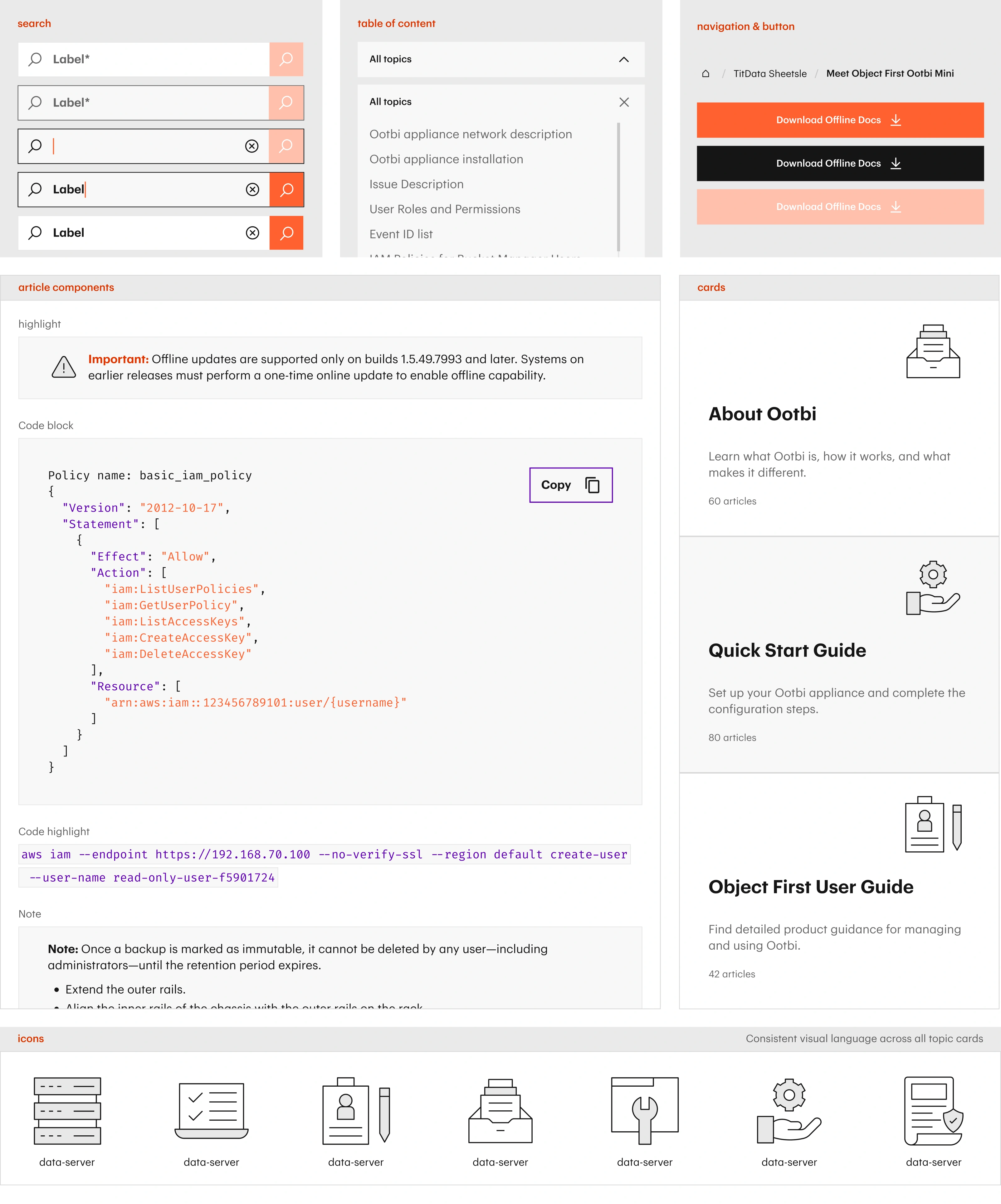
Examples of the components from the design system
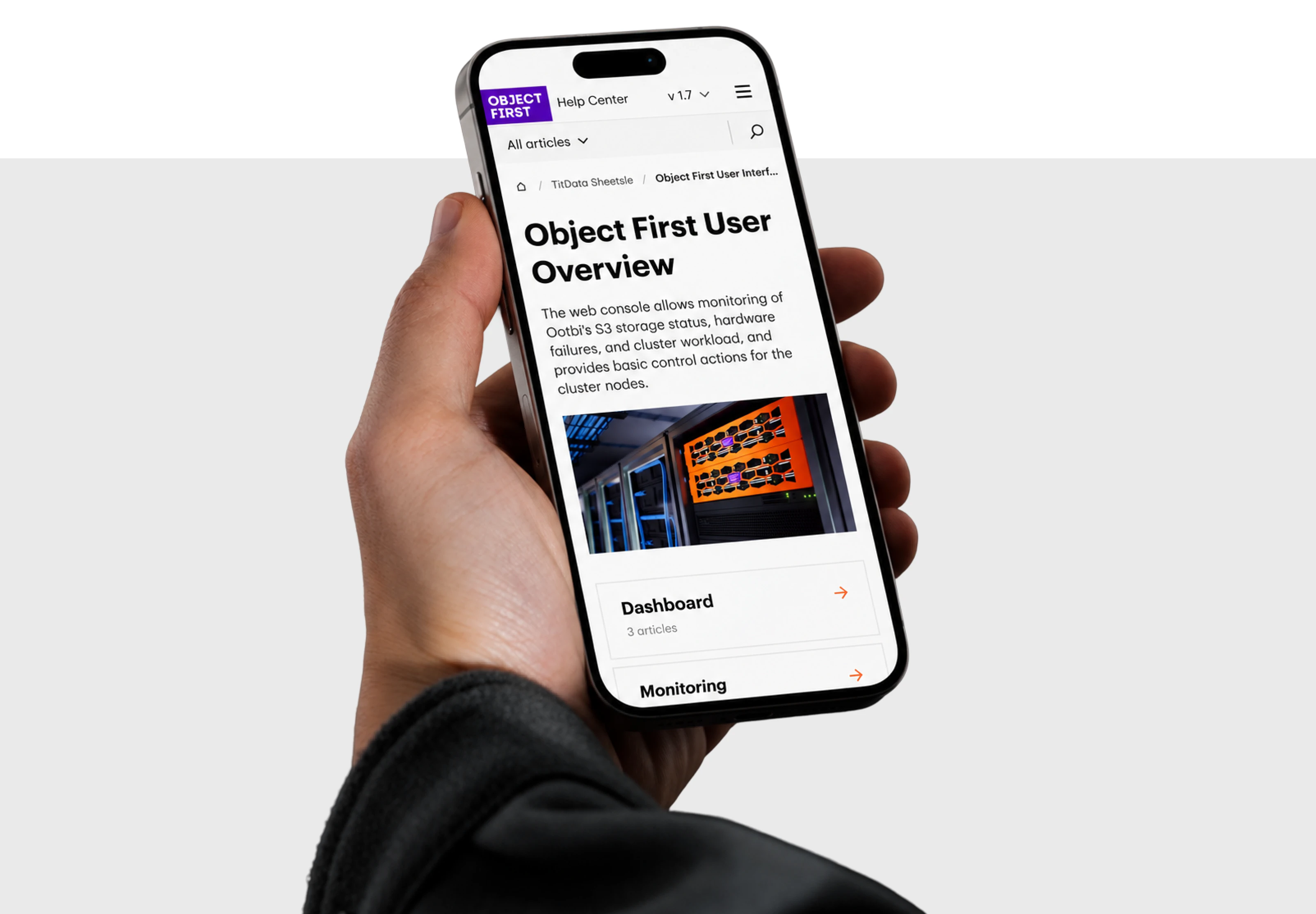
Mobile version
Like this project
Posted Oct 17, 2026
A UX/UI case study on redesigning a technical Help Center to make information easier to find, understand, and act on.
Likes
0
Views
2