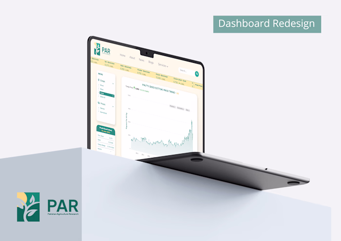
UI/UX Design: Dashboard Redesign for Agri Startup
Zainab Rizvi
Challenge
The challenge presented to me was redesigning an outdated dashboard for an agri-startup, aiming to align it with modern aesthetics while enhancing user-friendliness. Given its top-priority status, I was tasked with completing the project within a tight timeframe of 4-5 days. The dashboard's primary purpose was to display essential cotton information for the current cotton season.
My objective was to revamp the interface, ensuring it was visually appealing and easy to navigate. The focus was on organizing the cotton data in a manner that facilitated a seamless user experience. Despite the time constraints, I was committed to delivering a professional, efficient, and aesthetically pleasing dashboard that met the startup's requirements for the ongoing cotton season.
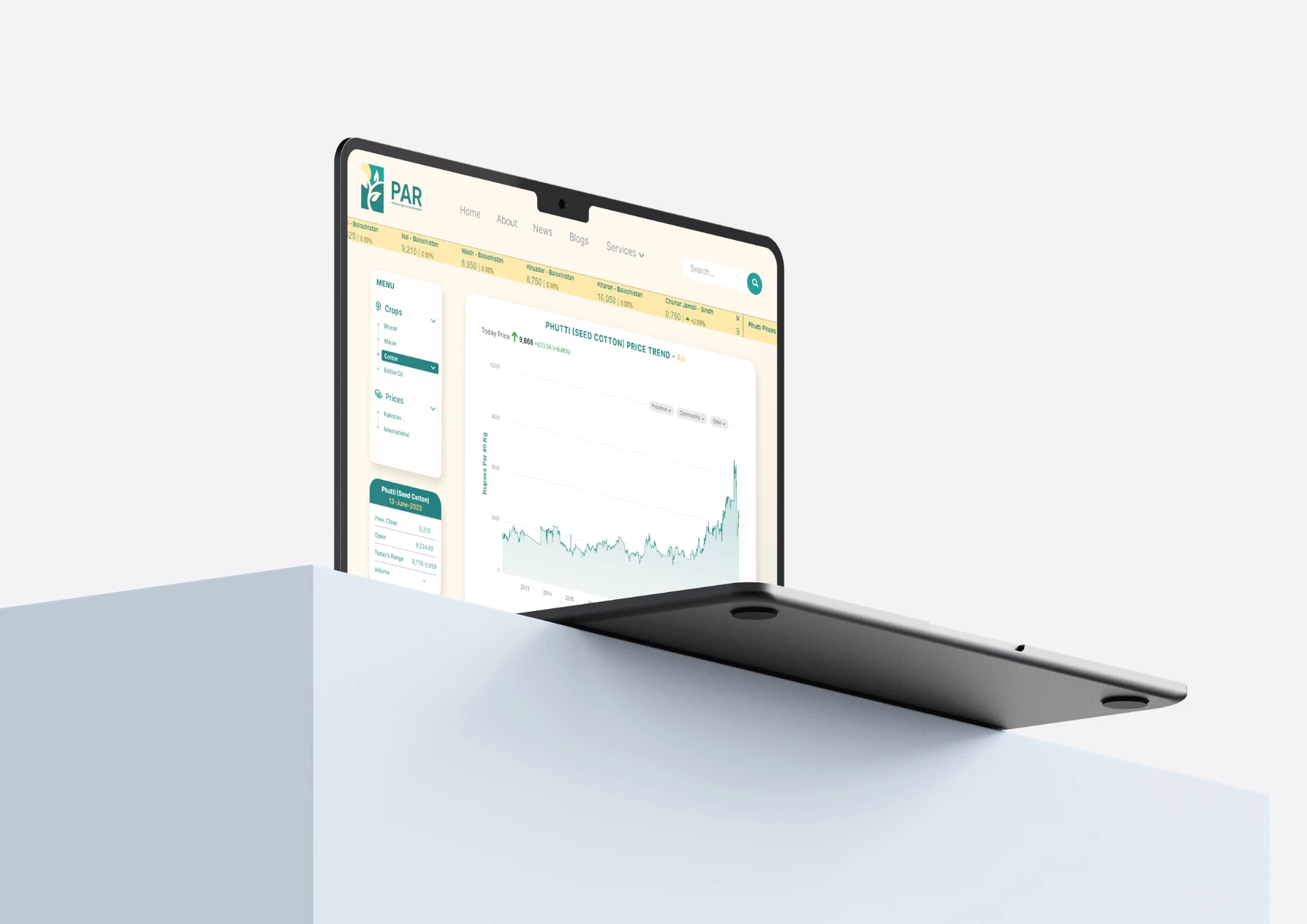
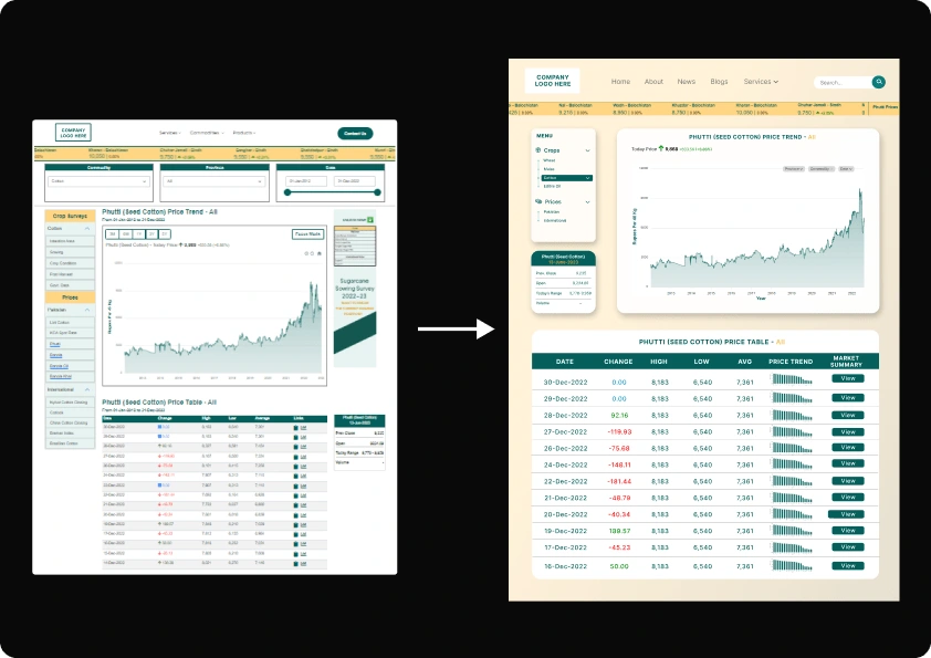
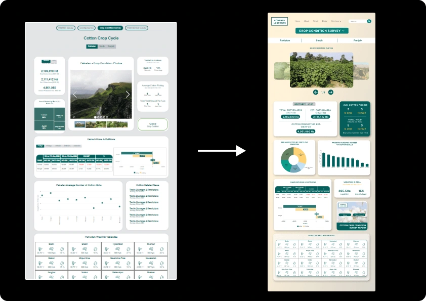
Dashboard (Before Redesigning)
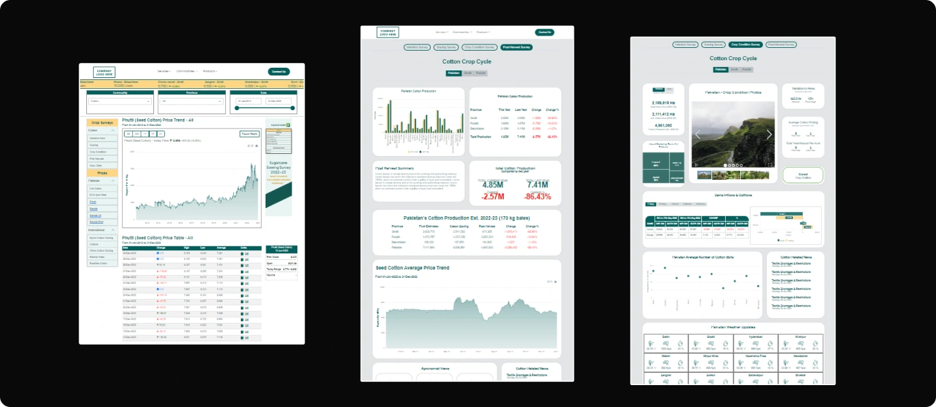
To address the challenge of redesigning the outdated dashboard for the agri-startup, I crafted a comprehensive solution that encompassed several key elements.
Modern Aesthetics: I introduced a contemporary and visually appealing design that aligned with the startup's brand identity. By incorporating their brand colors throughout the dashboard, I ensured a consistent and recognizable visual experience for users.
Typography and Sizing: I carefully selected appropriate typography that not only complemented the brand image but also enhanced readability. By using consistent font sizes and spacing, I improved the overall legibility of the dashboard's content.
User-Centric Layout: To enhance user-friendliness, I reorganized the dashboard layout, placing essential components and information prominently. A clear and intuitive navigation system allowed users to access critical data effortlessly.
Essential Components Addition: In consultation with the startup, I identified the most crucial cotton information for the current season and strategically integrated essential components to present this data effectively. Charts, graphs, and visual elements were used to display statistics and trends in a more accessible manner.
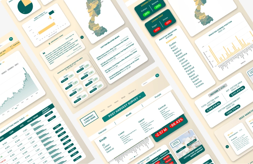
Redesigned Version Overview
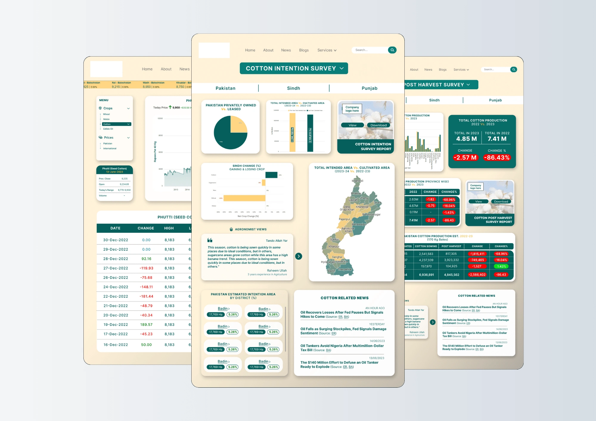
Screen-by-Screen View
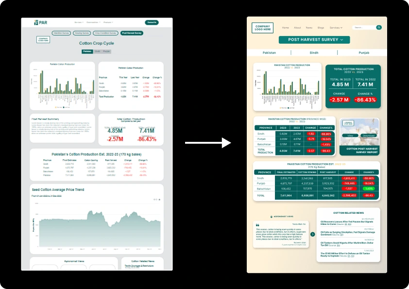
By combining these elements, I successfully delivered a modern, aesthetically pleasing, and user-friendly dashboard within the tight 4-5 day timeframe. The revamped dashboard now provides the agri-startup with an efficient tool to display critical cotton information for the ongoing season, elevating their user experience and enhancing their business operations.
Like this project
Posted Jul 15, 2024
Zainab redesigned an agricultural dashboard to enhance the user experience, resulting in easy navigitation and increased webpage conversion rates.
Likes
0
Views
24