What do you think of

Meet Khatri


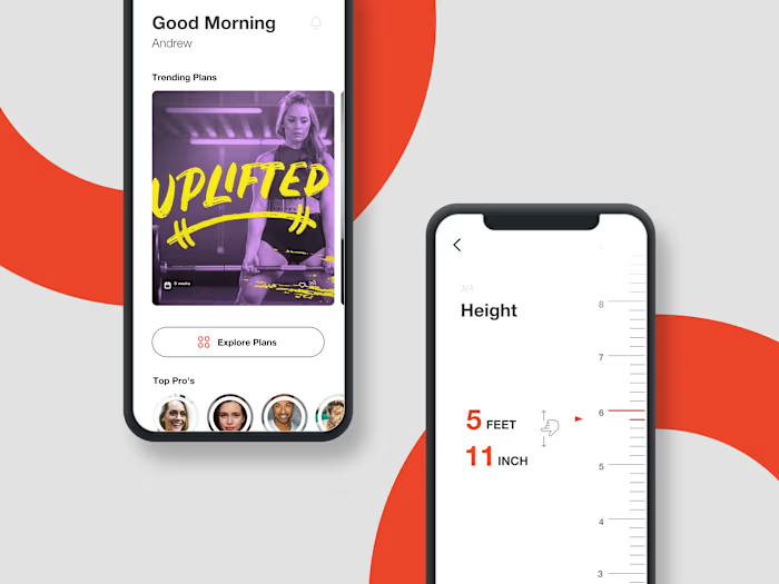
What do you think of this layout and the color palette for wellness application?
The app allows user to keep track of their mood and suggest activities based on their mood. User can talk to AI assistant coach and get help to calm themself down. I'd love to hear your feedback on the visual hierarchy, the card components, or any ideas you have to improve the overall user experience!
Like this project
Posted Jul 20, 2026
What do you think of this layout and the color palette for wellness application? The app allows user to keep track of their mood and suggest activities base...