Visual Identity Design for Hooroo.ai
Client Background
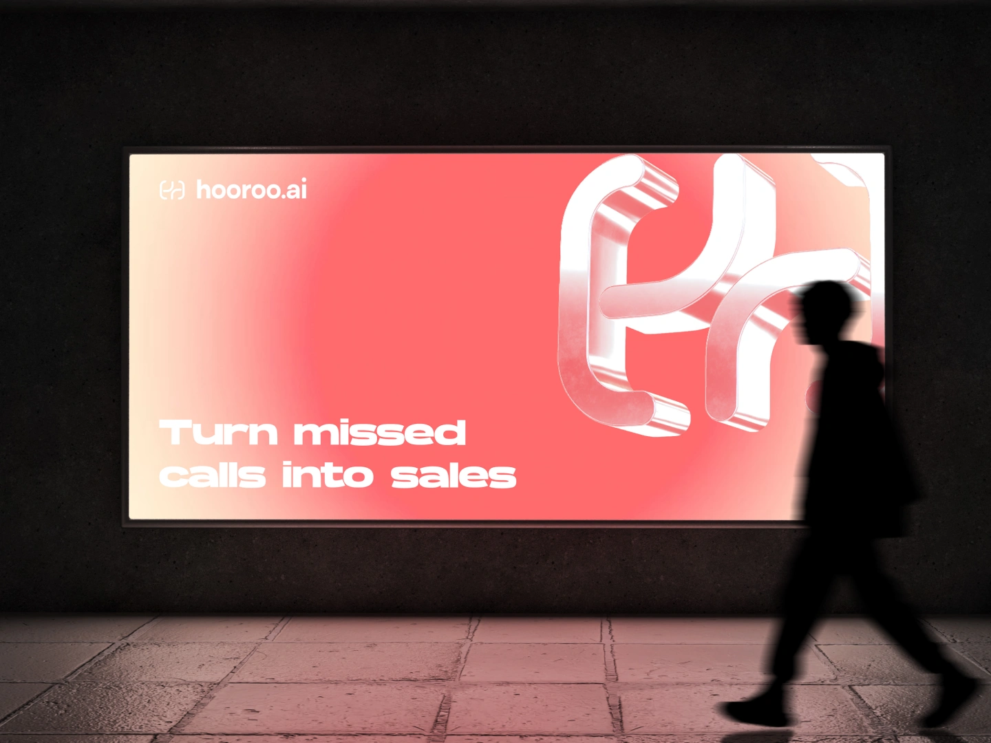
Hooroo.ai helps businesses turn missed calls into sales. They needed a visual identity that feels modern, scalable, and instantly recognizable across digital touchpoints.
Challenge
The client wanted:
A memorable symbol that works at any size
A brand system that feels energetic and tech-forward
A mark that can scale across ads, UI, merch, and motion
A look that stands out in a crowded SaaS landscape
Strategy
I focused on three principles:
Simplicity
A symbol that can be recognized in a split second. Clean geometry, smooth flow, and high usability.
Motion
Since Hooroo.ai deals with calls, follow-ups, and conversion loops, we built the mark around connection and continuity.
Scalability
The identity had to work everywhere—from a billboard to an app icon—without losing clarity.
Concept
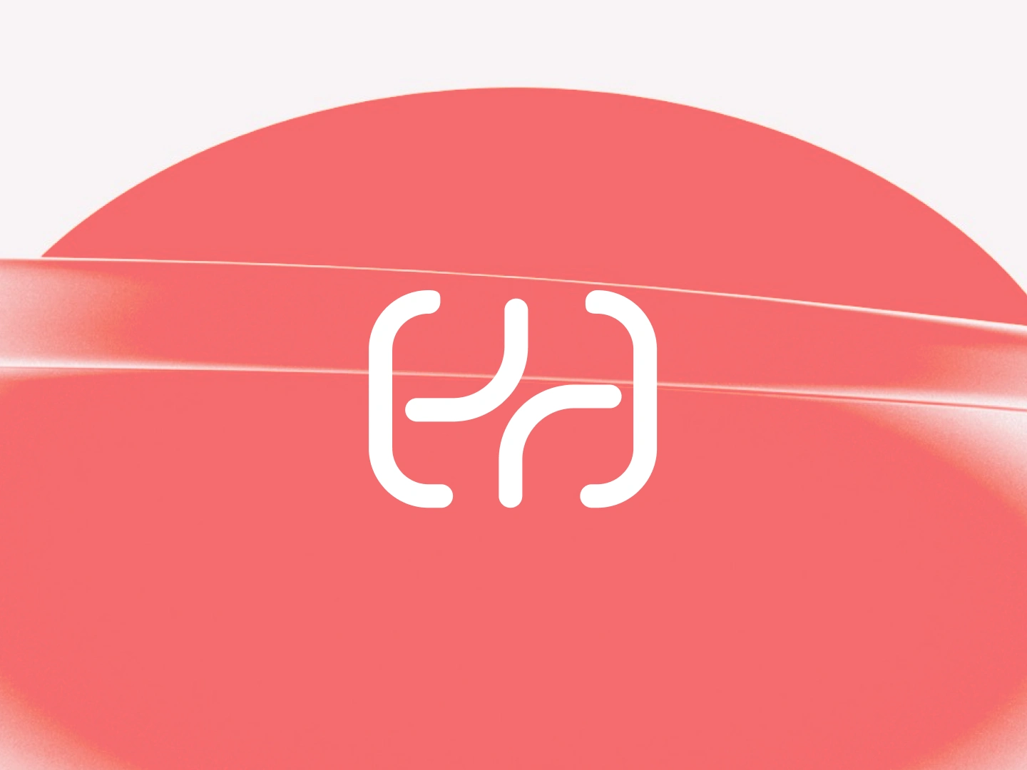
The symbol merges two ideas:
“H” for Hooroo
A looping flow that resembles call routing, follow-up cycles, and smooth communication
The final result is a flexible monogram that feels human and tech at the same time.
Execution
Color System
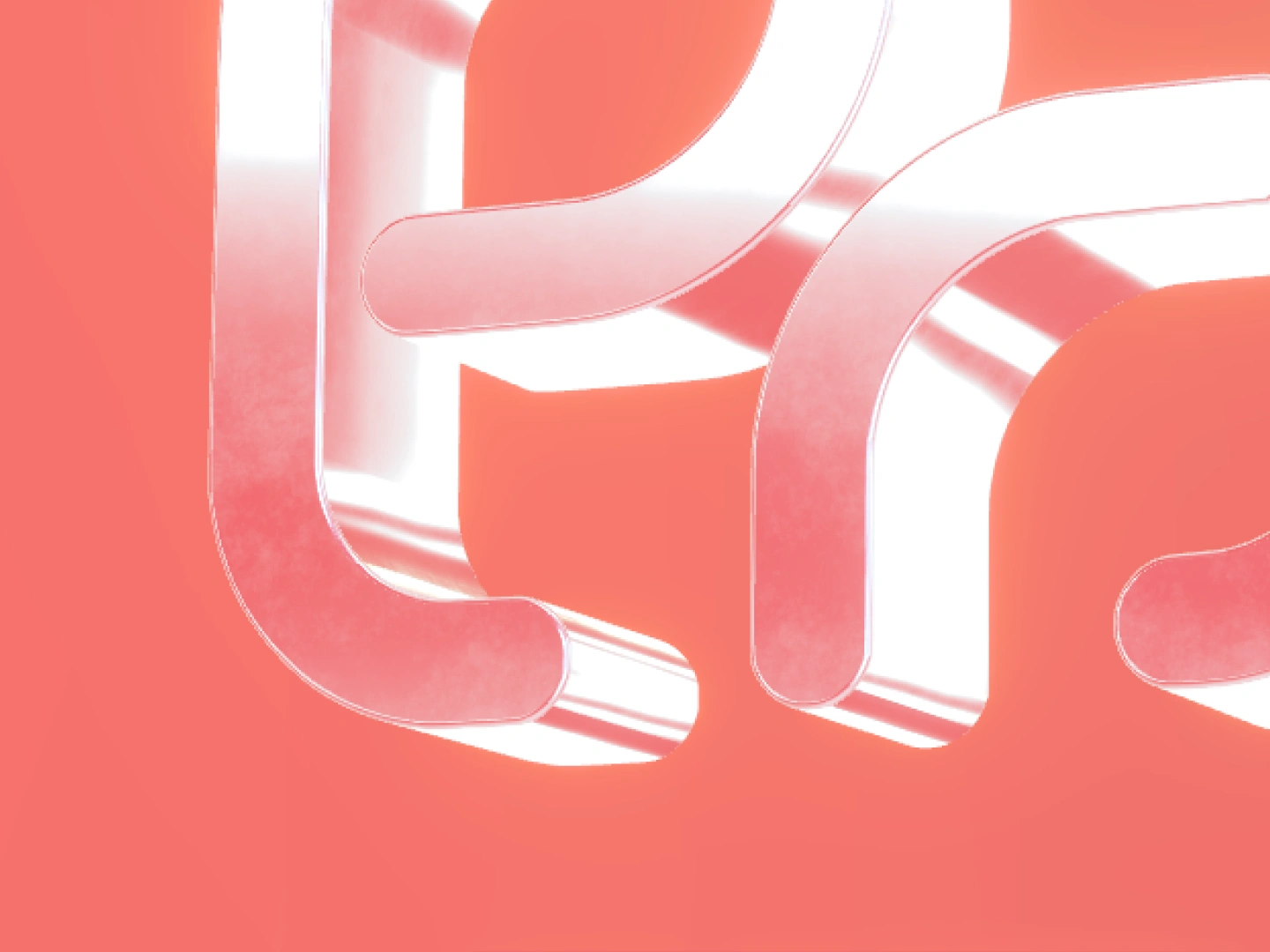
A warm coral gradient that feels inviting, modern, and high-energy. It pops in ads and UI.
Typography
Rounded, friendly type to match the softness of the symbol.
Visual Language
Soft glows and curves support the flow concept. Everything feels connected and in motion.
Applications
Billboards and OOH
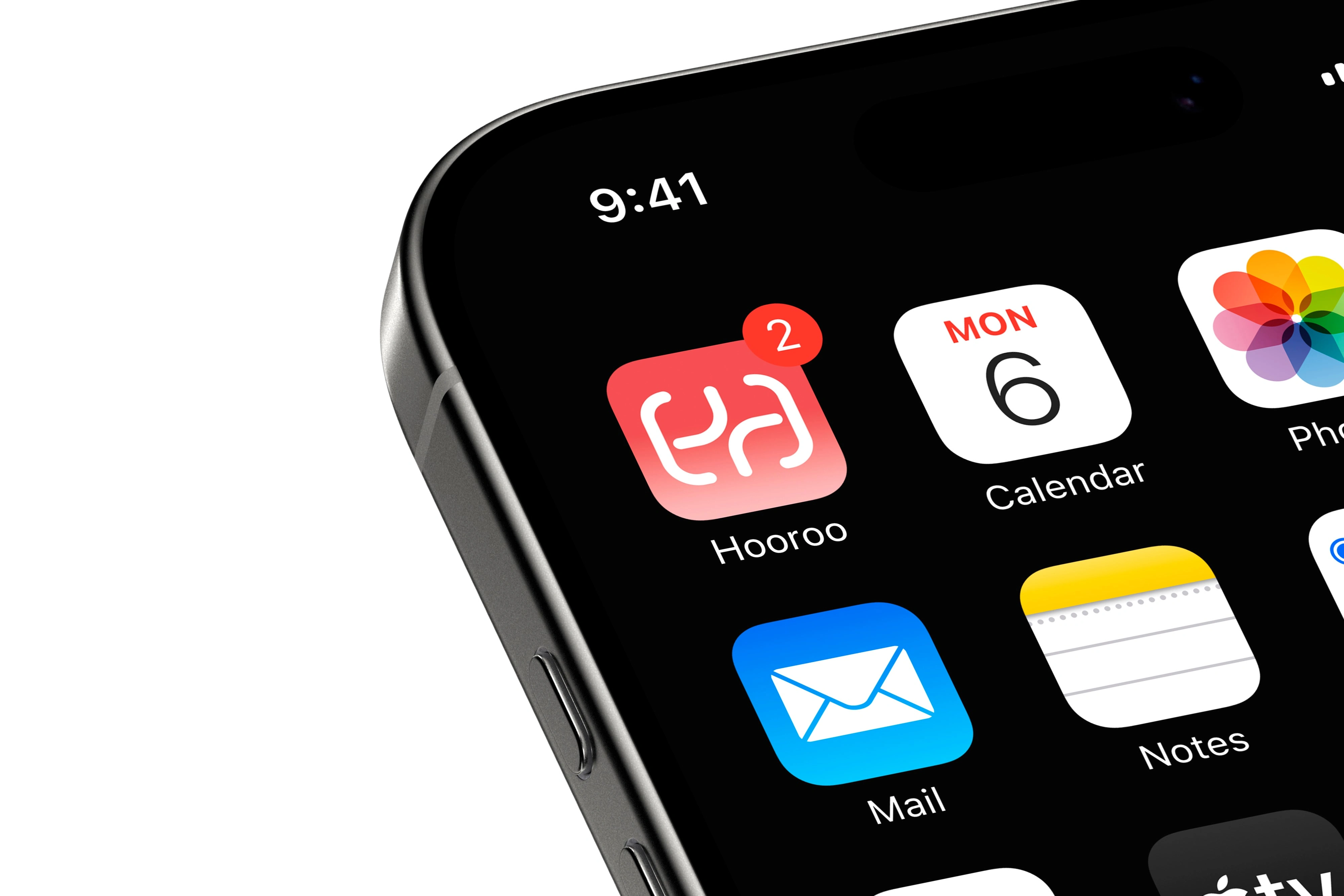
App icon
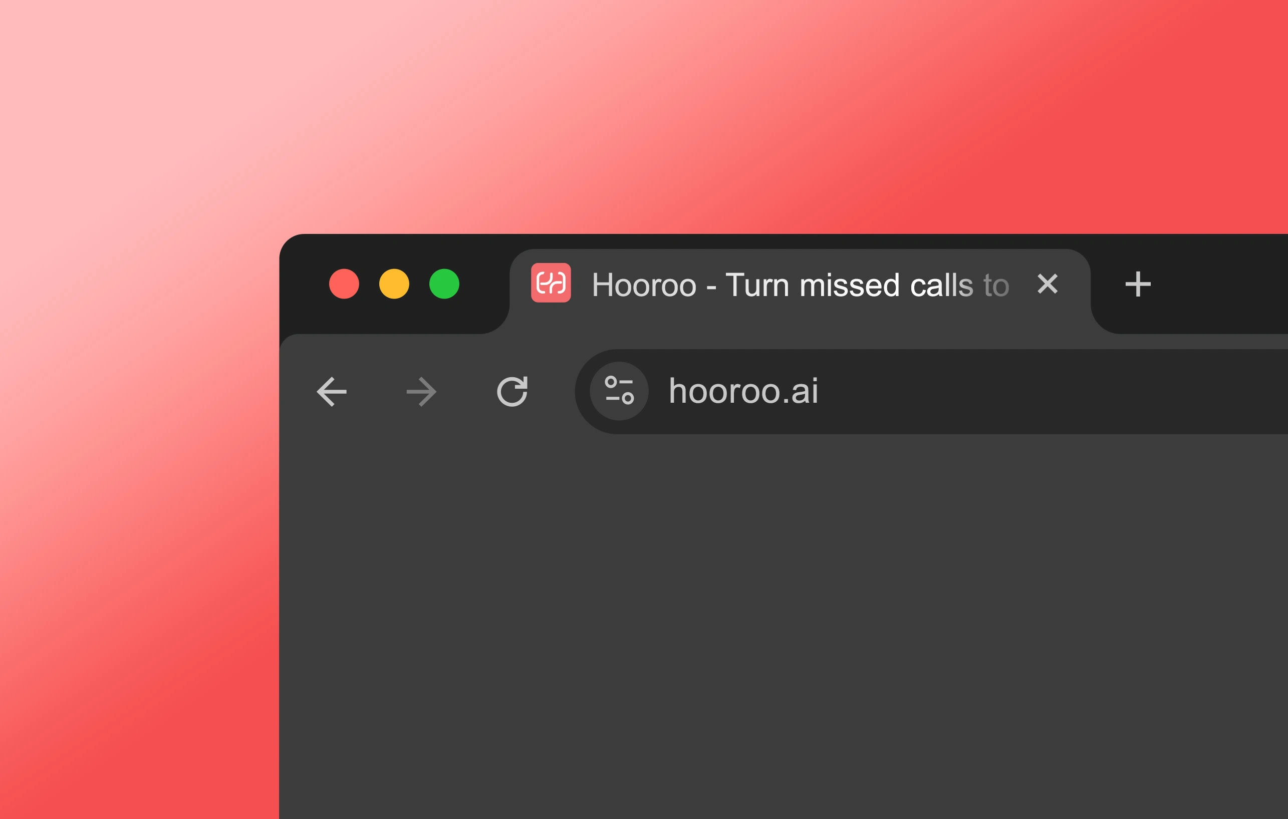
Website UI
Social templates
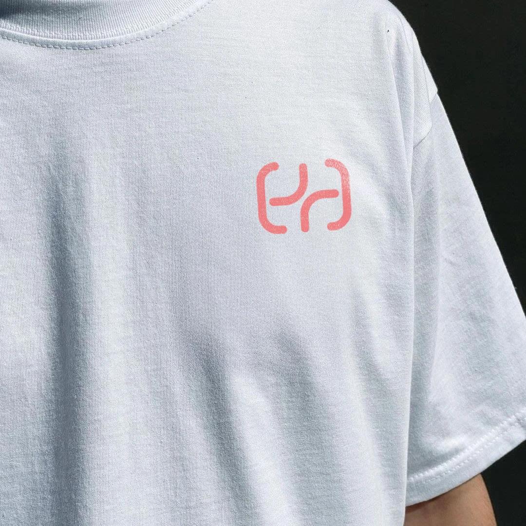
T-shirts and merch
Product walkthroughs
The identity holds its shape everywhere while staying memorable and clean.
Outcome
Hooroo.ai now has:
A distinct symbol that works as a standalone asset
A brand that communicates trust, clarity, and momentum
A system that’s easy to scale across future campaigns
A visual identity that looks premium without feeling corporate
The client can now grow their marketing with a mark strong enough to anchor the entire brand.
Like this project
Posted Nov 22, 2025
Developed a modern, scalable visual identity for Hooroo.ai.

