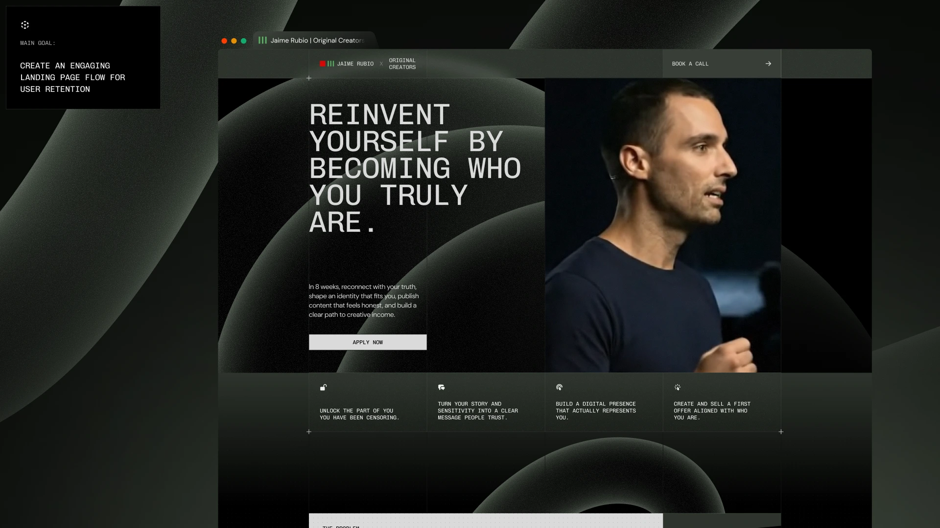
Strategic Landing Page Design for Jaime Rubio
Fernando Felix
2025 © Original Creators
Jaime Rubio
The Challenge
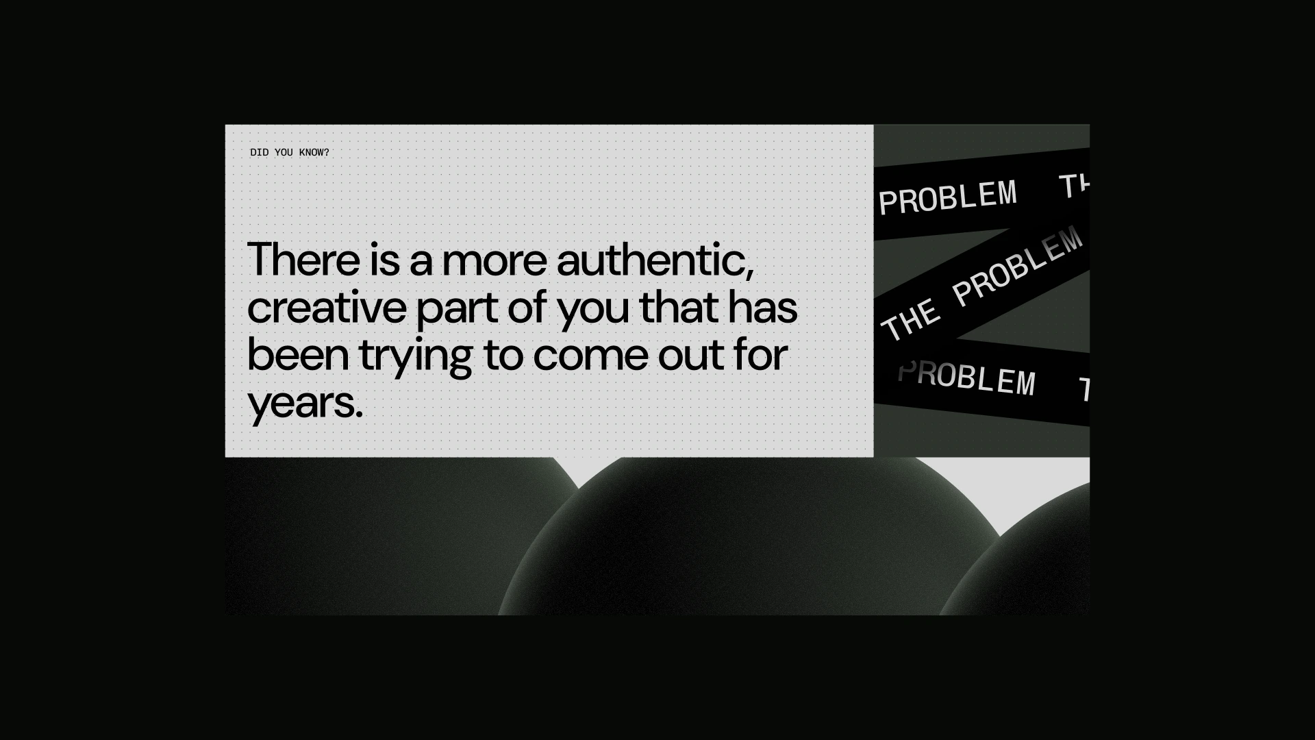
Jaime had a powerful program and a strong message, but the landing page needed a flow that could hold attention long enough to convert. The risk was losing the right people in two ways: either the page feels too “salesy” and they bounce, or it feels poetic but unclear and they scroll without deciding. The challenge wasn’t visuals. It was retention through clarity. How do we create a page that feels honest, emotionally precise, and still drives applications with one clear path?
The Solution
We designed a landing page layout system built around rhythm, hierarchy, and intentional “attention resets.” The structure included:
Pattern interrupts that prevent scroll fatigue using callouts, layered blocks, and shifting density.
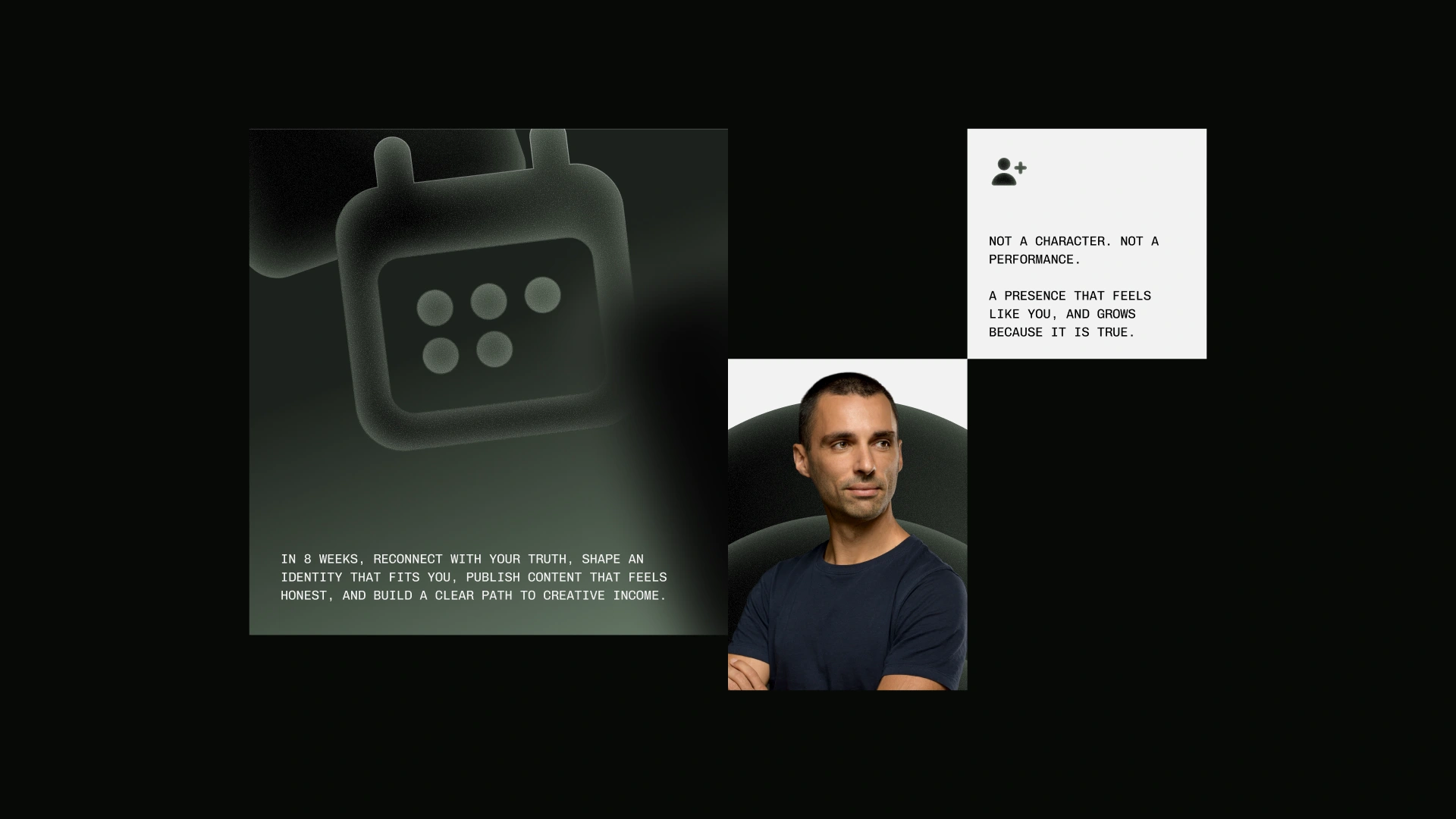
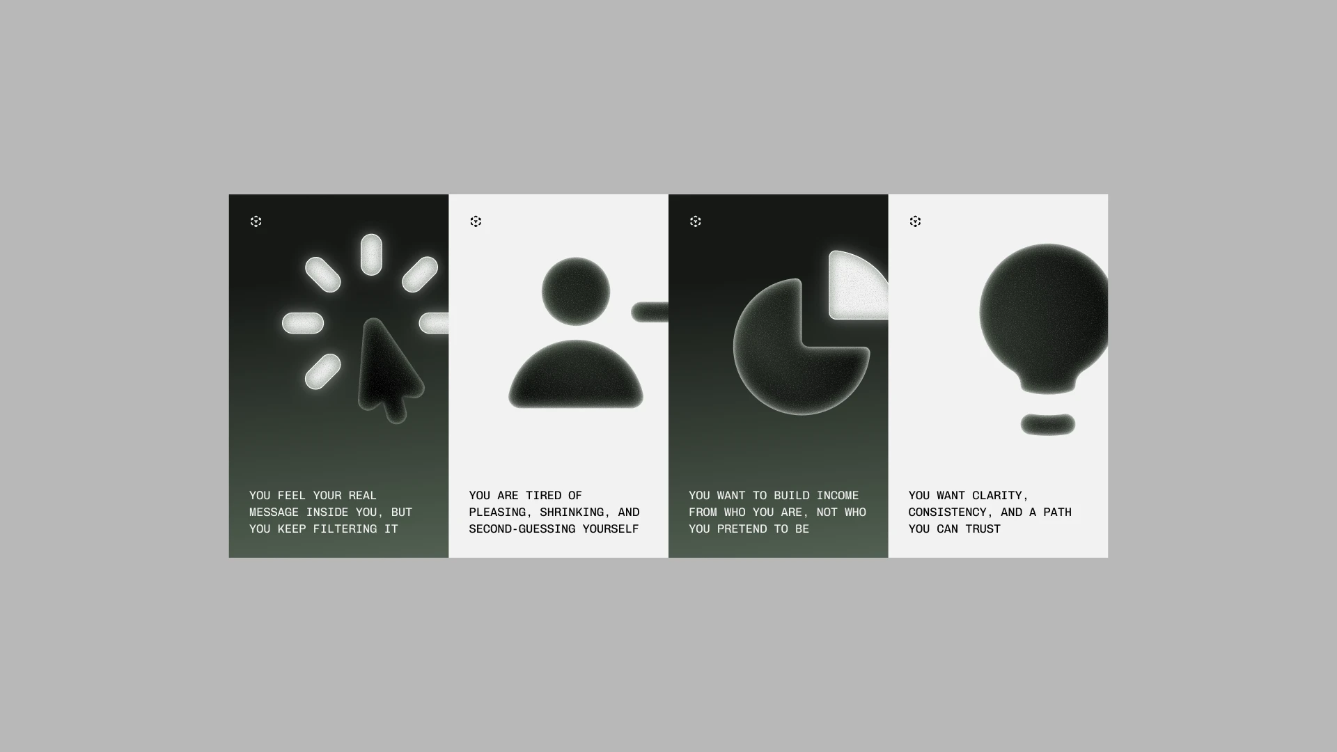
A “This is for you if” section to qualify the audience and increase conversion quality.
An outcome section that makes the program tangible and decision-ready after 8 weeks.
Every decision served one goal. Keep the right person engaged long enough to feel seen, understand the path, and apply.
The Experience
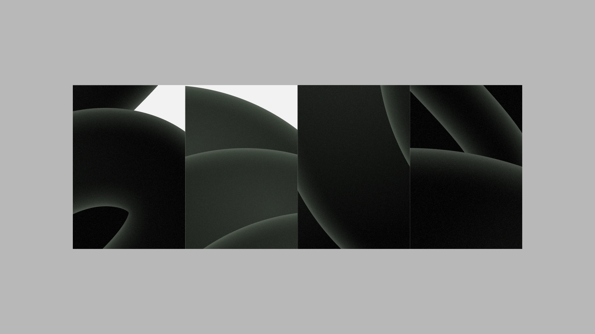
The process was iterative and strategic, focused on layout decisions that translate emotion into structure. We built a modular system that stays consistent while still feeling human. Strong typography, calm cinematic visuals, and a controlled grid with deliberate breaks to keep the scroll alive. The final output was a full landing page flow and reusable component framework designed for retention, clarity, and higher-quality applications.
Thank you for watching!
Reach out today and let's start the magic!
Like this project
Posted Dec 28, 2025
Designed Original Creators’ landing page flow. A calm, high-retention layout that turns clarity and trust into more qualified applications.
Likes
3
Views
37