Logo Revamp for Non-Profit Company
Khaliyah Barber
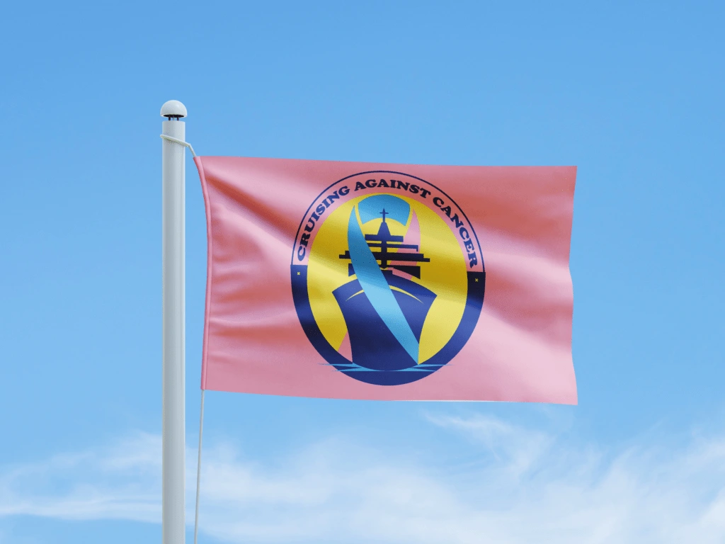
Logo Redesign for “Cruising Against Cancer”
Project Overview:
She redesigned the “Cruising Against Cancer” logo to create a modern, meaningful, and visually engaging identity that aligns with the nonprofit’s mission of supporting cancer awareness and advocacy. Her goal was to evoke hope, strength, and unity while ensuring the design could be effectively used across various platforms and marketing materials.
Project Objectives:
• She aimed to enhance brand recognition by crafting a cohesive and professional visual identity.
• She incorporated elements that symbolize the nonprofit’s purpose and values, such as the cruise ship and cancer awareness ribbon.
• She ensured the design was scalable and adaptable for digital, print, and merchandise applications.
Design Process:
Her process began with extensive research into the nonprofit’s mission and audience, followed by brainstorming ideas to align visual concepts with their goals. The resulting design features a sleek cruise ship as a central element, representing the organization’s journey and dedication to combating cancer. She included the cancer ribbon to reflect advocacy efforts, and the circular design was chosen to promote wholeness and inclusivity. The blue and pink color palette was carefully selected to convey optimism, compassion, and support.
Outcome:
Her final logo design successfully communicates the nonprofit’s mission and vision while maintaining a polished and modern aesthetic. It provides a flexible, high-impact solution for use in fundraising campaigns, events, and promotional materials, helping “Cruising Against Cancer” strengthen its connection with the community and stakeholders.
Below is the prior logo design:

Like this project
Posted Feb 7, 2025
She redesigned the “Cruising Against Cancer” logo to create a modern, meaningful, and visually engaging identity that aligns with the nonprofits mission.