ALTO ARCHITECTS
AdamStav Branding Studio
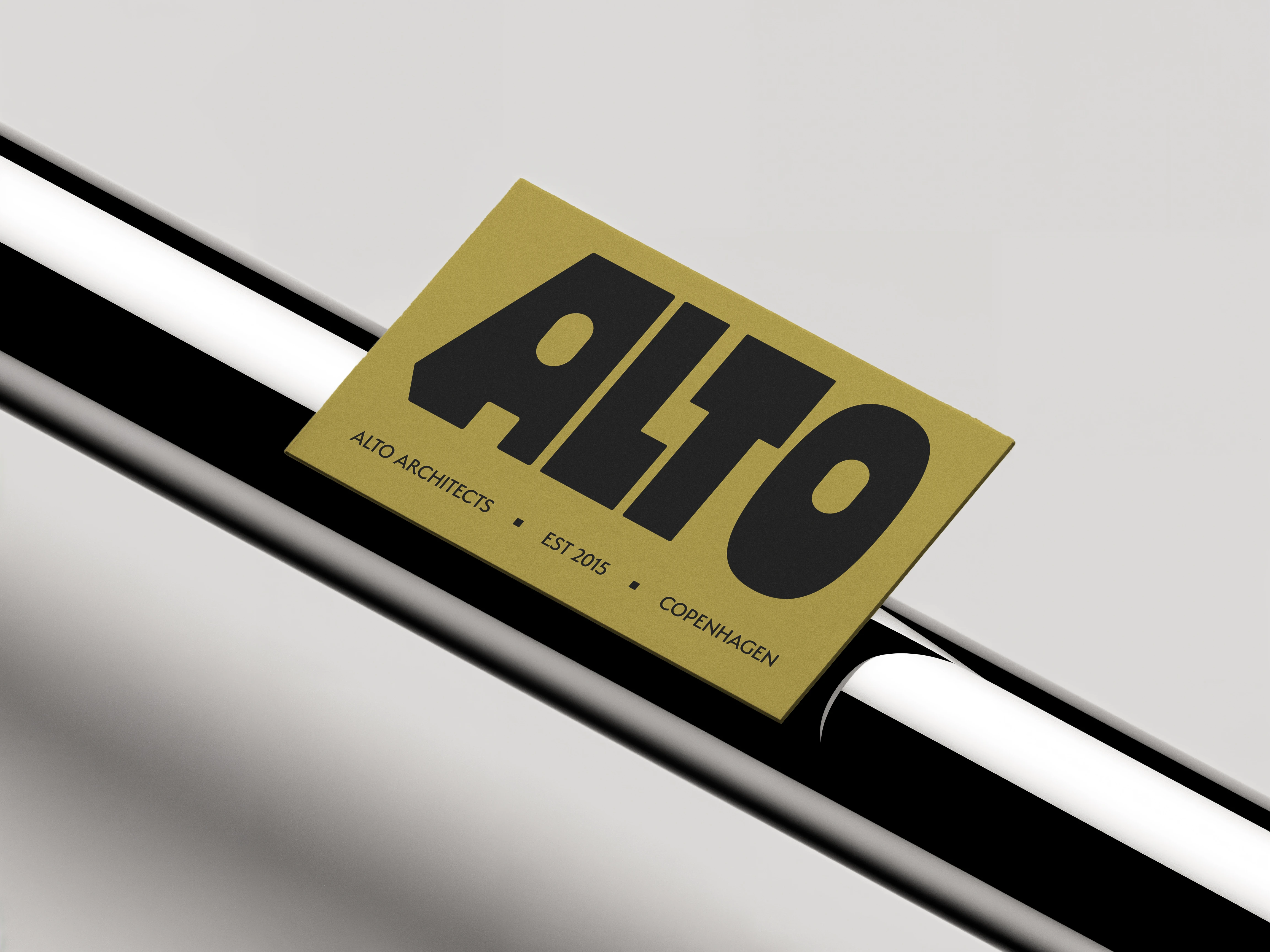
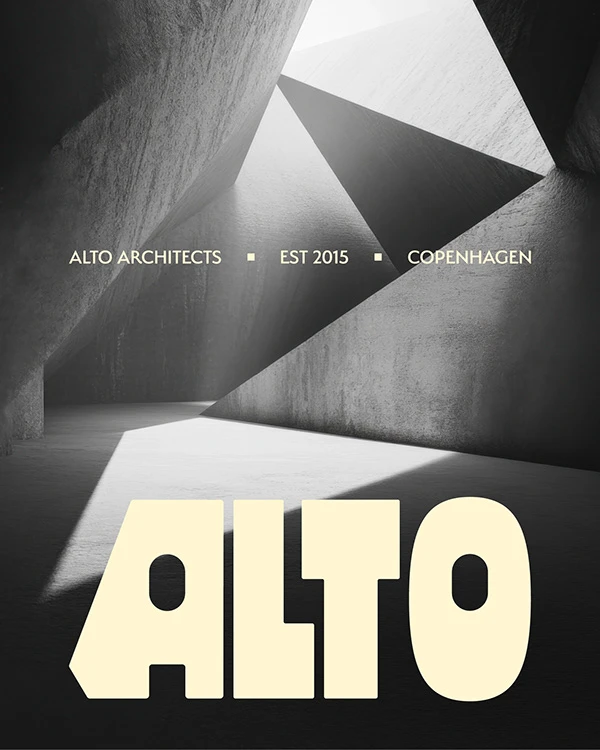
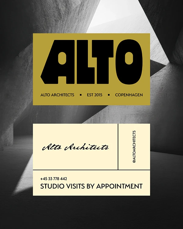
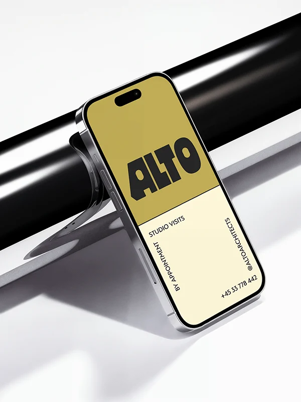
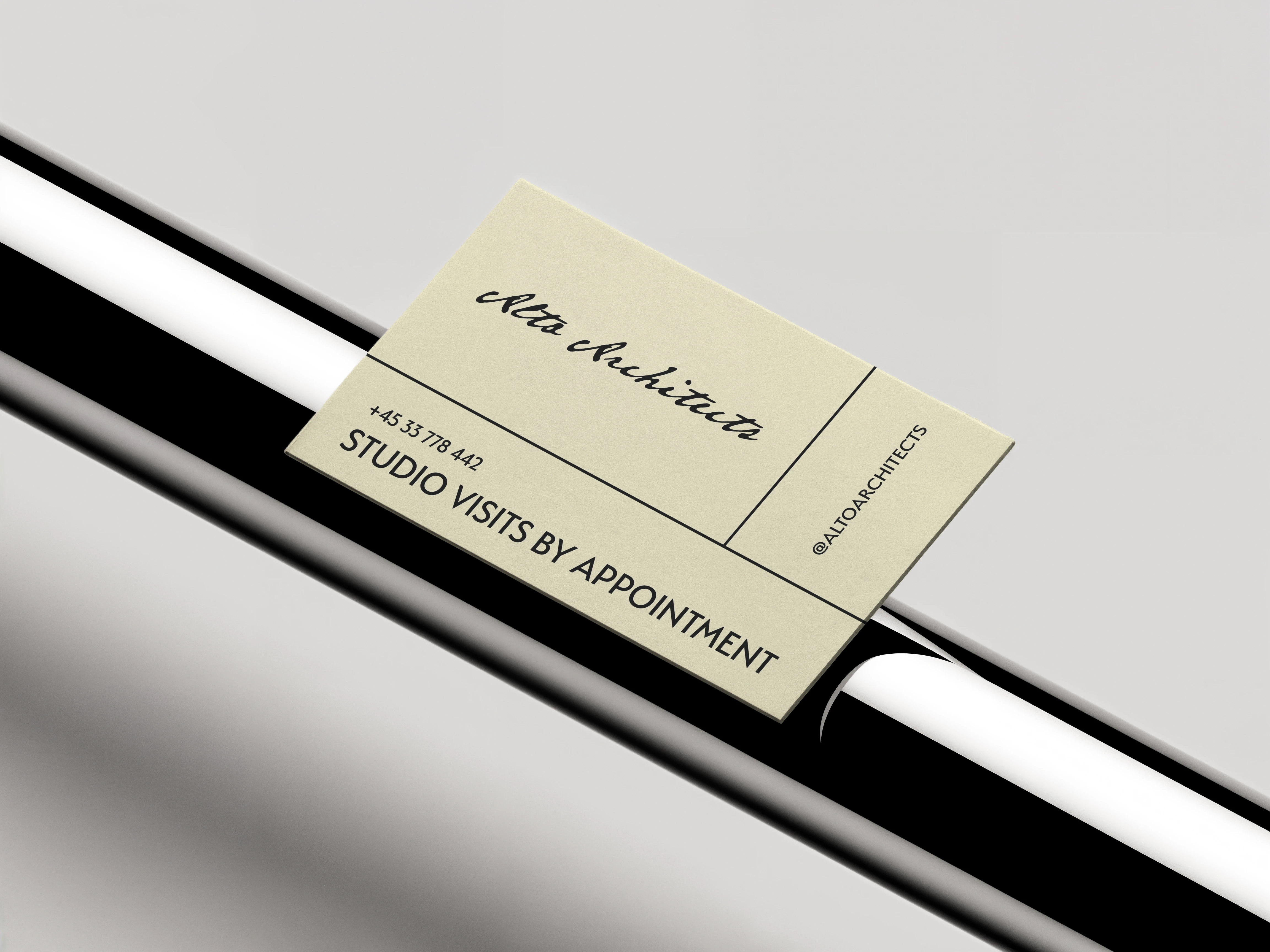
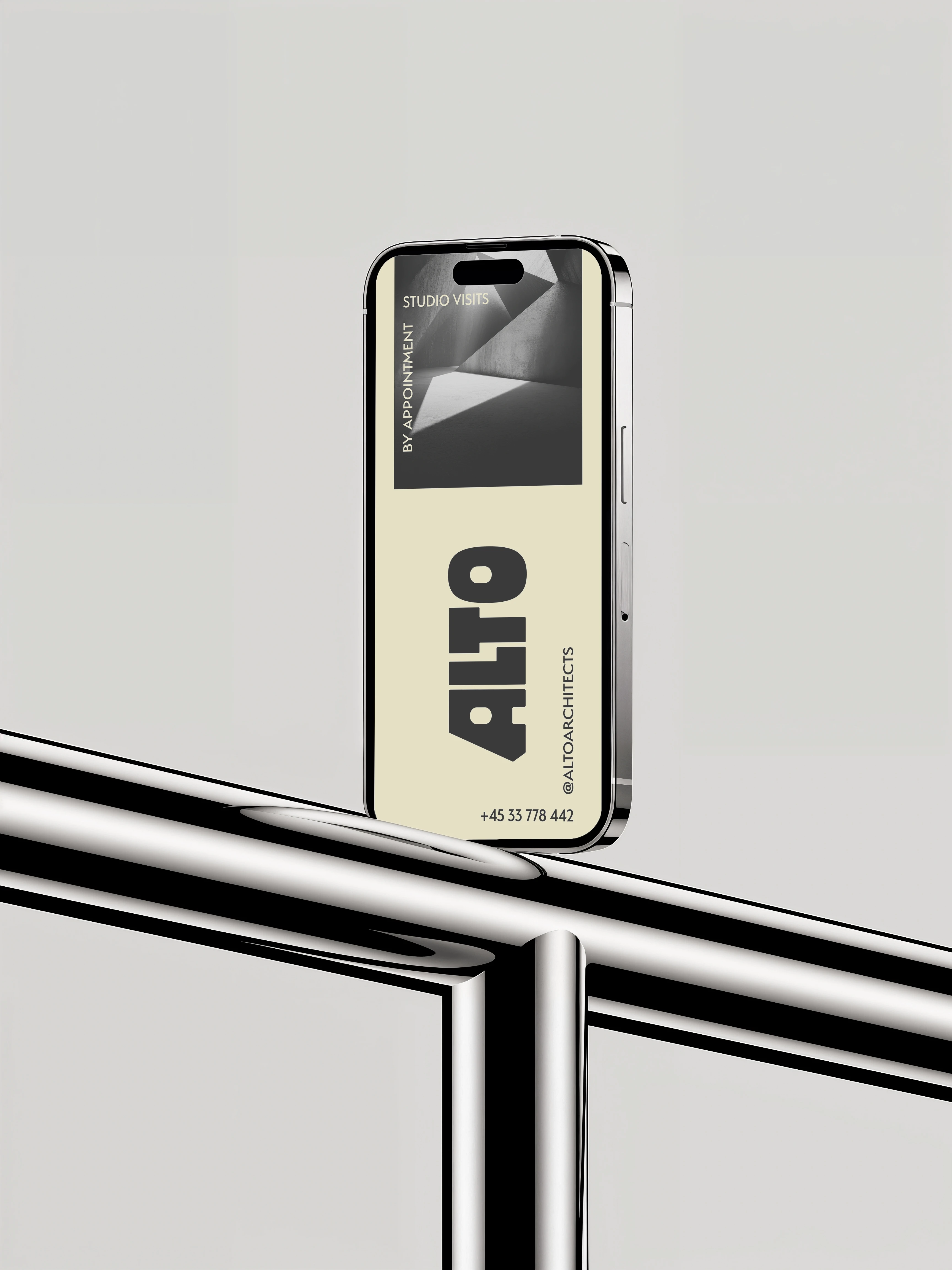
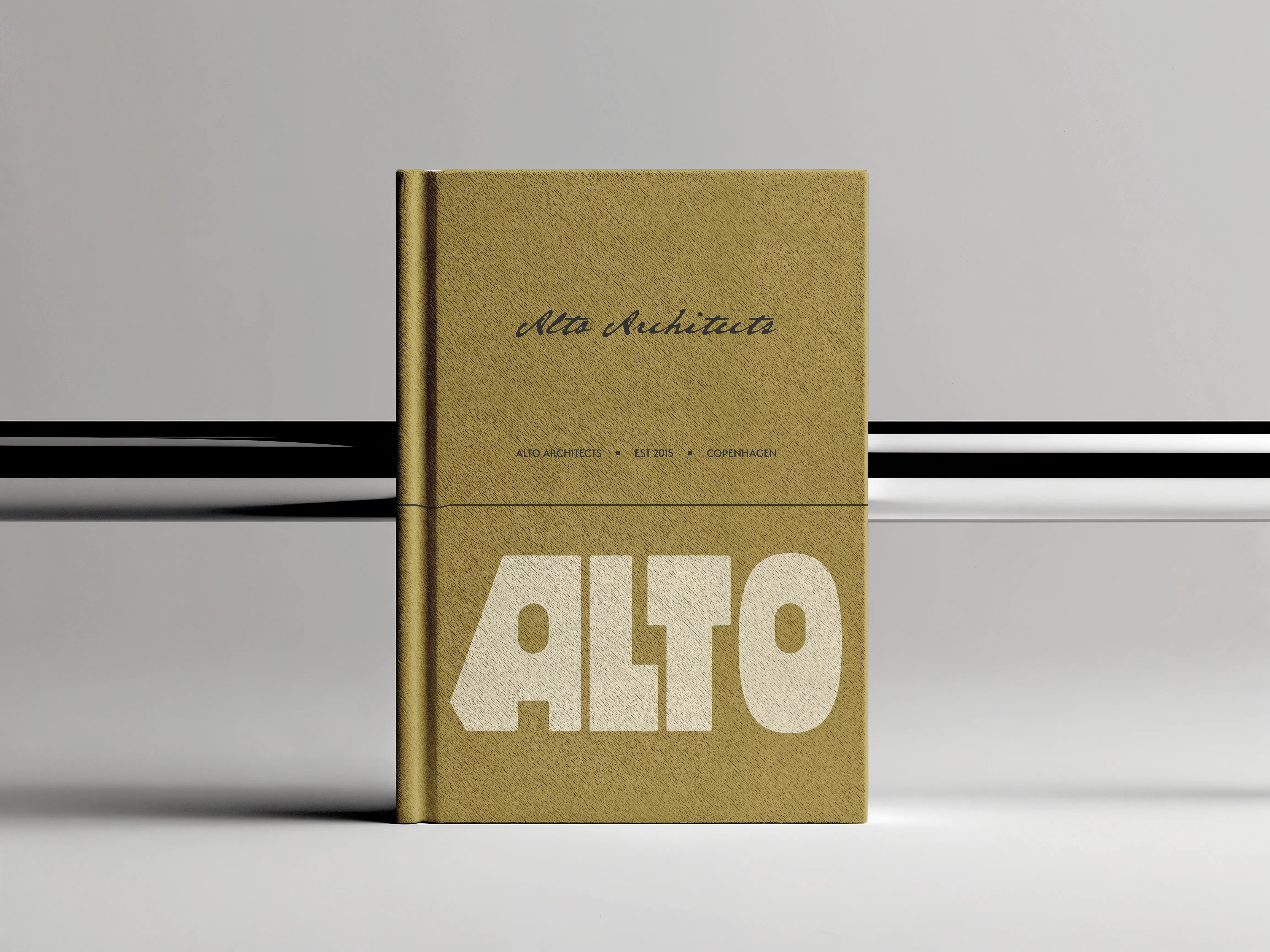
ALTO ARCHITECTS
An independent architectural practice dedicated to the meticulous fusion of Scandinavian minimalism and raw, tectonic strength.
Concept & Strategy
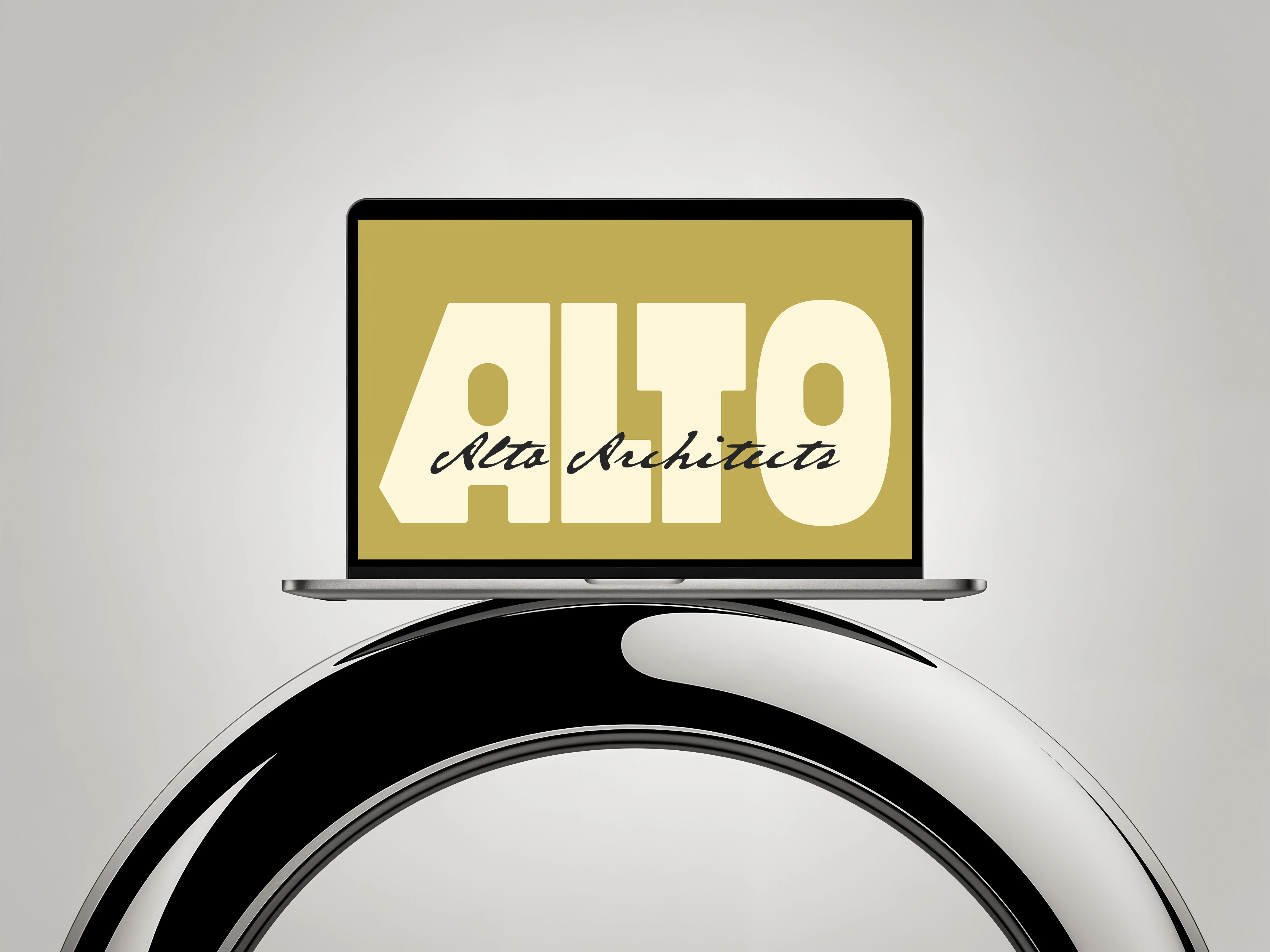
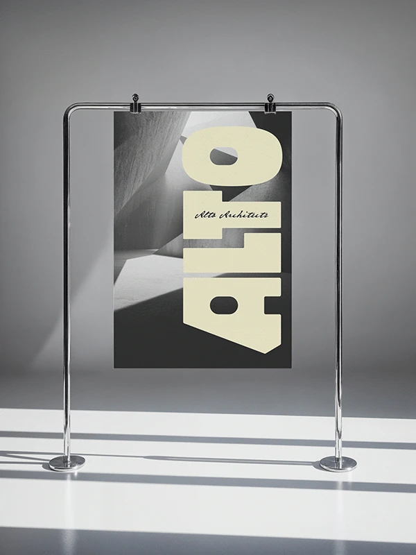
The identity is built on high contrast typography. The primary logotype, a heavy, custom geometric typeface, delivers immediate visual weight, while the secondary, handwritten script offers a nod to craftsmanship and human scale.
A grounded palette of earthy dark yellow, cream and black. This is a deliberate choice to ensure the brand feels substantial, referencing the foundational materials of architecture. The system is designed to allow the bold logotype to dominate in certain contexts and serve as a subtle anchor in others.

Helping businesses look premium with strategic design.
Book a discovery call:
adamstav.studio/contact
Stay connected:
Instagram Linkedin Tik Tok
Like this project
Posted May 17, 2026