WISP Brand Identity & Visual Direction

Maya CR


WISP – Brand Identity & Visual Direction
Role: Branding, Concept, Visual Identity
Tools: Illustrator, Photoshop, Pacdora
Deliverables: Logo, color system, product mockups, packaging direction, brand voice
01. Background & Purpose
WISP is a conceptual wellness brand designed to bring ritual and softness into everyday care. Specializing in eco-conscious, vegan bath products, WISP exists at the intersection of nature, design, and intention.
The brand was created to feel light yet grounded, like a breath, a pause, a mist of calm in a world that moves too fast. Its identity invites users into sensory stillness and sustainable self-connection.
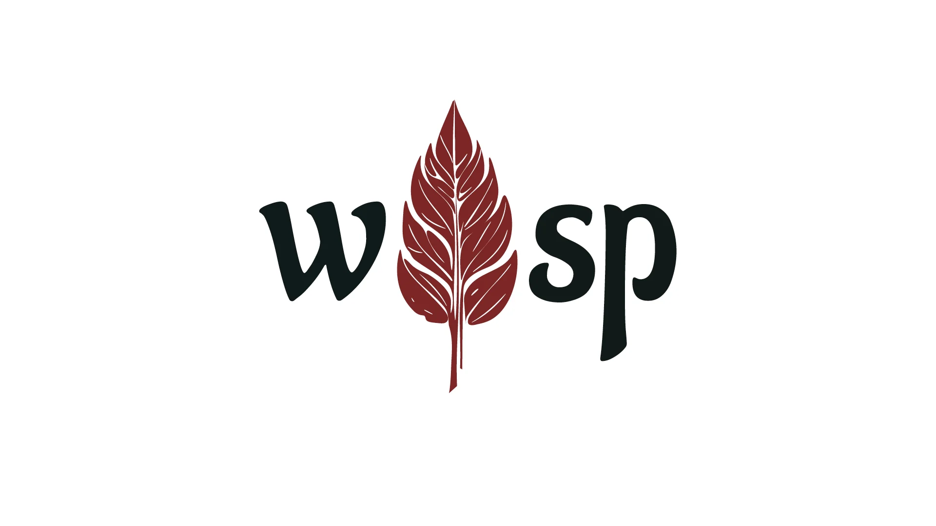
02. Logo Concept & Brand Name
The name “WISP” evokes lightness, air, and something fleeting but unforgettable. The logo reflects this through elegant, minimalist type, airy letterforms with soft negative space.
It’s not loud, but it lingers. The simplicity is intentional: to let texture, product, and ritual speak for themselves.
03. Typography & Voice
The brand uses a gentle, clean serif for headers and a soft sans-serif for body, striking a balance between classic and contemporary.
The tone of voice is soothing, poetic, and grounded in ritual. Each phrase is crafted to feel like a whisper—subtle, caring, and purposeful.
04. Color System & Atmosphere
WISP’s palette is built around natural tones and emotional warmth:
Soft Sage — grounding, gentle, earthy
Ivory Mist — purity, air, calm
Clay Rose — intimacy, body, ritual
Midnight Blue — quiet power, night energy
Together, these colors create a visual world that’s both sensory and sustainable, built for slow moments and thoughtful rituals.
05. Product & Brand Application
The identity was applied to packaging mockups, including bath soaks, essential oil rollers, and wellness cards. The focus was on reusability, minimal printing, and natural materials. Visuals leaned into textures like handmade paper, stone, and water, always with an undercurrent of softness.
Like this project
Posted Apr 19, 2025
Wisp is an eco-conscious bath brand rooted in body rituals. This identity explores sustainability through texture, tone, and a nature-inspired aesthetic.
Likes
0
Views
2
Timeline
Mar 24, 2025 - Mar 31, 2025