Personal Branding - Visual Identity

Maya CR

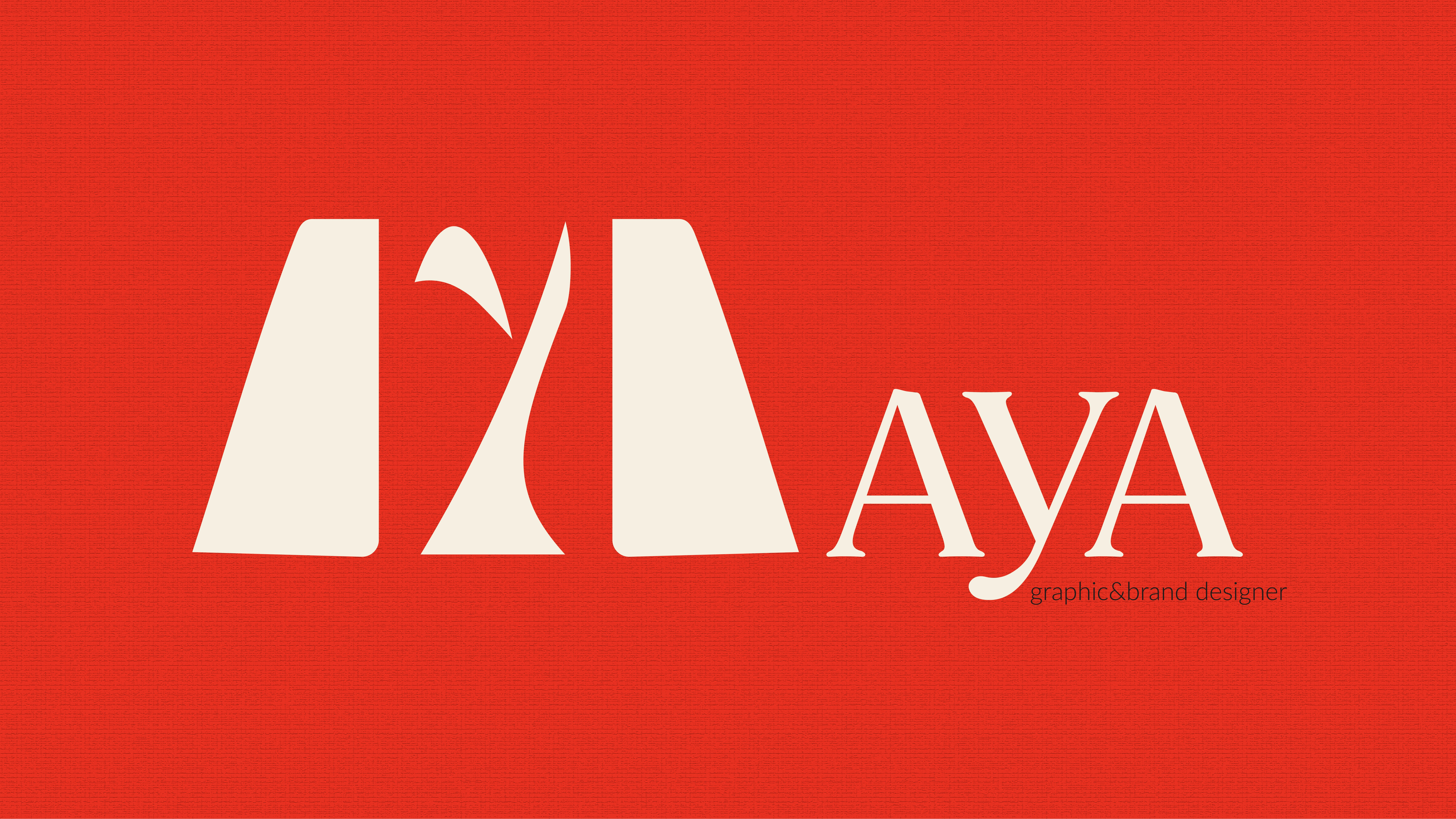
MAYA – Personal Branding / Visual Identity Design
Role: Concept, Design, Art Direction
Tools: Adobe Illustrator
Deliverables: Logo system, color palette, typography
01. Background & Purpose
MAYA is a personal brand identity system built to reflect a creative philosophy rooted in intention, emotional intelligence, and bold expression. The name "MAYA" symbolizes both a personal connection and a conceptual framework, something poetic, layered, and evolving.
This identity was created not just as a logo, but as a living system, one that communicates vision, voice, and creative direction with clarity and feeling.
02. Logo Concept & Symbolism
The logomark is constructed from sculptural, custom forms that blend simplicity with depth. At the heart of the symbol is a hidden “Y”, historically used as an early symbol for a tree, representing growth, readiness, and becoming.
Rather than leaning on design trends, the logo draws meaning from personal narrative and symbolic form. The result is a visual mark that feels both grounded and expressive, an emblem of identity in motion.
03. Typography & Voice
The primary type is confident and editorial, bringing sophistication and rhythm to the name. Paired with a clean, neutral sans-serif, the typography system creates a dynamic contrast between boldness and simplicity, reflecting both the emotional and strategic aspects of the brand.
Each word is meant to be read with weight, giving the brand a strong yet poetic tone.
04. Color System & Emotional Expression
The palette is rich and grounded, led by ivory, deep blue, and vermilion. Each color pairing carries its own energy:
Deep Blue + Ochre — Signature identity: grounded, intelligent, timeless
Vermilion + Ivory — Creative fire: emotional, vibrant, and bold
Black + White — Editorial strength: minimal, sharp, intentional
These variations offer flexibility for different brand moments, each one designed to communicate with meaning and adaptability.
05. Visual Language & Application
The identity is supported by a minimalist, poetic layout system favoring white space, textured elements, and quiet detail. Each touchpoint is designed to feel deliberate, expressive, and reflective of a larger creative journey.
Like this project
Posted Apr 19, 2025
A personal brand identity blending structure and expression, built around a custom logo, curated palette, and storytelling-driven design.
Likes
0
Views
1
Timeline
Apr 16, 2025 - Apr 18, 2025