York & Dante Website
Felix Enyinnaya
Overview
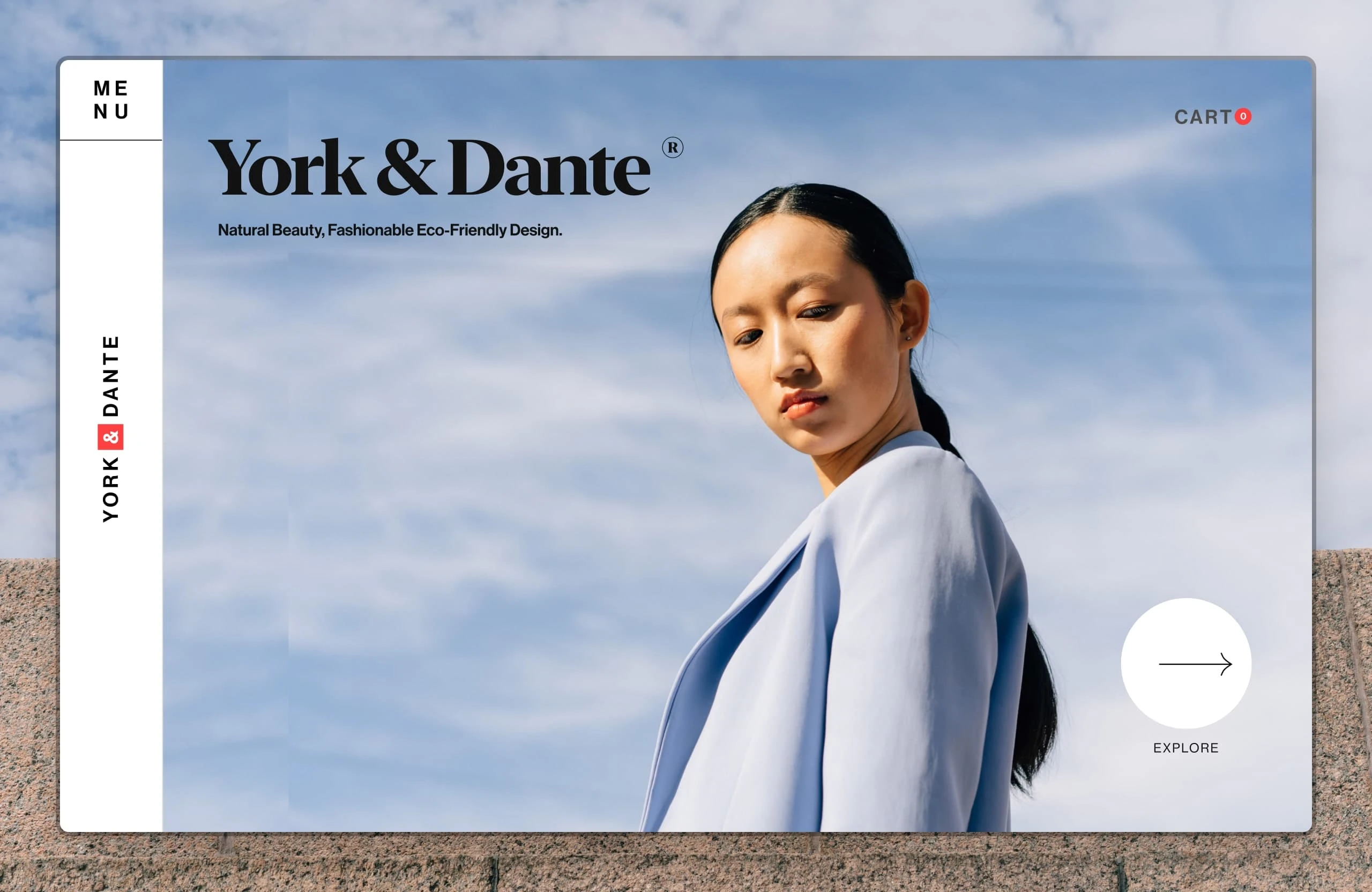
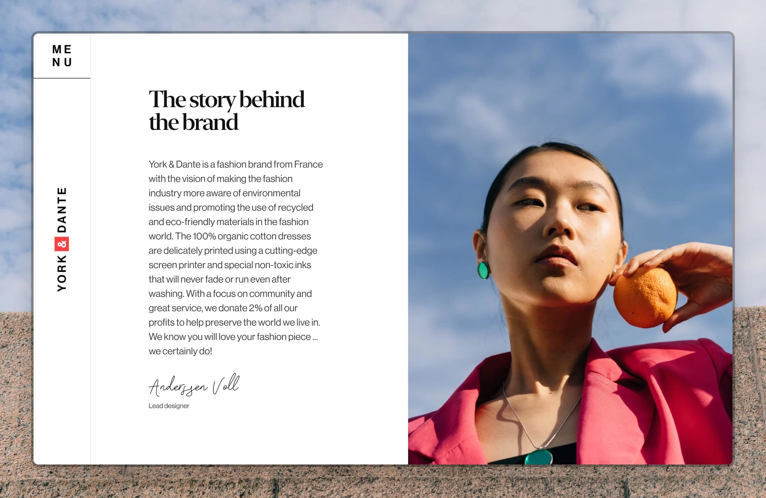
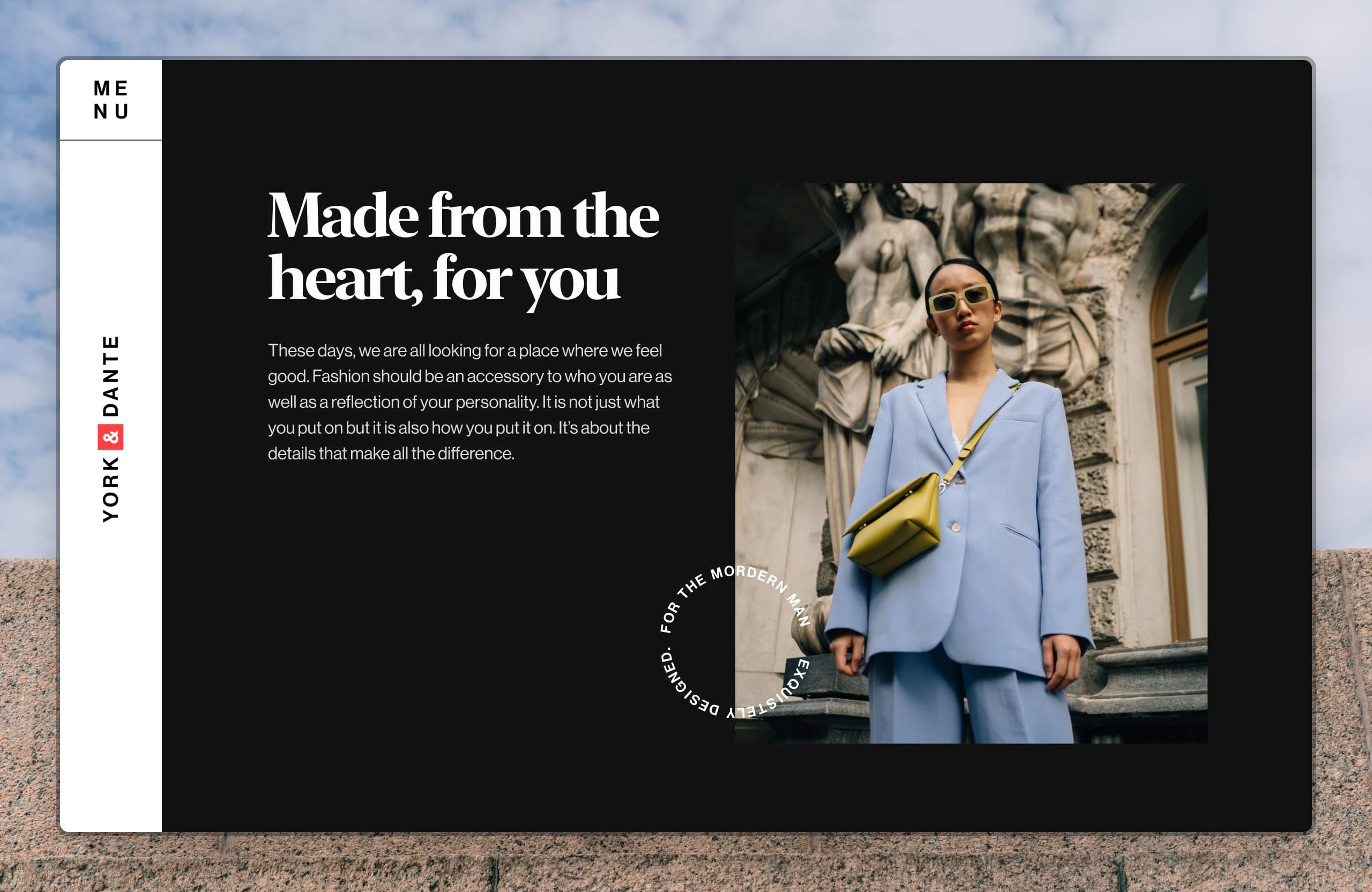
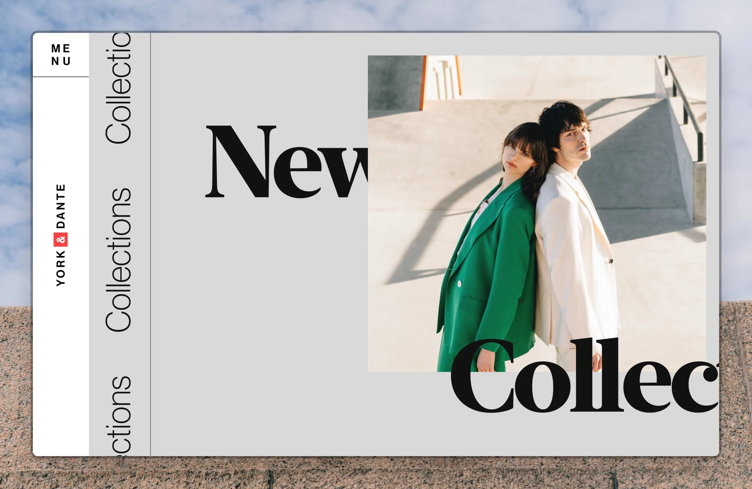
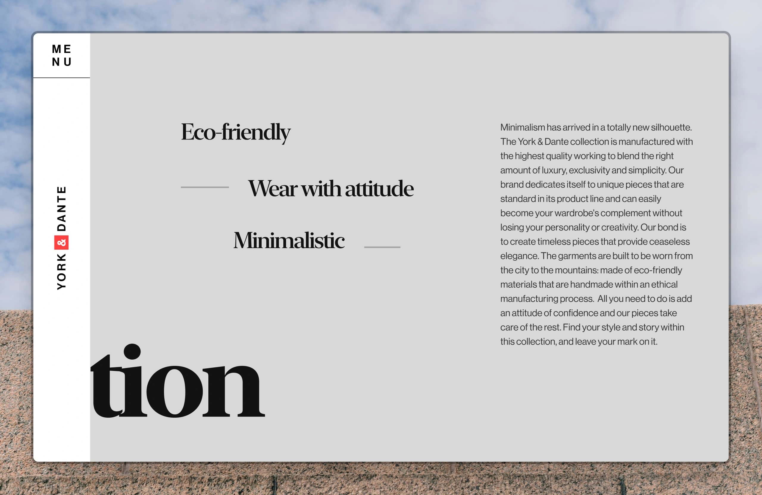
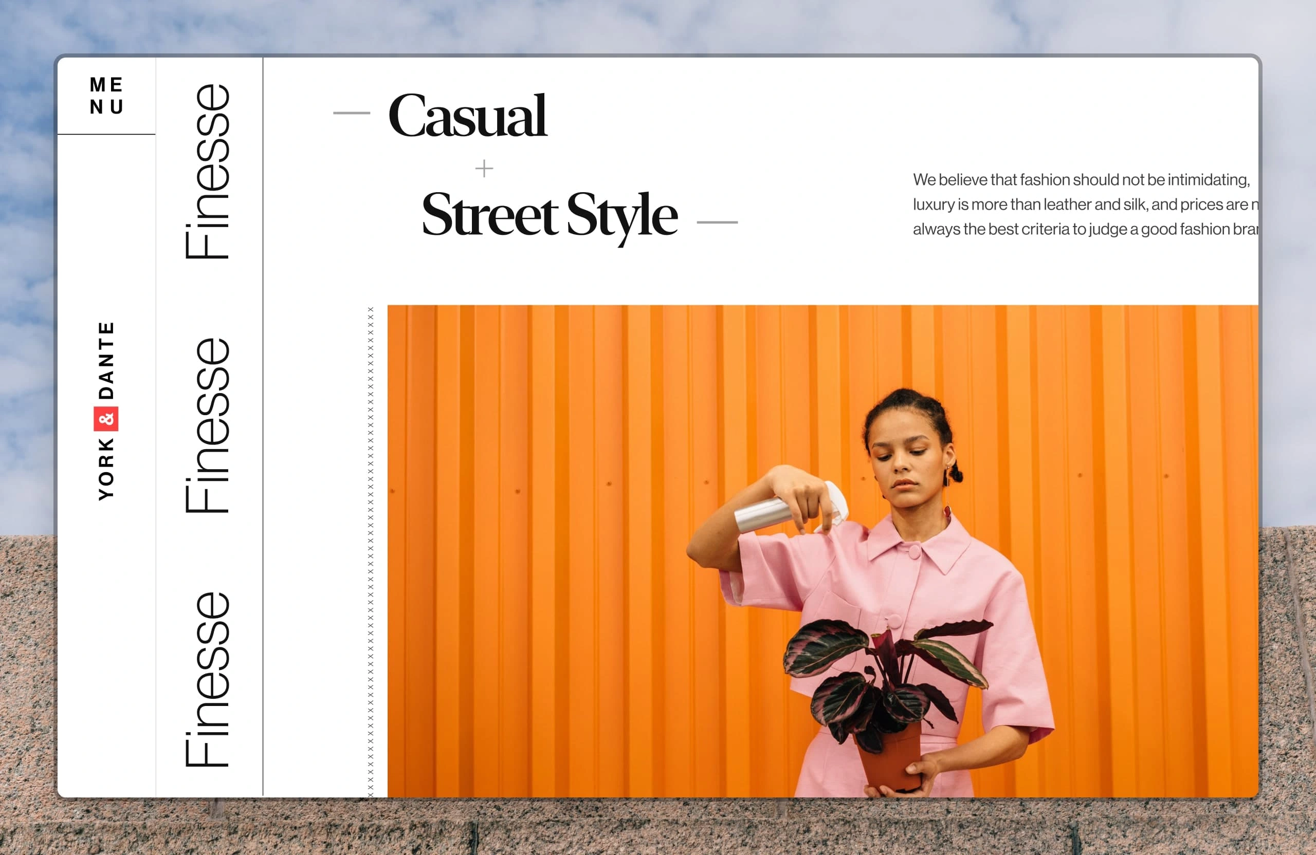
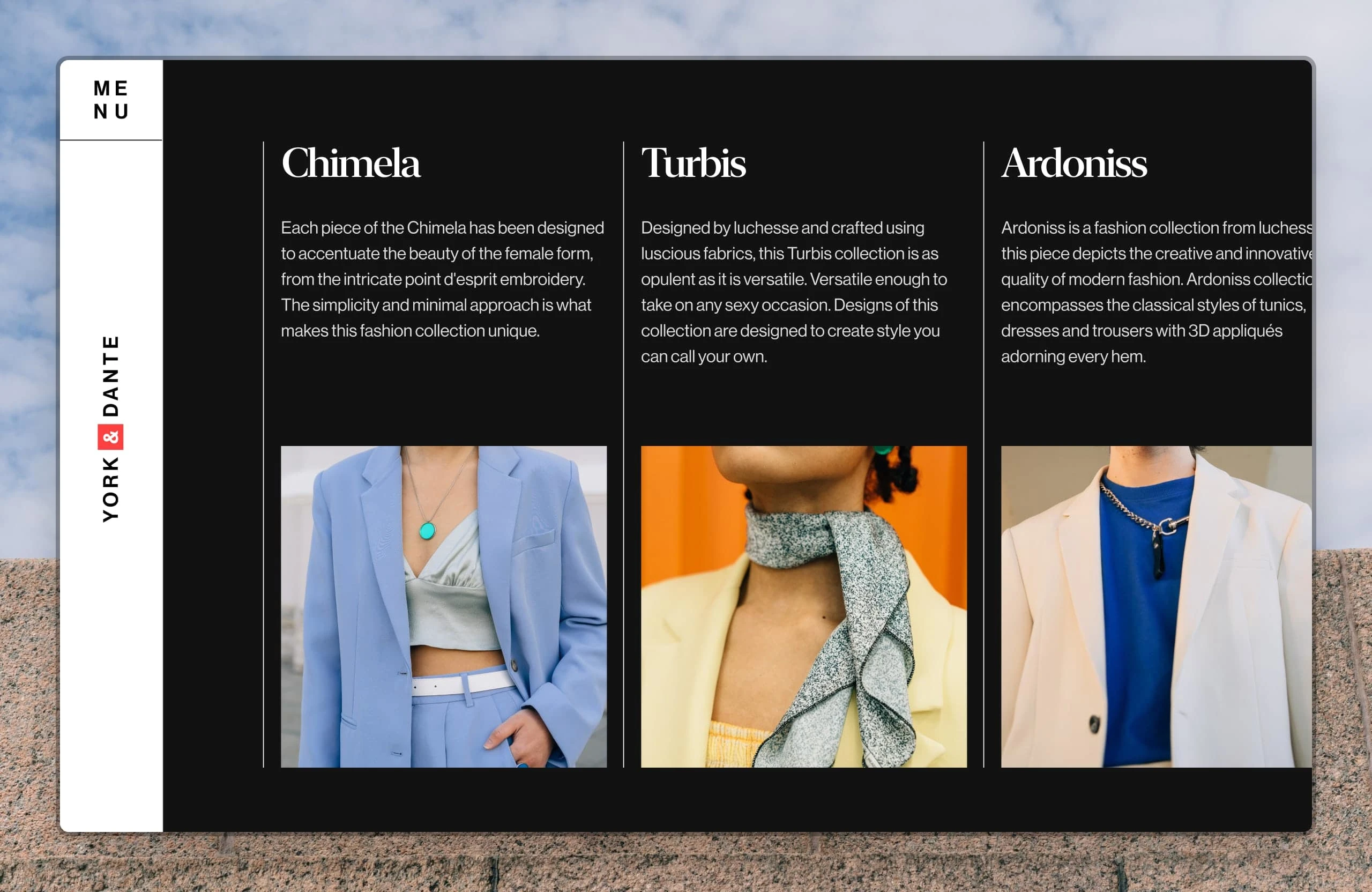
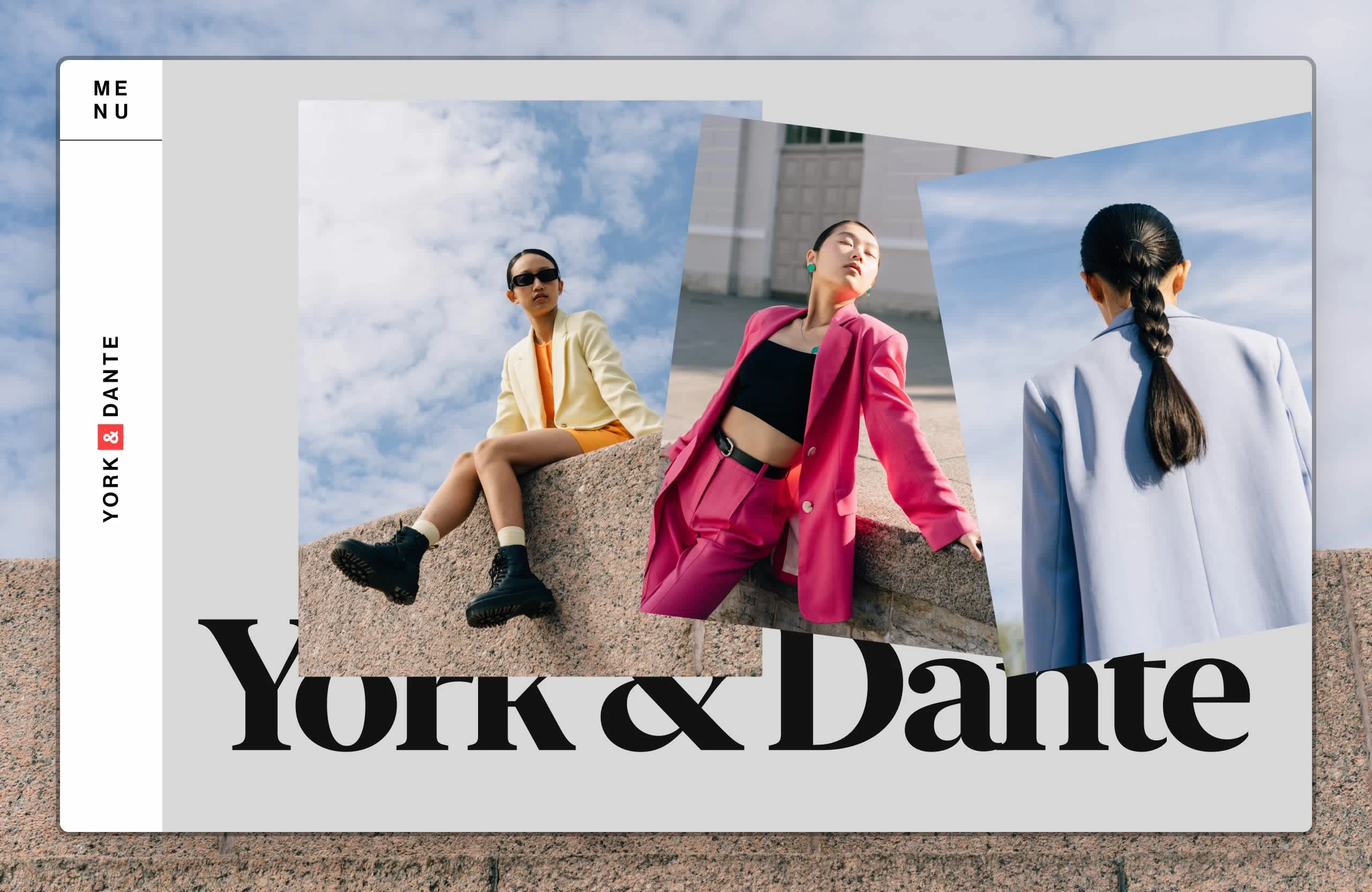
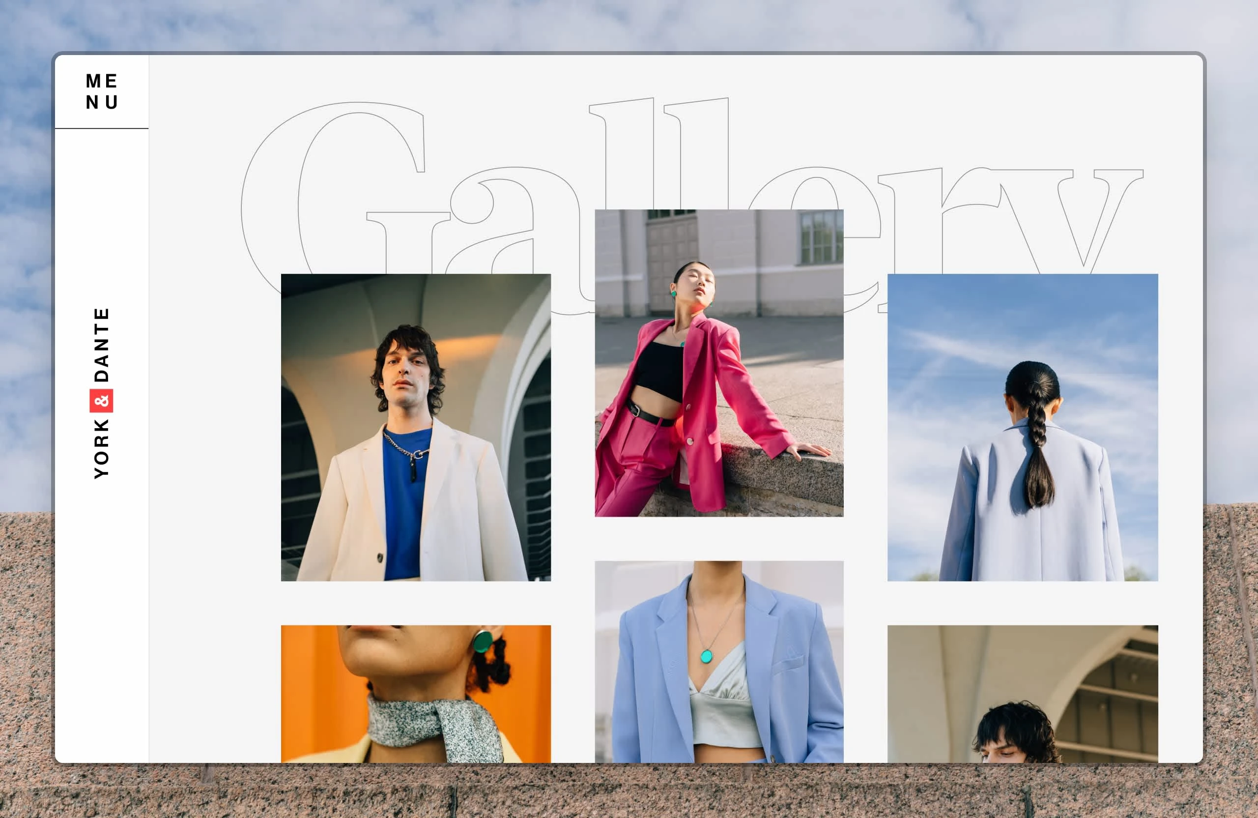
The design of a horizontally scrolling website for a fictional fashion company, York & Dante.
For the art direction, I wanted the website to have a sophisticated appearance, drawing inspiration from the photo collection. This informed my choice of my heading font, New York. For colours, I stuck to neutral colours so that the photos could stand out.
I employed the Golden Canon grid as a guide to layout the site's information.
Like this project
Posted Feb 14, 2025
The design of a horizontally scrolling website for a fictional fashion company, York & Dante.