Squeaky Clean Squad Website
Felix Enyinnaya
Overview
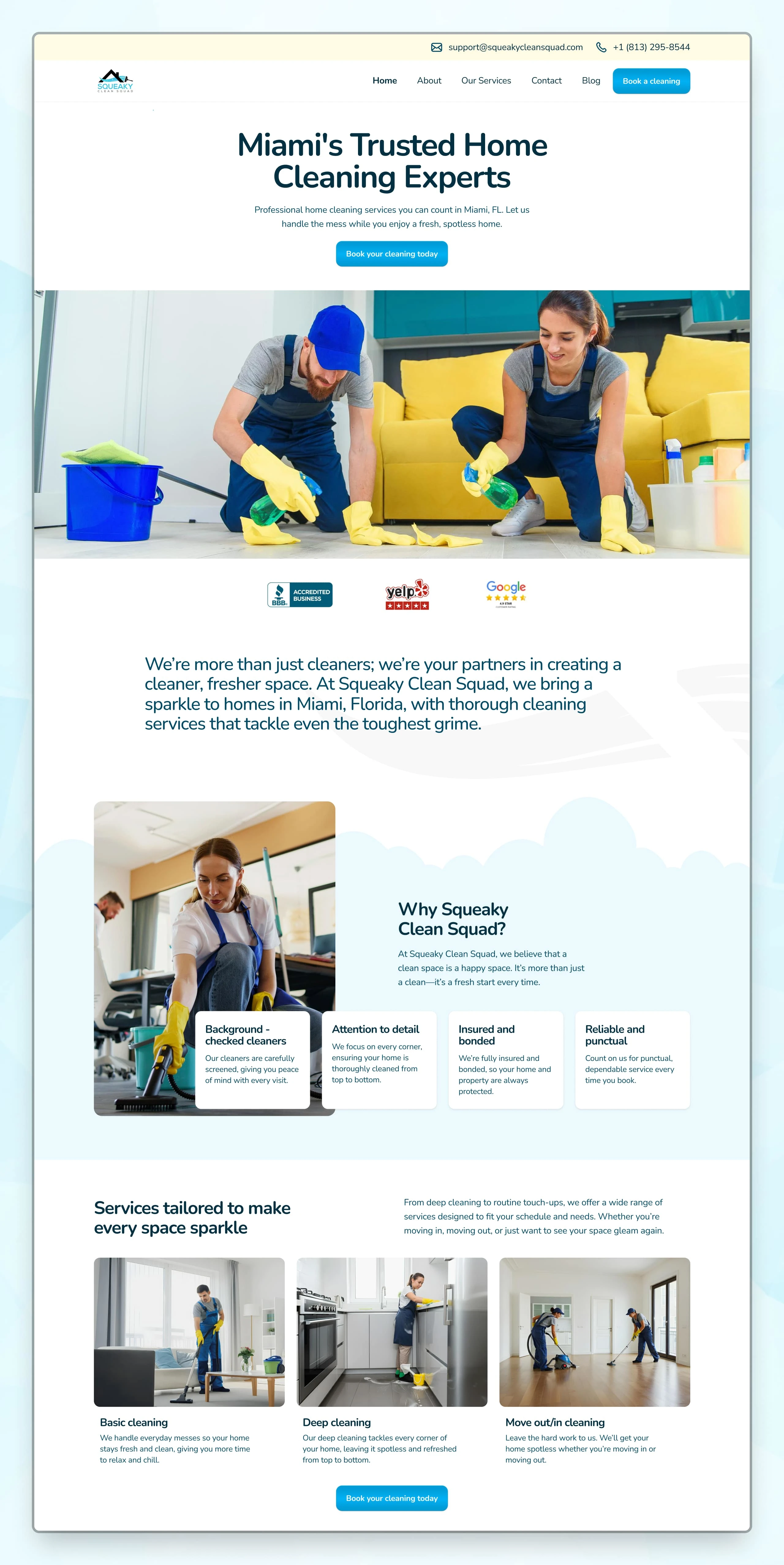
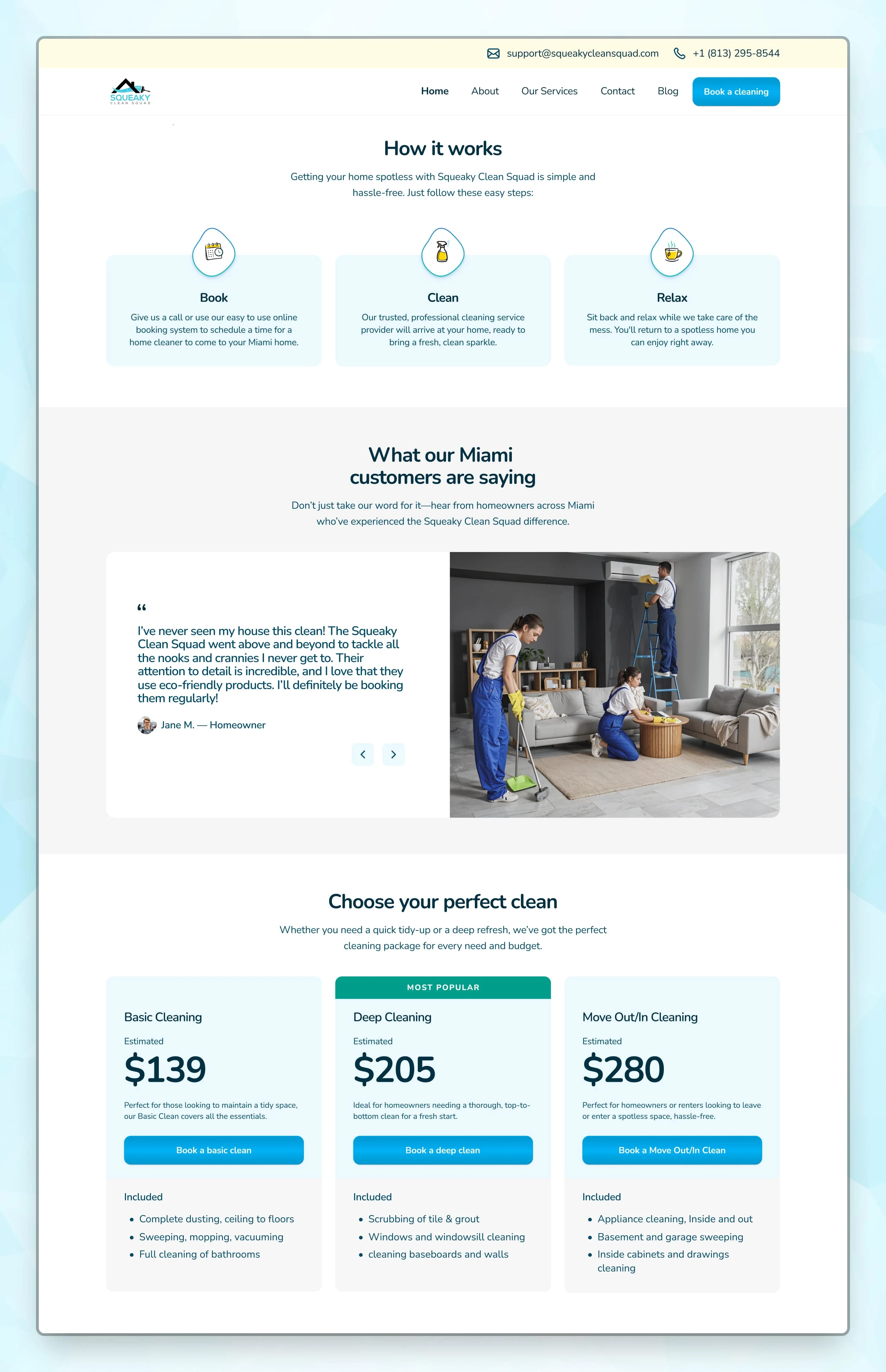
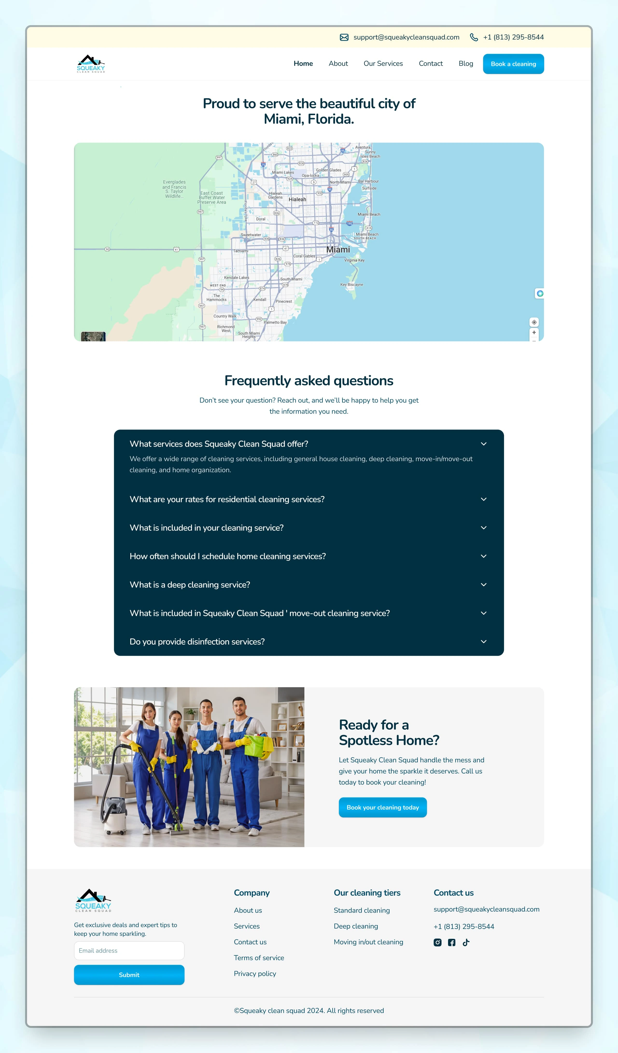
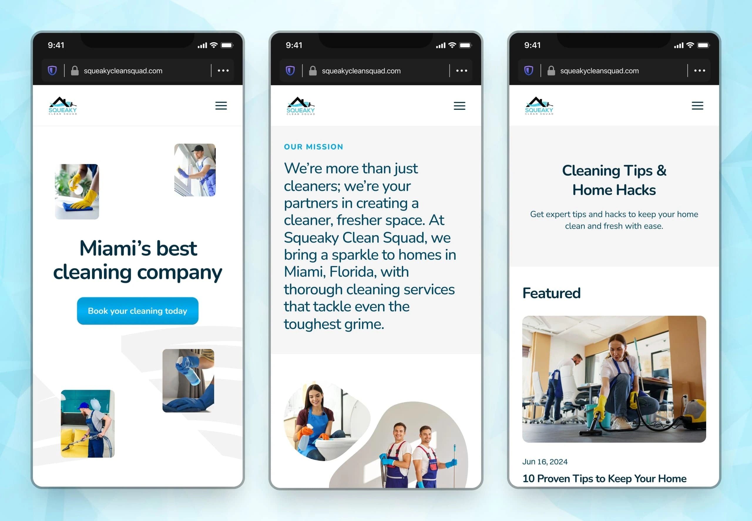
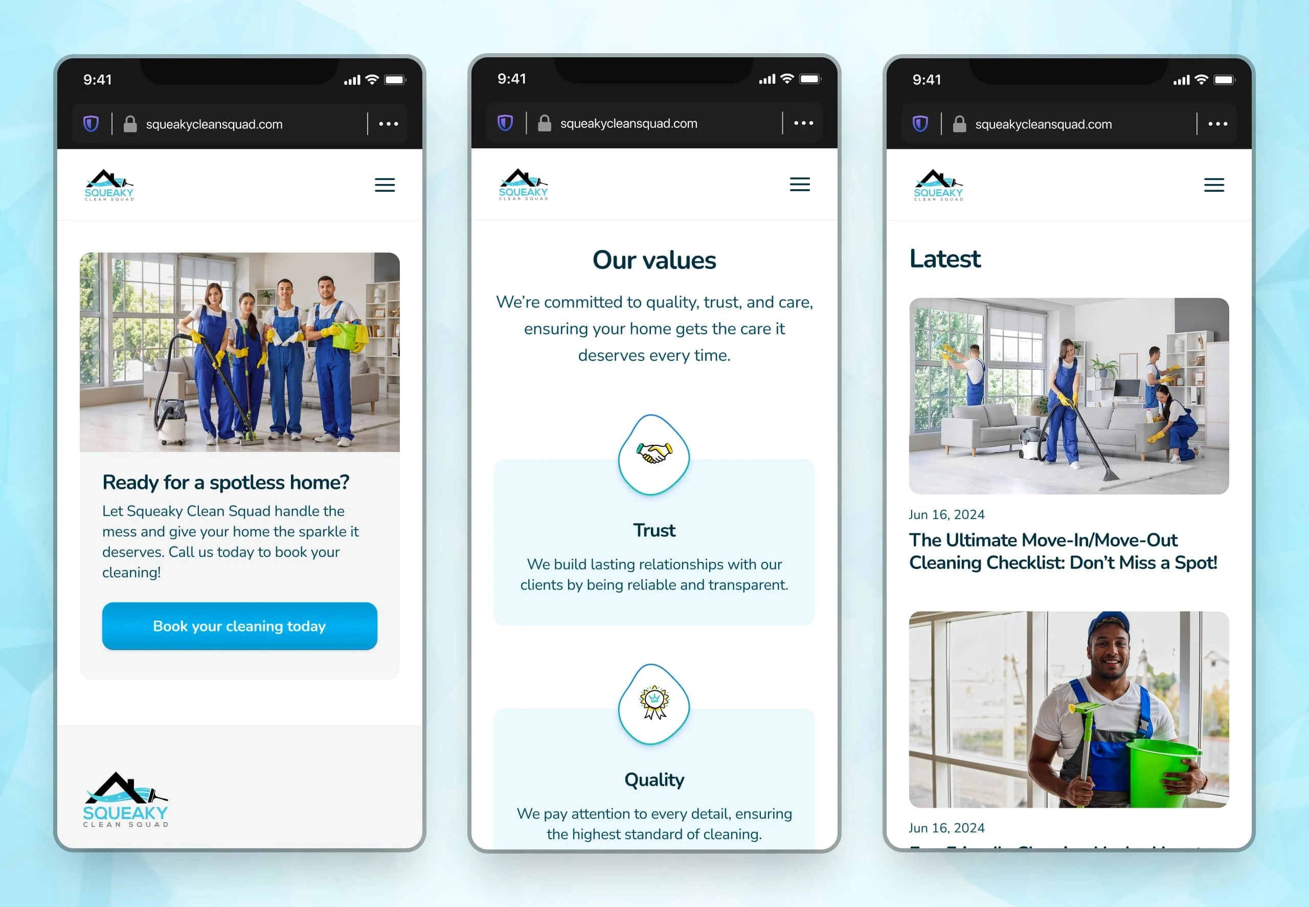
The design of a website for Squeaky Clean Squad, a cleaning agency based in Miami, Florida. The goal of this site is to convey all the necessary information needed for a visitor to decide to book a cleaning service.
The layout was simple. Information was laid out properly. The call to actions stood out, and I ensured all texts were legible according to WCAG standards.
For the art direction, I chose a soft blue colour coupled with a simple rounded font to evoke a sense of trust in visitors. I used imagery of cleaners creating a human connection between visitors and the business.
Like this project
Posted Feb 13, 2025
The design of a website for Squeaky Clean Squad, a cleaning agency based in Miami, Florida.
Likes
0
Views
4