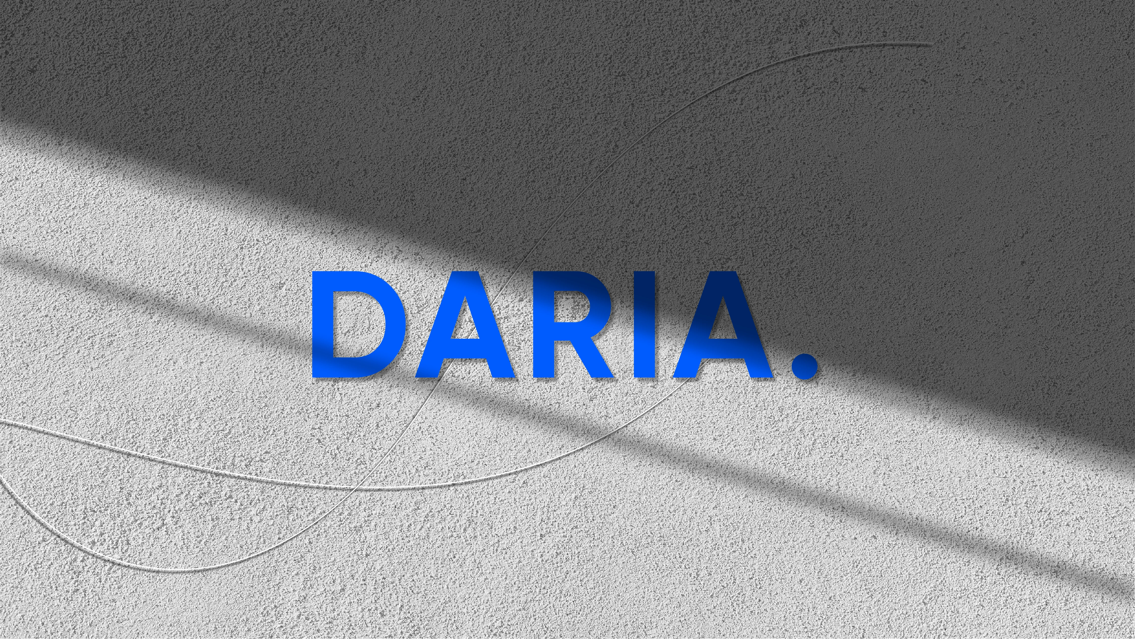
Brand Identity for Dentistry.
Marina Koroleva
CONCEPT
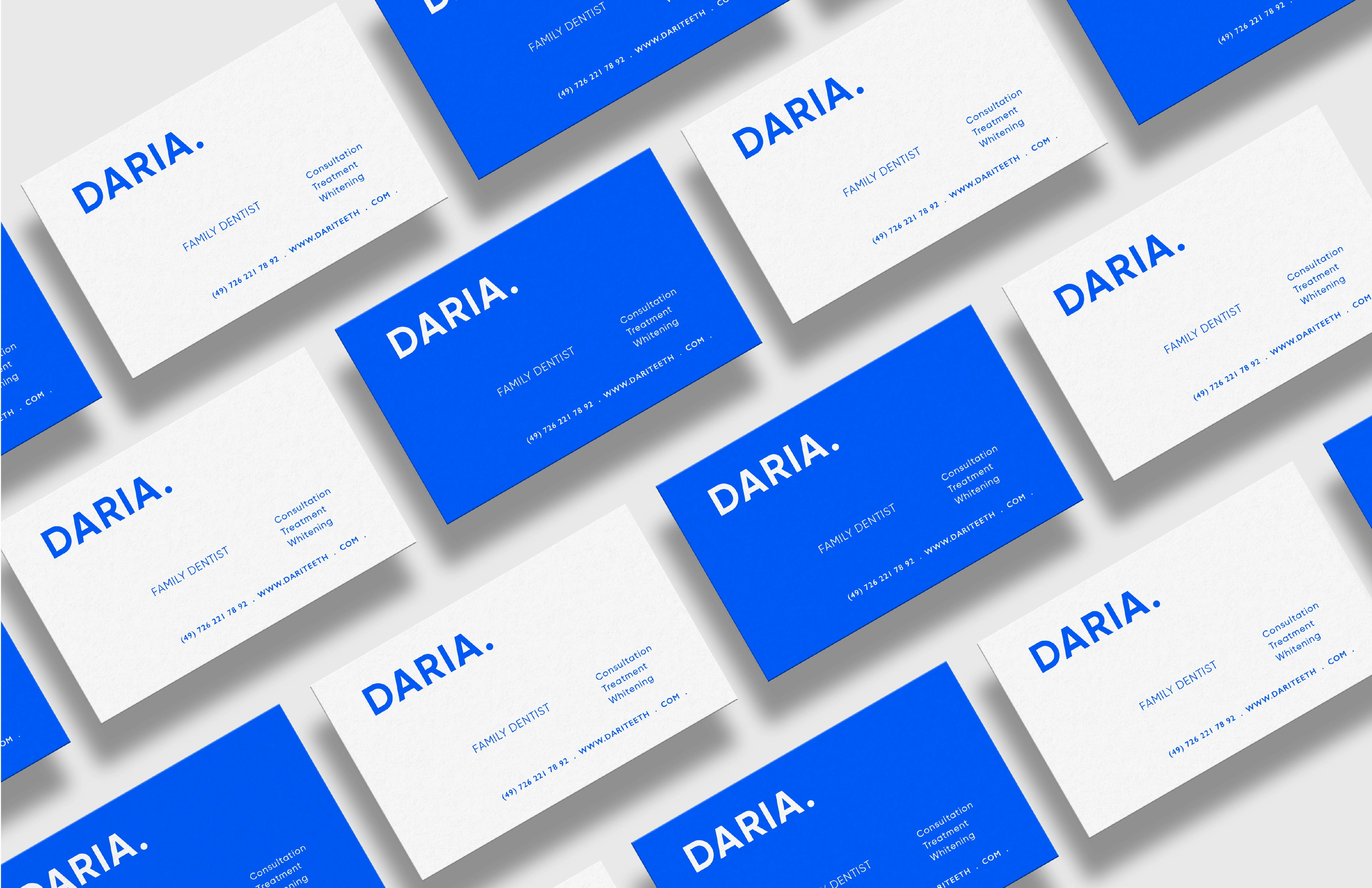
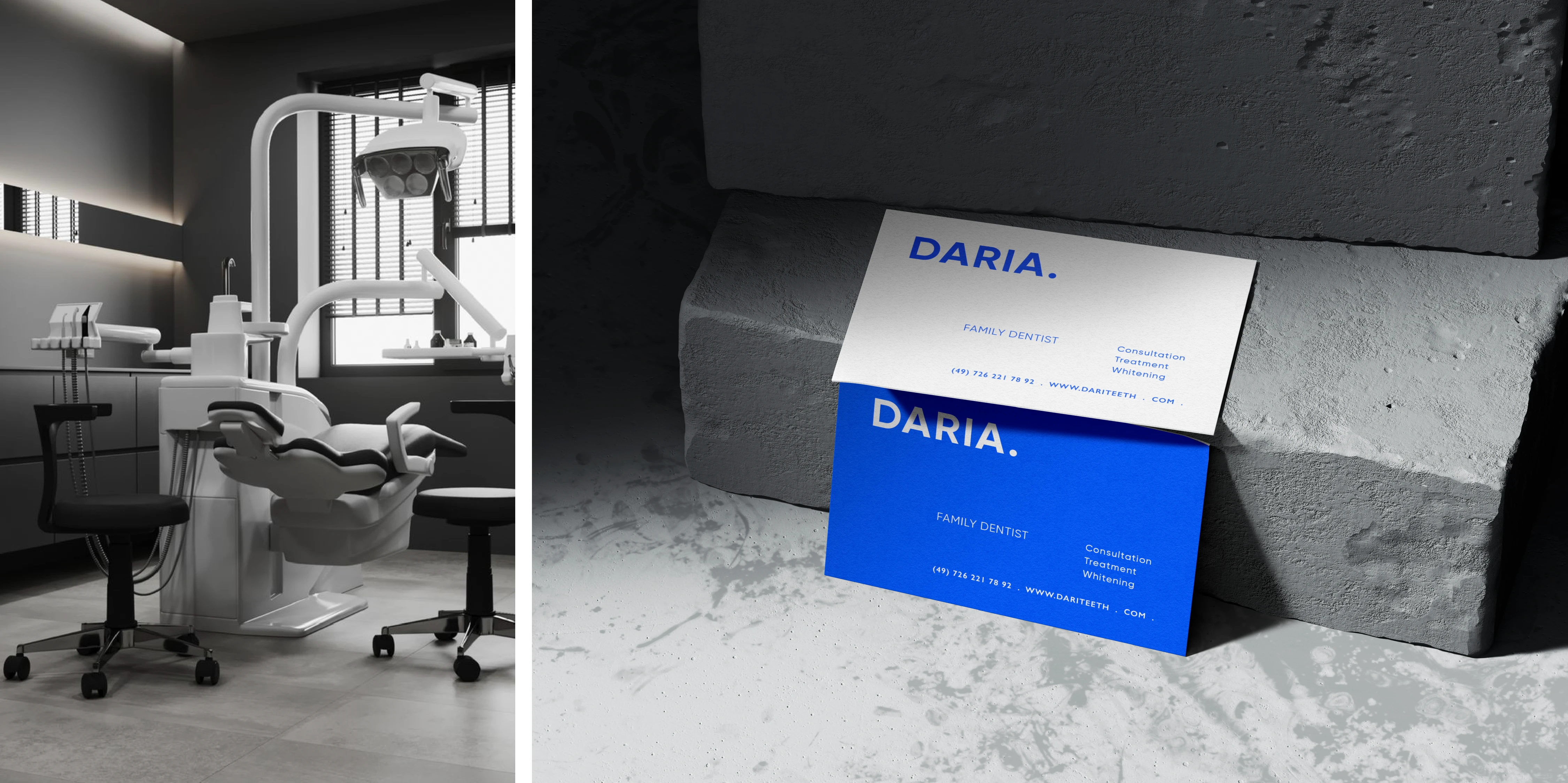
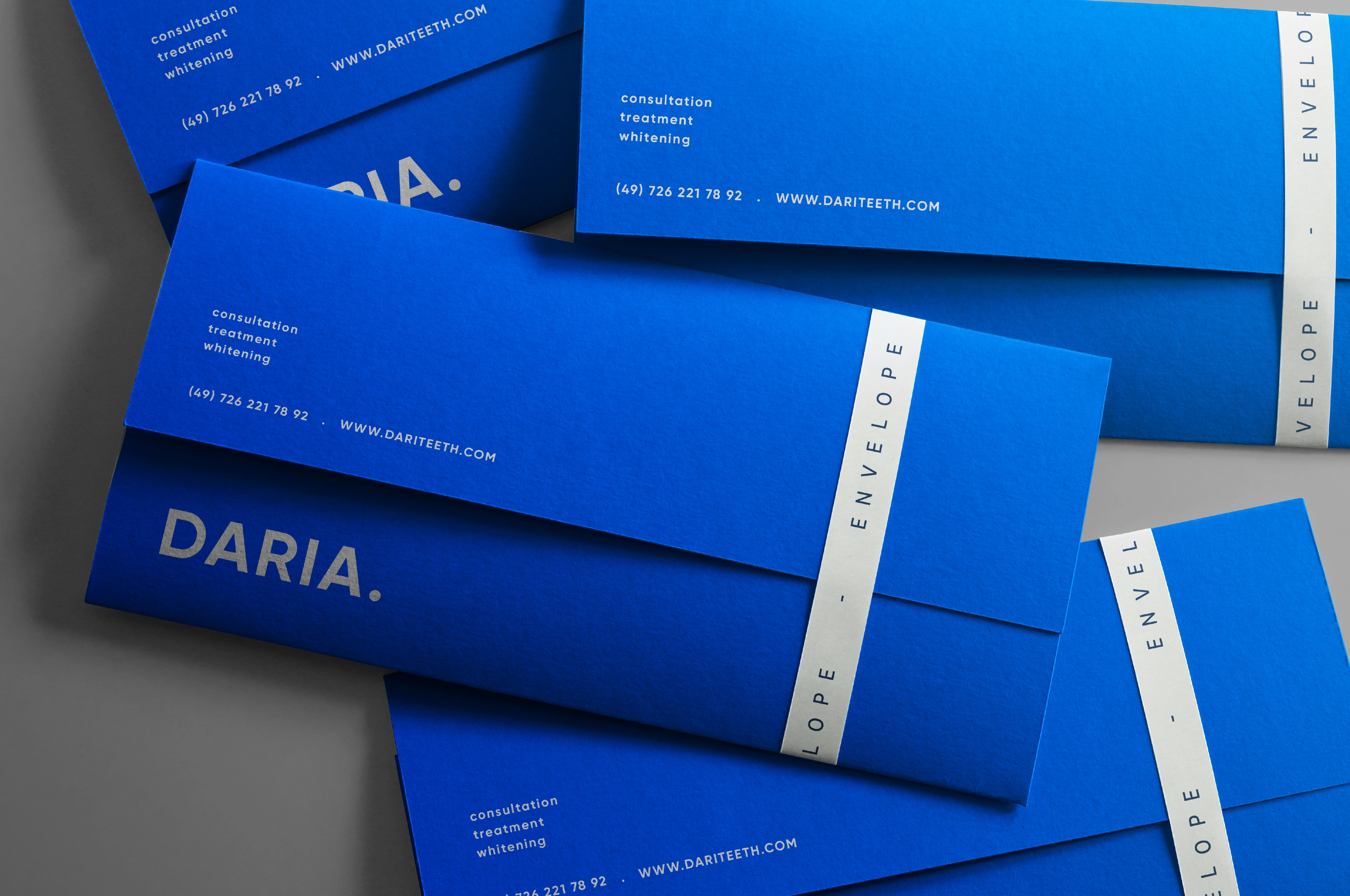
LOGO / CORPORATE IDENTITY / LOGO / BRANDING
BRAND DESIGNER: Marina Koroleva.
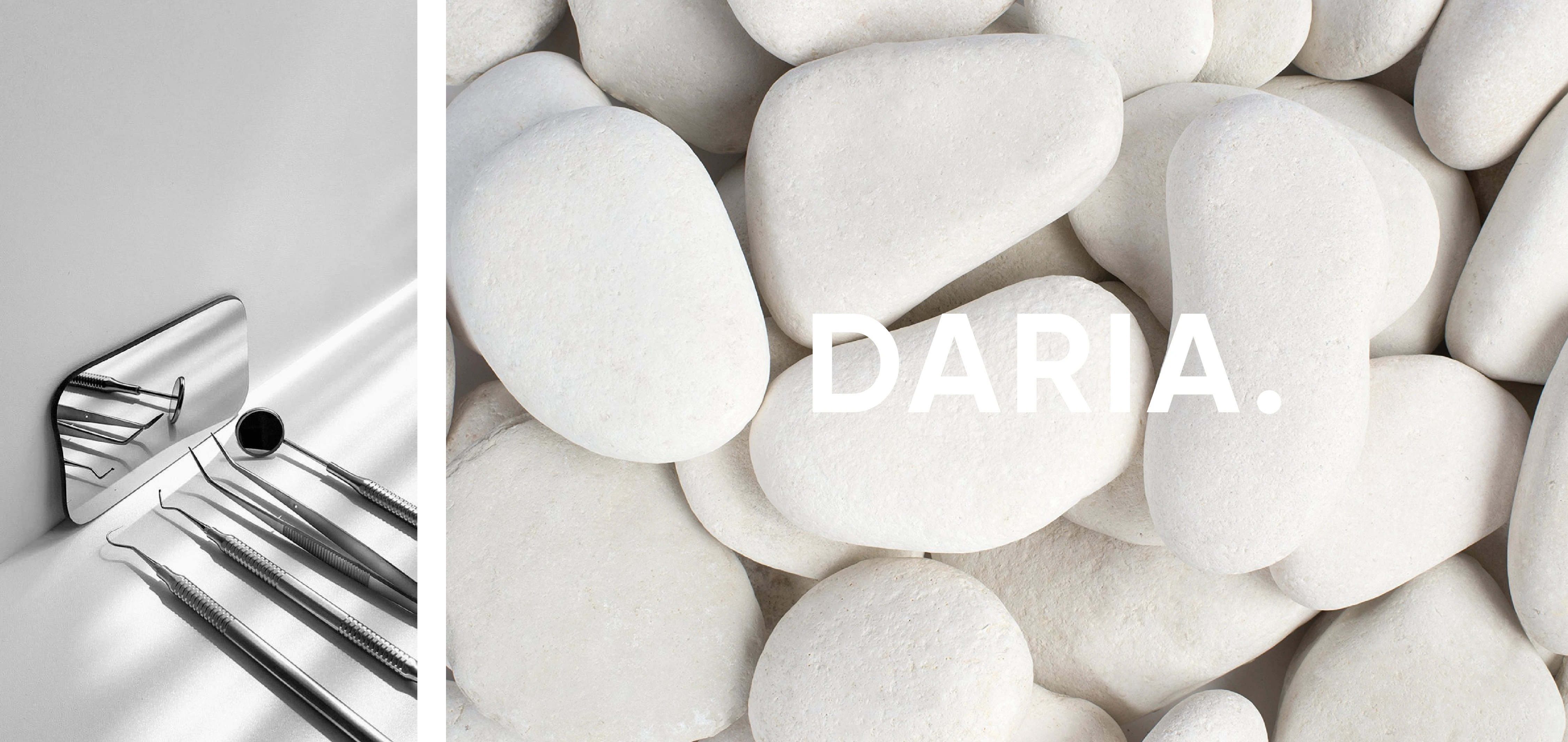
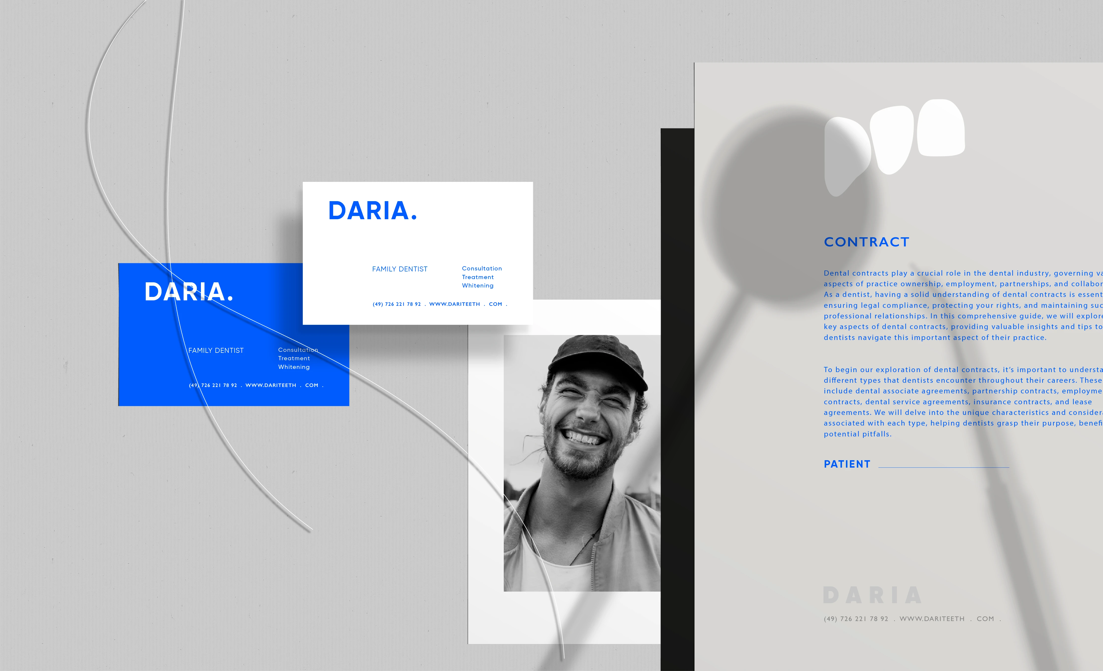
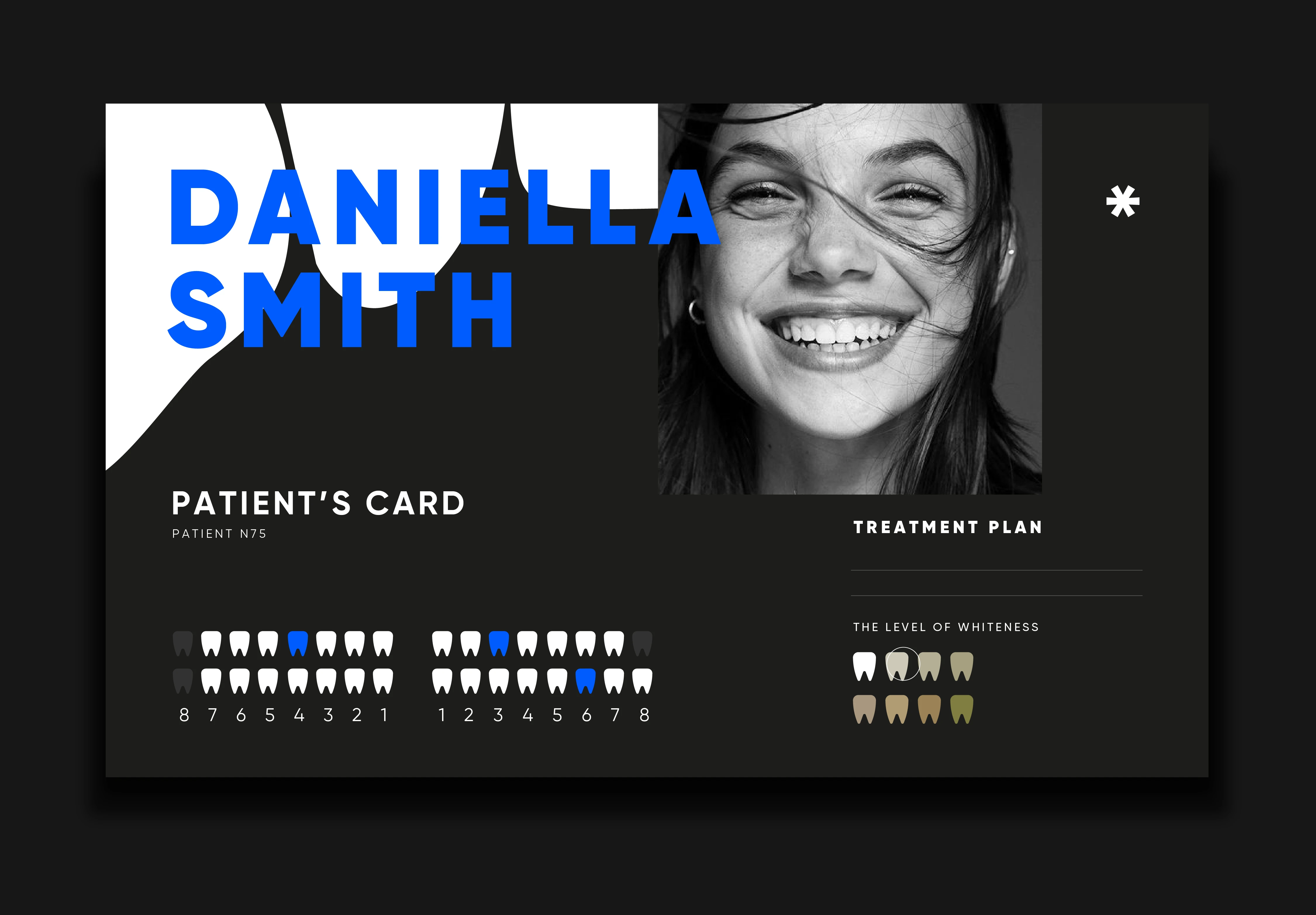
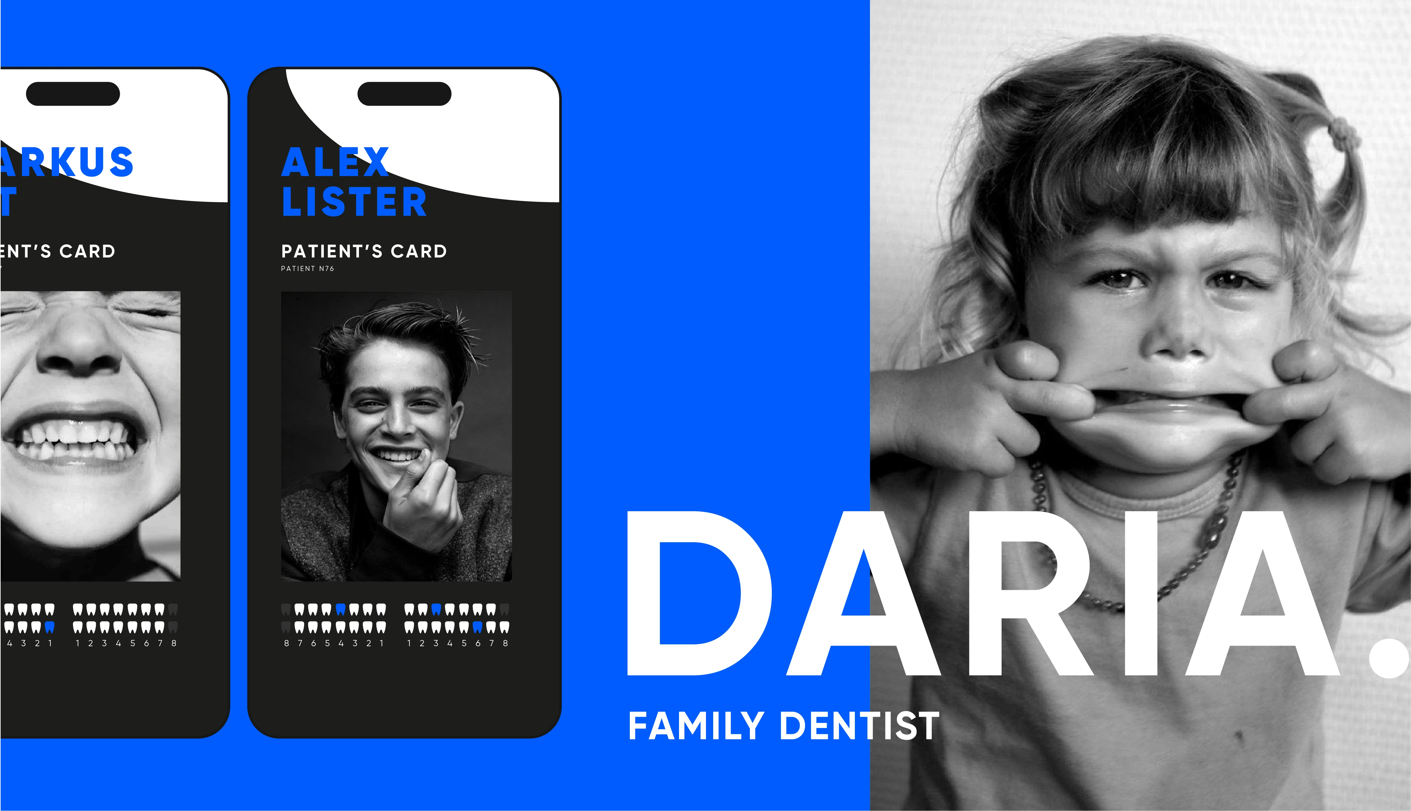
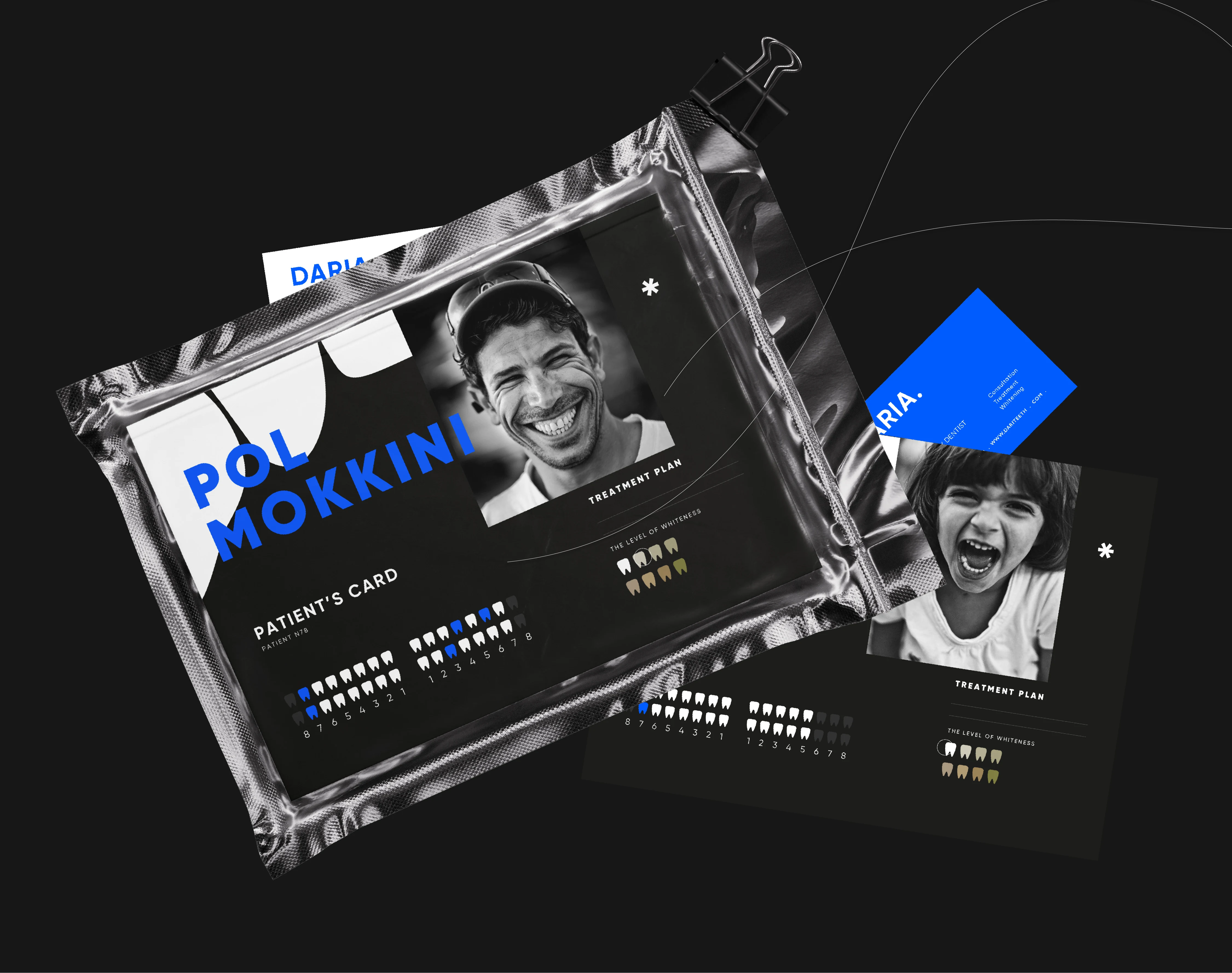
BRANDING FOR PRIVATE FAMILY DENTISTRY.
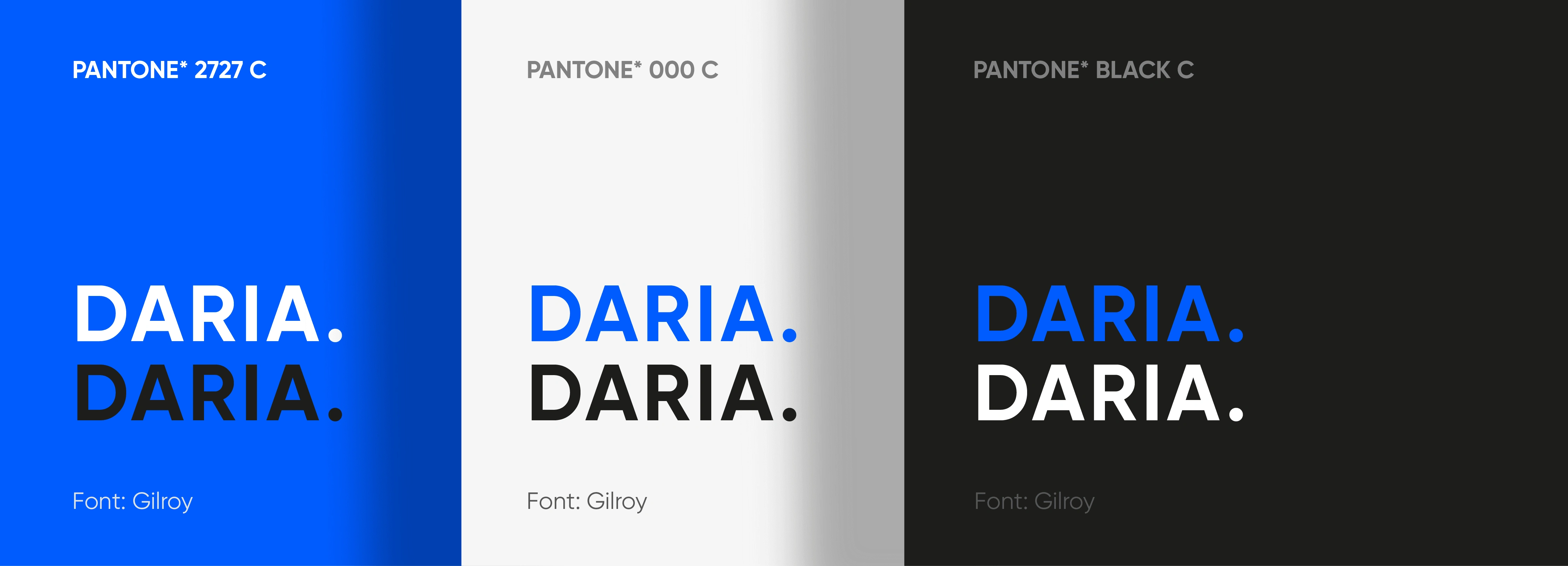
PRECISE TO THE TOUCH: white chalk stone
SHAPE: streamlined + modern lettering (Gilroy)
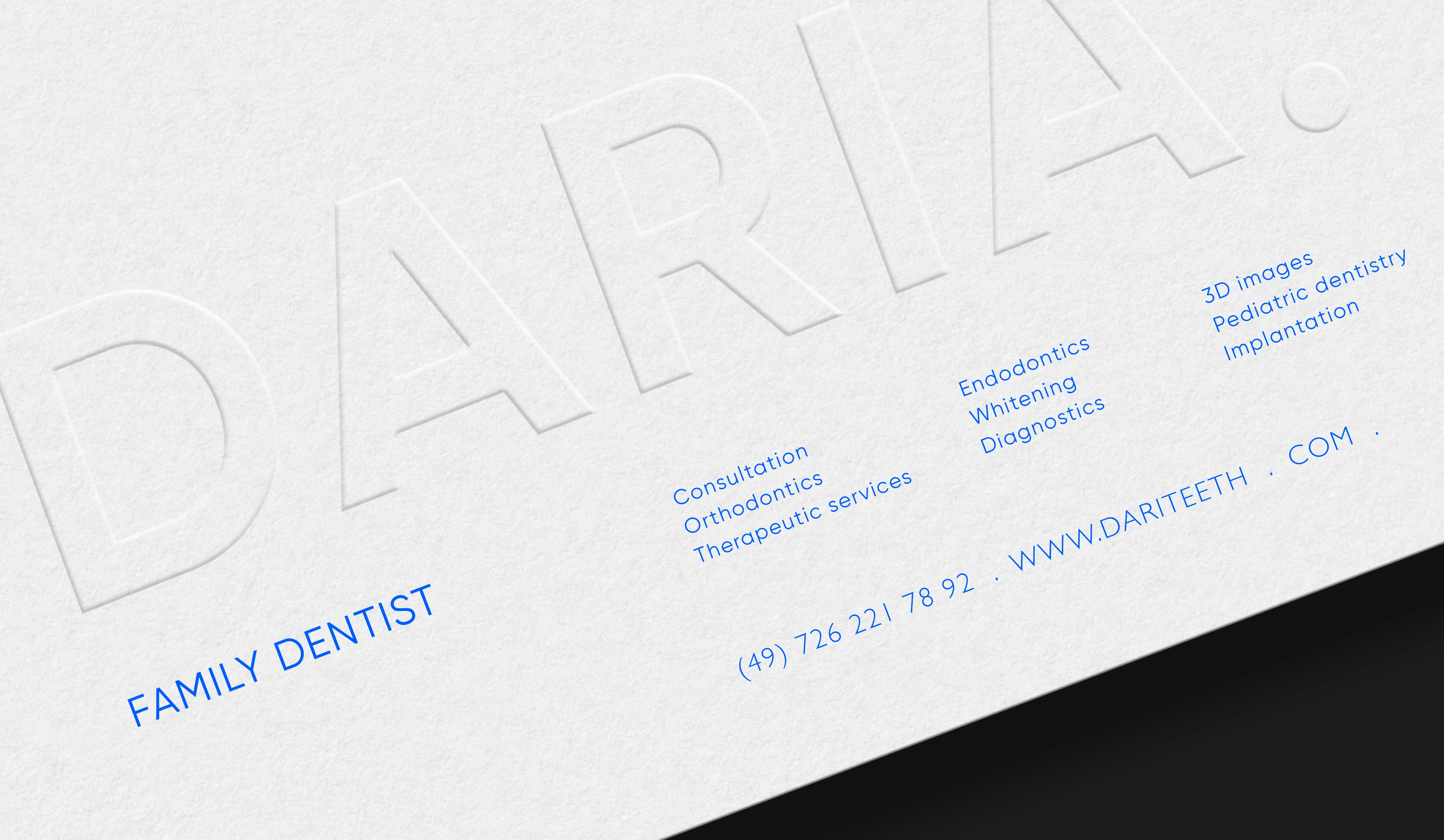
The idea is the individuality of each product and, accordingly, an individual approach to each.
We do not take the stereotypical shape of the tooth, our graphics are based on the natural shape of the teeth, lines and bends create uniqueness in the graphics of the corporate identity.
HE WAS ONE OF THE FIRST TO APPLY BLUE LIGHT FOR TREATMENT. AFTER A LONG STUDY OF ITS CAPABILITIES, HE WROTE: "I CAN'T IMAGINE ANY OTHER PAINKILLER THAT COULD MATCH THE POWER OF BLUE LIGHT."
STAGES OF WORK
1. Discussing all the details, getting to know the project (1 day).
2. Signing the contract, making an advance payment (1 day).
3. Presentation of the concept and part of the corporate identity (3 days).
4. Completion of the entire corporate identity (5 days).
5. Layout of the guideline (corporate identity guide) (3 days).
Final Thoughts:
This project is like fresh air. Minimalistic, clean, clear. I wish Daria success in her favorite business as a professional and simply a wonderful and ambitious woman.
Thanks for watching. I am open to cooperation as a freelancer, my contacts:
Like this project
Posted Jul 31, 2024
PRIVATE FAMILY DENTISTRY. CORPORATE IDENTITY / LOGO The idea is the individuality of each product and, accordingly, an individual approach to each.