Boost by 8% short-term retention by re-designing the onboarding
User problem
Student users face challenges in understanding language choices, differences between pages, and discovering features, leading to confusion and reduced engagement.

Old vs new user flow
Solutions
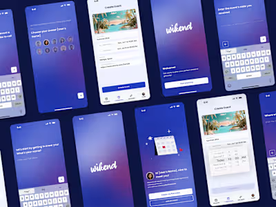
Onboarding flow enhancement
Change illustrations, text copies, and the entire flow to guide users upon installation.
Language and page type selection
Implement a screen where users can choose their preferred language for note-taking and choose between Notes or Documents explaining differences.
Contextual guidance
Create sample pages with essential information tailored to the chosen context (Note or Document), informed by metrics and test results.
We conducted guerrilla testing sessions with non Nebo users to assess the flow and the comprehensibility of our text copies and onboarding steps.
Insights
11/16 participants had misinformed expectations from the App Store description.
6/9 didn’t read the onboarding slides' app explanation.
All 16 participants lacked interest in payment options and their purpose.
7/9 found the initial versions took too long to thoroughly test.
Metrics
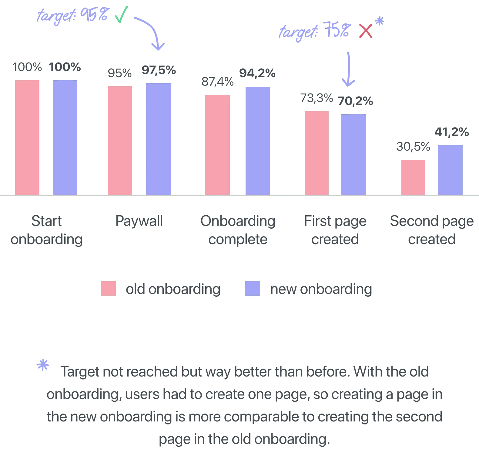
More people finished the onboarding (94% now, up from 86%).
41% made at least two pages, which is higher than the previous 30%.
The number of users buying during onboarding stayed the same at 3%.
Now, 12% are having trouble and getting stuck in the sample pages.
Like this project
Posted Jan 22, 2024
Improved onboarding with UX flow and UI boosts completion to 94%, with 41% more engagement.


