CivicLens: Building a Brand for Public Accountability

Paul Idenyi


Brand Identity Design for Civiclens - Building a Brand Around Public Accountability
Project Overview
CivicLens is an independent civic accountability organisation focused on making public spending easier to see, understand and question. The platform connects public budget information, government projects, and citizen-contributed evidence to help Nigerians better understand how public resources are allocated and what is happening within their communities.
The goal was to create a visual identity that communicates this mission clearly while positioning CivicLens as a trustworthy, authoritative, and citizen-driven organisation.
Challenge
Public spending and government accountability can be difficult for citizens to follow in Nigeria. I mean budget documents, project records, and information about actual project delivery are often disconnected from reality, making it challenging to understand what has been allocated, what should have been delivered, and where questions need to be raised.
CivicLens needed an identity that could communicate these complex ideas without feeling overly institutional, political, or difficult to approach.
The challenge was to build a brand that inspires trust, encourages participation, and makes the subject of public accountability more accessible to everyday citizens.
The Brand Strategy
I approached the identity by focusing on three key characteristics:
Trustworthy: The brand needed to communicate credibility and make people feel confident engaging with the information presented.
Authoritative: The visual language needed to reflect the seriousness of public accountability and the importance of evidence.
Bold and Reform-Driven: CivicLens should not simply present information. It should encourage citizens to pay attention, ask questions, and participate in conversations around public spending.
These characteristics informed the visual direction, typography, colour choices, and overall brand expression.
Logo Concept
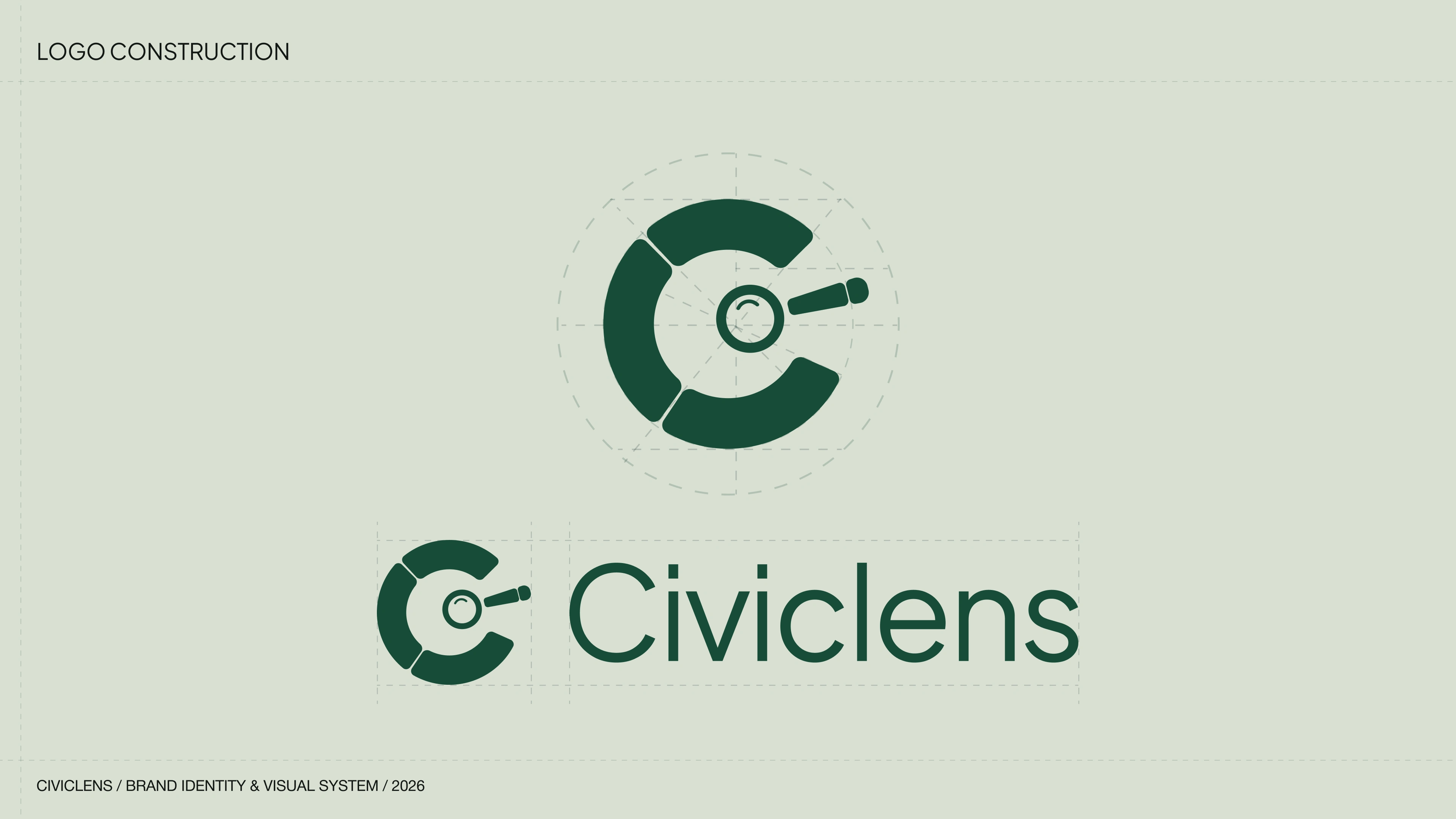
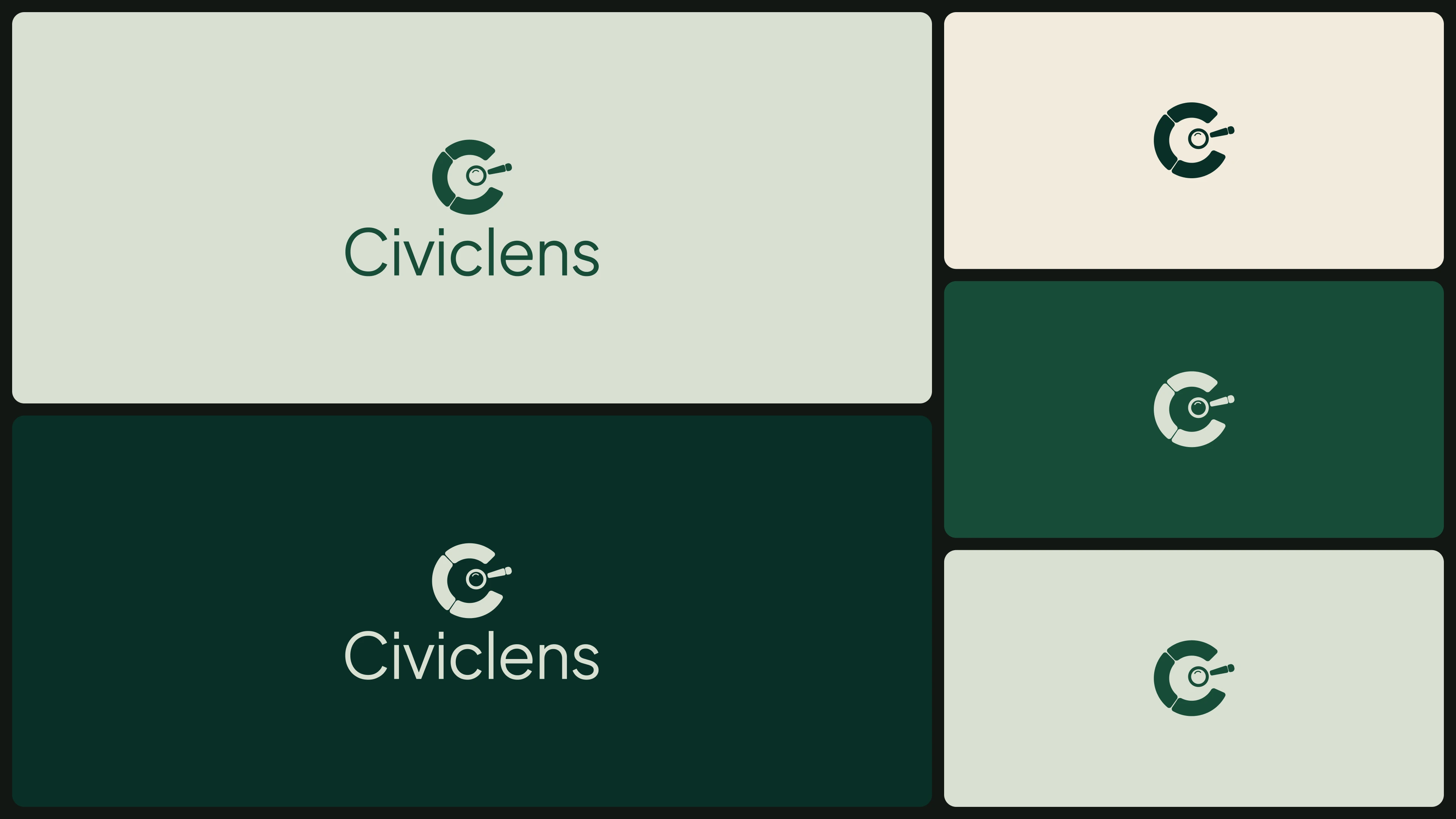
The CivicLens logo is built around a distinctive lens-inspired symbol. The concept represents focus, visibility, and the connection between different pieces of public information.
Rather than relying on familiar eye or magnifying-glass imagery, I explored a more distinctive geometric approach that gives the brand its own visual identity.
Visual Identity System
Colour Palette
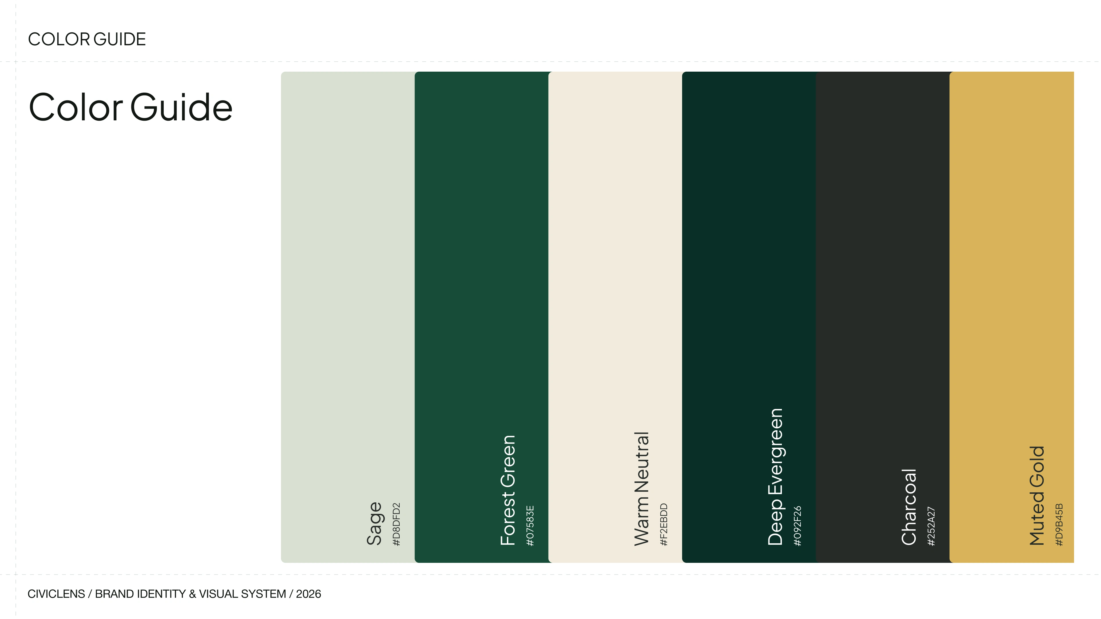
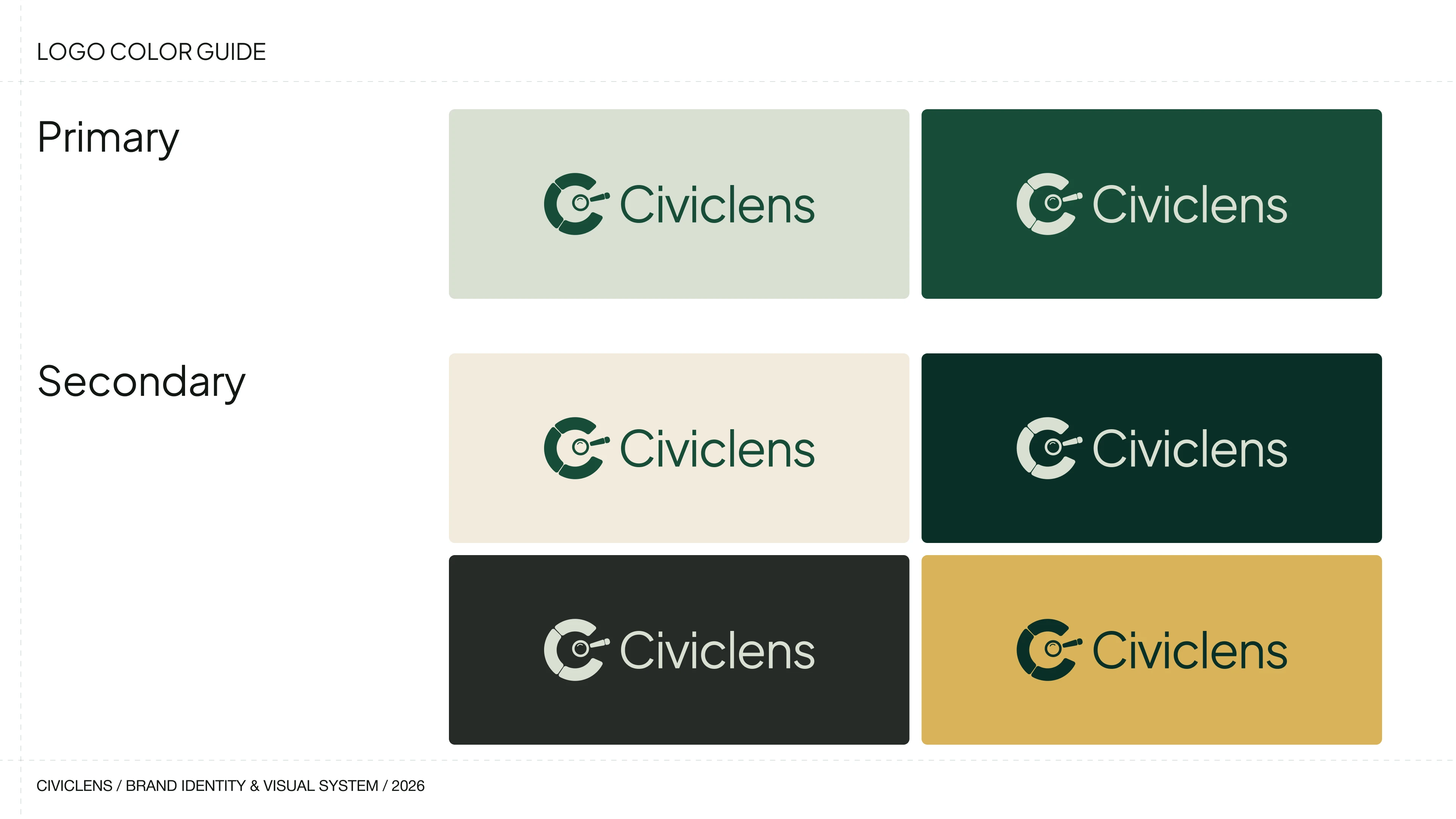
The identity retains a strong green direction, anchored by a deep green tone. The palette was developed to communicate trust, stability, and authority while providing a consistent foundation for the brand across different applications.
Typography
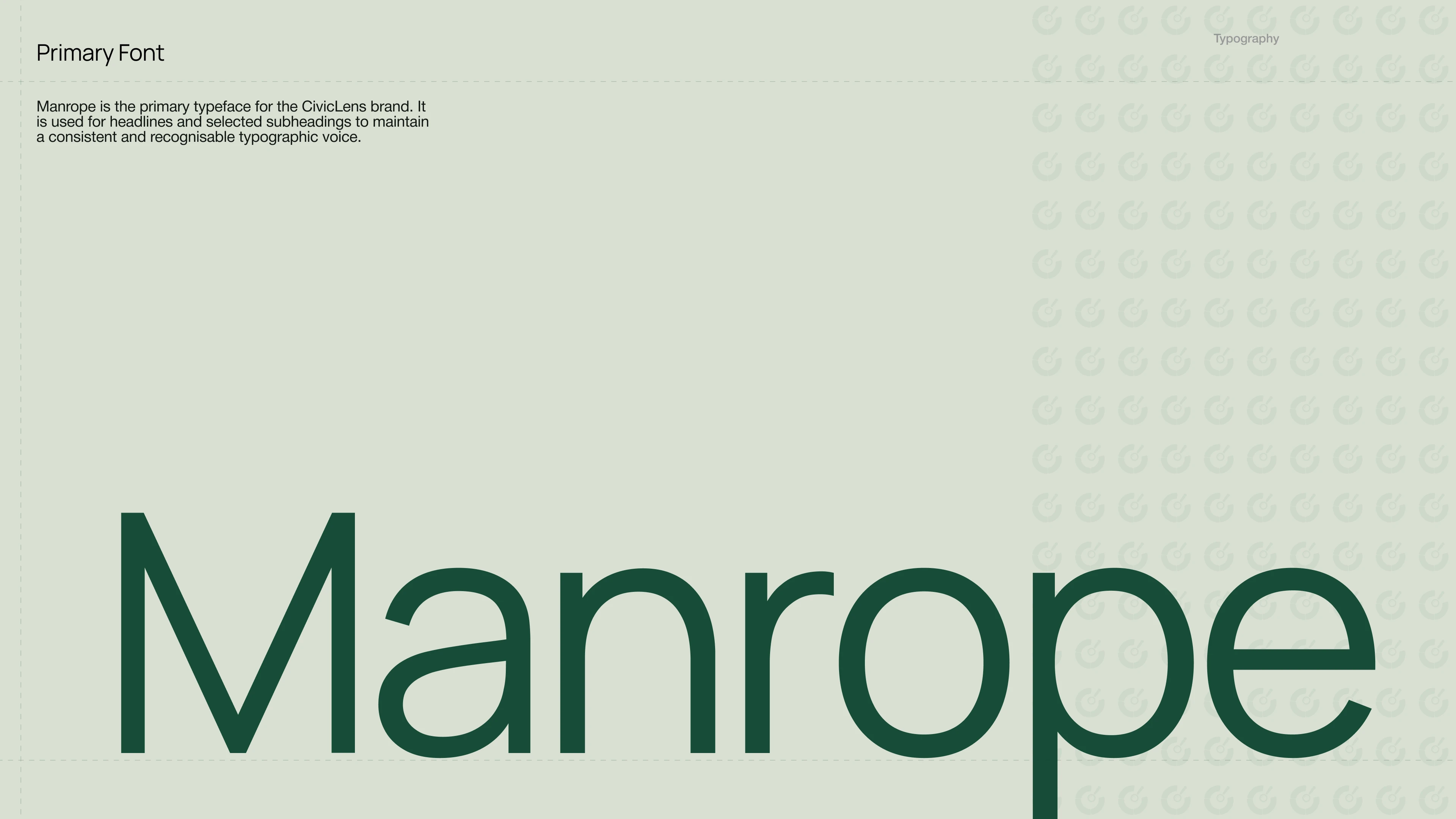
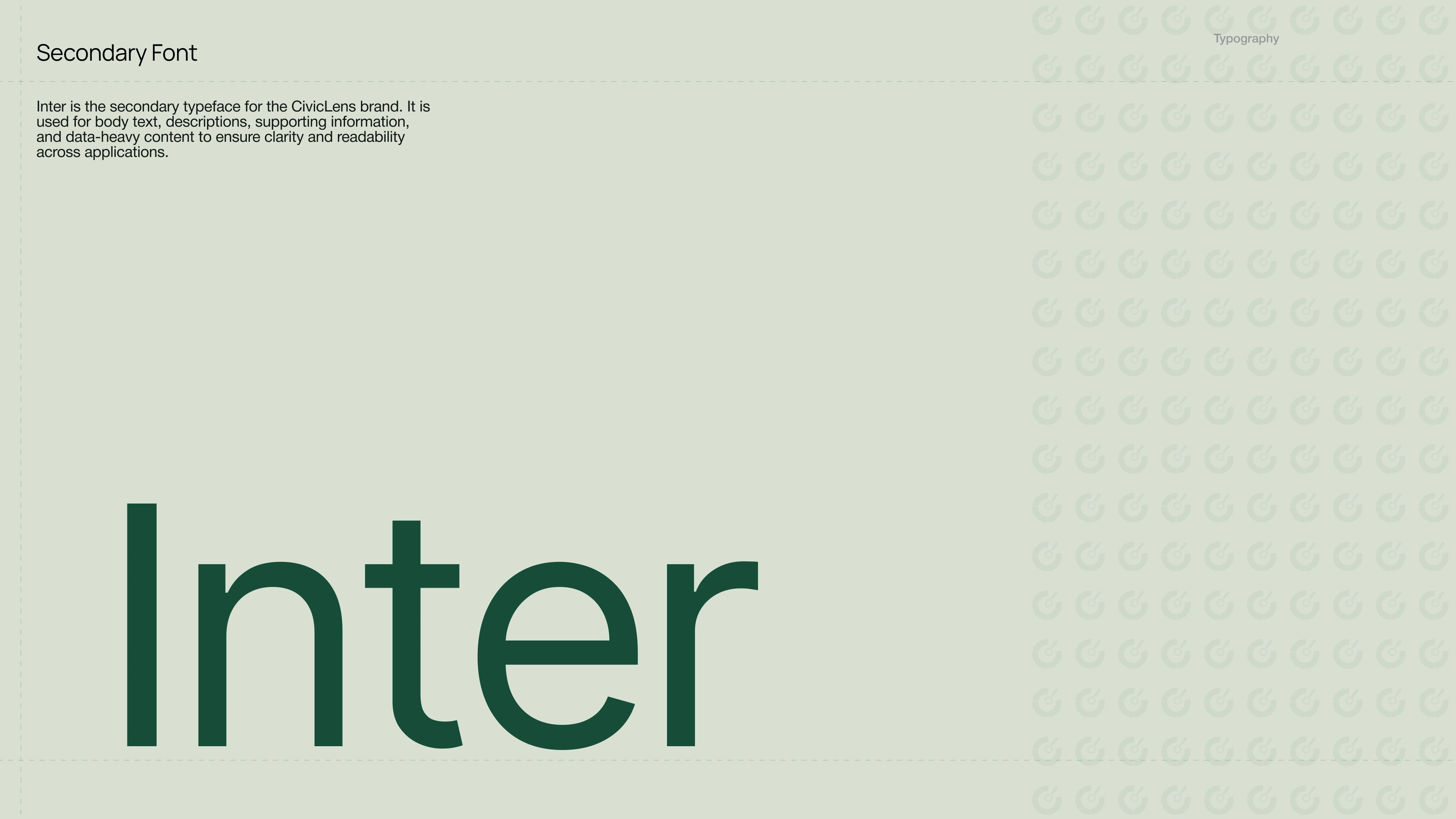
Manrope serves as the primary typeface, bringing a confident and modern character to headlines and prominent brand messaging. Inter supports it as the secondary typeface, providing clarity and readability across body copy, reports, digital interfaces, and information-heavy content.
Together, they create a typographic system that balances strong visual communication with accessibility.
Brand Applications
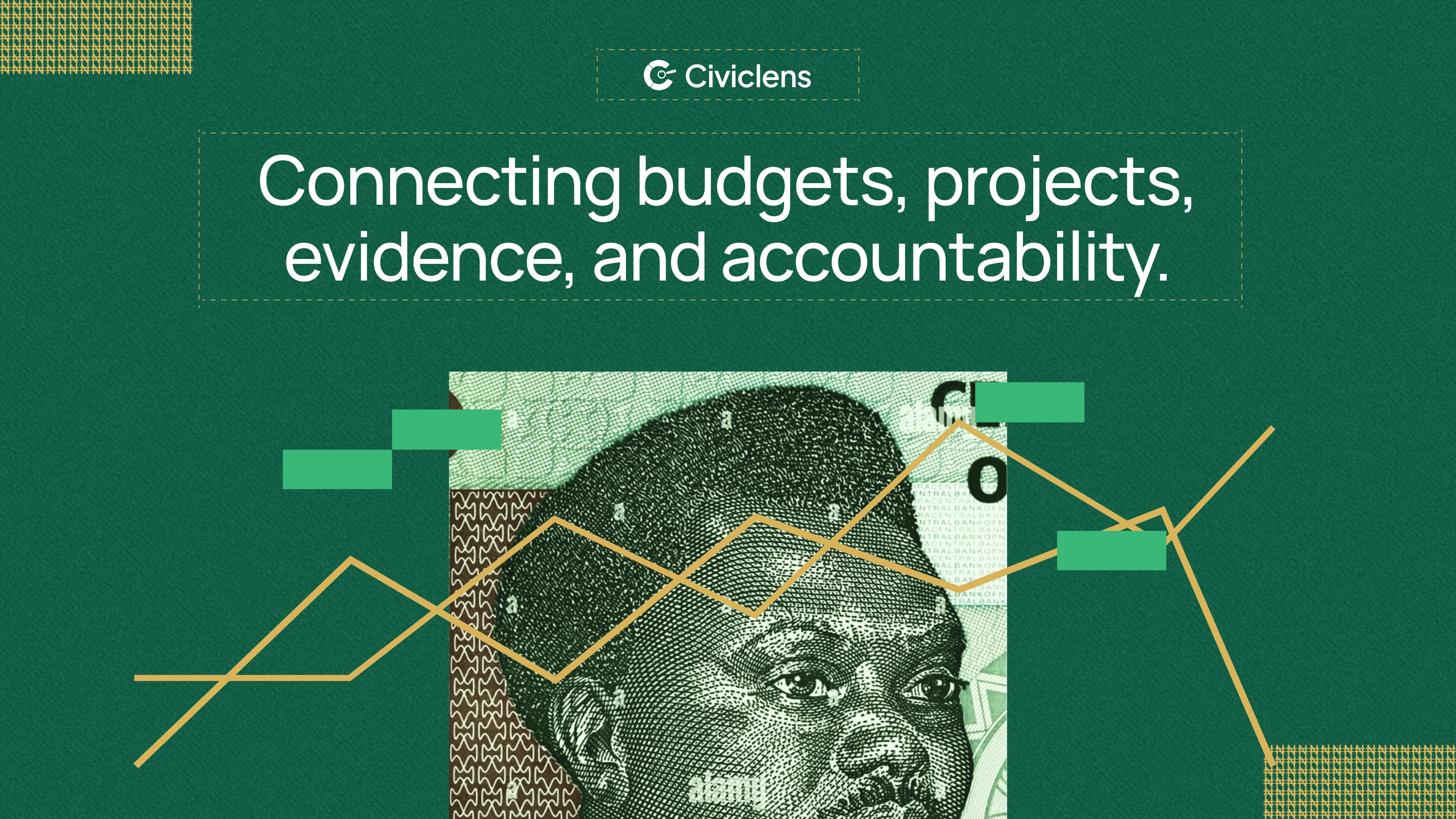
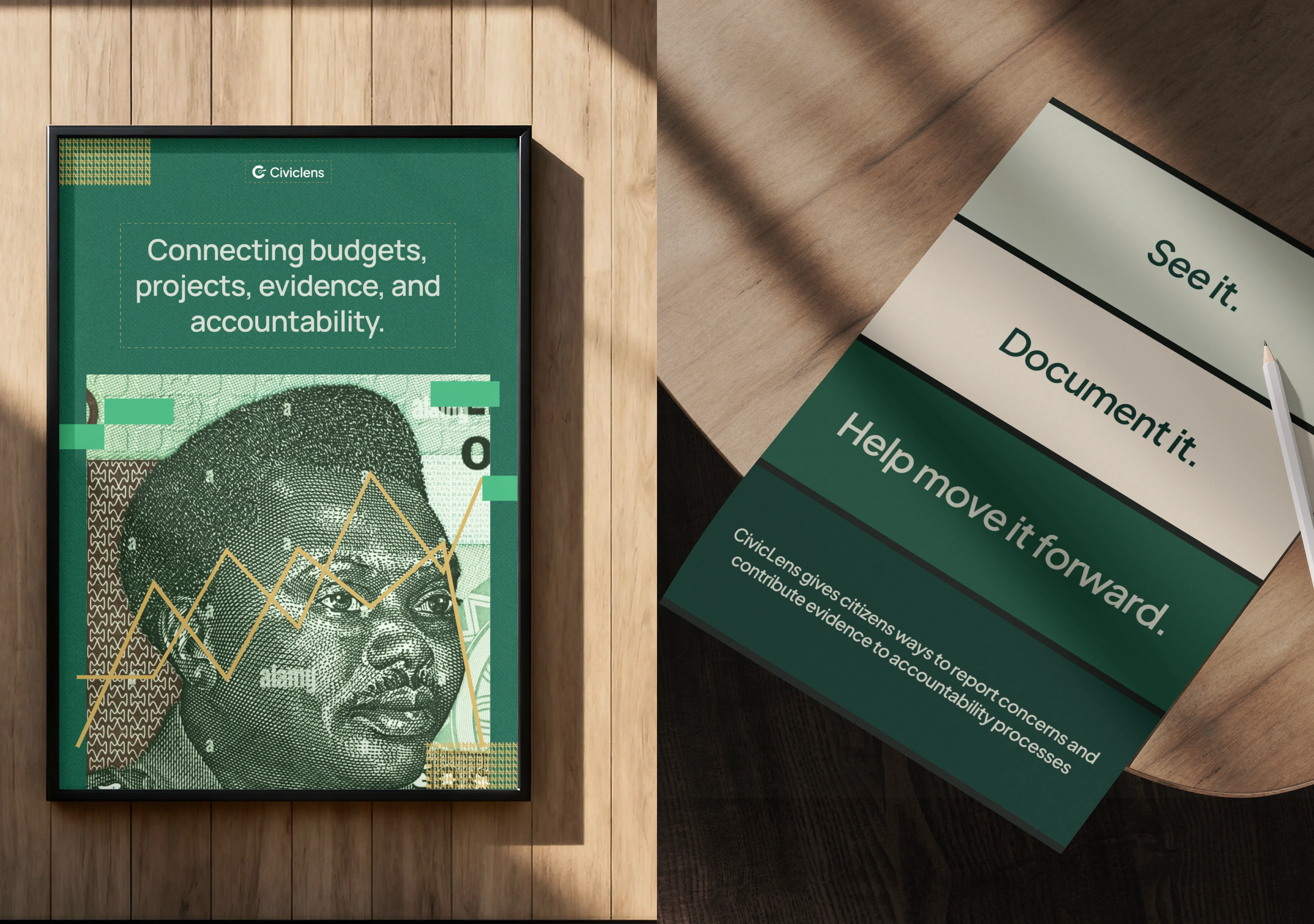
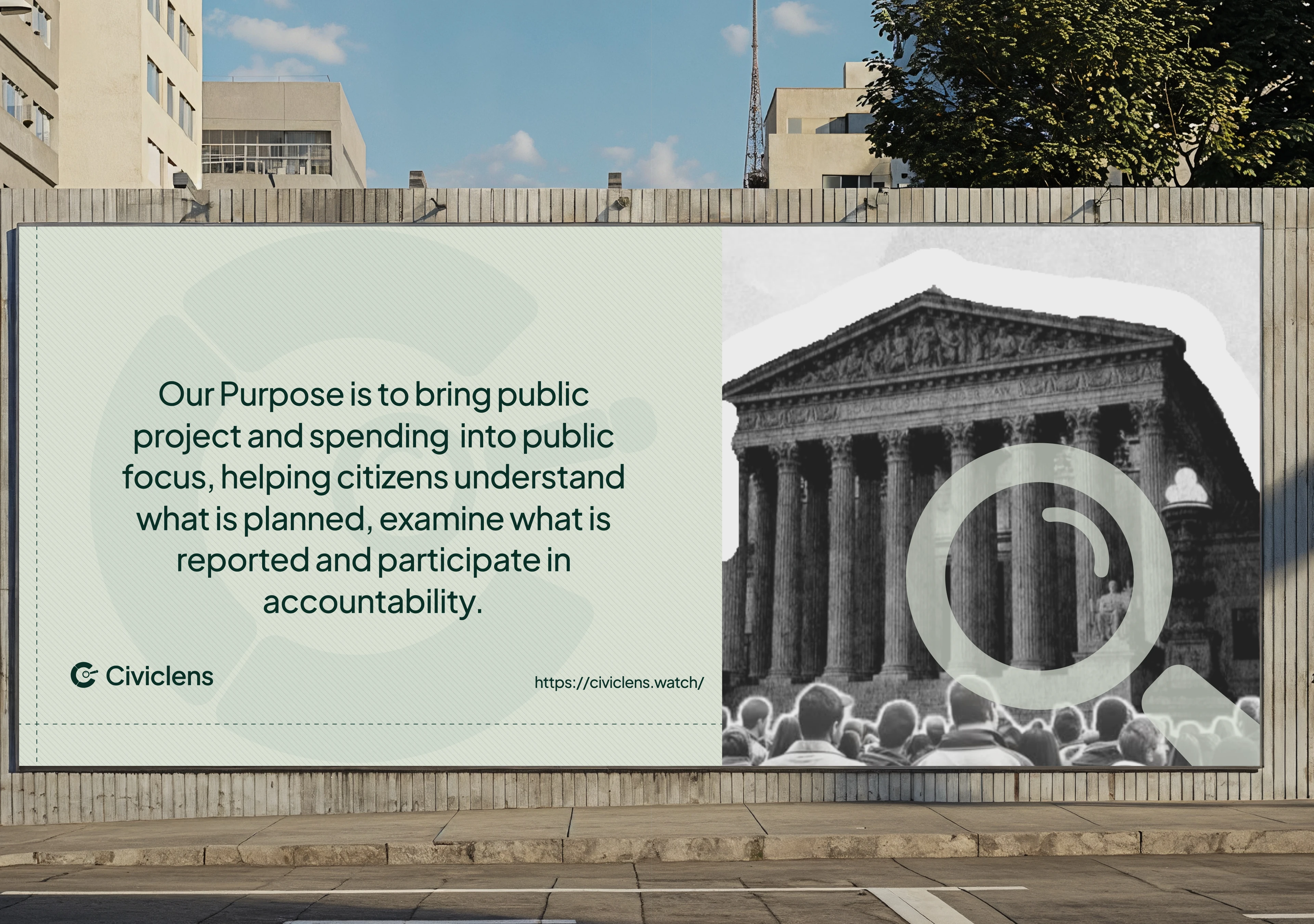
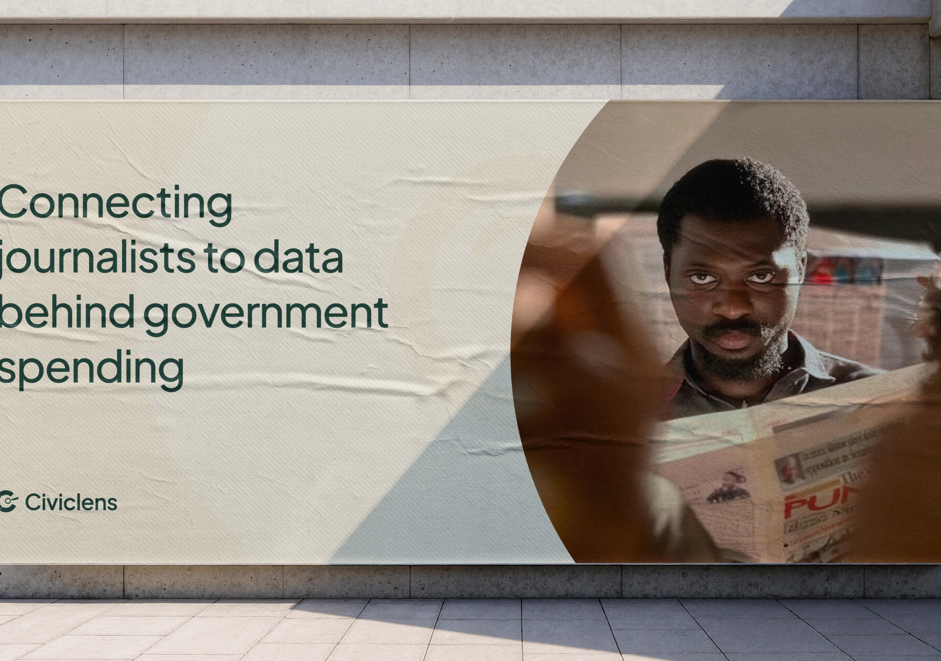
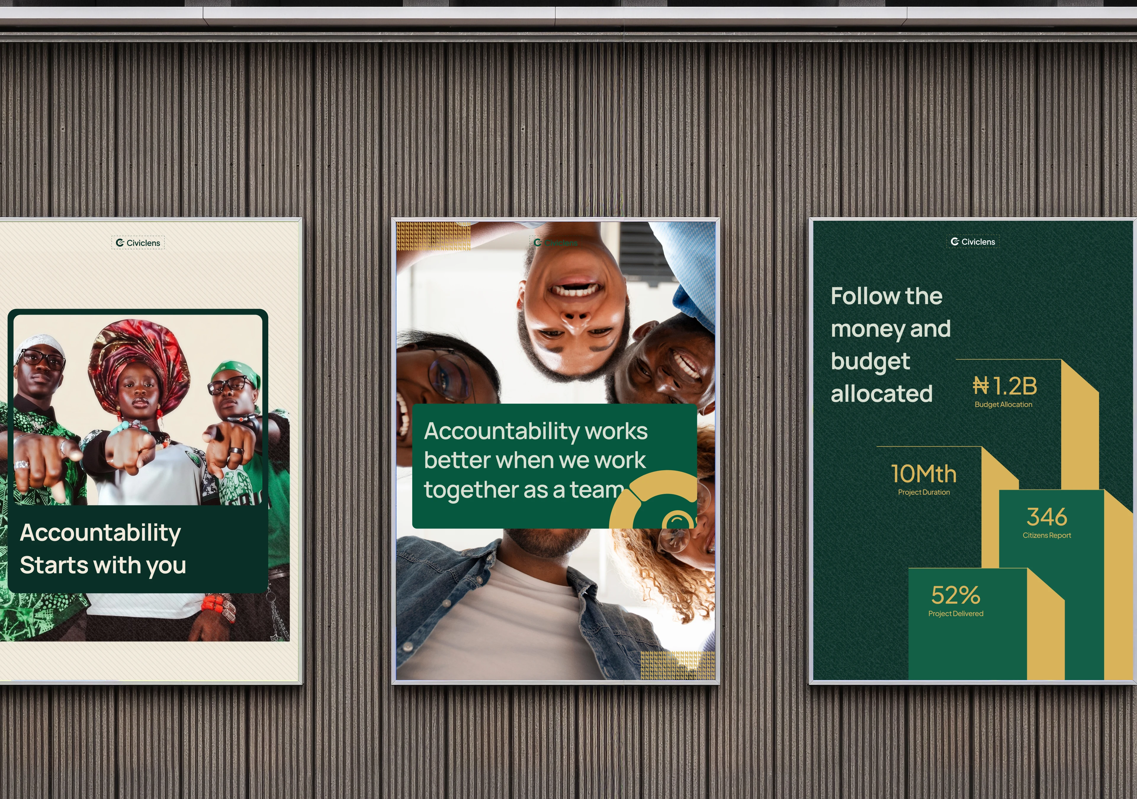
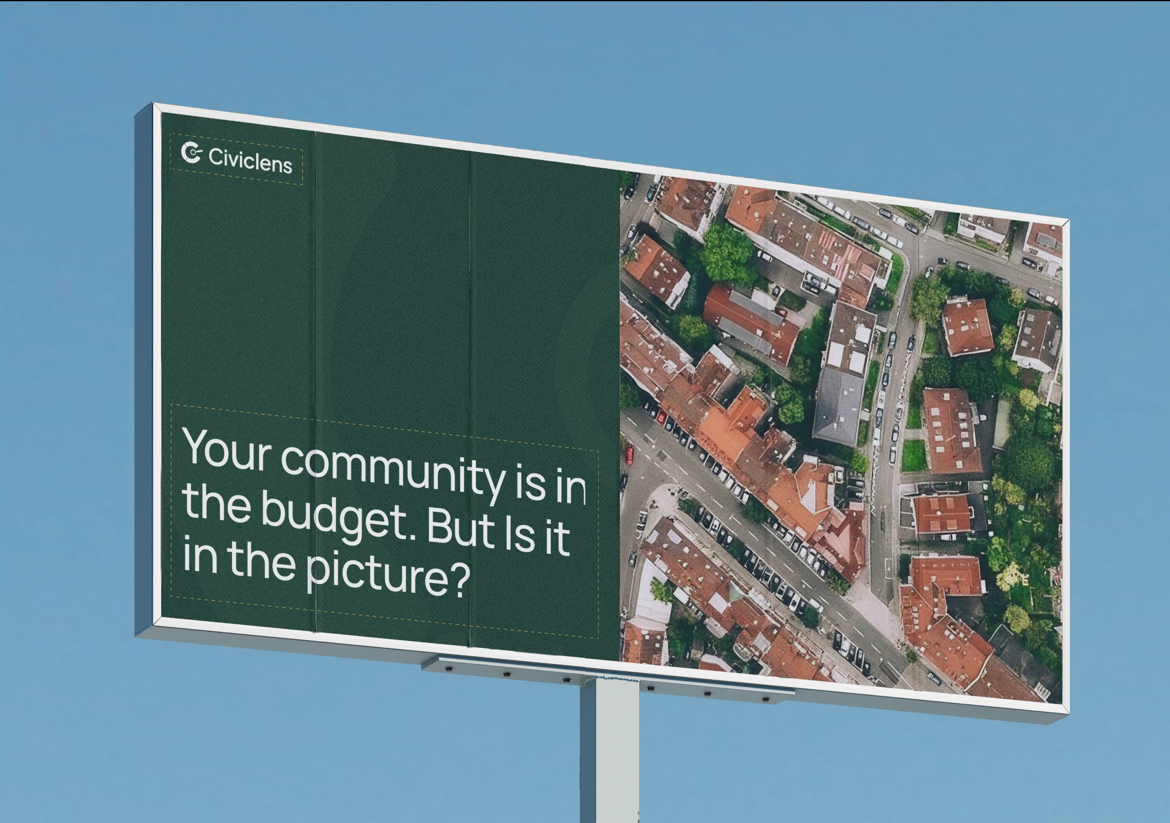
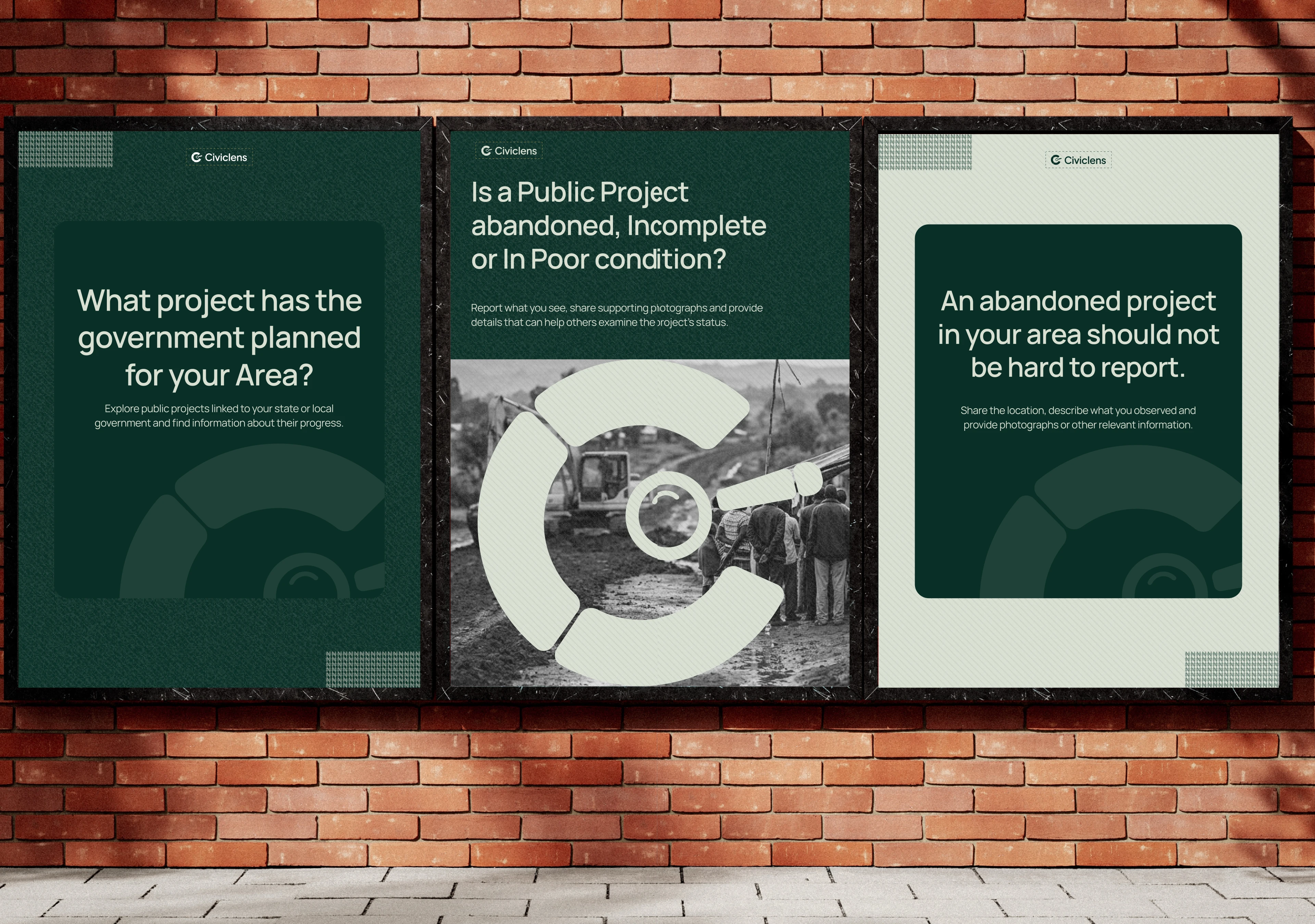
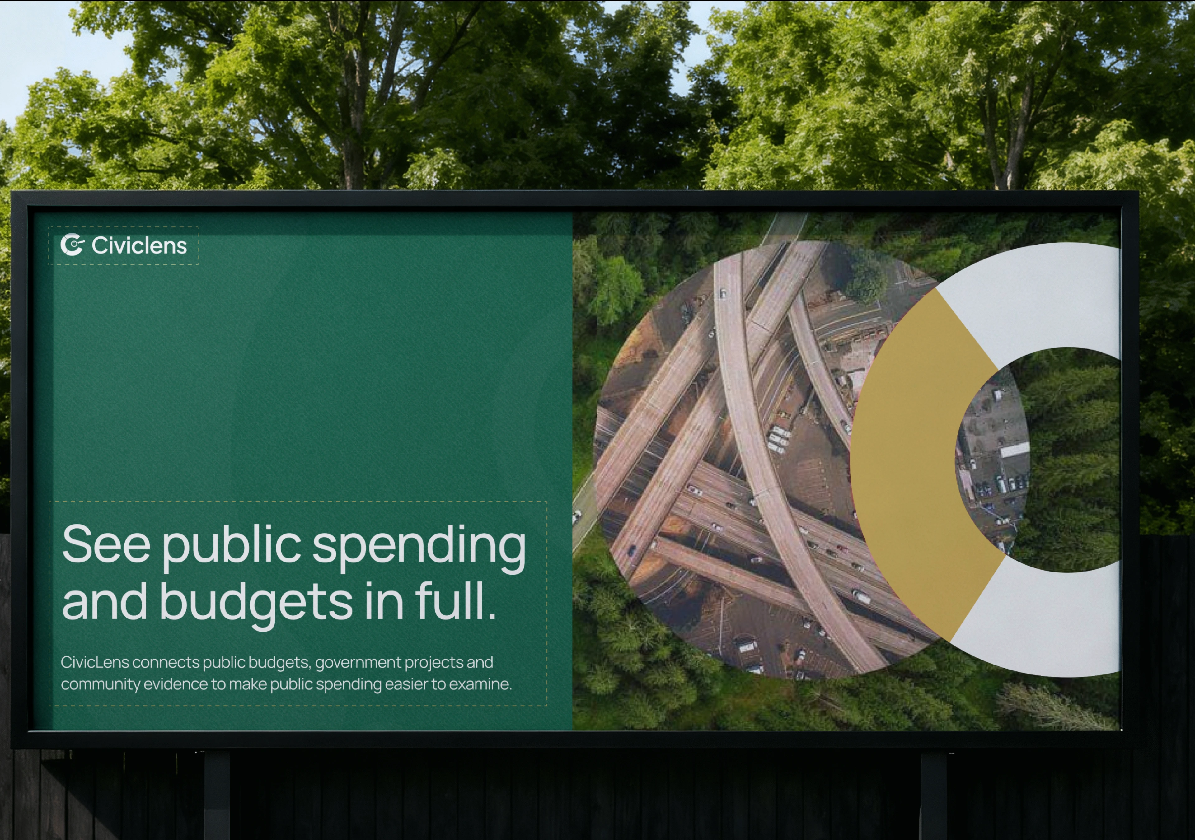
To demonstrate how the identity works beyond the logo, I developed a series of visual applications that bring the brand into everyday communication.
These include:
Social media graphics and campaign designs.
Brand presentation materials.
Pitch deck and presentation layouts.
Typography and colour applications.
Visual compositions for communicating civic information and public accountability.
The applications were designed to maintain consistency while allowing the brand to communicate different messages across platforms.



Like this project
Posted Nov 6, 2026
Created a brand identity for CivicLens to communicate trust and civic accountability.