An UI/UX Case Study : A Product Review App for Designers
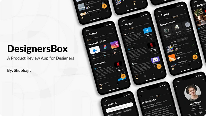
DesignersBox Cover Image
Problem Statement:
Designers often have a problem in finding, reading as well as writing Product Reviews especially since there are no dedicated product review apps. Reviews from the general users are available in plenty but the need to have specific Designer reviews to make sound decisions on the product’s UI/UX updates has been missing so far.
Solution:
A product review app designed specifically for designers would provide a valuable resource for finding & reading product reviews. The app would be easy to use & would include features that are meant for product designers, such as the ability to write reviews, read reviews from others fellow designers & be part of the community of Designers as a whole.
This is where DesignersBox comes in. It enables the designers to write reviews for products, provide ratings based on their experiences with the UI & UX of the App as well as checkout reviews from other designers all while being part of a large community of designers helping each other learn, Collab & grow in their careers.
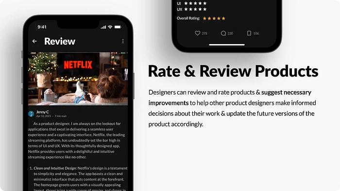
Rate & Review Products Screen
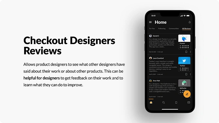
Designer Product Reviews Screen
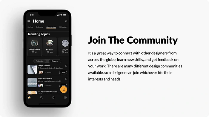
Design Community Screen
Goals:
Increased Productivity — Designers would be able to find the information they need more quickly & easily, which would save them time.
Understand Designer’s Mindset — Product Designers will be able to understand the mindset of the designer’s reviewing the products, it’ll help the up & coming designers as well as the experienced ones to make sound decisions while designing or updating their own products.
Community of Designers — Being part of a community of designers from across the globe will be able to help them to learn, grow & collaborate to excel in their respective careers as Designers.
Project Information
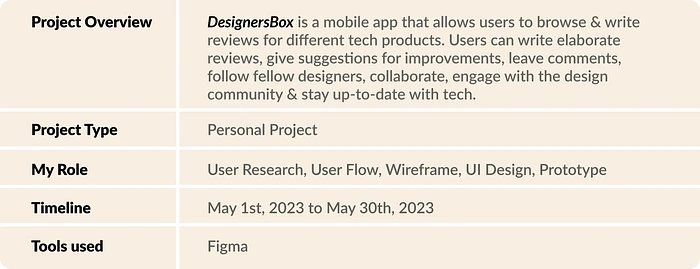
Basic Project Details
Design Process:
I followed the 4 D’s of Design Thinking Process to solve this problem.
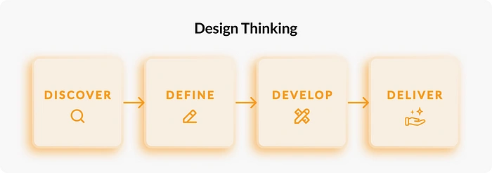
4 D’s of Design Thinking:
Discover : This stage involves identifying the user’s needs through research & survey.
Define : In this stage we explore the insights received from the previous stage & develop user persona.
Develop : Based on the information we have now, this is where we start to ideate & design to solve the problem.
Deliver : The Final stage in design process where you refine, finalize & deliver the product.
Note: It is important to point out that a Design Process involves constant back & forth of feedbacks between team members, clients, stakeholders in every step of the way when ideating a product. Since this is a personal project, I had to proceed as it is, ideating on my own & updating my design along the way to completion.
Idea Inspiration
The idea for this app came to me during my learning phase of Digital Design & trying to understand the mindset of an Experienced Designers about how they look at products & analyzed the good & bad aspects of it.
Hence, I started researching for apps or websites where we can find Designers who talk about existing product’s pros & cons.
Also the lack of a Designer Centric App (focused on Designer’s opinion on products) which had a community of its own where Designers can network, Collab & help each other grow (while designer’s do that via twitter, discord & other apps, the beginner designers still find it difficult to grab opportunities initially).
I also found out that during During Design Interviews, the interviewer at times asks for the candidate’s perspective of a product & its UI/UX design.
⚡💡 All these led to me thinking that there was a genuine scope to monetize ideas recommended by the designers that will help the Tech Companies to make sound decisions during their respective product updates. Hence why I started my work on this project.
User Research
It is the process of gathering & analyzing data about users to understand their needs, behaviors & attitudes.
Discover Phase:-
This stage involves identifying the user’s needs through research & survey.
Quantitative Research
Created an user survey questionnaire using Google Sheets, to determine the target audience demographic and to gain a basic understanding of our users. I shared the questionnaire with Designers across Twitter & WhatsApp Design groups & received 10 responses from 3 countries (US, Nigeria & India). Majority of the users were from India. Based on the responses I received, here are the key insights presented below:-
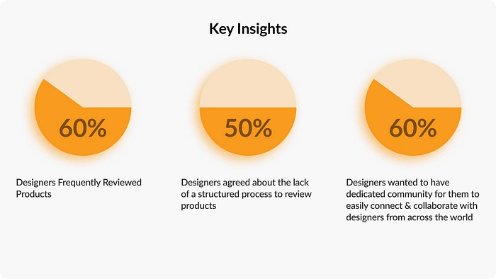
Key Insights from the User Survey
Competitive Analysis
Since this is mostly a new app idea with a niche user demography, it doesn’t actually have that many direct competitors. Below is the competitive analysis of indirect competitors of DesignersBox.
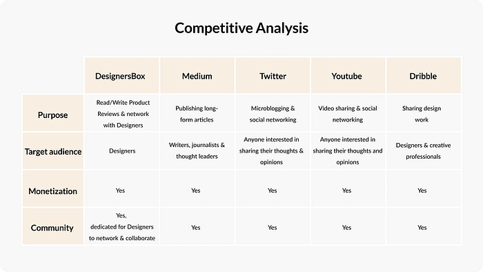
Competitive Analysis Table
Define Phase:-
In this stage we explore the insights received from the previous stage & develop user persona.
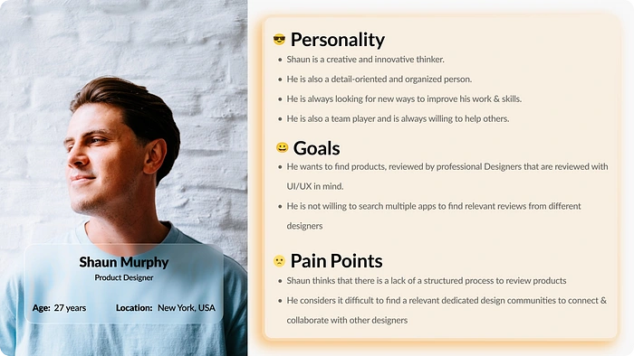
Created a persona to understand more about the user’s problems.
A persona is a representation of your customers.
User Persona
Develop Phase:-
Based on the information we have now, this is where we start to ideate & design to solve the problem.
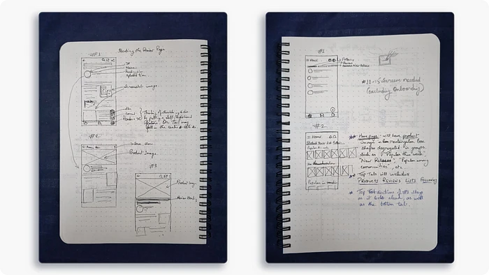
Sketches
I did rough sketches to get the vibe & outline of the application I was planning to design. At this stage my main aim was to get an idea of the look I was going for in terms of the structure of the components, icon placements, number of screens, etc. As you can see, I only sketched 4 screens that felt more important to me, once I was confident enough, I moved to the next step with the Lo-fi wireframes.
P.S. : The other screens were conceptualized during Lo-fi wireframing stage.
Paper Sketches
Wireframes
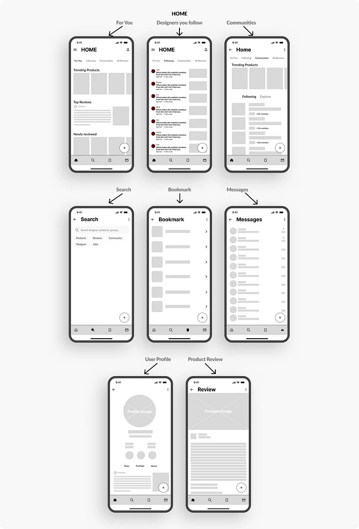
Wireframes are designed to get a basic structure of the app.
For this app, I’ve designed wireframes for the 8 important screens & rest of the screens were finalized while creating the hi-fidelity design. As can be seen from the wireframe, the home screens & the following screens had significant changes in the final output because I wanted the cards for the products & the reviews with ratings to have a similar look & feel in this app. Hence the visible changes in the final design.
Low Fidelity Wireframes
Style Guide
A style guide is a document that details a company’s set of standards for writing, editing, formatting, and designing documents.
Typography
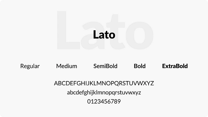
During my research for the suitable typeface for this Project, I found out that the Google typeface Lato is one of the most preferred typeface for content writing for magazines, website & promotional materials etc. because of its round edges & the approachable warmth that it gives to the readers. Which felt apt for this app, hence why I went ahead with it.
A typeface is what you see and a font is what you use
Typeface & Font Used
Color Palette
While choosing the color palette for the app, I decided to go for the vibe that Medium App gives off with their minimalistic design, hence chose a F8F8F8 color text on top of 131313 color background for the Dark Mode because the contrast between the two colors is high, which makes it easy to see the text. And chose F5A132 as a highlight color. Simultaneously, took similar design choices for the Light mode color palette as can be seen 👇.
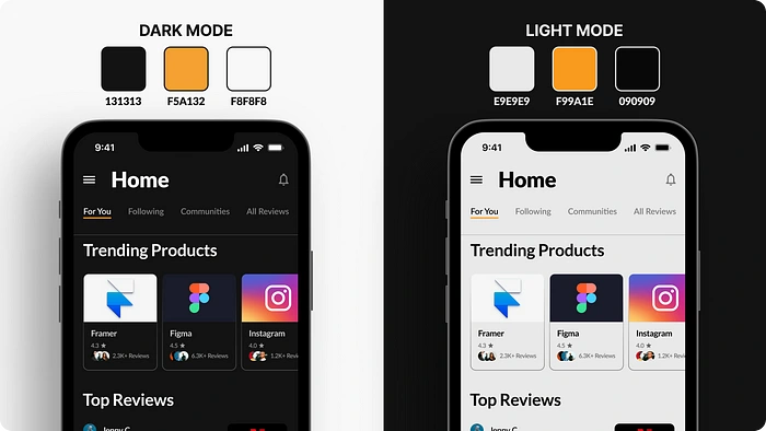
Color Palette used for this project
Components
Components are interactive building blocks for creating a user interface. They can be organized into categories based on their purpose: Action, containment, communication, navigation, selection, and text input.
I designed the components keeping in mind the color palette & the features of the app making sure that it is easy for the users to understand their respective functions as can be seen below. Similarly, Icons (taken from Coolicons Set) were chosen based on how simple they are & they easily convey the required actions from the user.
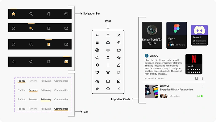
Components used in this project
User Flow
The User Flow Diagram is a visual representation of the steps user takes to complete a task.
In the below user flow diagram, I’ve shown the important tasks that the user has to go through to reach each specified screens. I’ve been designed it as such that a new user finds it easy to reach respective pages quickly without feeling lost.
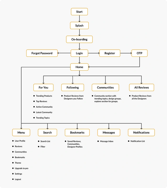
User Flow Diagram
Deliver Phase:-
The Final phase in design process is where you refine, finalize & deliver the product.
Final Design
The Final Design is the finished product created by the Designer. It should be user-friendly, visually appealing & meet the needs of the target audience.
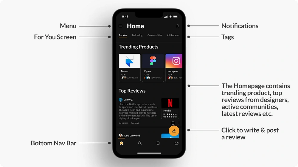
Home Screen
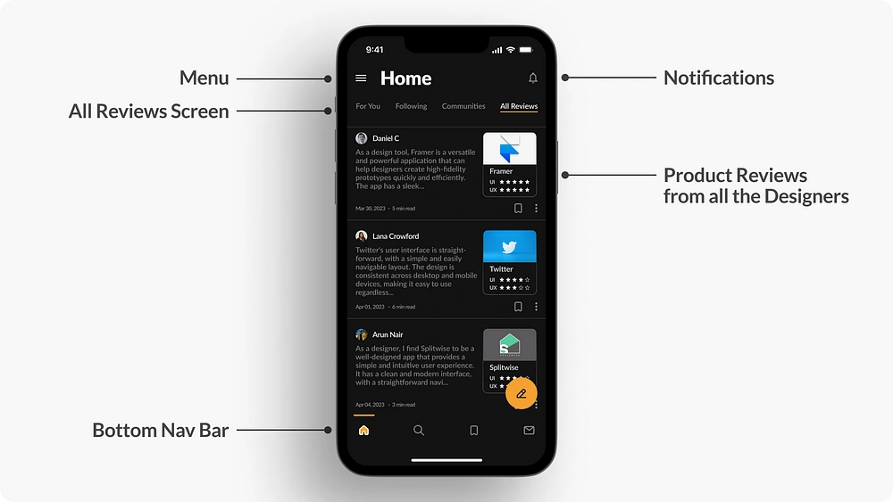
All Reviews Screen
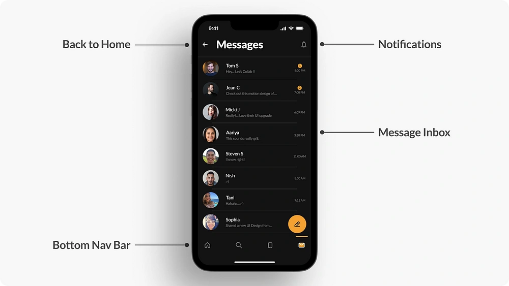
Message Inbox Screen
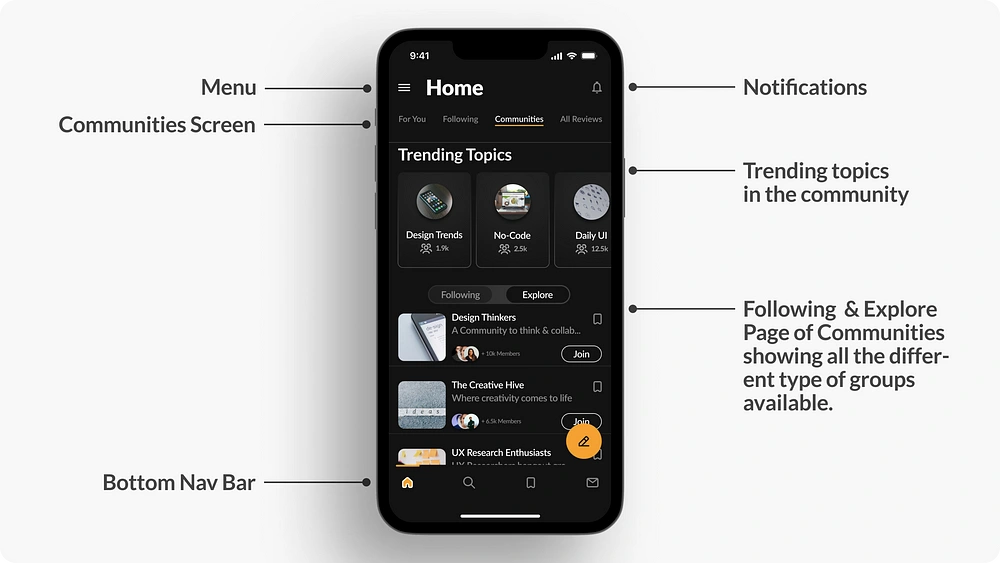
Communities Screen
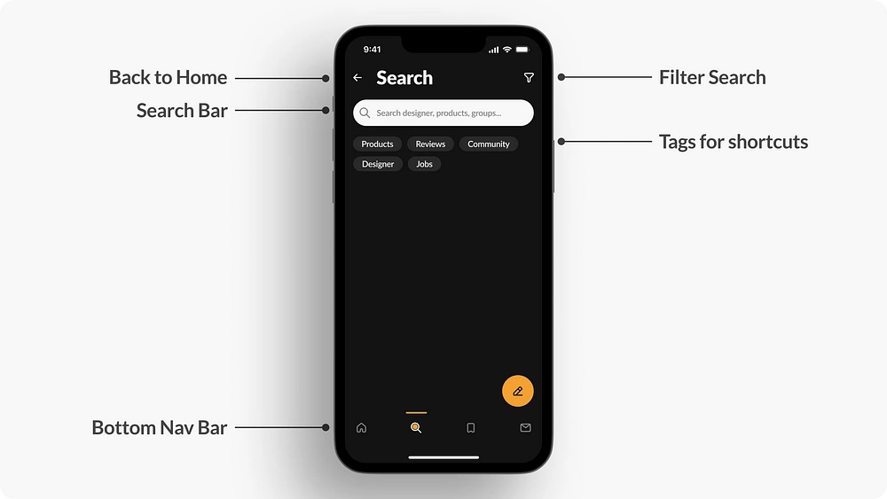
Search Screen
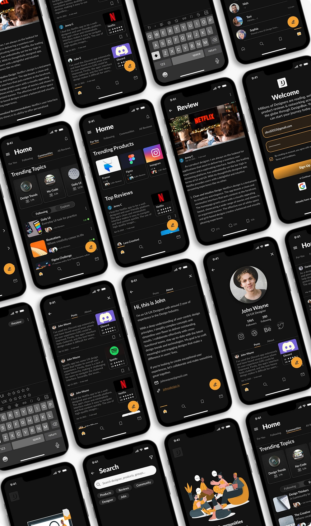
All Screens
Prototype
An UI prototype demonstrates a product’s design and functionality to stakeholders, clients, and potential users.
Click the prototype link below to view it on full screen.
Figma Prototype.
Note: Select Flow 2 on Figma to start from the Onboarding Screen.
Challenges Faced
Since this was a personal project, I didn’t have a set of Users ready for Survey beforehand. Had to share the Survey questionnaires to few of the responders manually to get a wide variety of responses
I didn’t have a basis for this app prior to starting my work on it since there were no direct competitors of this product, I had to basically pick apart various other products to gain inspirations & ideas to design this app.
I wanted to give the user a familiar experience while handling this app, something similar to other reading apps but slightly distinct in UI to standout from the rest which took a lot of time to finalize.
Key Takeaways
What I learned : The project helped me to learn more about the process of design thinking & how to craft a case study. During my research, I got to network with new & experienced designers, learnt from them, that helped me in my process.
What I realized : I also realized that I should’ve spent little more time iterating few more ideas before finalizing the final designs to get a more polished look.
Insight gathered : One of the major insights I gathered while conducting the survey was the interest for the Designers to monetize their opinions for the product reviews especially when referring to UI/UX specific changes in the products. Potentially giving them an urge to re-design the products & get it noticed by that specific brand/company.
Plans for Future App Update : I had some more ideas that I wanted to implement in this project (but had to scrap them for now due to time constraints) such as adding a Jobs board for designers, a testimonial section in the profile showcasing appreciations from the clients. I also would like to include the Graphic Designers into the mix for future updates.
💙…and that’s a Wrap
Thank You for taking the time out & reaching the very end of my case study.
Have a project in mind?
I’m currently available for work.
📧 : shubhajit.design@gmail.com
Like this project
Posted Jul 14, 2023
Designers often have an issue in reviewing Product for Designers as well as network with design community easily. Reviews from the general users are available …


