Aftrtste Coffee | Brand Identity Redesign
Lugu Gumilar
/Logo Design/Graphic Design/Branding
Aftrtste Coffee — Brand Identity Redesign
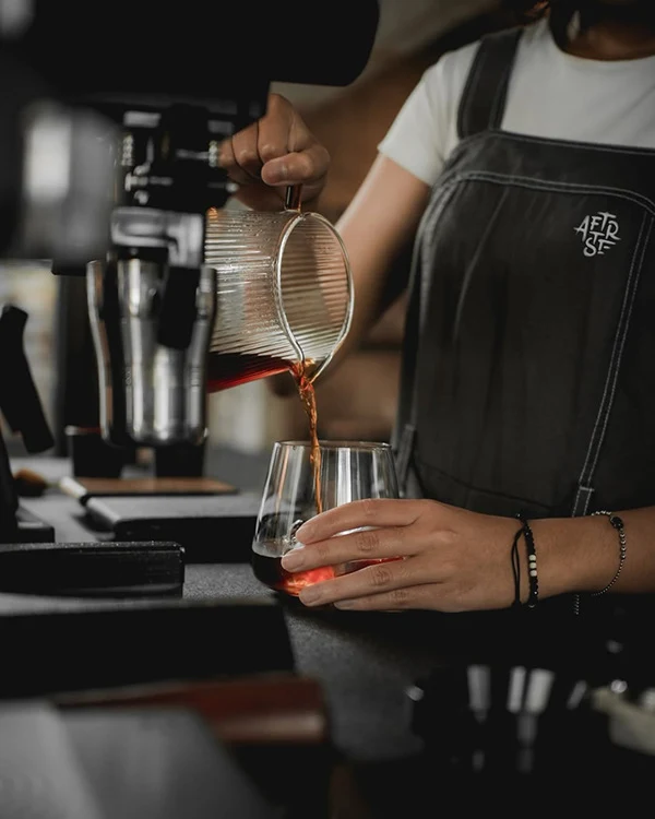
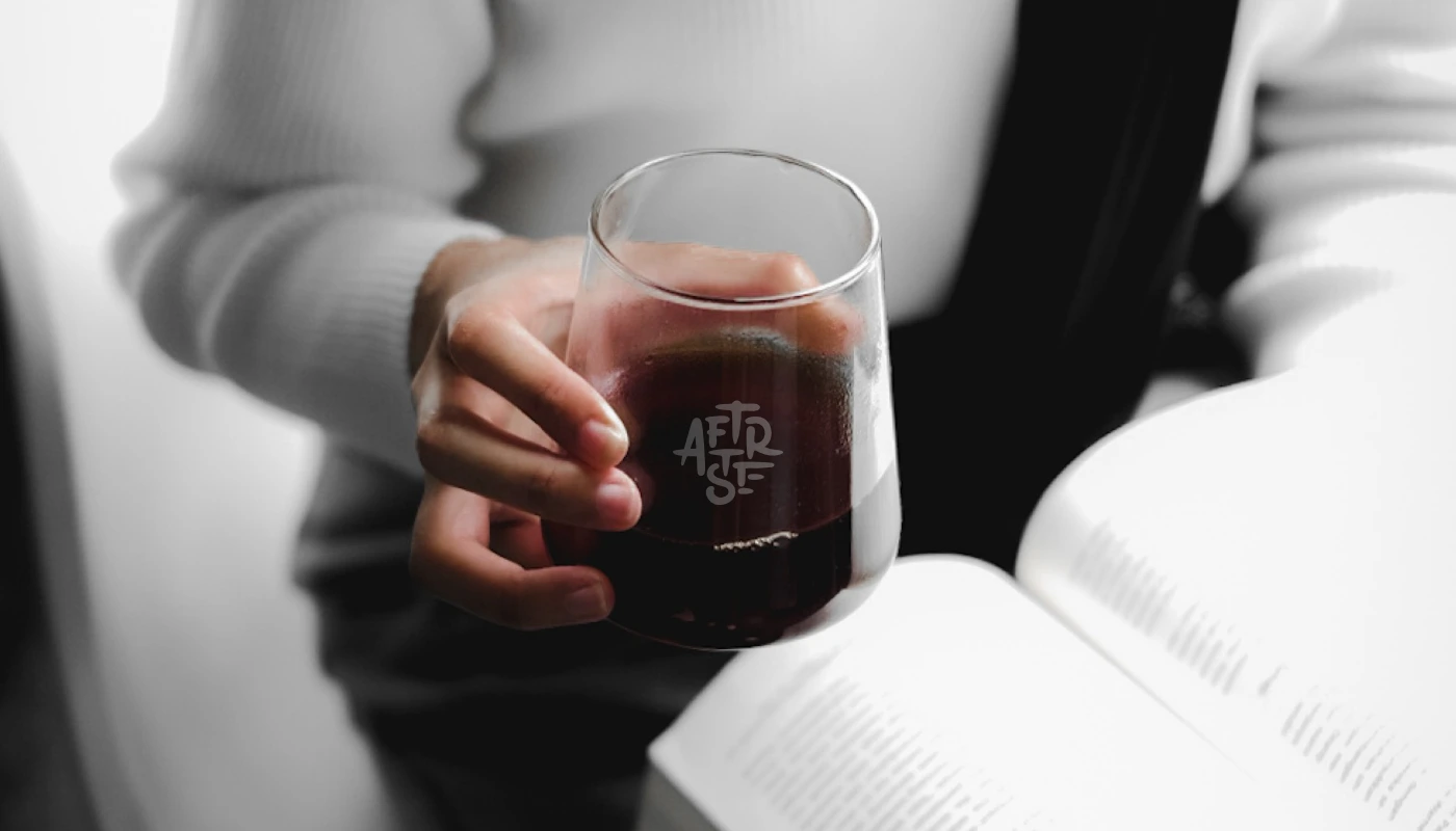
Aftrtste Coffee had something most brands spend years trying to build: a name people remember, a loyal customer base, and a physical space with real character. The name is a condensed spelling of ‘aftertaste’: the feeling that stays after you leave.
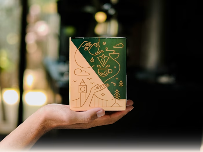
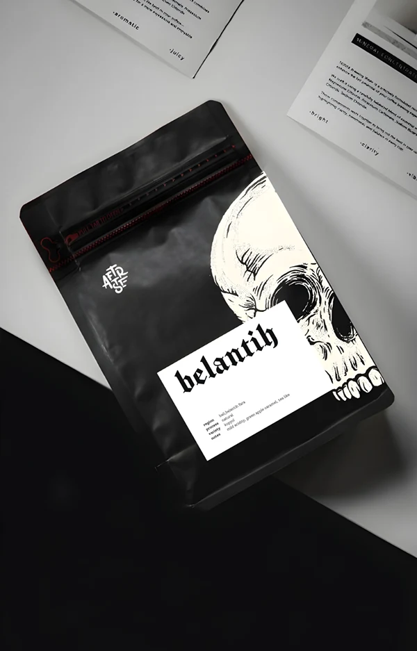
We redesigned the wordmark from hand-drawn sketches, built a colour palette and drawn from the physical space, a typeface system designed for real-world application, and brand touchpoints from cup sleeve to Instagram grid.
The goal throughout was practical: an identity that’s easier to read, more consistent across formats, and built to last as the business grows.
2025 © All Right Reserved · Kalih Studio, Batu, East Java · kalihstudio.com
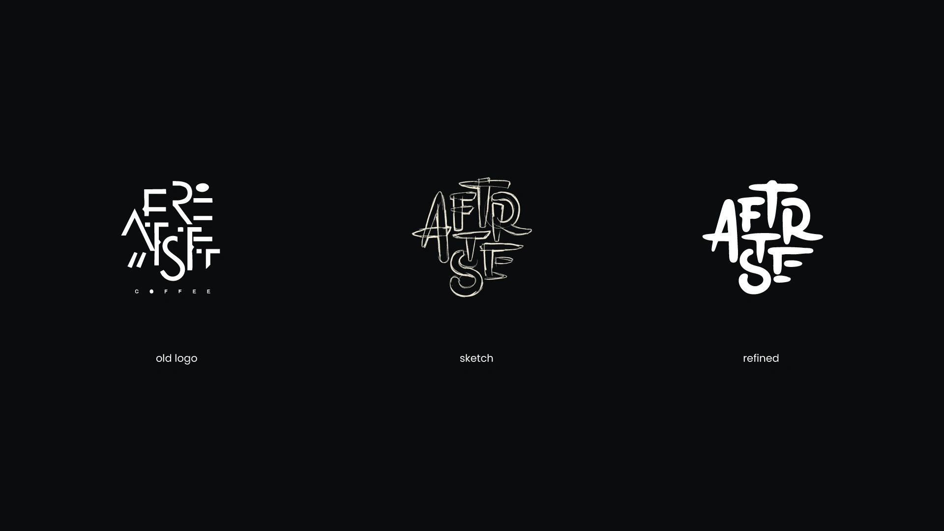

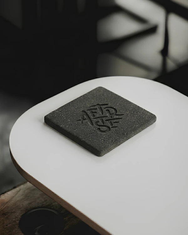
AFTRTSTE is an unusual name to look at, and we wanted the mark to earn that rather than fight it.
The assembled mark you're seeing is the refined version of what the hand figured out first: a stacked structure that compresses naturally into a badge, holds at any size, and keeps the name's personality intact rather than ironing it out.
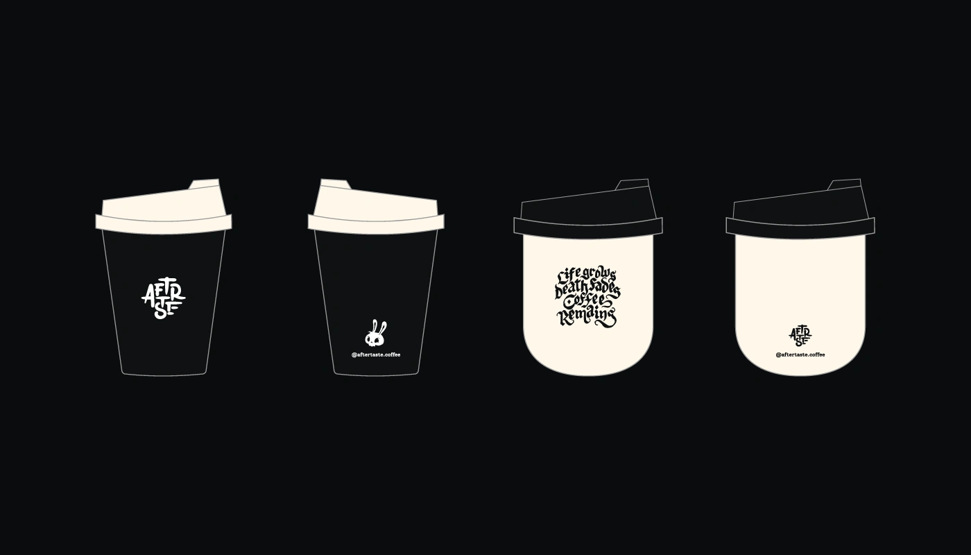

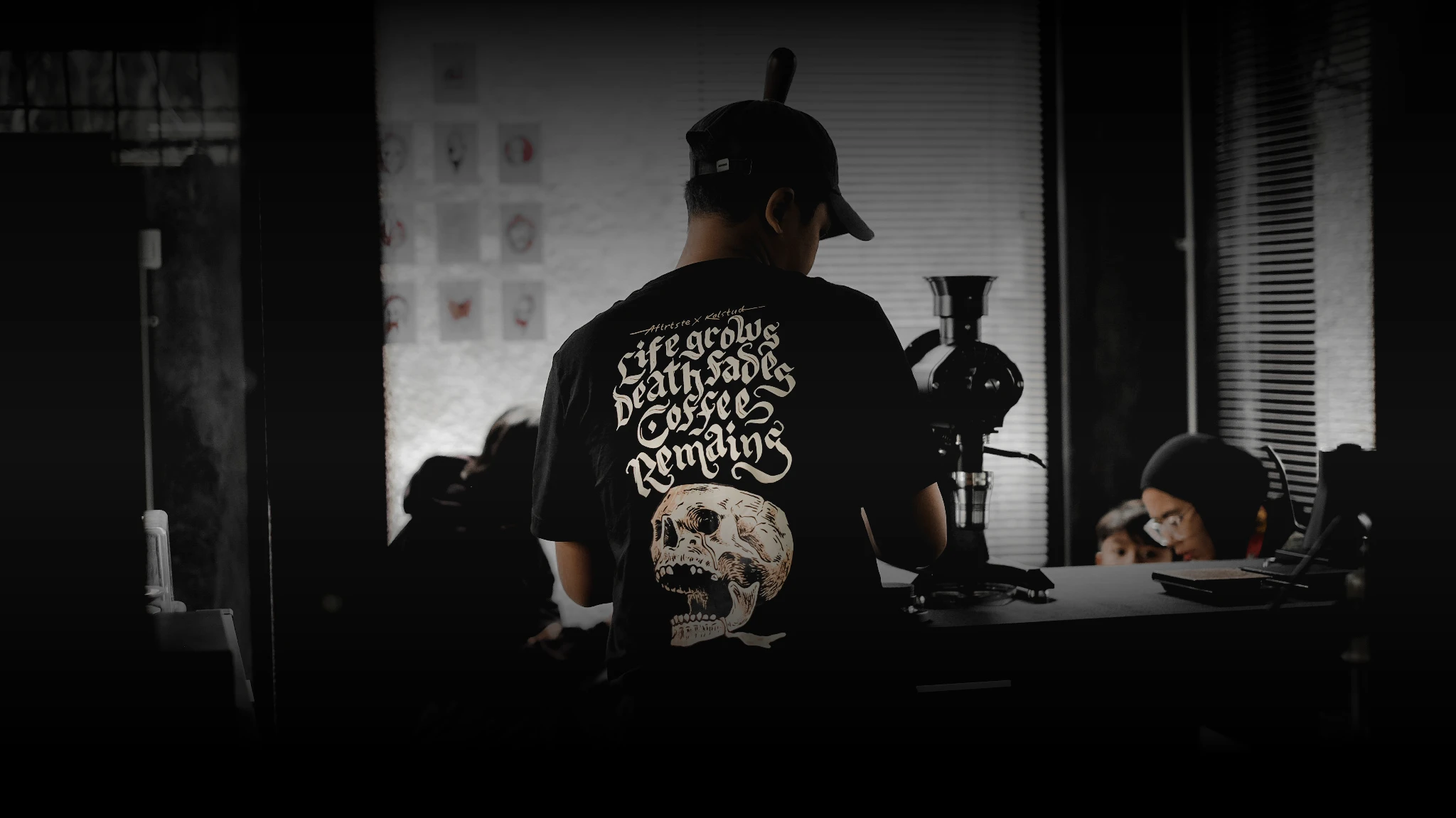
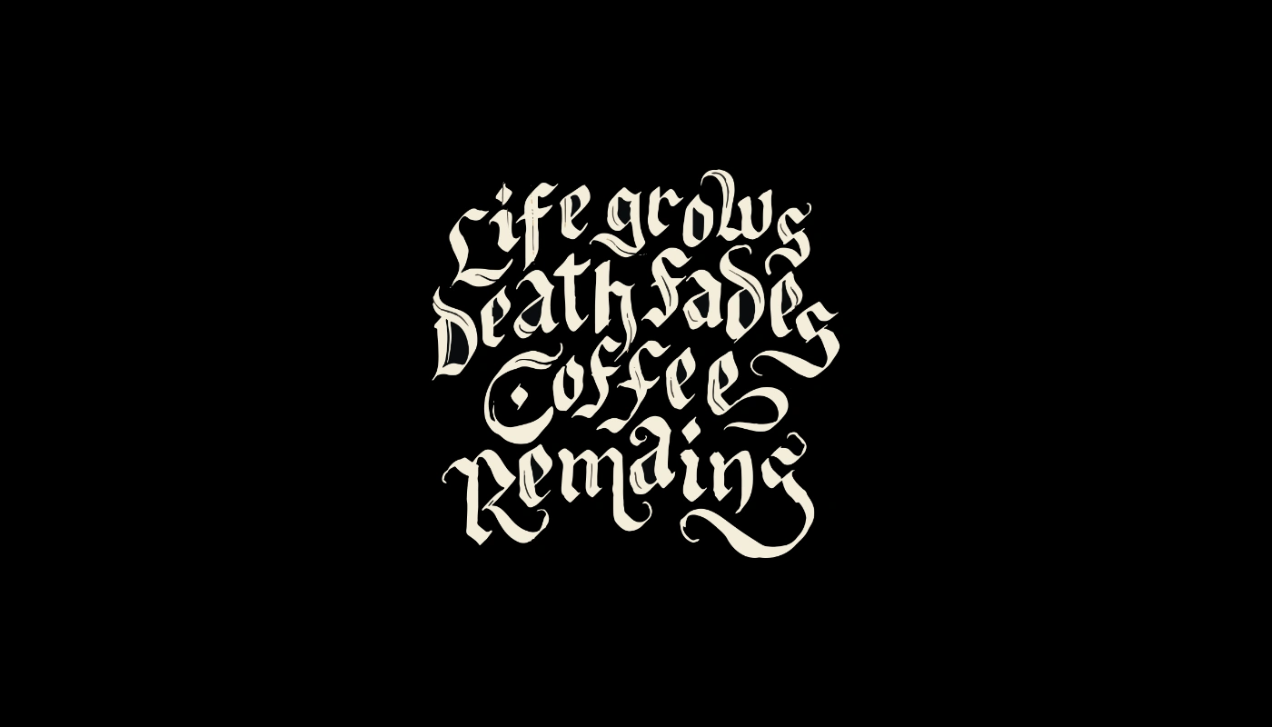
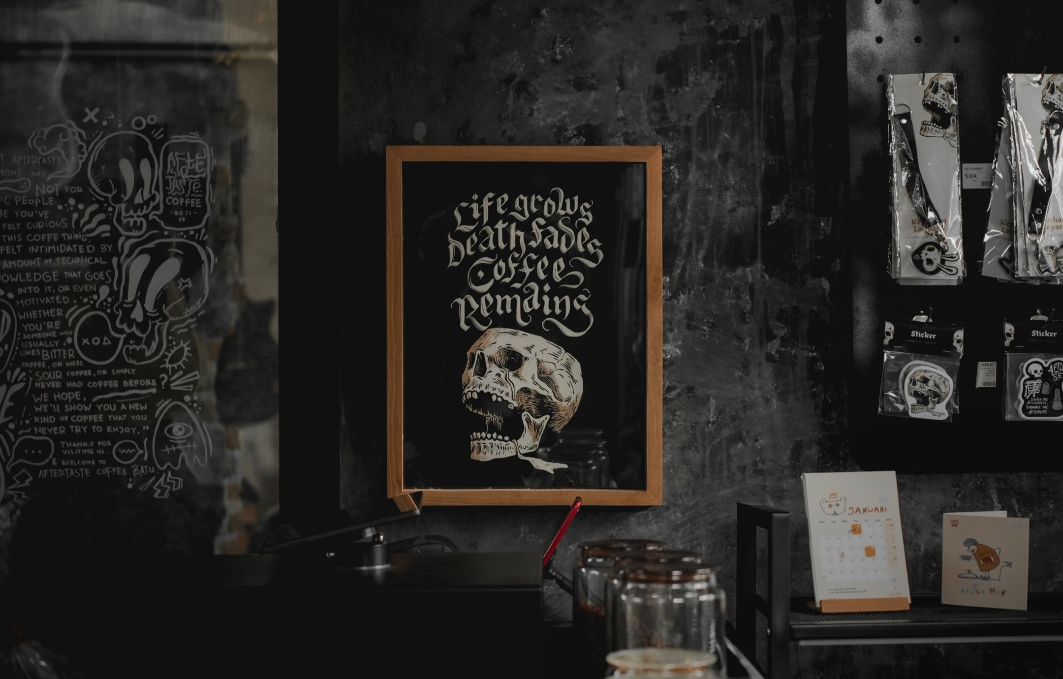
Alongside the identity, we proposed a tagline: "Life grows, death fades, coffee remains."
A line about permanence — the one constant in everything that keeps changing. Blackletter was the natural vessel for it; a letterform that's outlasted every trend it's ever been declared dead by, hand-lettered rather than typeset, because a line about endurance should feel like it took effort to make.


Kalih Studio X Aftrtste Coffee
Copyright ©. All rights reserved.
Project Team
Creative Direction & Logo Design: Lugu Gumilar
Project Manager: Nadjma Achmad
Graphic Designer: Fiofi Nindi, Keysa Zefha, Putry "Ishmah
Photographer: Daneshwara Harimurti
Working on a brand that should work harder?
Let’s talk!
Like this project
Posted Apr 25, 2026
We redesign the Aftrtste Coffee brand identity, building a coherent visual system, and creating something that could scale as the business grows.