Welcome Screen Design Guidelines for Asset Team
Bianca Maddela
Crafting Guidelines for MSPbots’ Asset Team
A 3-week internal project where I was requested to create a design guideline PDF for the company’s Asset Team on constructing the Welcome Screens of our apps.
Narrative
MSPbots is a Chicago-based SaaS company that builds process automation and business intelligence tools for managed service providers. Their Asset Team is responsible for creating bespoke client-facing Welcome Screens for each app. With a growing backlog and limited HTML knowledge, team members had been generating their screen sections using ChatGPT.
The result was a product with no shared visual language. Fonts, colors, layout structures, and information density varied from screen to screen. No two Welcome Screens looked like they came from the same product.
King Moya, a Data Analyst on the Asset Team, recognized the gap. He went to the Product Head and specifically requested me by name, citing my hybrid UX/UI and front-end development background. That combination mattered here: the team did not need a style guide to admire. They needed something they could actually use.
Discovery
No formal research was conducted. The primary discovery input was a kick-off meeting with King Moya, where we audited every Welcome Screen currently live in the app together. Seeing them side by side made the problem immediately obvious. That audit doubled as the research phase and the brief.
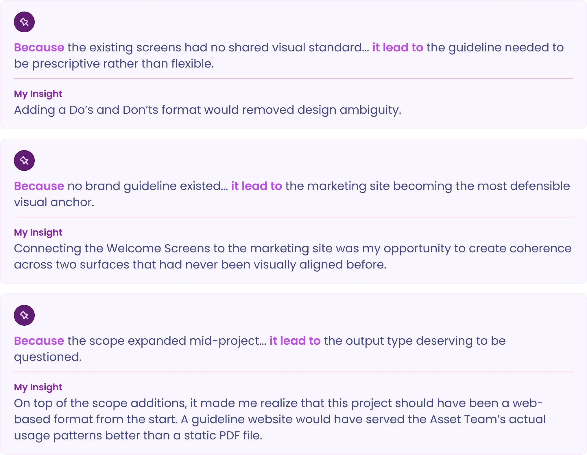
Three key insights shaped every decision that followed:
Deliverables
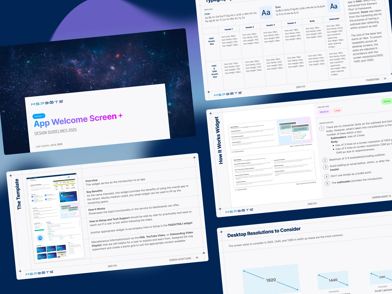
The output was a single PDF document structured around four features.
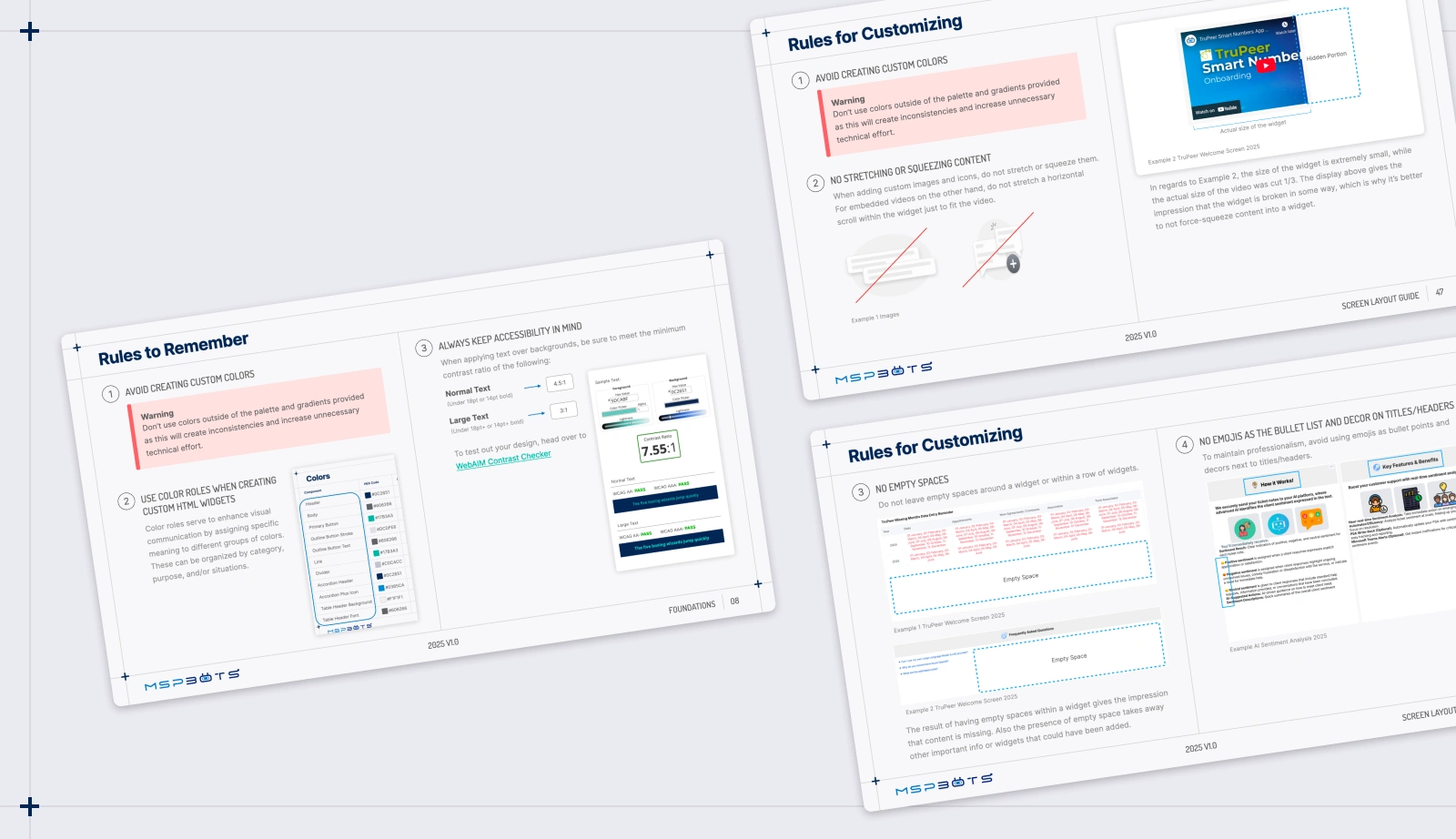
01: Do’s and Don’ts Framework
Prescriptive rules designed for non-designers. Covered color usage and color roles, WCAG AA accessibility contrast requirements, and content handling rules, including layout, asset creation, and emoji guidance. No design theory, no abstract principles. Only actionable rules with clear visual examples.
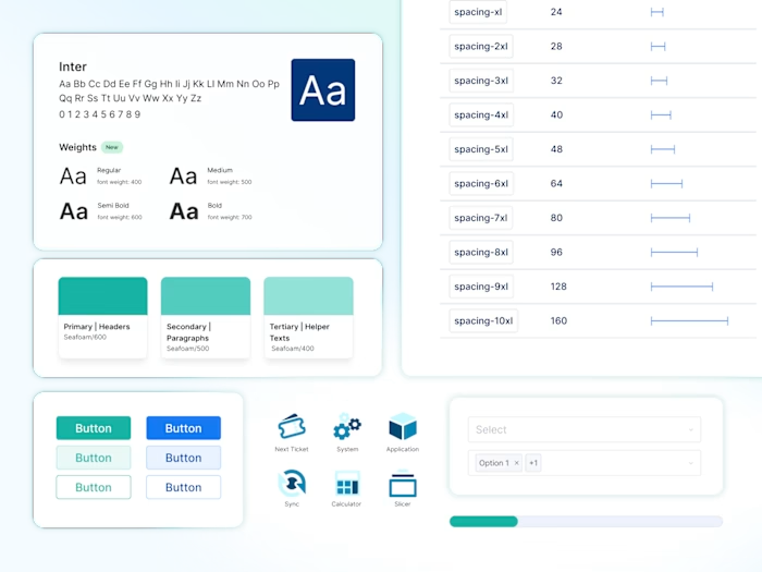
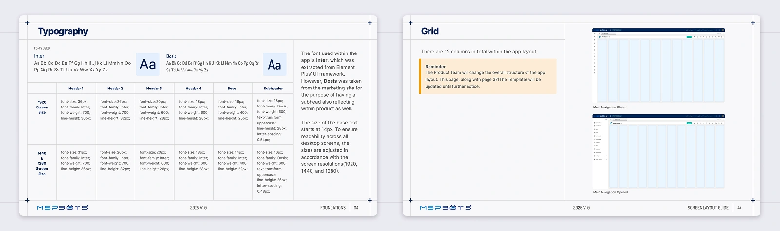
02: Desktop Breakdown Guidance
Typography and layout specifications across three breakpoints: 1920px, 1440px, and 1280px. Mobile and tablet were explicitly out of scope, as the legacy product was desktop-only. Inter, extracted from the app's Element Plus UI framework, and Dosis, drawn from the marketing site, were established as the two typefaces, bridging product and marketing surfaces for the first time. A 12-column grid and per-breakpoint type scales were documented throughout.
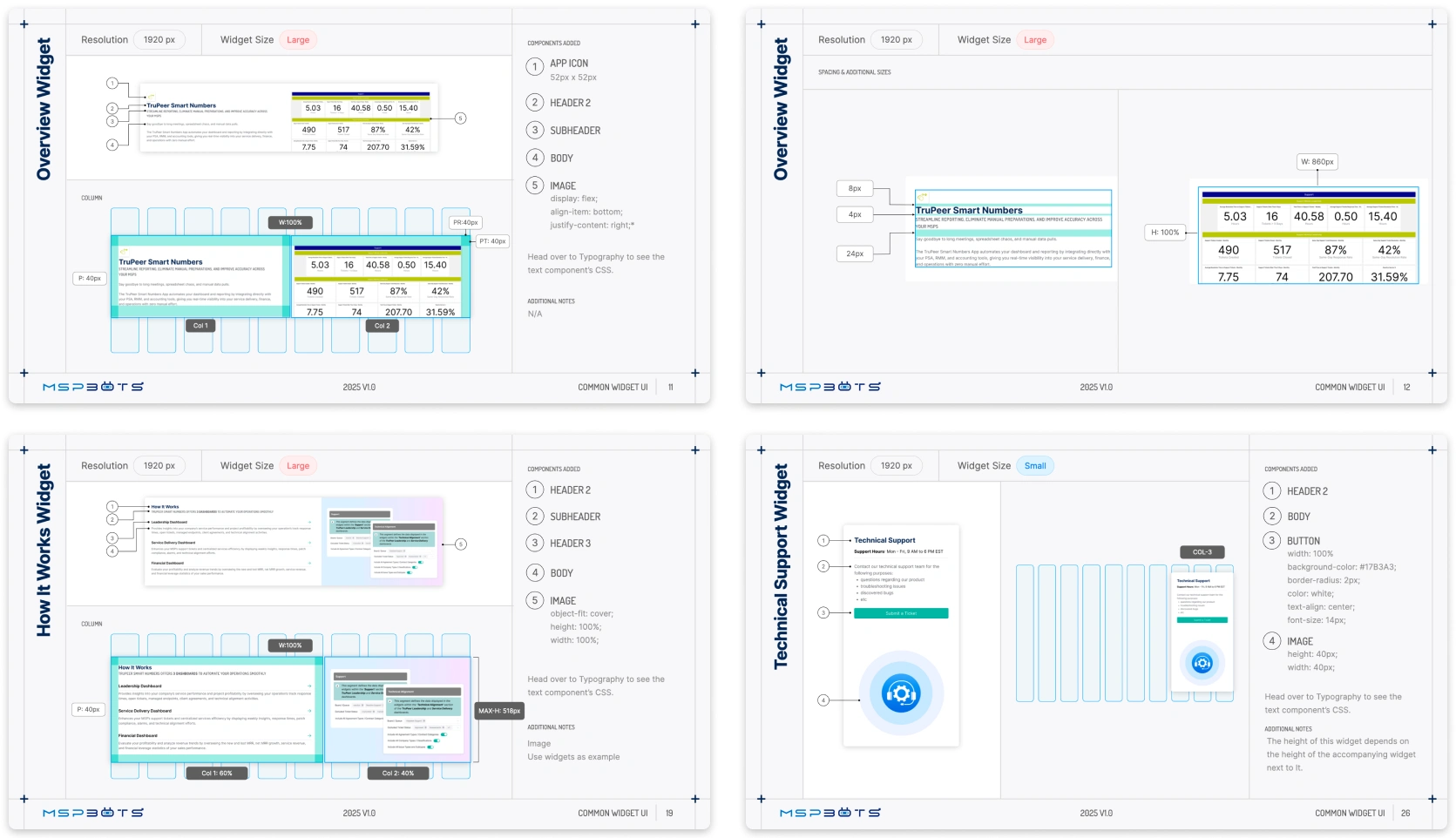
03: CSS Instructions for Section Widgets
A mid-project scope addition. Detailed component specifications and spacing rules for the widgets the Asset Team was building: the Overview Widget, which appears as the first section on every Welcome Screen; spacing and gap values per HTML element; dashboard link sections; and the Technical Support widget.
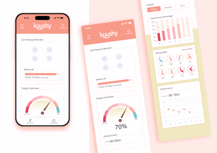
04: HTML Widget Templates
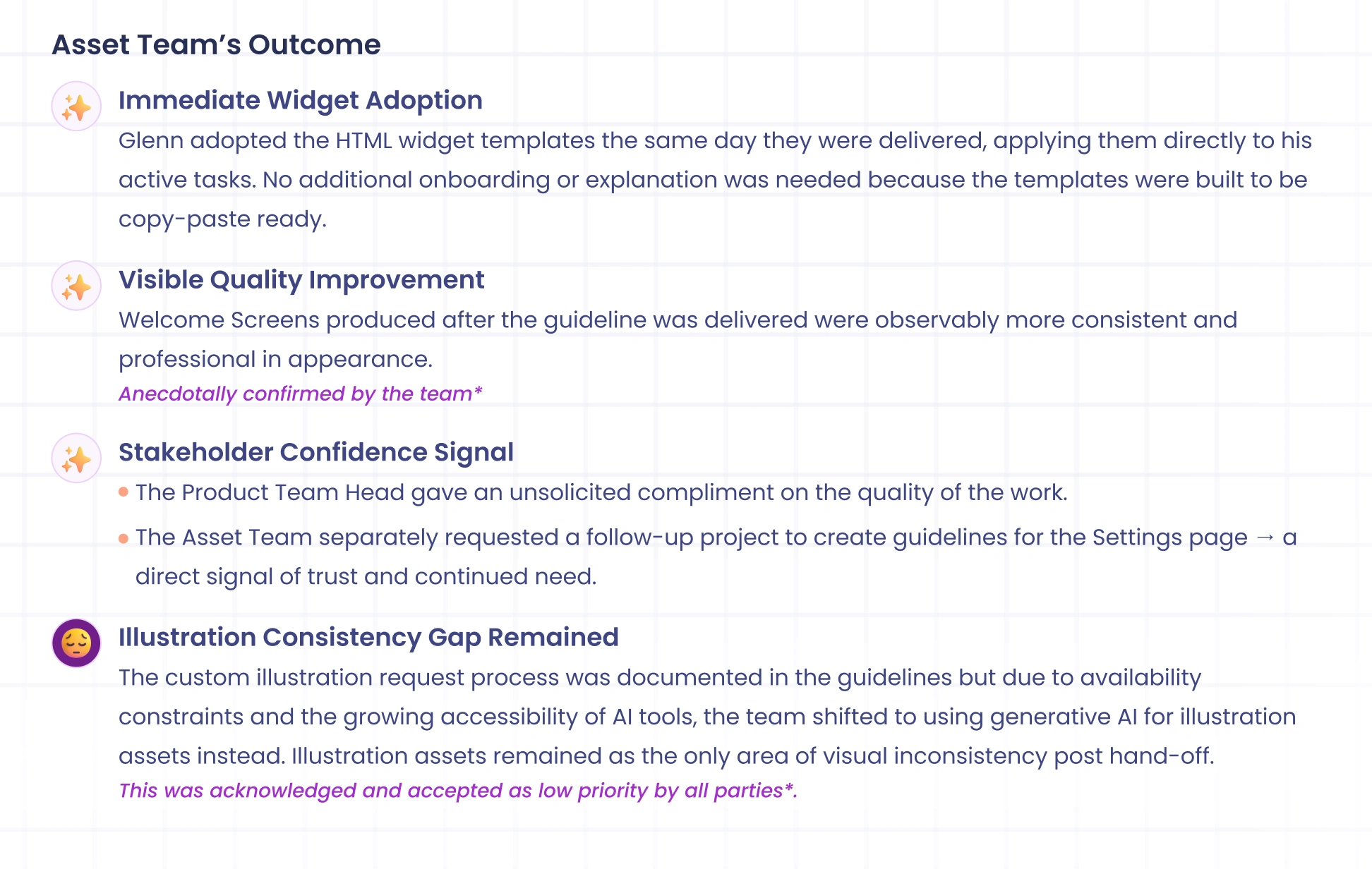
Rather than writing instructions for non-developers to interpret, I designed the section mockups in Figma first, then built the templates directly into the legacy app. Eliminating the translation layer removed a point of failure. When I handed the templates to Glenn, he used them on the same day with no additional explanation needed. They were built to be copy-paste ready.
Outcome
Once the Design Guideline PDF and HTML widget templates were done, the efficiency of the Asset Team increased due to clearer design parameters and easier access for custom design requests to me at the time.
Looking Back
Anchoring the guidelines to the marketing site's visual language worked. It gave the work immediate credibility without needing a formal brand system in place. Building the HTML widget templates directly, rather than writing instructions for non-developers to follow, eliminated a translation layer that would have introduced errors and slowed adoption.
If I returned to this project, I would scrap the PDF and build a website from the start. The scope additions mid-project were signals that a static document was not the right medium. A web-based guideline would have accommodated all three deliverables natively, supported Glenn's copy-paste workflow from day one, and remained easier to update as the brand evolved.
Like this project
Posted May 21, 2026
Design guidelines and HTML widget templates built for MSPbots' non-designer Asset Team, bringing visual consistency to off-brand client-facing screens.
Likes
0
Views
4
Clients
MSPbots.ai