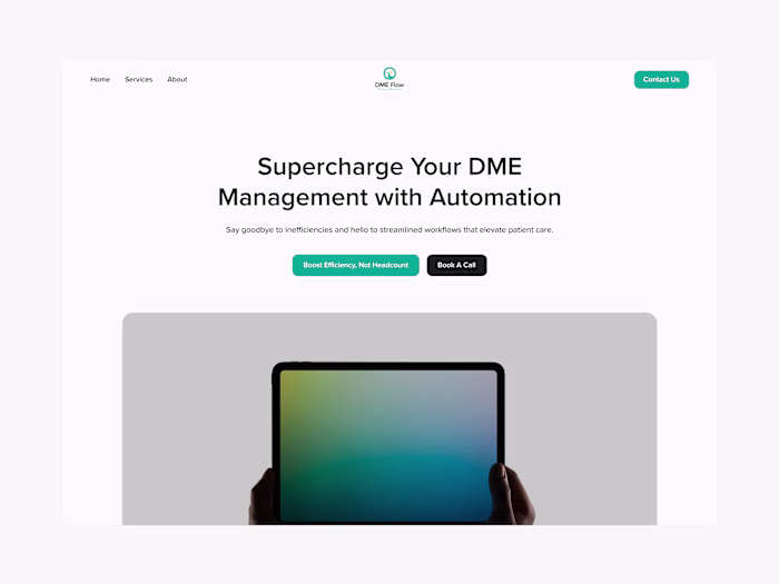
AI-Powered Insurance Verification
Noah Wainwright
Context & Challenge:
Claera’s vision was simple: replace outdated, error-filled workflows with fast, AI-powered insurance verification.
But there was a problem—actually, three:
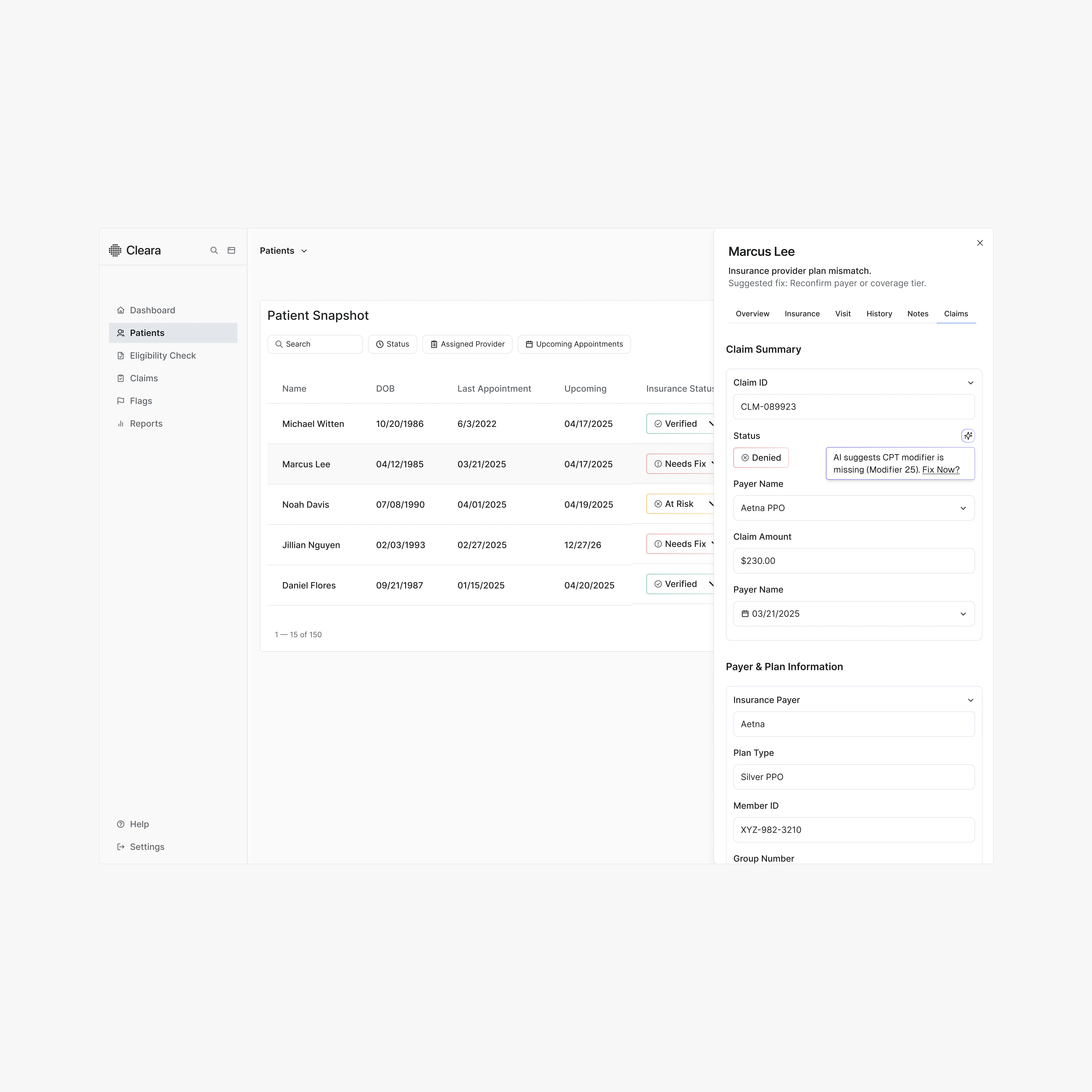
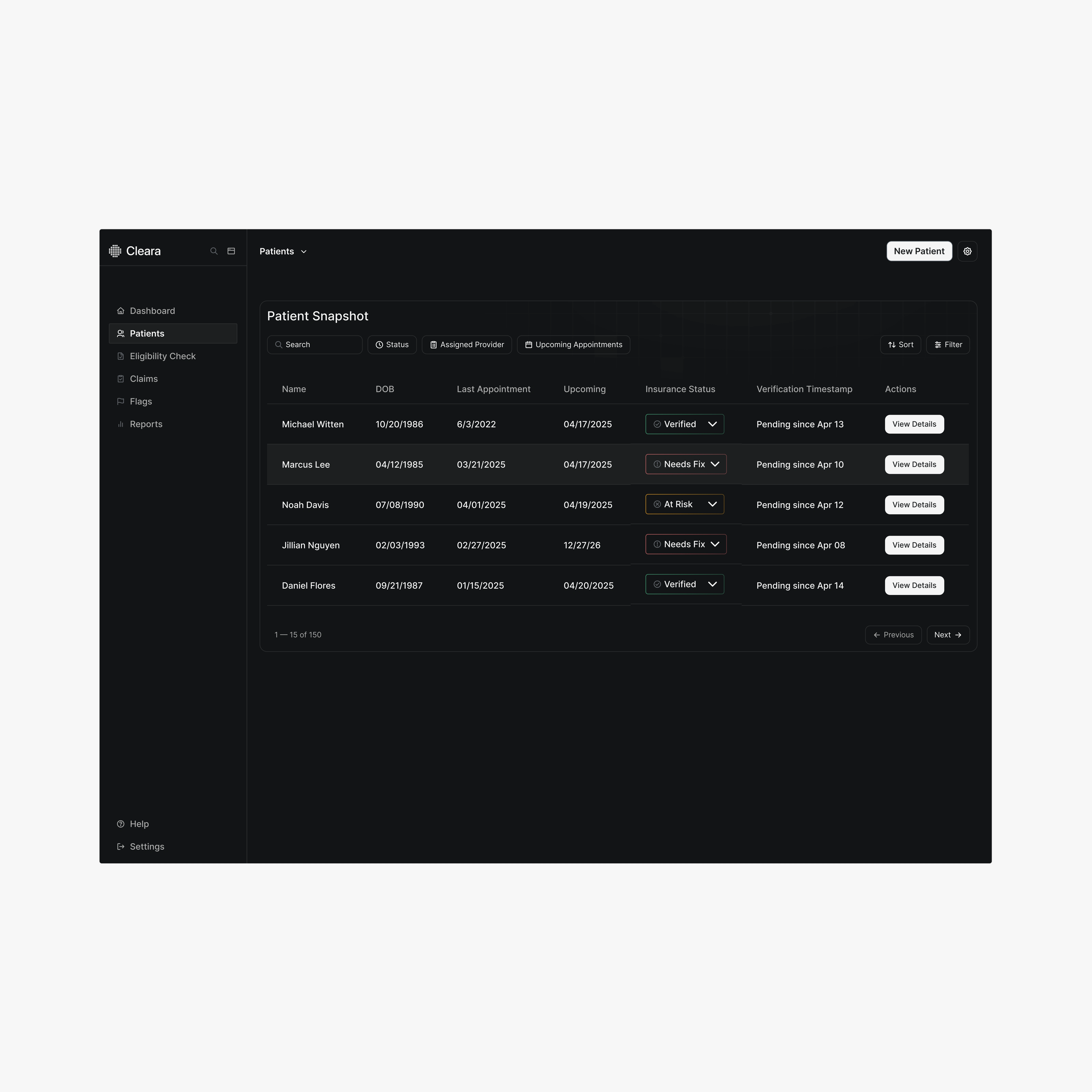
No Visibility, No Confidence Staff didn’t know if a patient was verified, why they weren’t, or what to do next.
Manual Data = Mistakes Reps entered info manually into multiple systems, leading to rejections and rework.
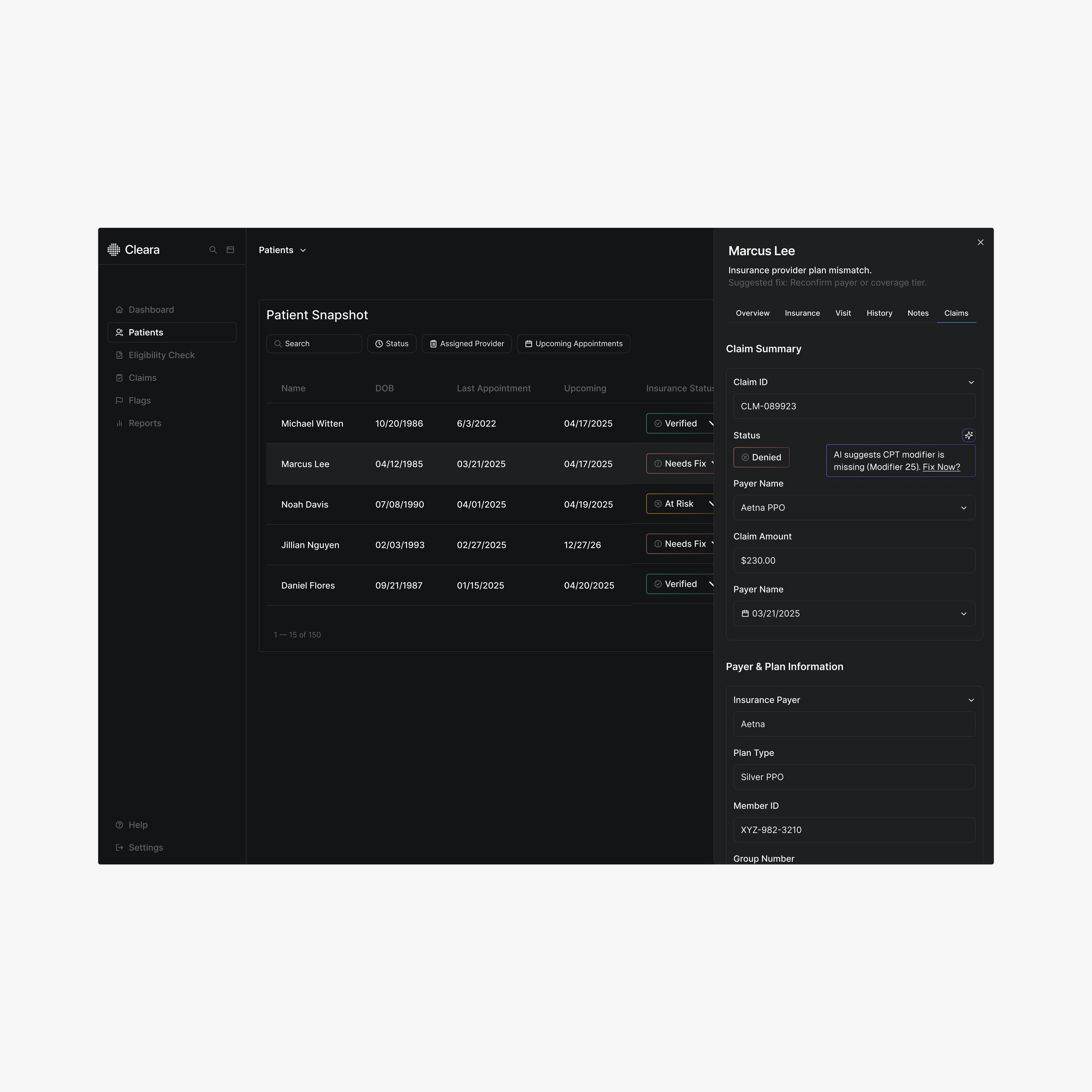
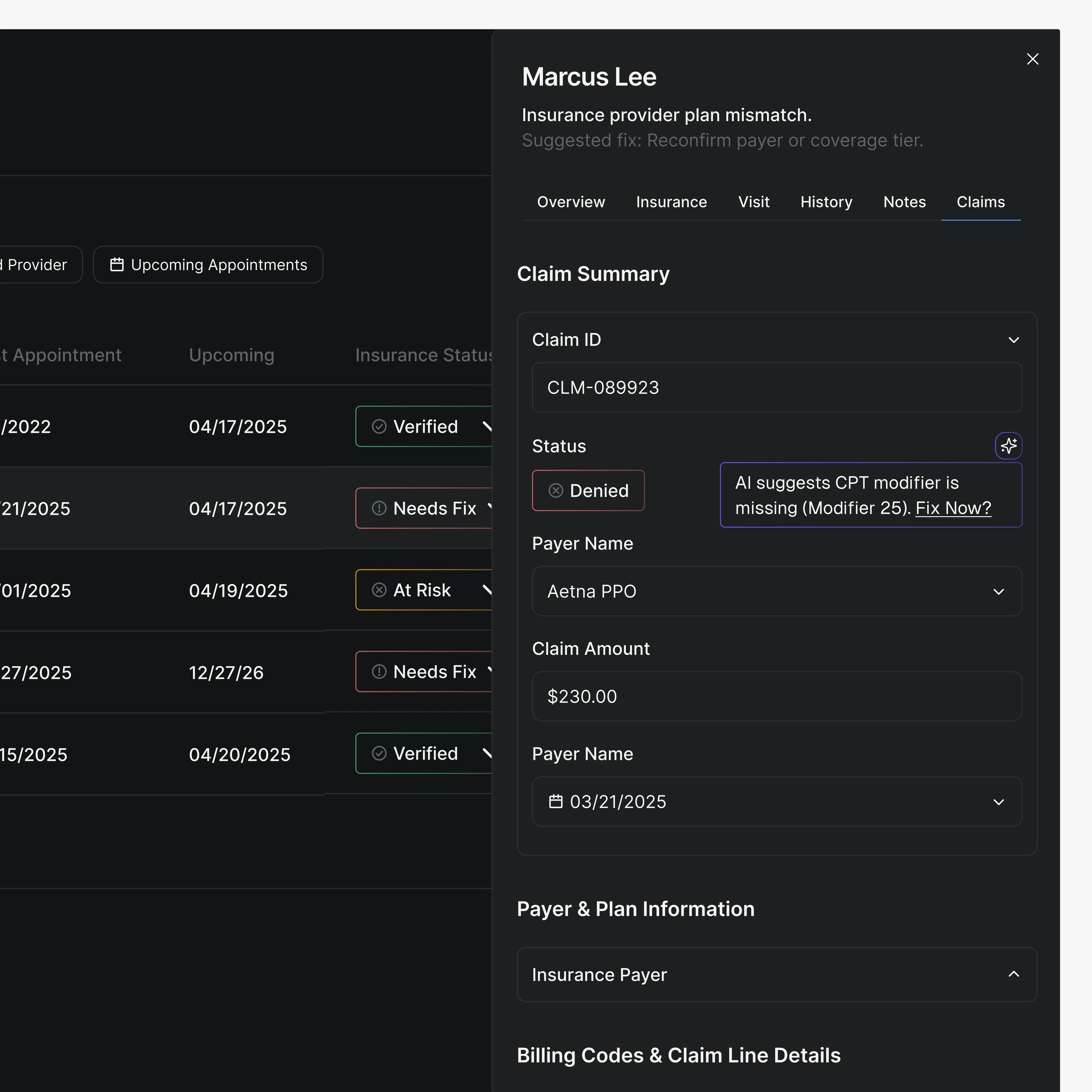
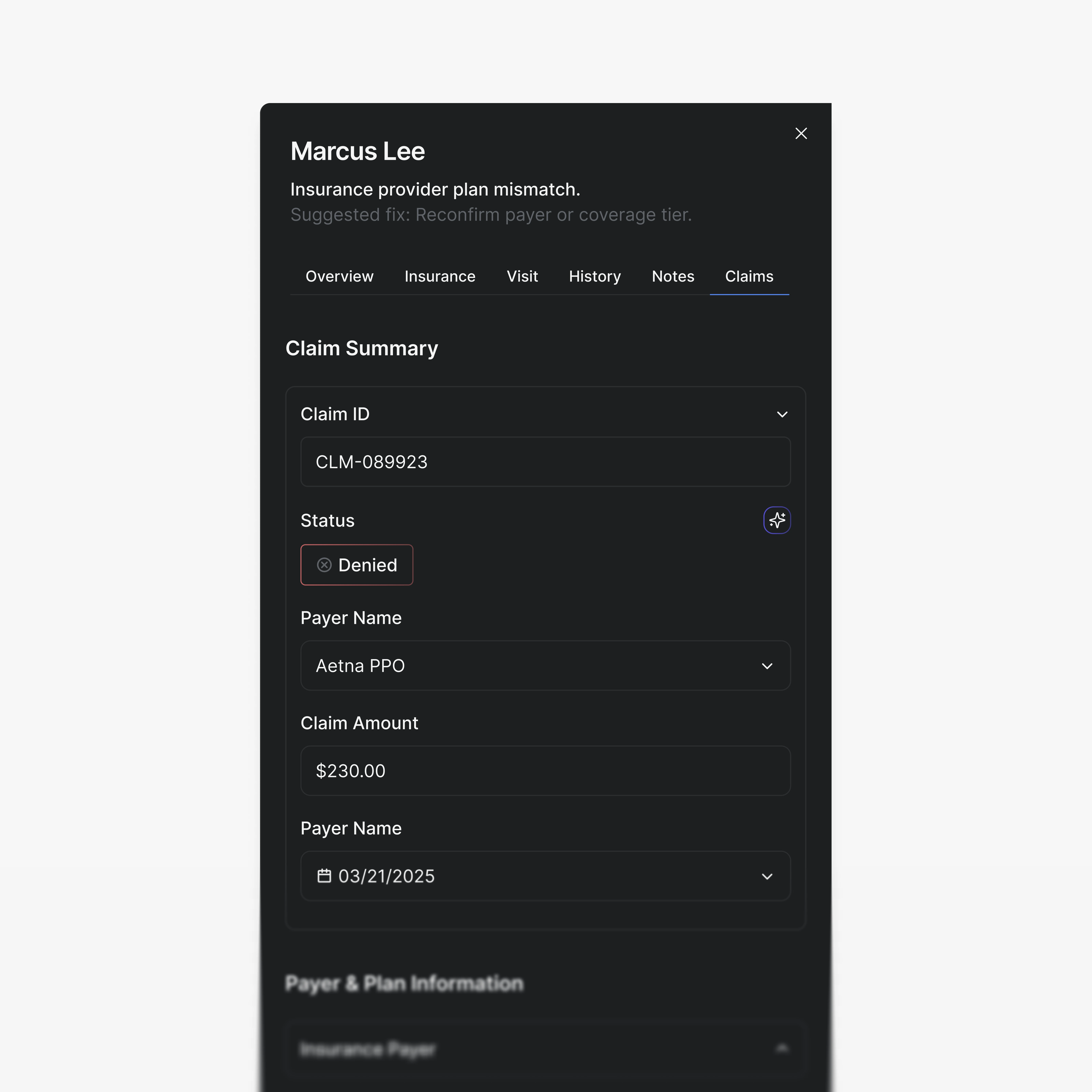
Unclear Errors = Support Overload Ambiguous status messages like “Invalid Subscriber” led to resubmissions, duplicate claims, and support tickets.
All of this slowed operations, eroded trust, and left money on the table.
Solution & Strategy:
We redesigned Claera’s product experience from the ground up using one core idea:
“You’re either verified, not verified—and here’s why.”
What We Changed:
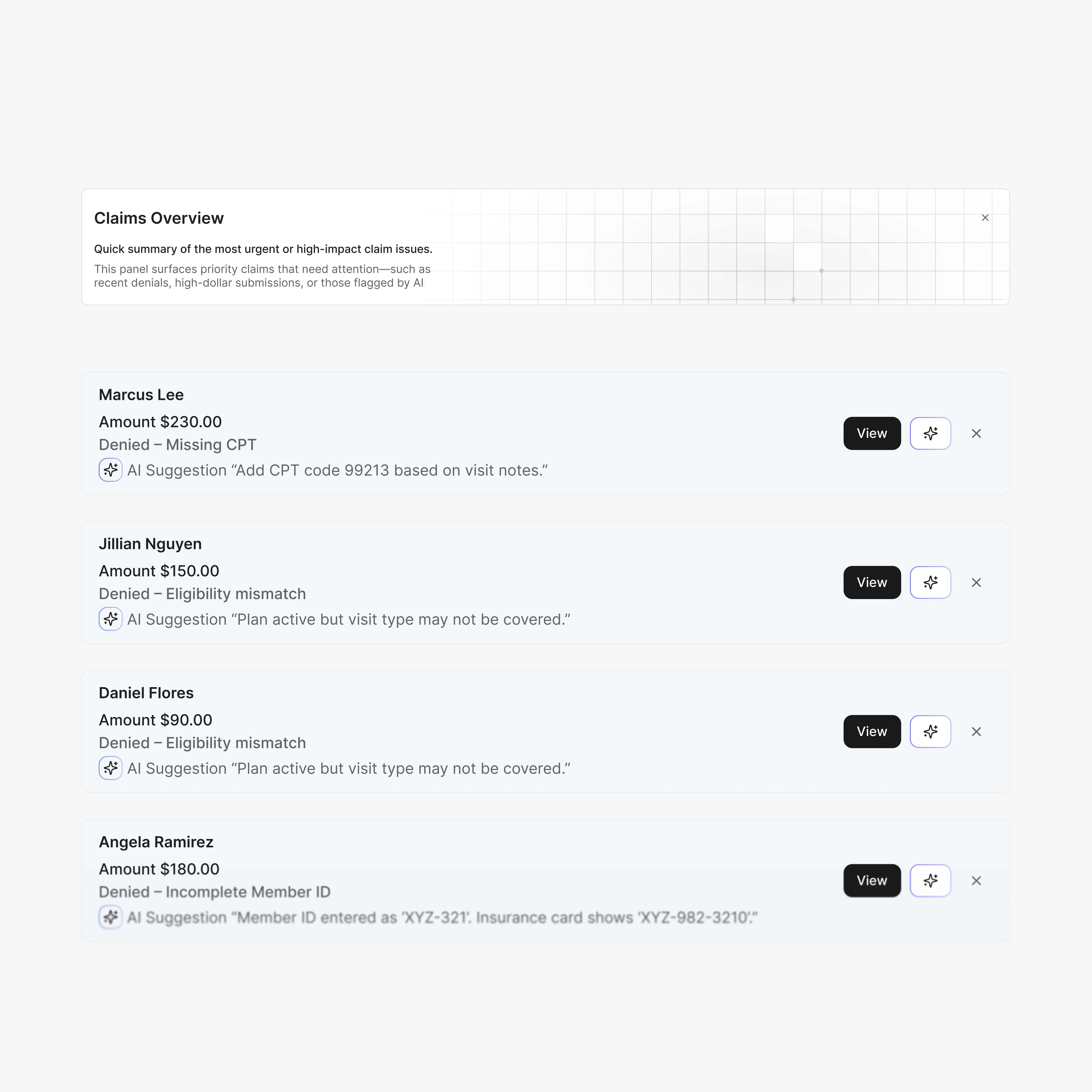
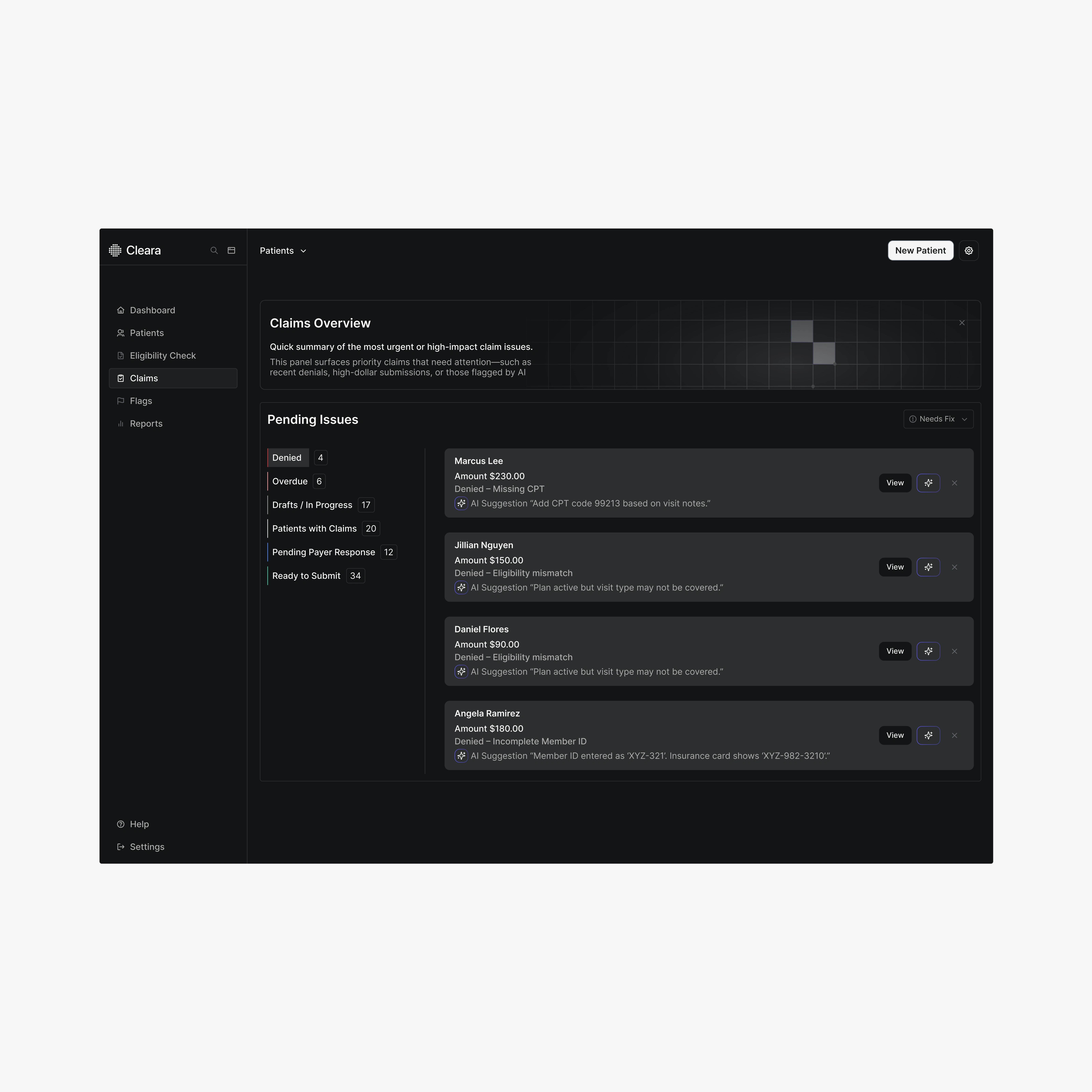
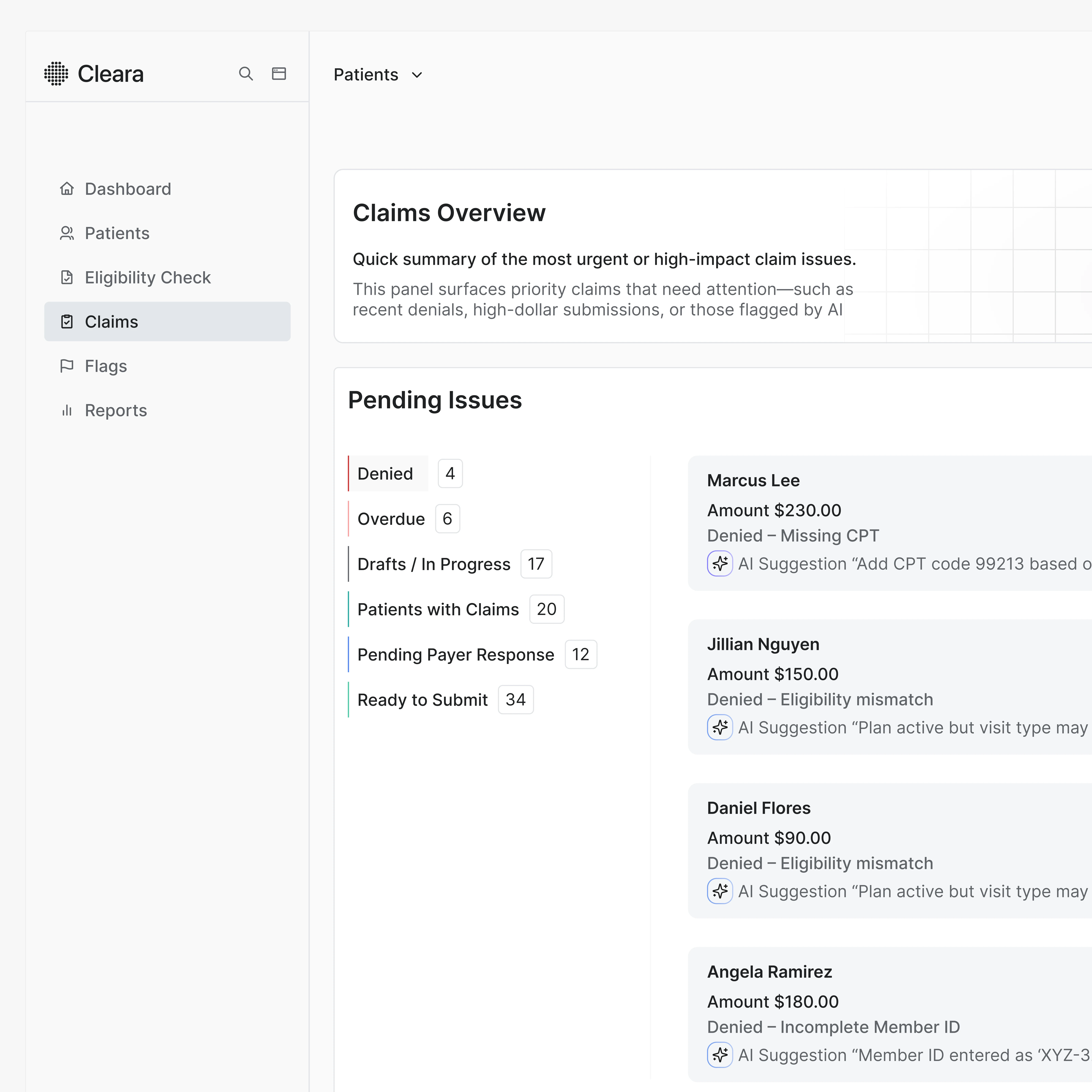
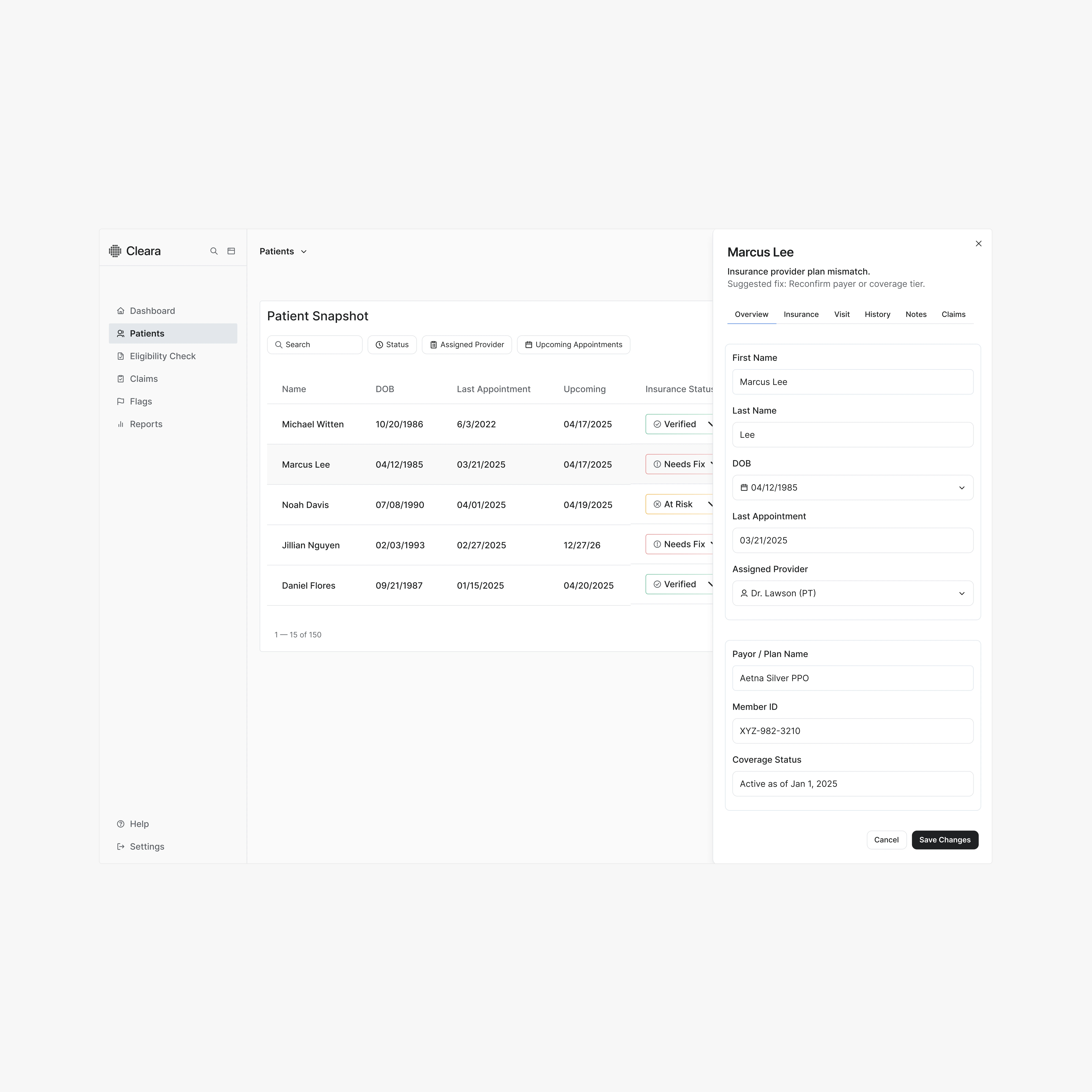
Clear Status Architecture → Introduced a three-tiered status system: Verified, Needs Review, At Risk—with color-coded chips and audit trails.
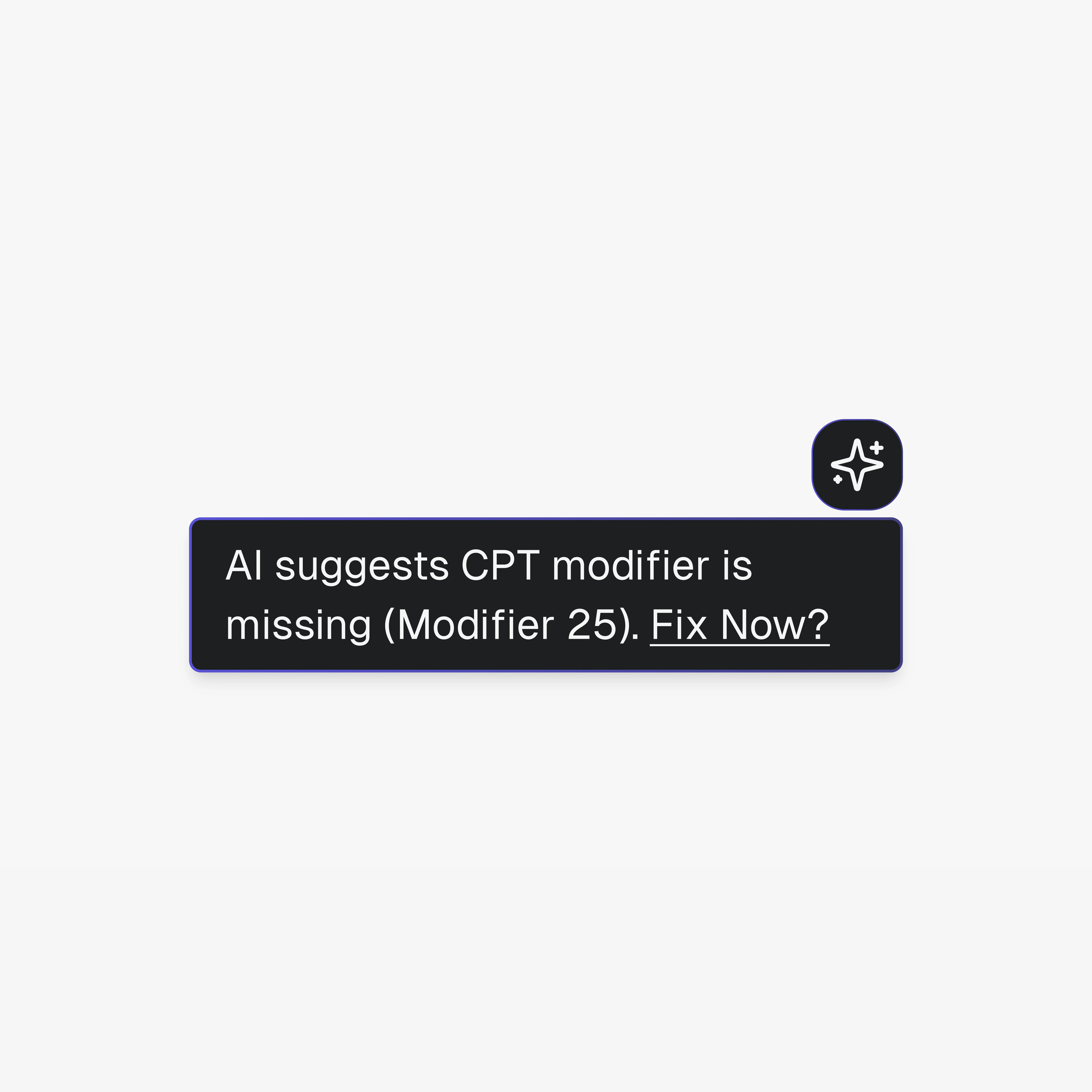
60-Second Fix Flow → Rebuilt verification review around one-click AI suggestions and contextual guidance—so billing teams never started from scratch.
Error Translation Layer → Translated cryptic clearinghouse rejections into plain English, showing how to fix them in real time.
Front-Desk Simplicity → Patient creation + eligibility check redesigned to be completed in under 60 seconds—by anyone.
Why It Worked: Lessons & Takeaways:
1. We Solved for Time, Not Just UI
Front desk staff don’t want better design—they want speed and clarity. We gave them both.
2. We Turned Errors Into Next Steps
“Rejected” isn’t helpful. “Rejected due to subscriber mismatch—click to fix” is.
3. We Made the Product the Pitch
With status clarity, smart nudges, and automation, Claera no longer needed to convince anyone. The UI did the selling.
What I Did With The Budget—in Plain English
Translated years of insurance rules into a status system staff can understand at a glance.
Cut time-to-submit using AI-assisted workflows and error feedback.
Eliminated support overhead without needing a full redesign or new team.
Shipped an intuitive dashboard that even the most rushed front-desk assistant can master in a single shift.
If your B2B SaaS or workflow automation tool needs a landing page or UX redesign that drives conversions and eliminates friction, let’s talk.
Like this project
Posted Apr 21, 2025
Redesigned Claera’s insurance verification dashboard to reduce support costs, speed up approvals, and help staff verify patients in under 60 seconds.
Likes
10
Views
154