Substack Banner Design – Clean & Professional Layouts

Karin Bauer


Like this project
Posted Oct 2, 2025
Designed a modern Substack banner with custom typography, clean layout, and subtle gradients to align brand identity with professional storytelling.
Likes
0
Views
9
Timeline
Sep 19, 2025 - Sep 25, 2025
Clients
The Female Mavericks


Project Overview
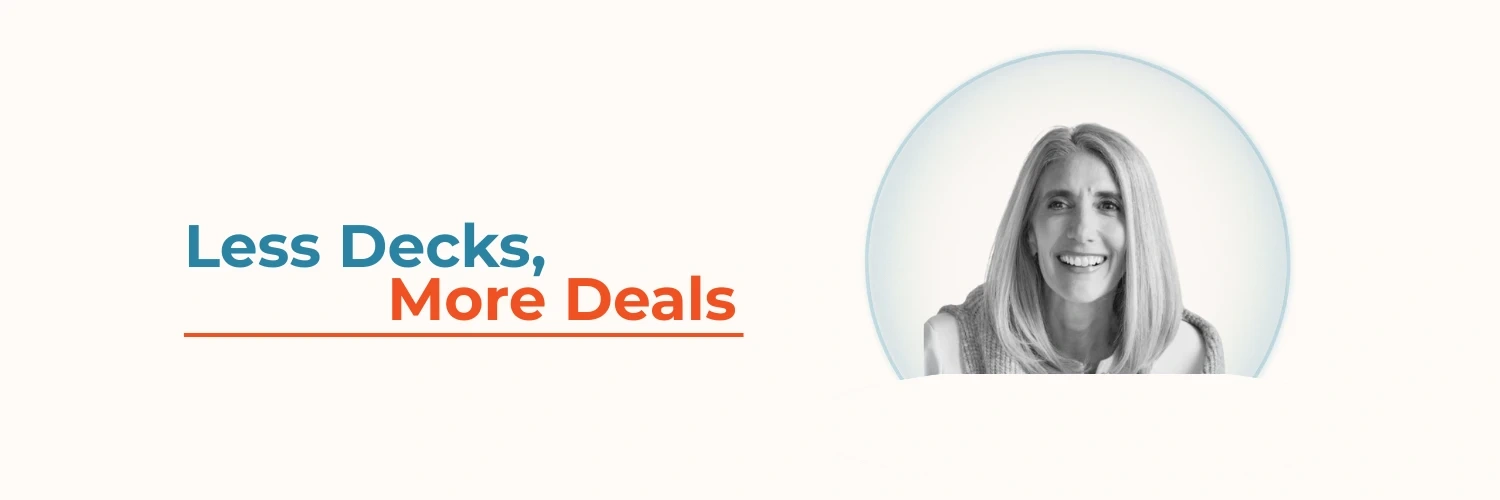
The client needed a clean, professional Substack banner that aligned with their brand identity and tagline, “Less Decks, More Deals.” The goal was to create a design that looked polished across both desktop and mobile views.
Design Process
Explored layout options in Canva to balance text with the client’s portrait.
Used brand-aligned colors: a bold orange for emphasis and teal-blue for contrast.
Incorporated subtle gradients and outlines to keep the image from looking cropped.
Tested multiple mockups to ensure they adapted well to Substack’s profile display on desktop and mobile.
Outcome
The final banner effectively highlights the brand message with strong typography and features a portrait within a clean, circular frame. The design feels professional, on-brand, and displays well across devices.