
What I look for when reviewing a logo. 👀
One thing I’m learning as a brand designer is that creating a logo and reviewing one properly are two different skills.
Sometimes, a logo looks really good on a mockup, but that doesn’t necessarily mean it works.
When reviewing a logo, I try to take it beyond how attractive it looks on a presentation board.
I check how the symbol holds up at smaller sizes, whether the wordmark is still readable, how the logo looks in black and white, and whether the spacing between the letters feels right.
I also pay attention to how the icon sits beside the wordmark. Does the combination feel balanced? Can the logo be reproduced on different materials without unnecessary complications?
Then there’s the concept itself.
Does the logo communicate something that makes sense for the business? Does it have its own identity, or does it look too similar to what competitors are already doing?
I’ve also learnt that staring at a design for hours can make it difficult to notice certain mistakes. Sometimes, stepping away and returning with fresh eyes helps me see things I missed earlier.
I’m still improving this part of my process, but one thing is becoming clearer to me: a good logo needs more than a beautiful presentation. It needs to work outside that presentation too.
Reviewing a logo properly is a skill I’m learning to take just as seriously as creating one.
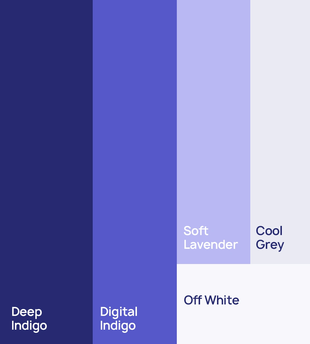
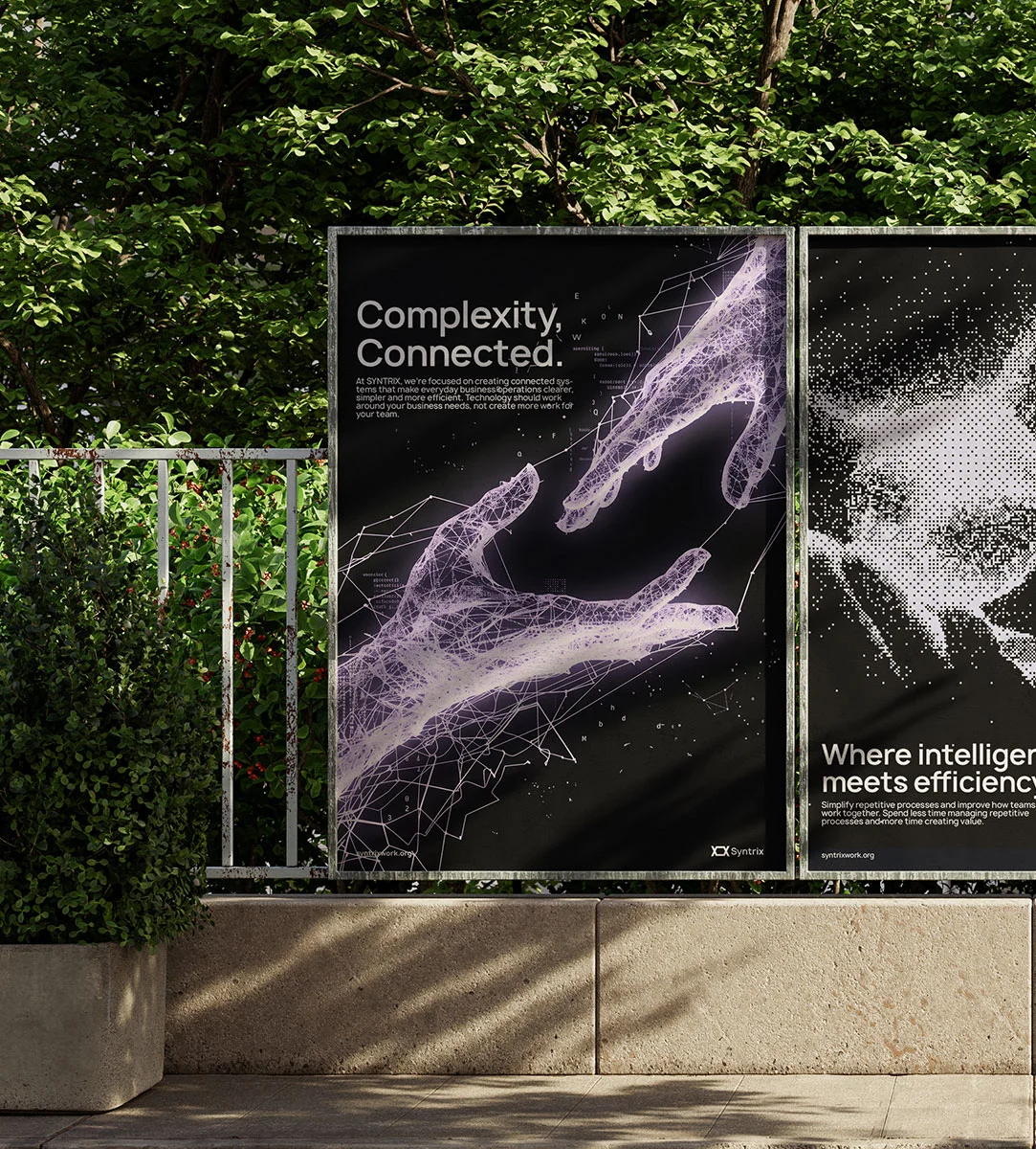
Here is a rejected concept from a branding project I was commissioned to work on. Feedbacks are appreciated 😊🫶🏽
#BrandDesign #LogoDesign #BrandIdentity #GraphicDesign #DesignProcess


0 likes · 0 views · Nov 8, 2026
What I look for when reviewing a logo. 👀 One thing I’m learning as a brand designer is that creating a logo and reviewing one properly are two different ski...


