Game-UI Portfolio: Keyboard-First UX Study in React

Alex Andrew



The brief
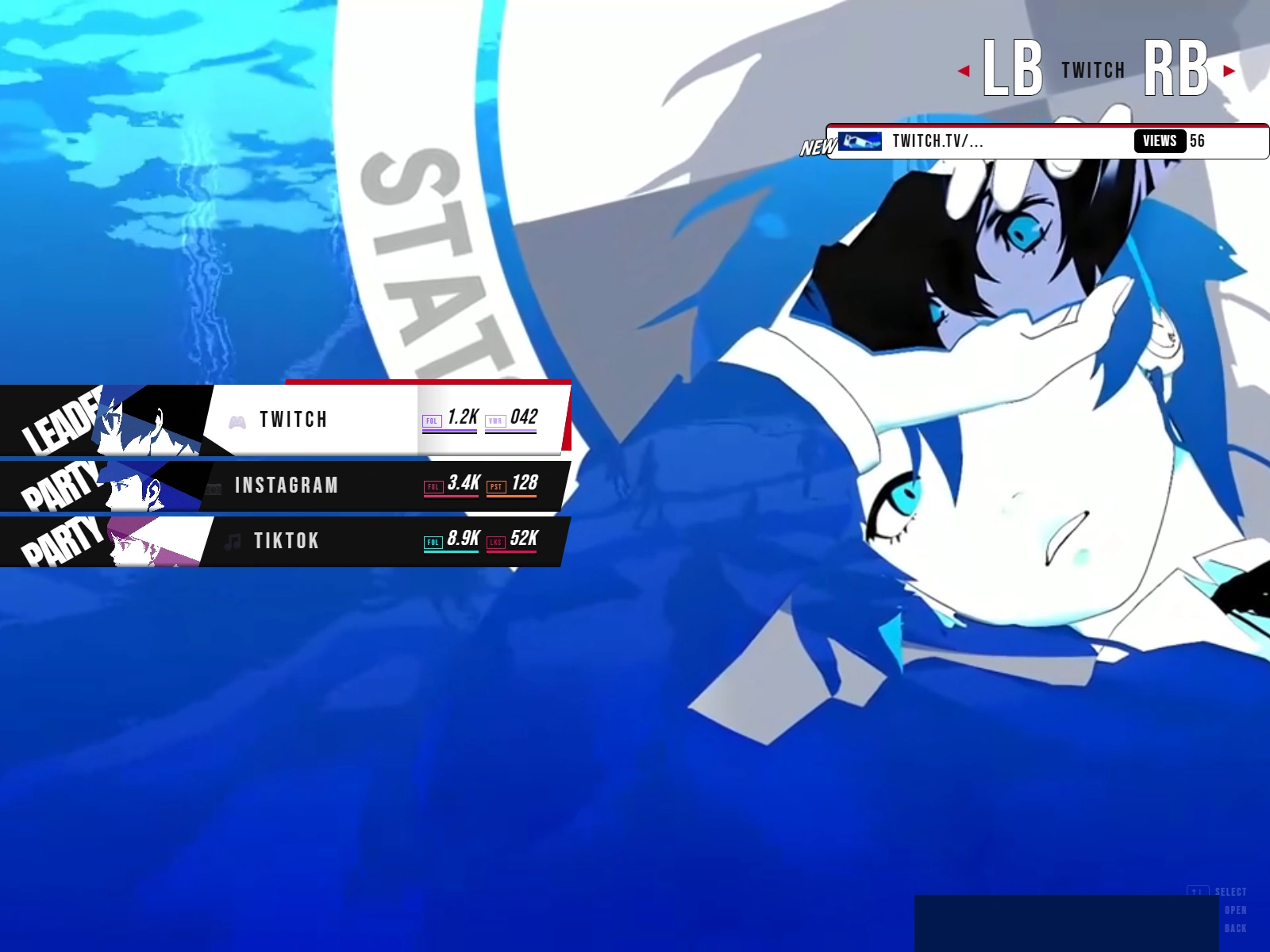
A personal portfolio that behaves like a video game menu instead of a website: no scrolling, every screen reachable with the arrow keys, Enter to confirm, Escape to go back. The goal was a UX study: can game UI patterns make a portfolio faster to browse and more memorable, without hurting clarity?
UX decisions
One action per screen. The main menu offers five choices only: About, Resume, GitHub, Socials, Side projects. Everything else is one level deeper.
Keyboard-first, mouse-friendly. Arrow keys move a clear highlight, Enter confirms, Escape and Backspace go back; hover mirrors the same states for mouse users, so both models share one mental map.
Feedback on every input. The selected item scales, skews and gets a contrasting clip-path highlight; transitions between screens use directional wipes so the user always knows whether they went deeper or back.
Information density by layer. The resume is a ranked list (Education, Skills, Projects, Experience); socials and side projects show status chips (WIP, Done, Queued) instead of long text.
Findings and next steps
Keyboard navigation and strong state feedback make the menu fast to scan, but the layout is not responsive yet: on a 390 px phone the skewed menu overflows. The next iteration adds a mobile layout with a vertical tap list and reduced-motion support for users who disable animation.
Build
React 19, React Router, Framer Motion for route transitions, CSS clip-path and keyframes, Vite, deployed on Vercel. Built on an open-source Persona 3 menu template, credited in the repo.
Background
Postgraduate degree in User Experience (UOC), Master in 3D Design (UPF), Computer Engineering studies at the University of Barcelona and IBM Professional Certificate in AI.

Like this project
Posted Oct 2, 2026
A portfolio that works like a video game menu: arrow keys, clear state feedback, directional transitions. UX study and React build with Framer Motion.
Likes
0
Views
0