Dinky brand identity
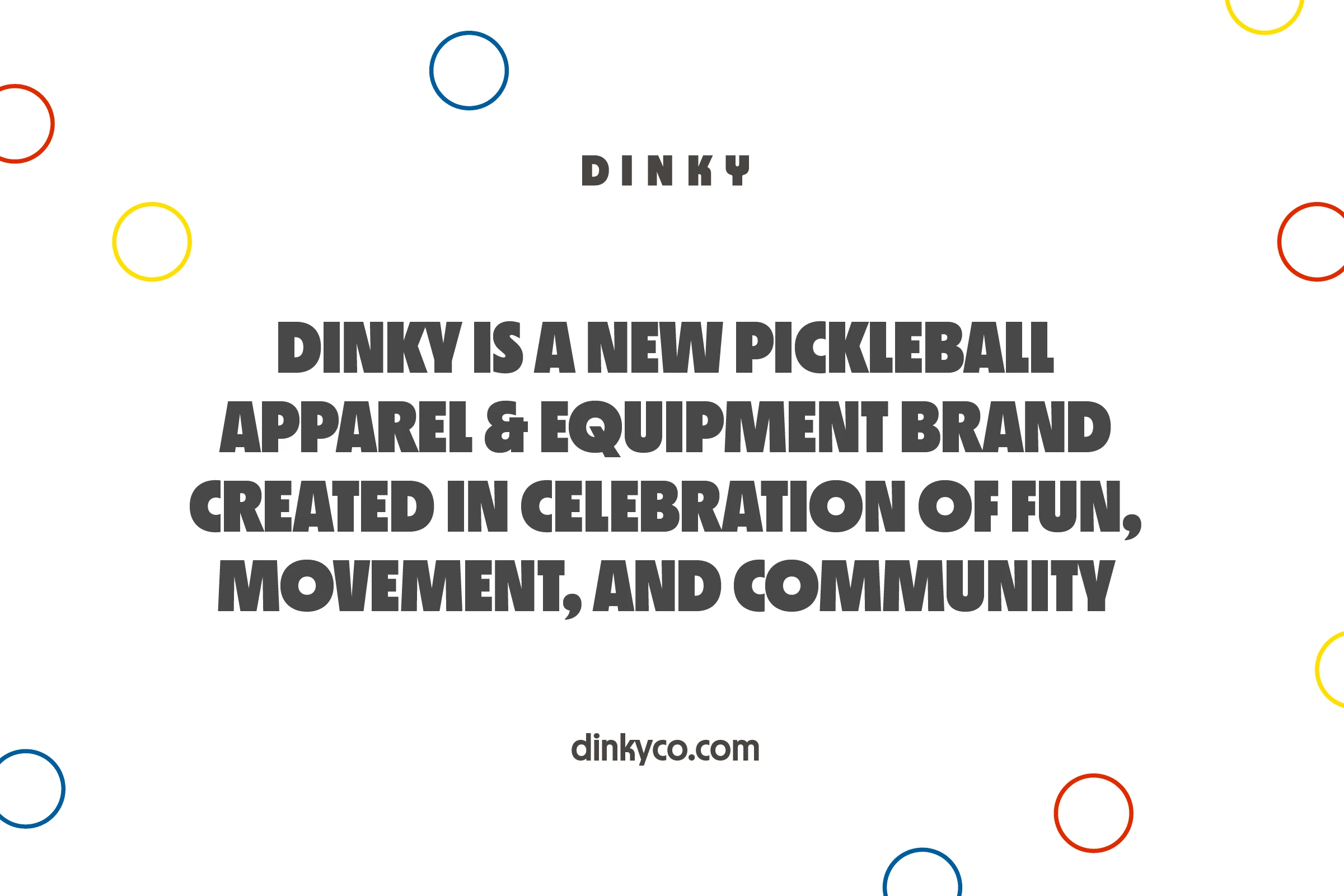
Brand identity for a new apparel brand specializing in casual attire for women who play pickleball.
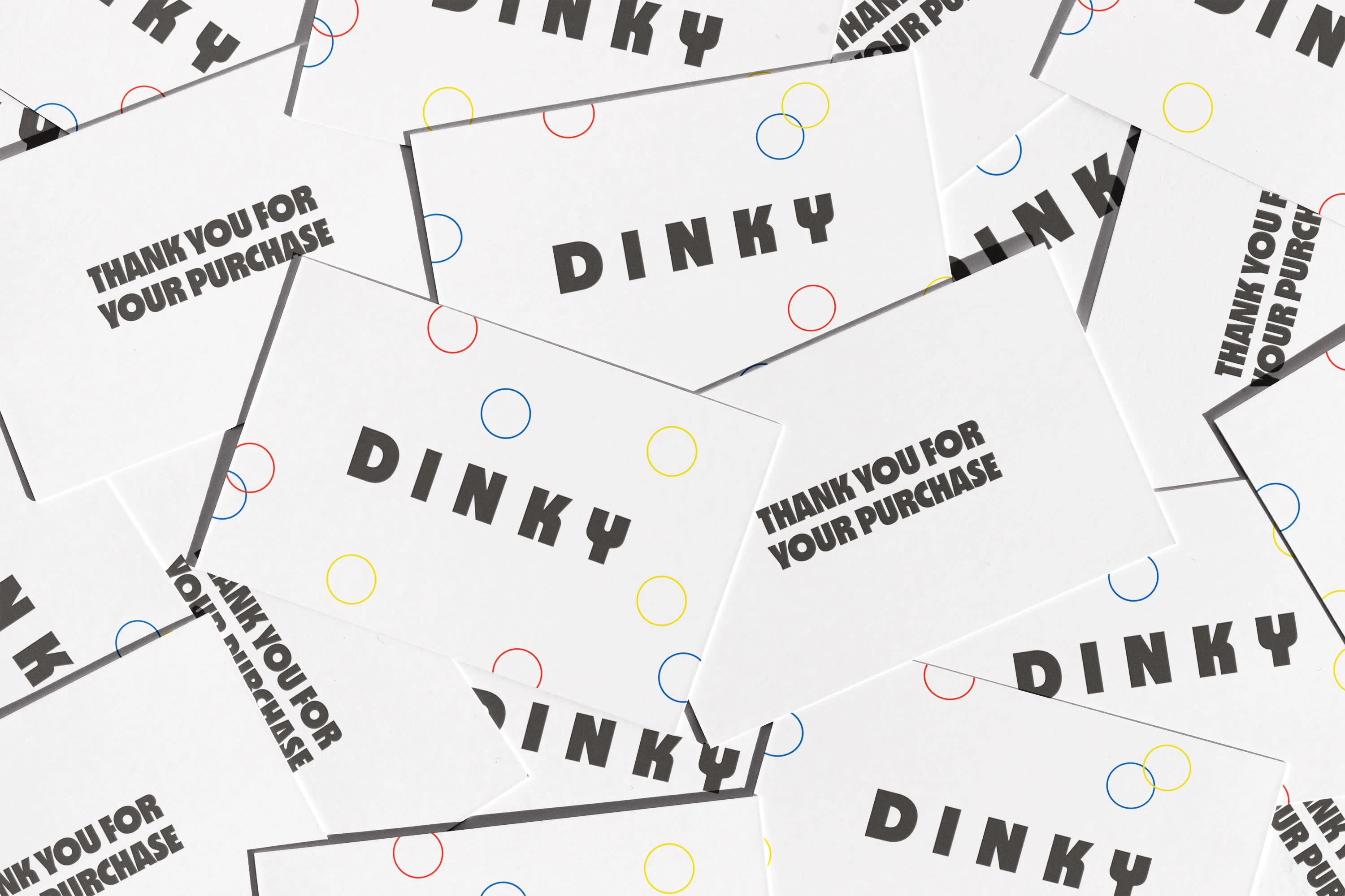
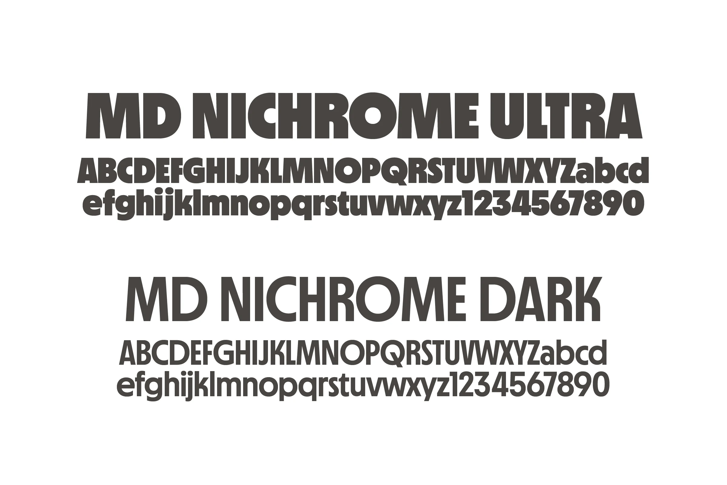
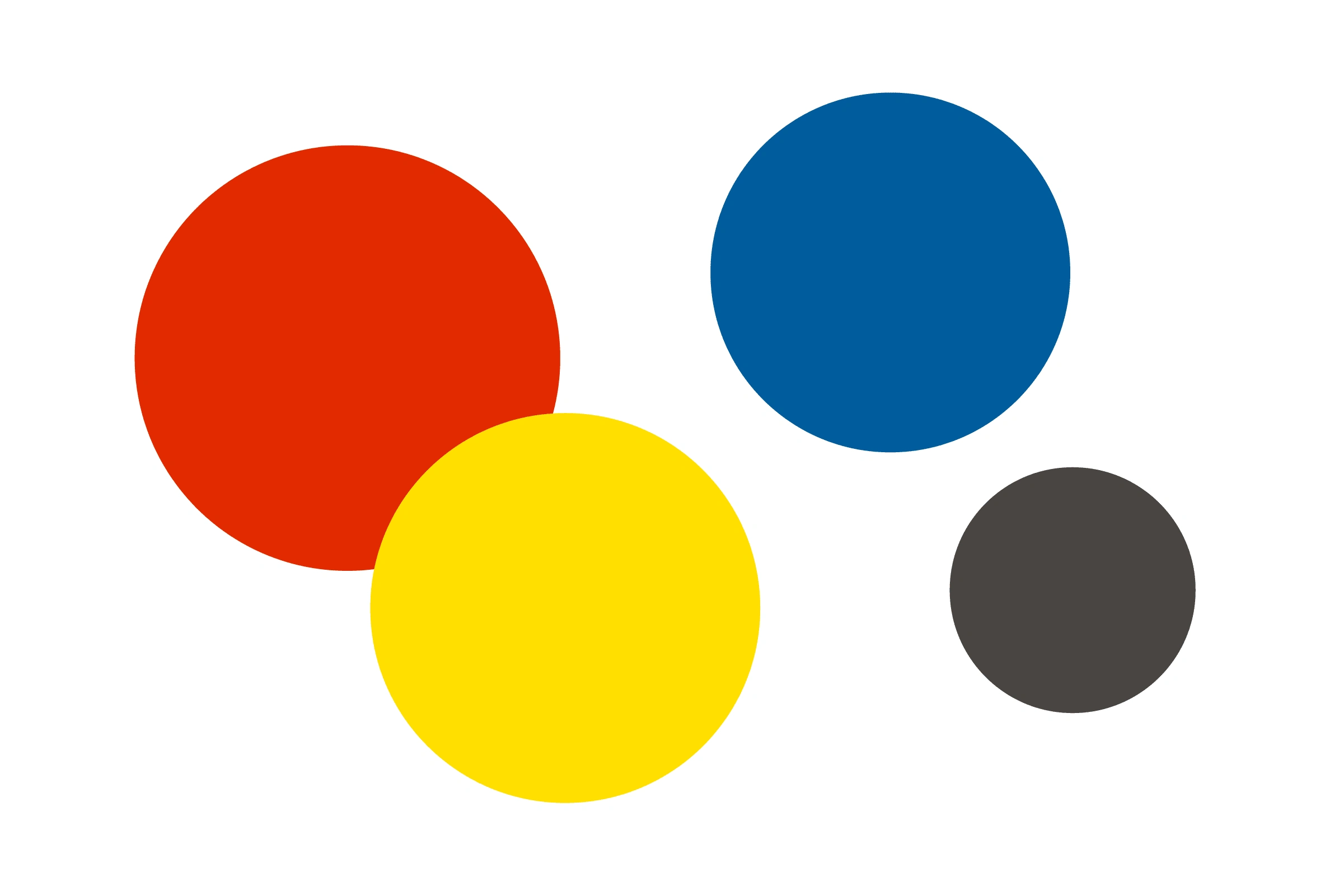
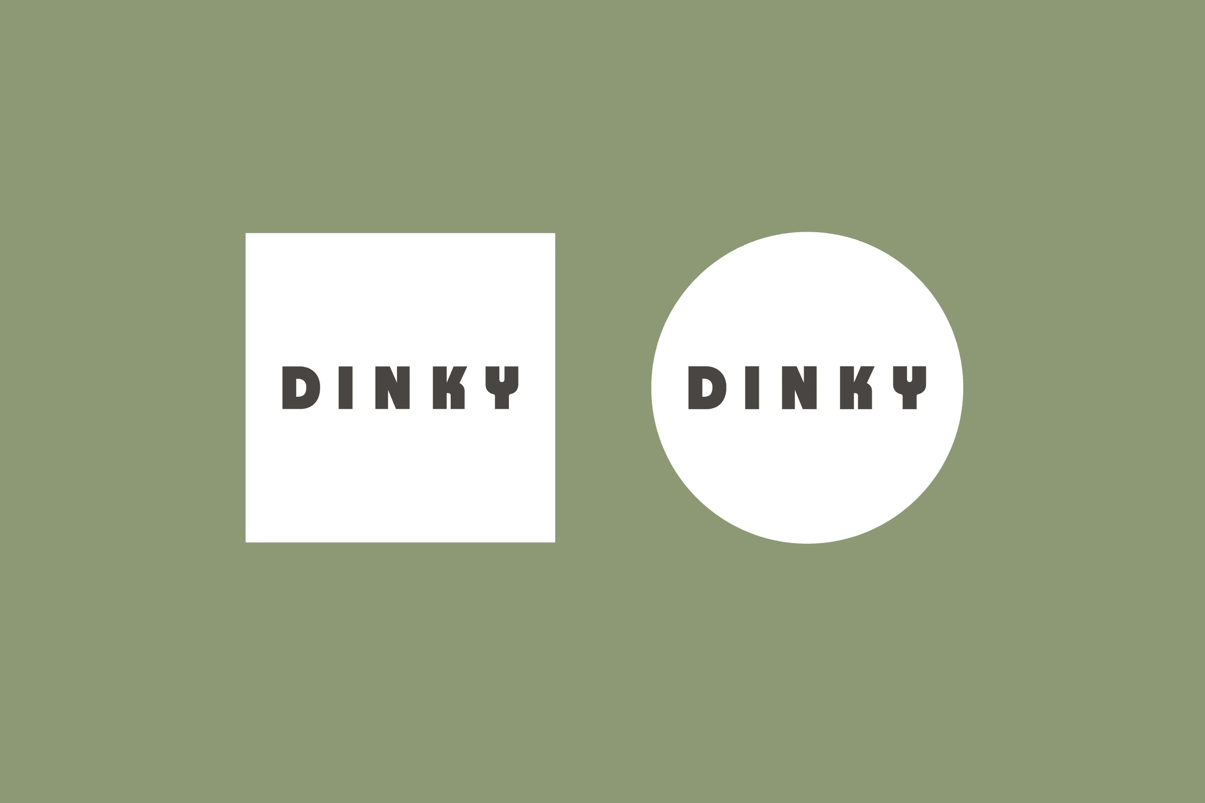
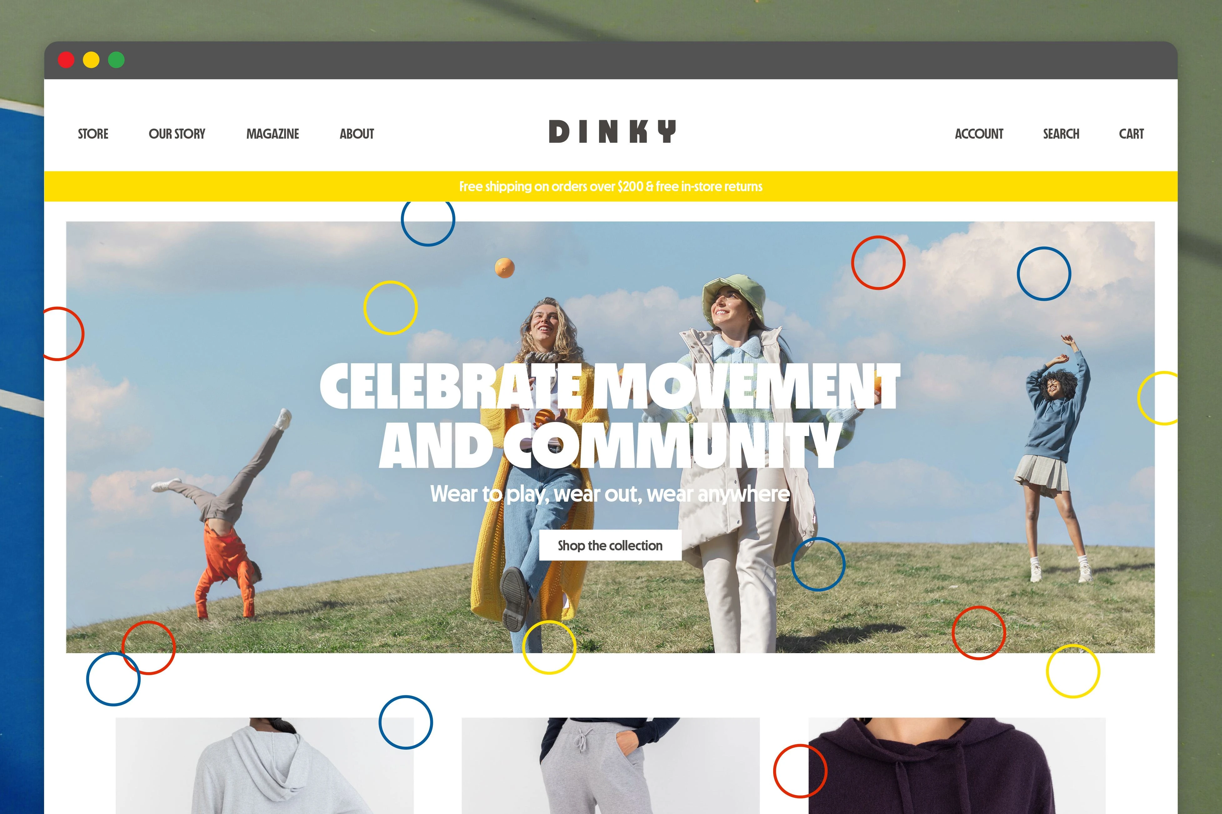
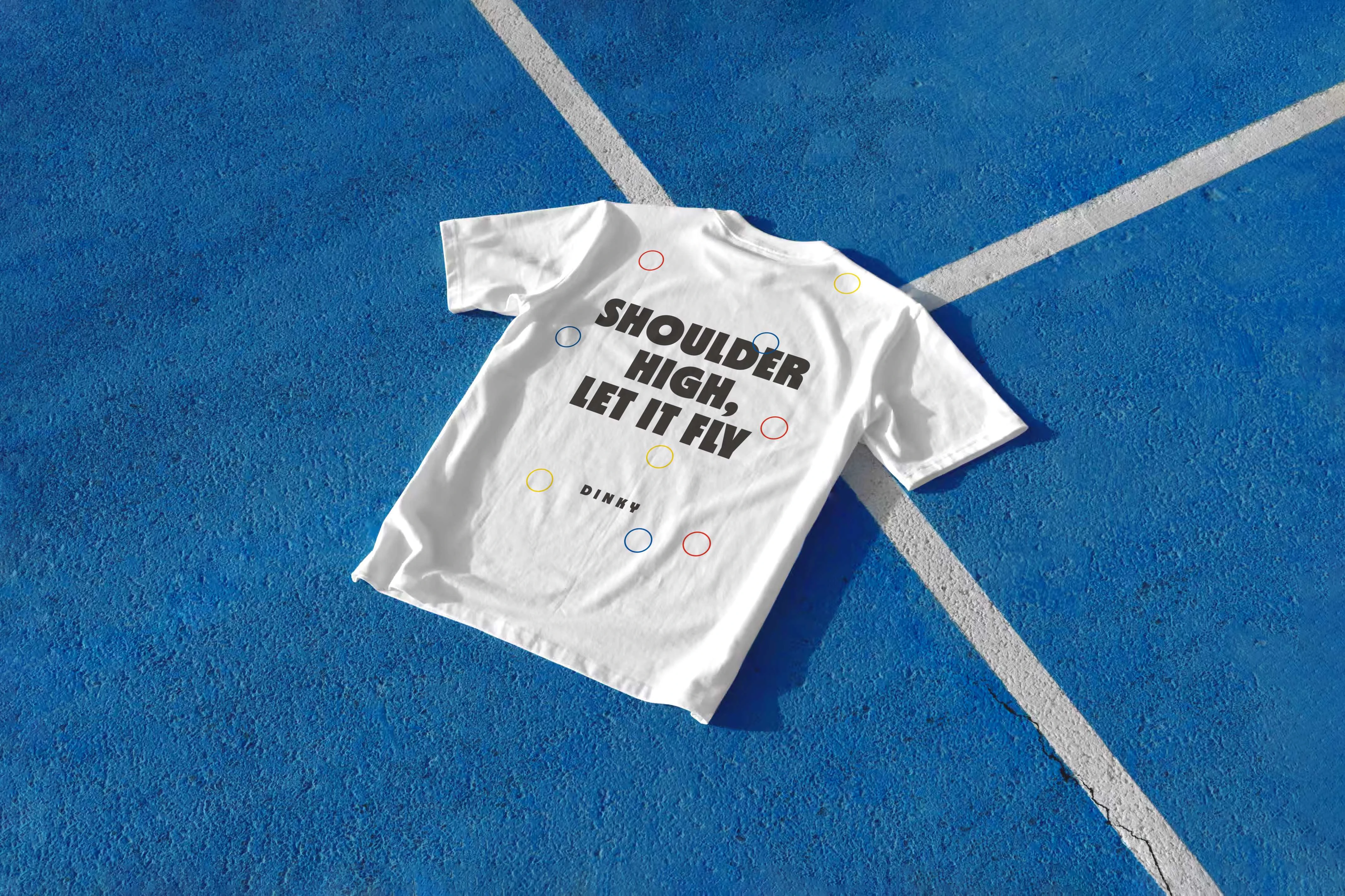
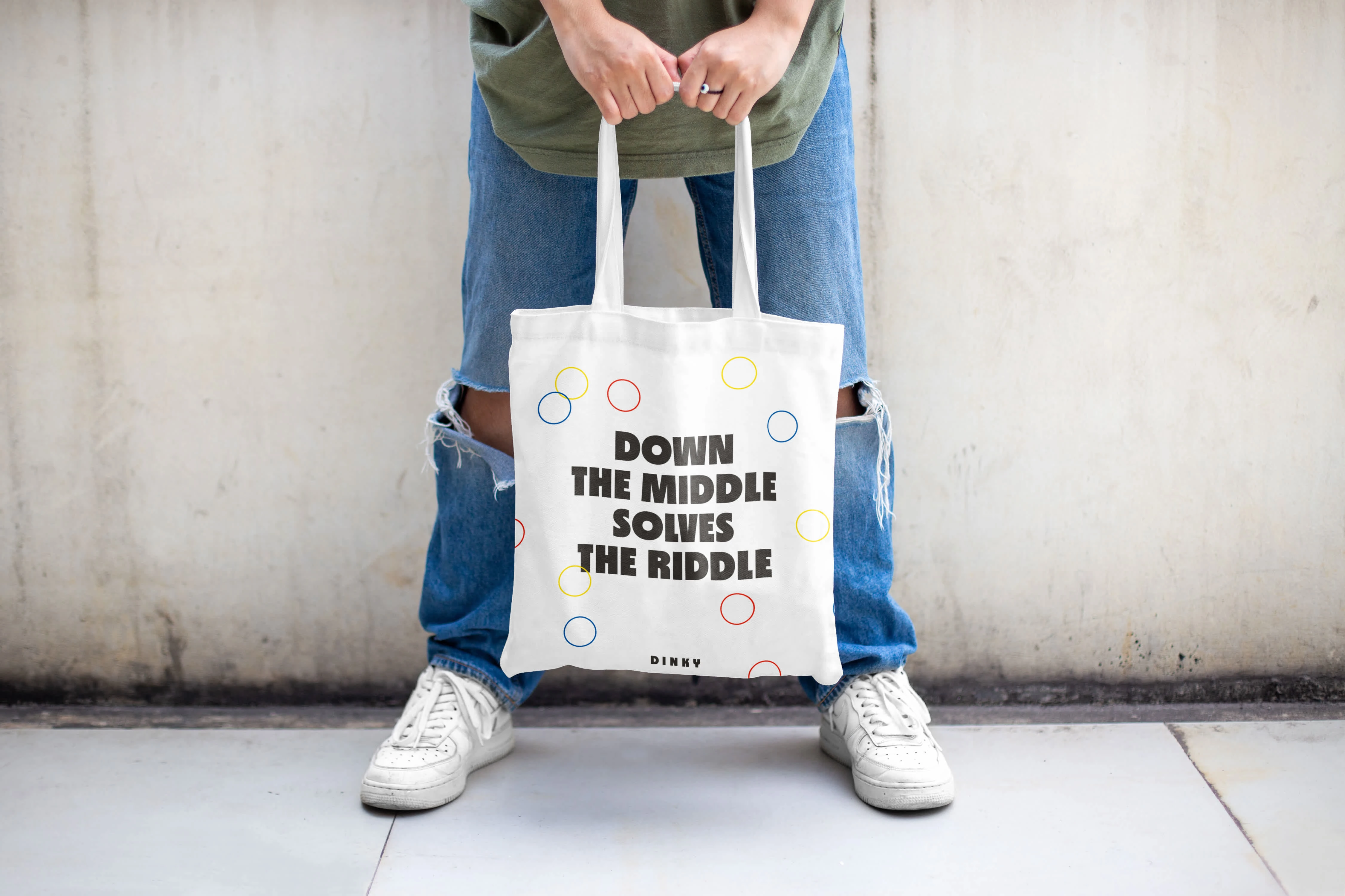
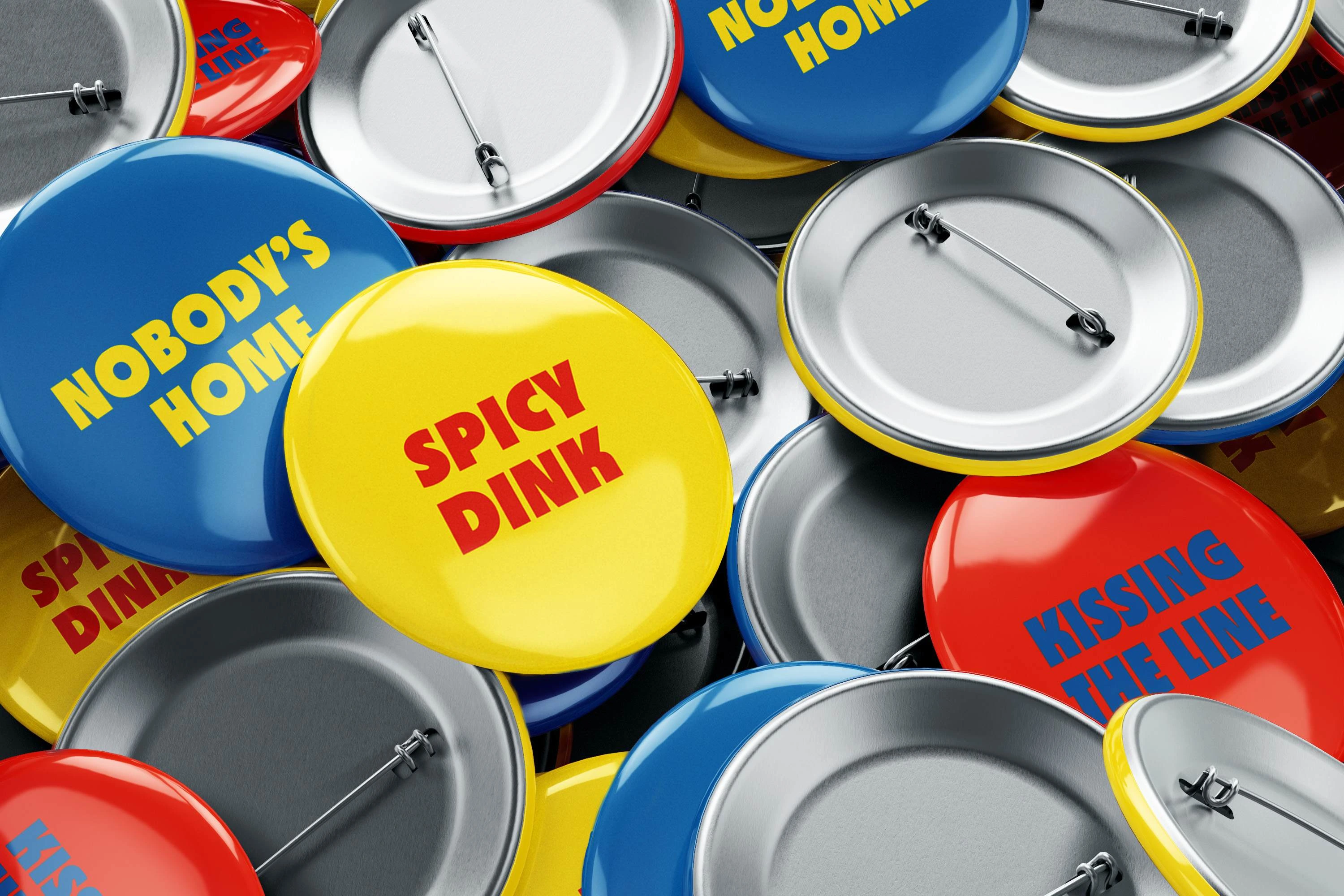
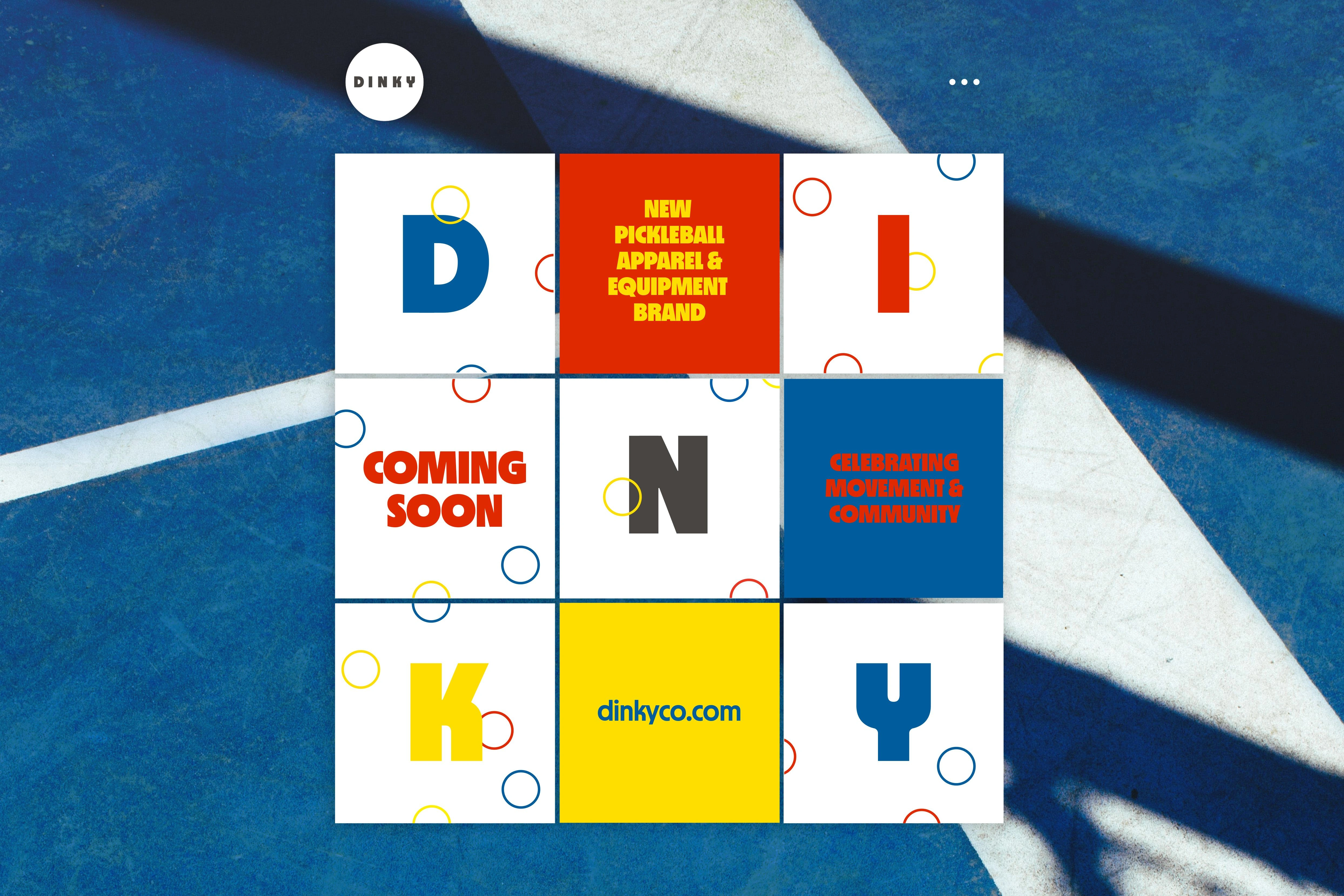
Building blocks of the brand are inspired by the game itself, with some visual nostalgia mixed in: punchy primary colors, dynamic circle patterns, and chunky off-black all-caps typography. The “Y” in the custom-drawn logotype is inspired by the shape of a pickleball racket, while the font choice, 2020 MD Nichrome by Mass Driver, nostalgic yet new, takes the starring role in mostly typography-heavy applications. Art direction is focused on the garments themselves while promoting the cheerful, fitness-forward, community-making ethos of the brand.
I worked directly with the founder to zero in on the world she wanted her brand to live in: starting from some initial mood images, to multiple design concepts, selection and refinement stage, and then to core brand codes, a guideline document, and applications like stationery, social media, website, and swag.
Like this project
Posted Aug 20, 2024
Brand identity and logotype for an apparel brand designed for women who play pickleball
Likes
13
Views
82
Featured on
