Brand identity system for Barron’s Advisor events
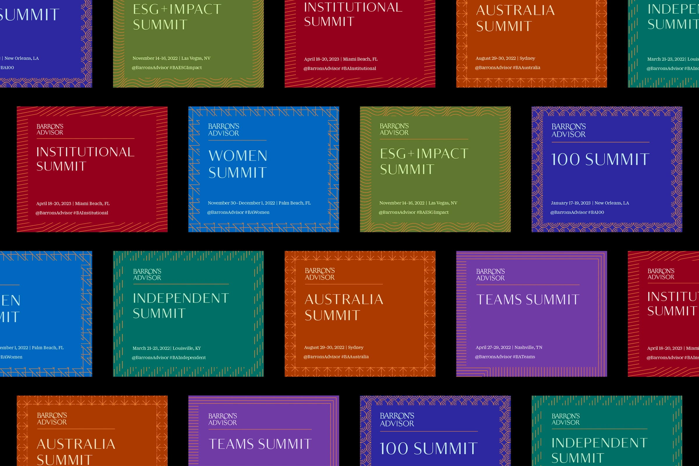
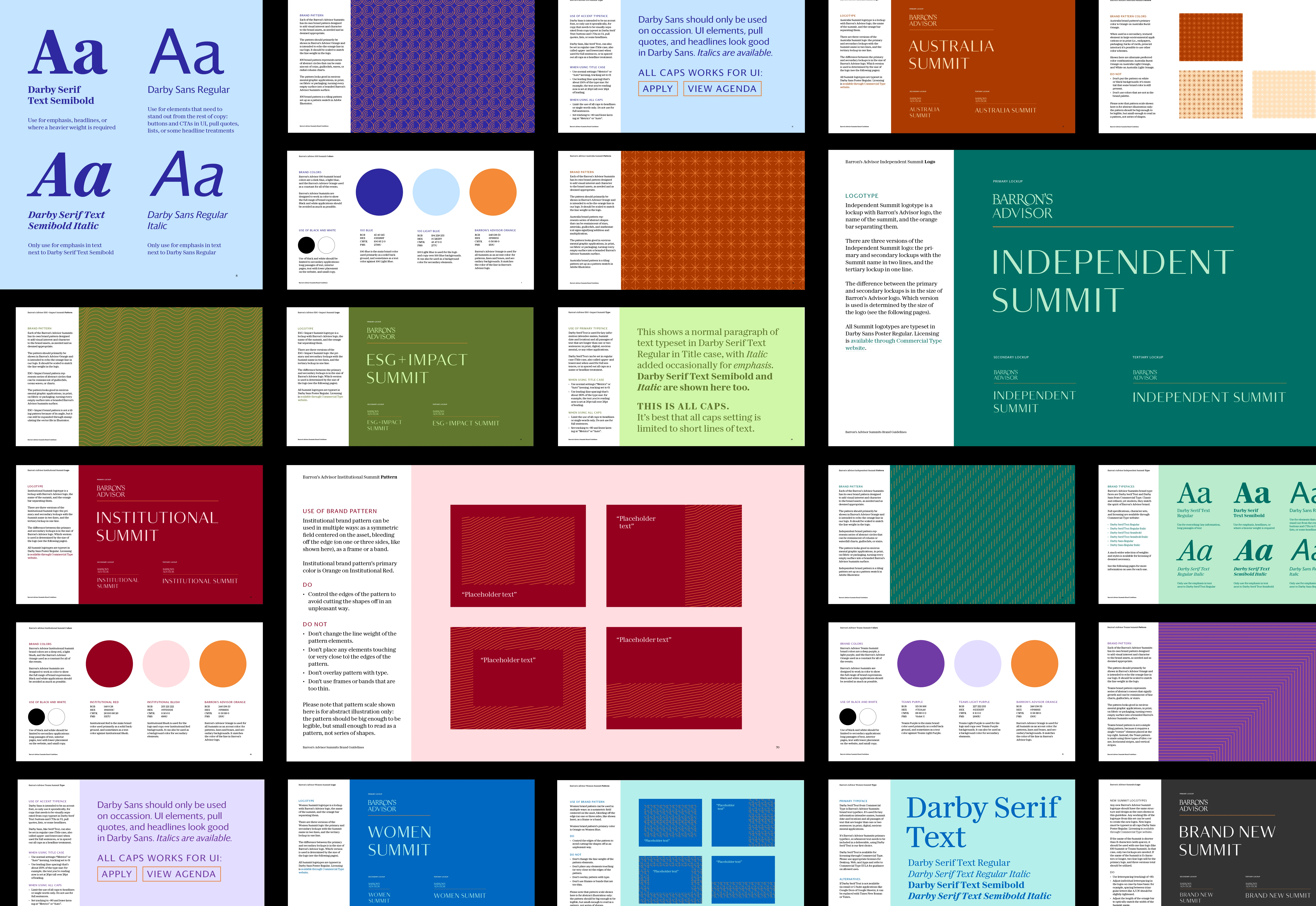
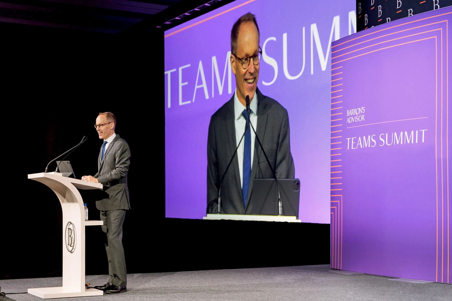
Set of brand identities and guidelines for Barron’s Advisor summits — established event series run by Barron’s Advisor, of Barron’s magazine fame published by Dow Jones & Company — aimed at top financial advisors and wealth management professionals.
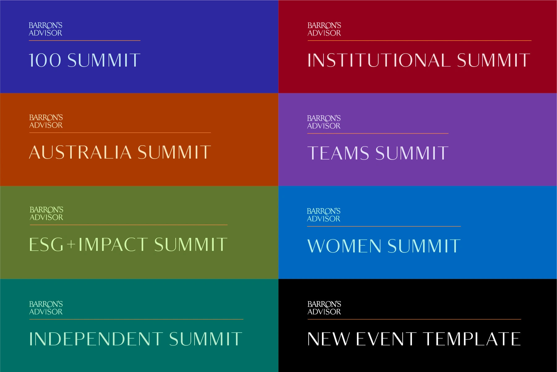
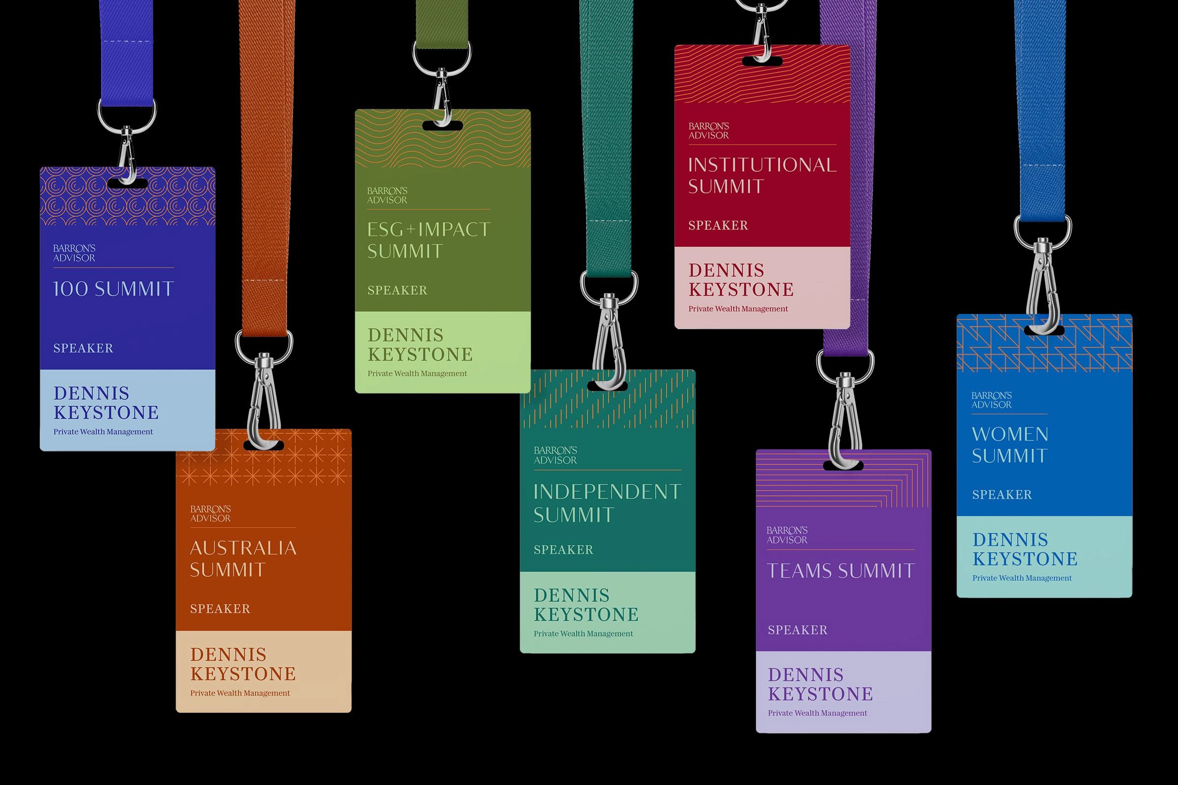
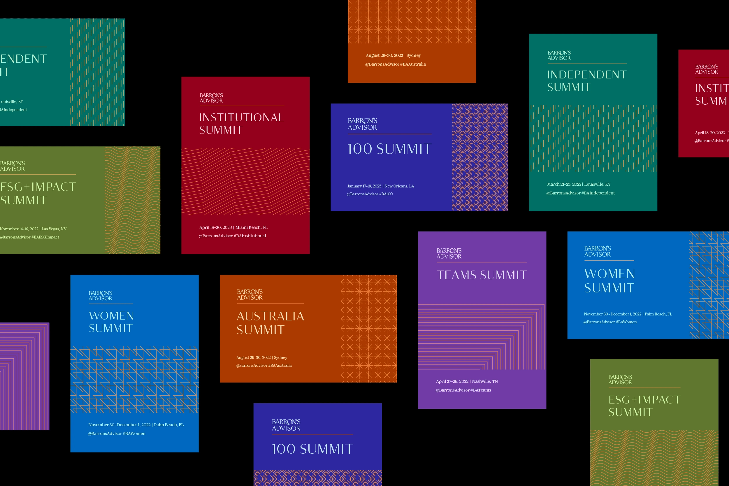
The new brand architecture extends the equity of Barron’s Advisor wordmark, and adds continuity and consistency to marketing, promotion, attendee experience, and environments for all events in the series. Previously designed as one-offs, the events now utilize visual identity toolkits with shared typography and layout principles, unique color palettes and patterns. Rich jewel tones build on Barron’s brand heritage and stand out in the paid media landscape, while abstract patterns evocative of data graphs and guillochés add visual interest and detail.
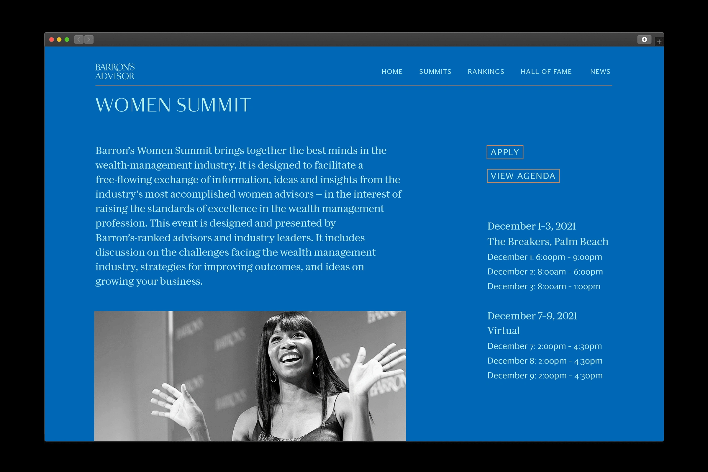
I worked directly with the Creative Director and Art Director at Barron's, connecting with the team every step of the way: from briefing, moodboarding, and initial brand architecture discussions, all the way to brand guideline structuring and practical advice on implementing the identities. I also provided design direction for key applications like the event website, email design, and printed program.

Like this project
Posted Aug 20, 2024
Brand identity and brand architecture for international Financial Advisor events run by Barron’s Advisor
Likes
0
Views
17
Clients
Barron's
