Koro Knives — Case Study
Sajid Mahmood
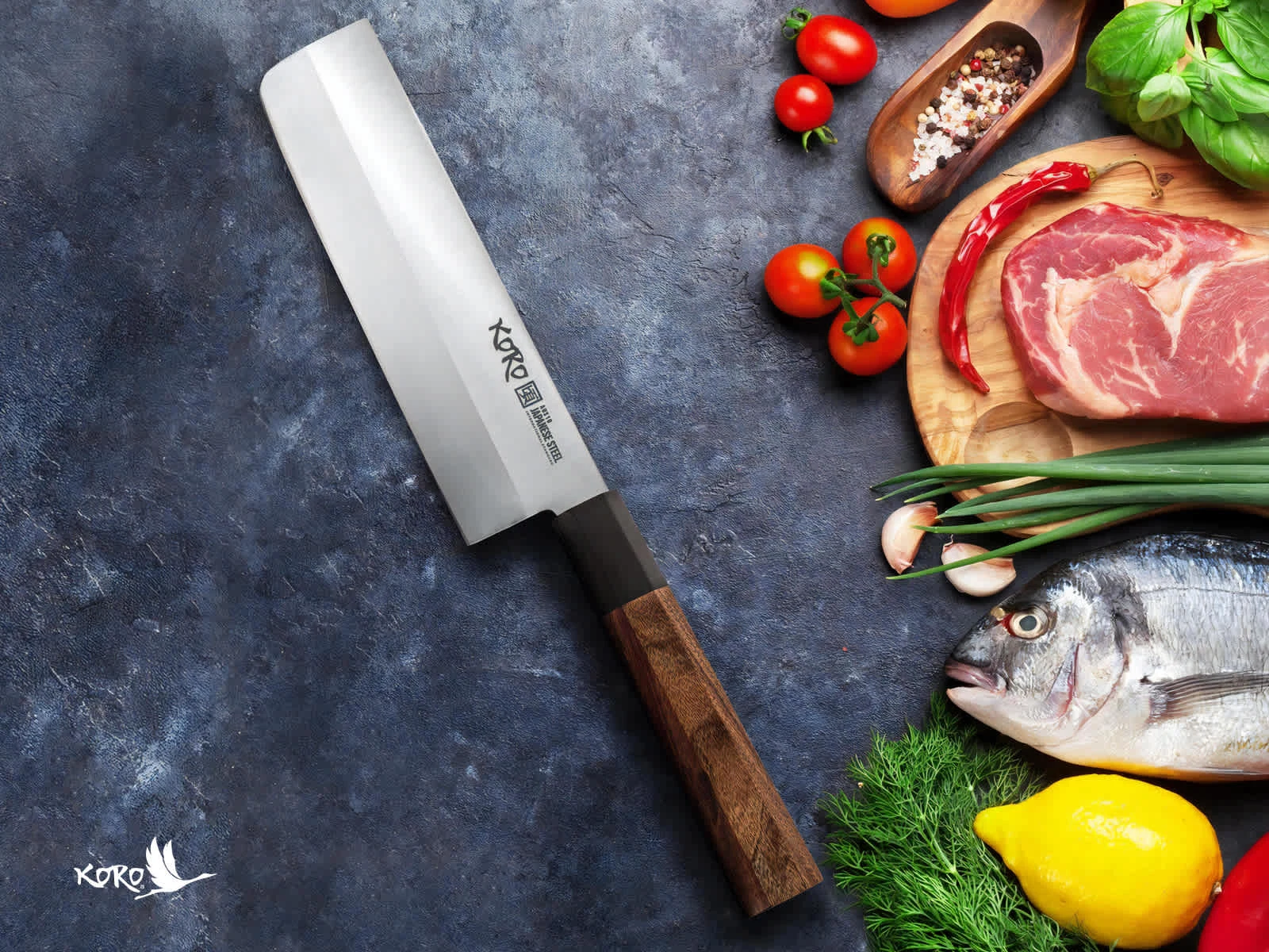
Koro Knives — Brand Identity Case Study
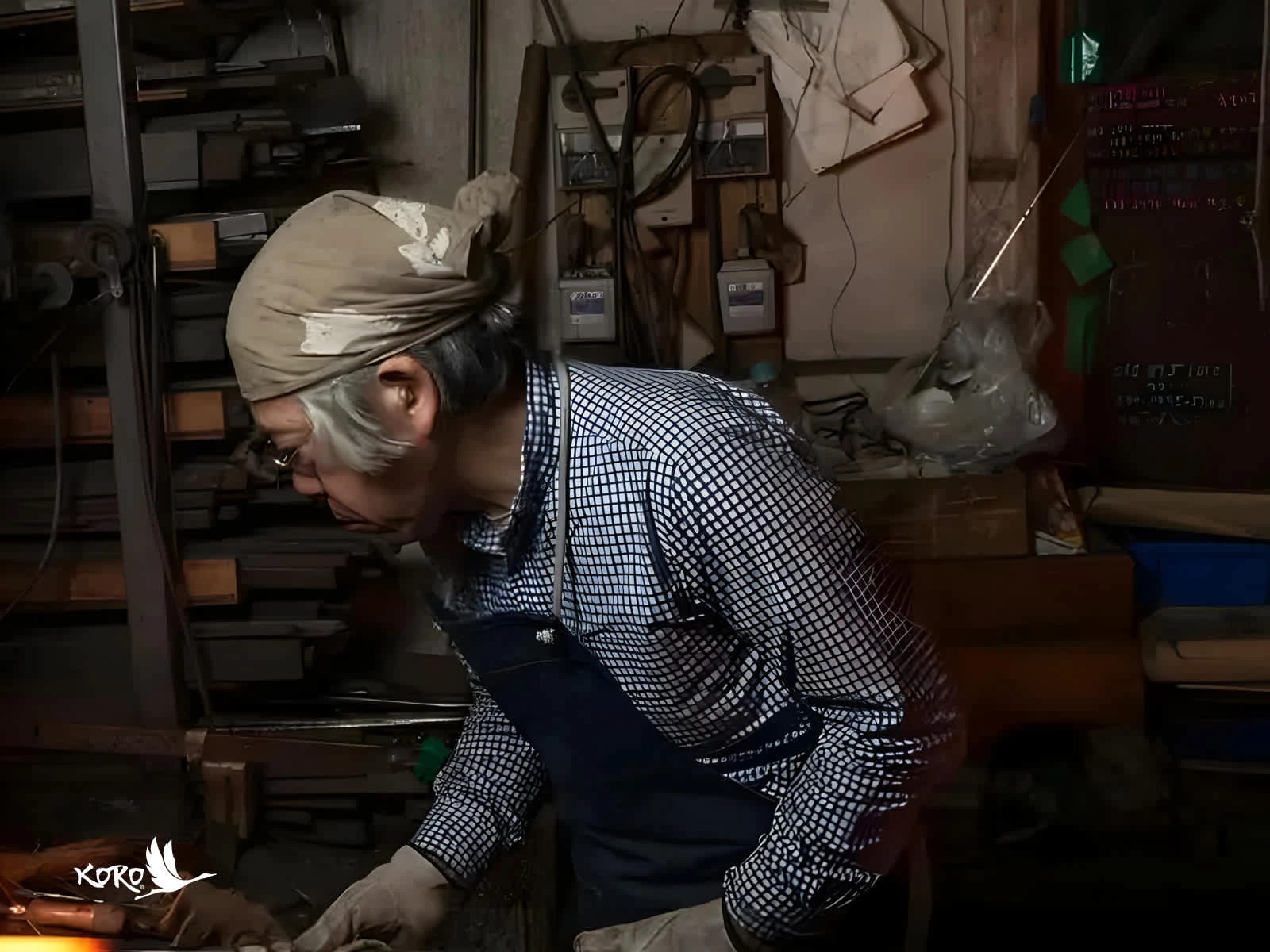
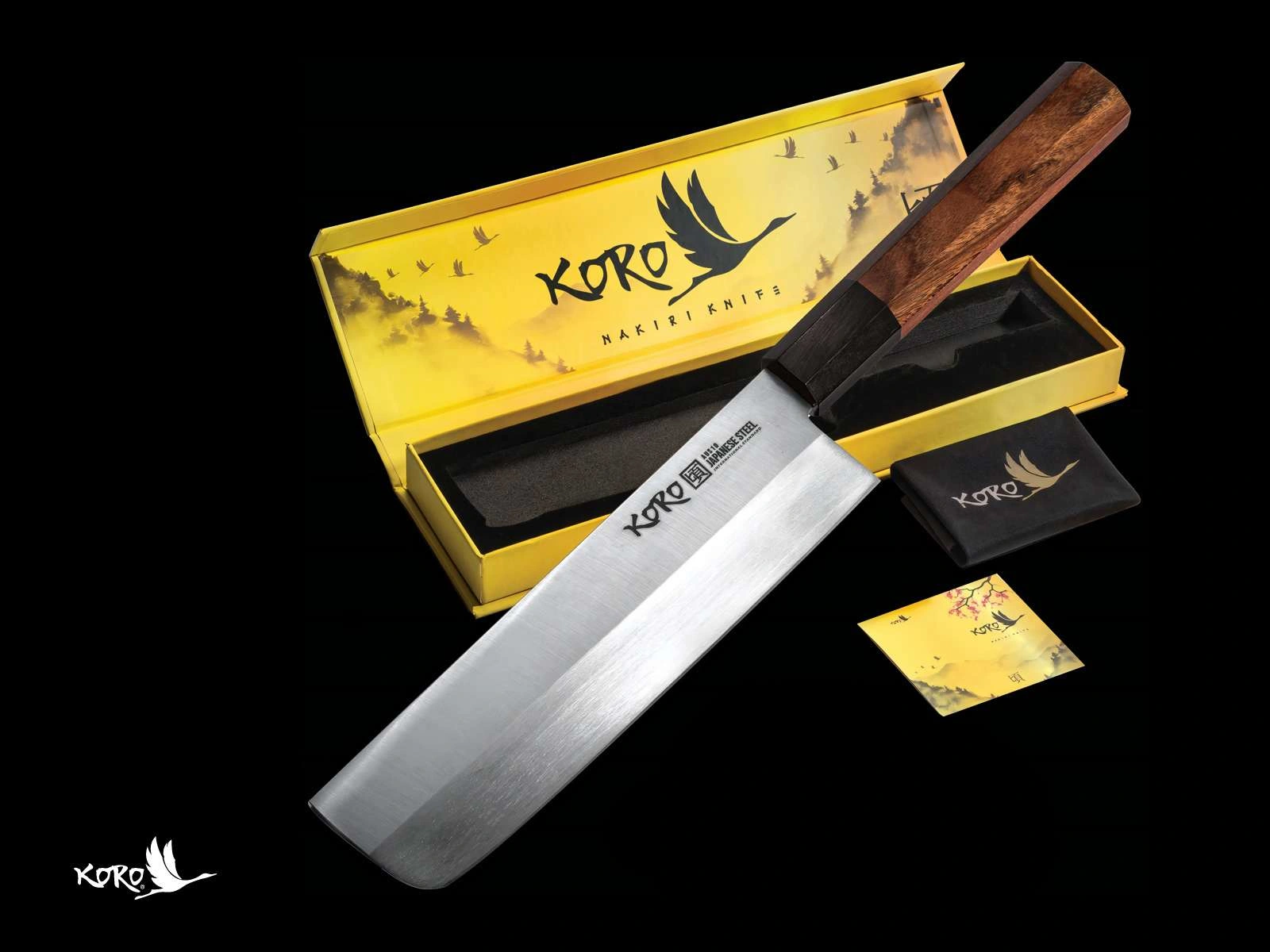
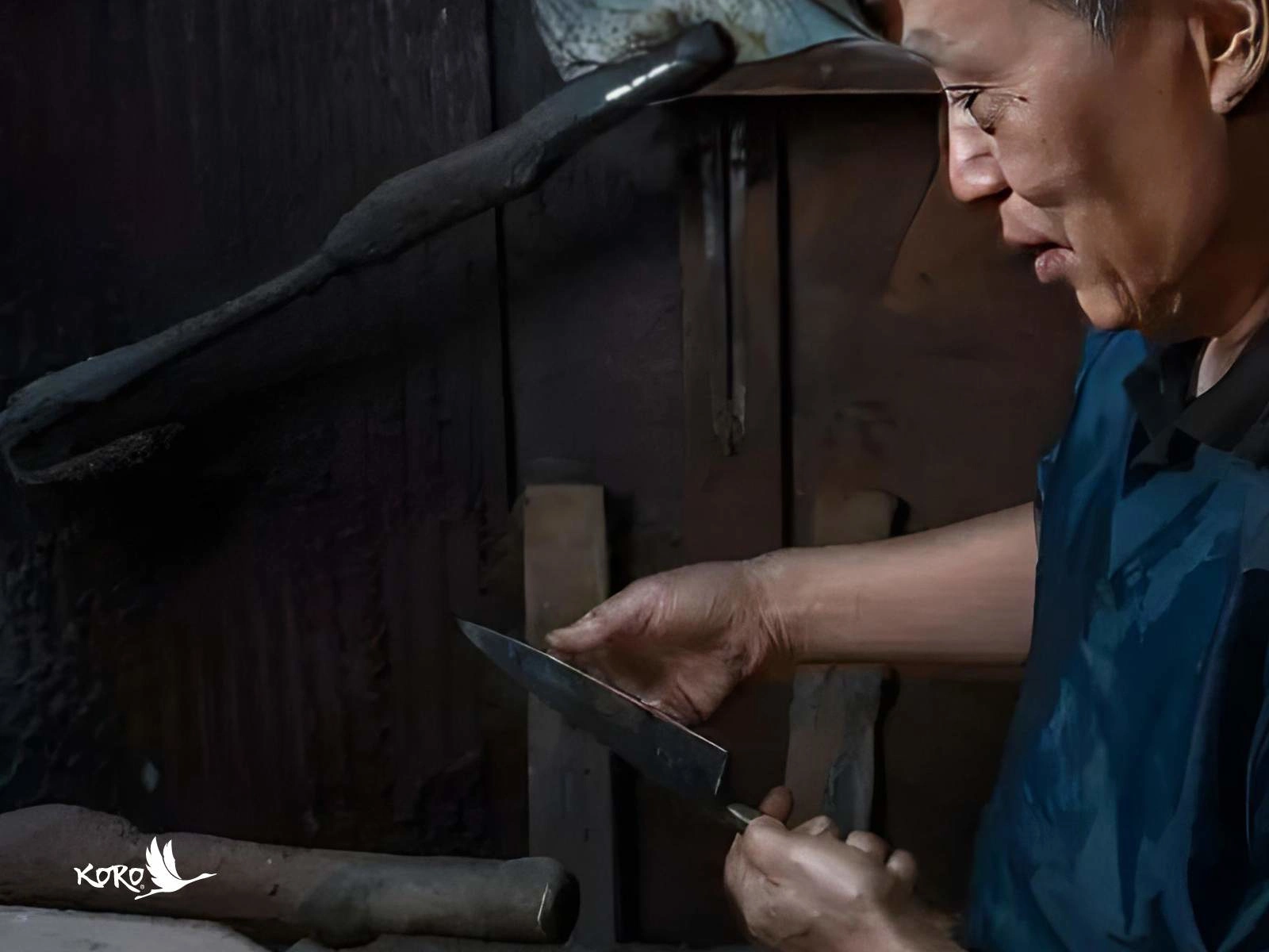
Koro manufactures high quality Japanese steel knives suitable for commercial and residential users. Koro Knives, a premium Japanese knife maker, sought a brand identity that reflects the tradition, craftsmanship, and quality of their hand-forged chef knives.
Problem Statement:
The challenge was to create an identity that communicates the brand’s commitment to longevity, precision, and the cultural significance of Japanese craftsmanship, while resonating with U.S. home cooks and professional chefs who appreciate fine, authentic kitchen tools.
Logo Design - Brand Identity
Author
Sajid Mahmood
Purpose:
To provide high-quality, hand-crafted chef knives that combine traditional Japanese craftsmanship with modern performance, enhancing the culinary experience for chefs and home cooks alike.
Mission:
To deliver exceptional, long-lasting kitchen tools made from authentic Japanese AUS-10 steel, ensuring superior performance and precision for every cook, while honoring the time-honored techniques of Japanese forging.
Vision:
To become the leading brand in premium handcrafted chef knives, recognized globally for combining tradition with innovation, and promoting health, longevity, and well-being through the joy of cooking.
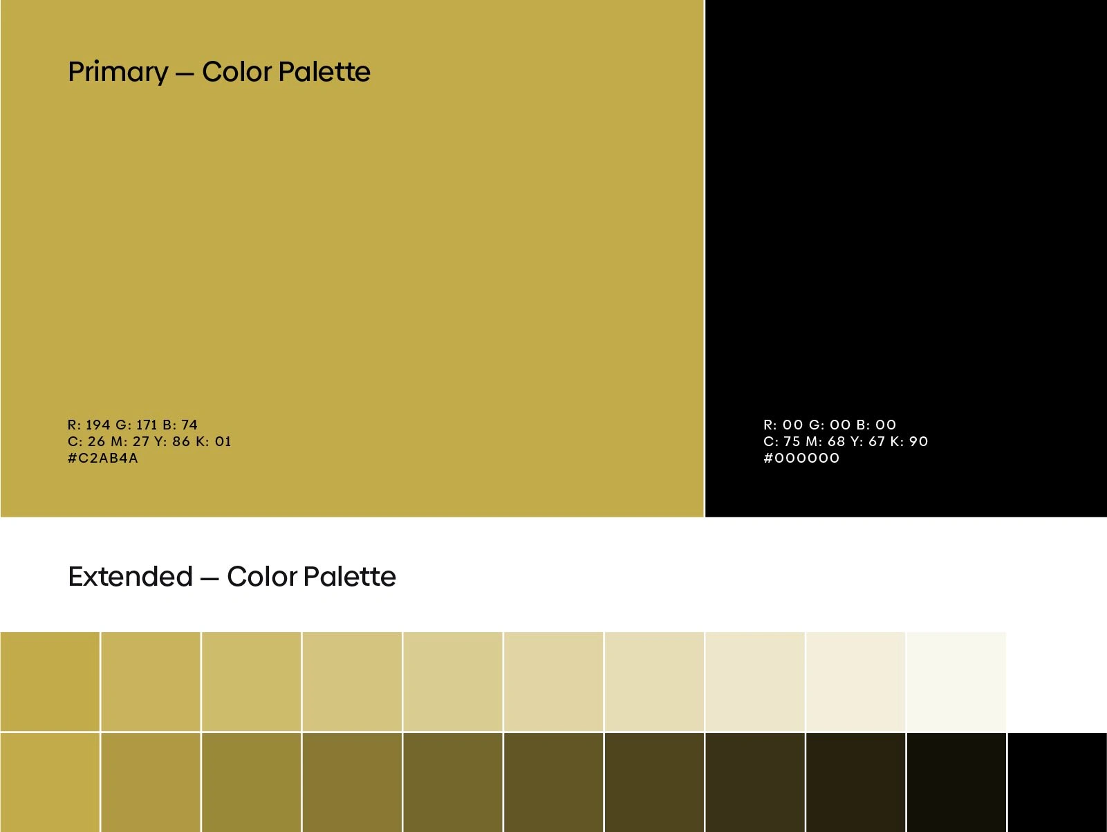
Colors:
The brand’s color palette blends an earthy gold with a deep black. The gold represents the premium quality, craftsmanship, and warmth of the knives, while the black conveys sophistication, strength, and timelessness. Together, they create a refined yet bold aesthetic, fitting for a luxury product.
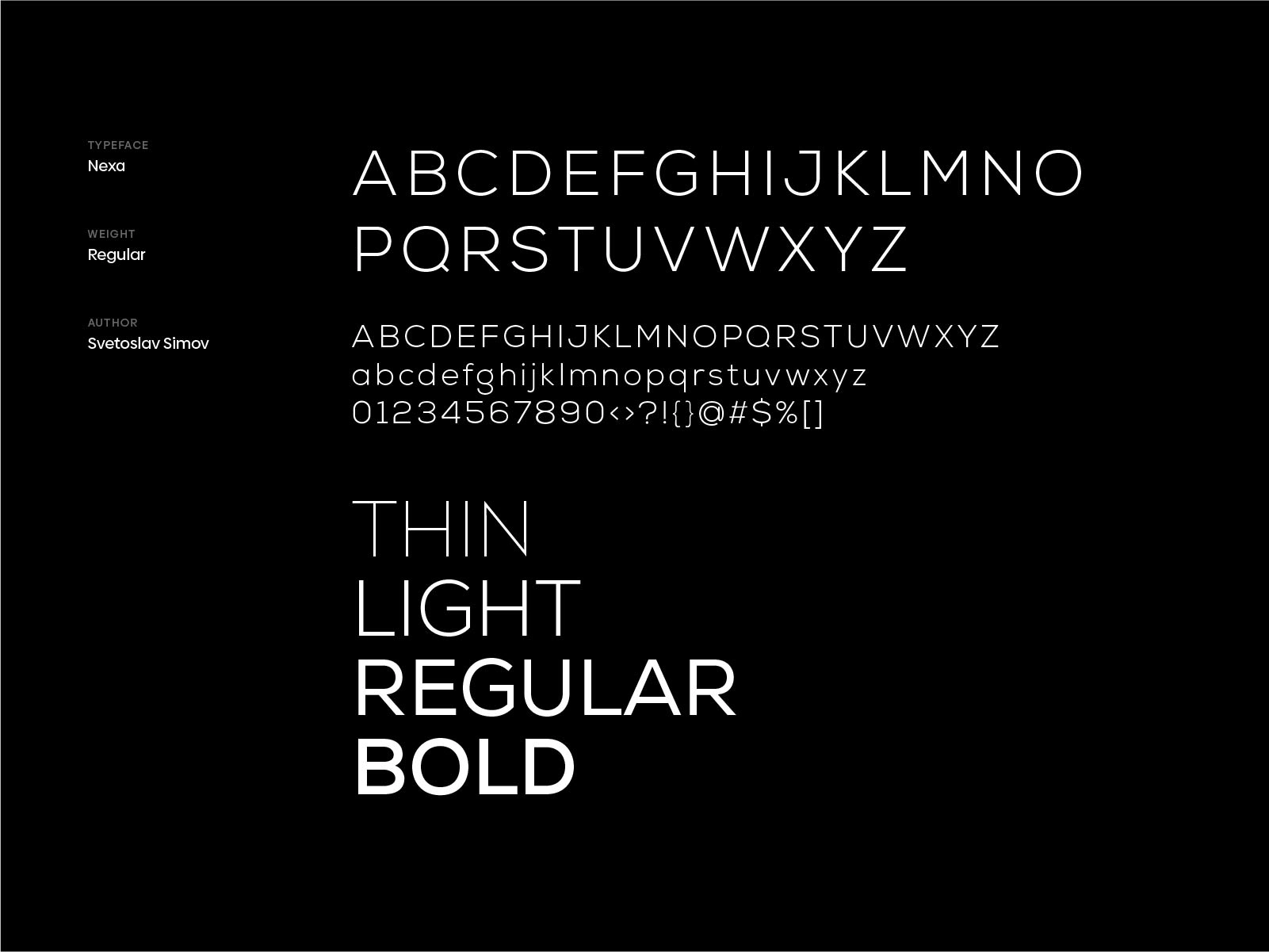
Typography:
The typography reflects the brand’s traditional roots with a modern twist, ensuring legibility and elegance. It complements the handcrafted feel of the brand while maintaining a clean, professional appearance that resonates with both chefs and culinary enthusiasts.
Project Summary:
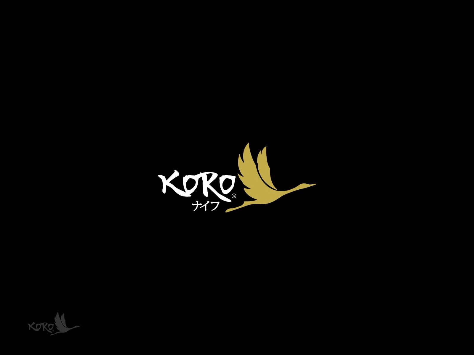
This branding project successfully conveyed the heritage and premium quality of Koro Knvies through a handcrafted logo and type design. The crane bird symbolized longevity, tying into the brand’s philosophy that time spent enjoying healthy food and cooking together leads to well-being. The refined color palette and elegant typography captured the balance between tradition and modernity, resulting in a distinctive brand identity that will resonate with high-end customers and professional chefs alike.
Interested in similar work? Let’s craft a unique brand identity that embodies your vision and stands out across industries. Get in touch today!
Like this project
Posted Nov 16, 2024
The branding captures the essence of Japanese craftsmanship, using a crane symbol for longevity & a refined color palette to convey premium quality & tradition.
Likes
0
Views
25