Kids' Meals Cards and Small-Format Print

Nychta Studio

Kids' Meals Cards and Small-Format Print
Project overview
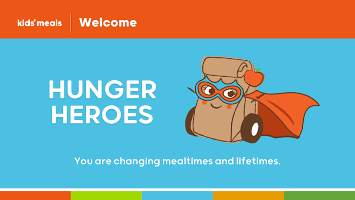
Small print pieces have seconds to make a caring, credible impression. I applied the Kids' Meals identity to compact cards that kept messaging, hierarchy, and calls to action easy to grasp.
The challenge
Compact print can easily become crowded, especially when it needs to carry a heartfelt message, brand identity, and practical action. If information competes for space, the audience may miss the point entirely.
The approach
I used the established brand system to prioritise the message, maintain legibility, and prepare print-ready artwork. The layouts balanced warmth with clarity so the cards felt personal without becoming visually busy.
What we delivered
• Applied the brand system to compact, high-attention print pieces
• Protected legibility and hierarchy in a constrained format
• Created print-ready artwork that retained the organisation's warmth
The result
Kids' Meals had a consistent small-format communication tool that extended the brand into personal interactions while keeping the important message easy to read and act on.
Like this project
Posted Aug 20, 2026
Business and gift card layouts that carry the Kids' Meals identity clearly at small size.
Likes
0
Views
3