Prismatica Studio: Brand World & Identity

Ariadna Giménez


Introduction: Unveiling Prismatica Studio
At the intersection of strategic insight and creative brilliance lies Prismatica Studio, a concept born from the vision of transforming how brands engage with the world. This branding project, a collaboration with Sofia di Stefano, lays the foundational identity for a future agency dedicated to making brand messages not just seen, but genuinely felt.
Our tagline — Visionary. Vibrant. Versatile. — encapsulates the essence of what Prismatica Studio stands for. It’s about forward-thinking strategies, dynamic creative expression, and adaptable solutions that empower brands to thrive in an ever-evolving digital landscape.
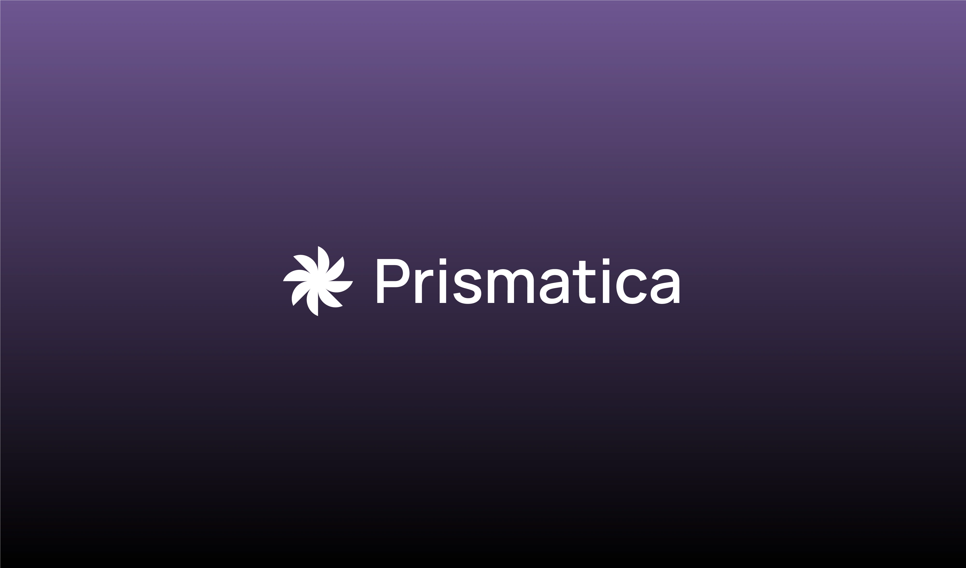
The core Prismatica Studio logo, showcasing its strong wordmark paired with the unique, multifaceted brand symbol.
The Challenge: Beyond Visibility, Towards Connection
In a crowded marketplace, achieving brand visibility is only half the battle. The true challenge lies in forging authentic connections that resonate deeply with an audience. Our mission for Prismatica Studio's brand identity was to embody this very philosophy: to create a visual and verbal language that speaks directly to the habits and values of a target audience, ensuring a profound emotional impact.
Our process began with a deep dive into the core values Prismatica Studio would uphold: innovation, connection, and adaptability. We translated these into a branding system that is both sophisticated and approachable.

The construction of the Prismatica symbol, demonstrating its geometric precision and balanced design, mirroring the studio's structured yet creative approach.
The Visual Identity: Visionary. Vibrant. Versatile. in Form
The Logo & Iconography: A Spectrum of Possibility
The Prismatica Studio symbol is designed to reflect clarity, multifaceted thinking, and the ability to refract a brand's essence into a powerful, cohesive message. Its clean lines and thoughtful construction speak to precision, while its dynamic form hints at adaptability. We explored various versions to ensure its versatility across different applications and backgrounds.
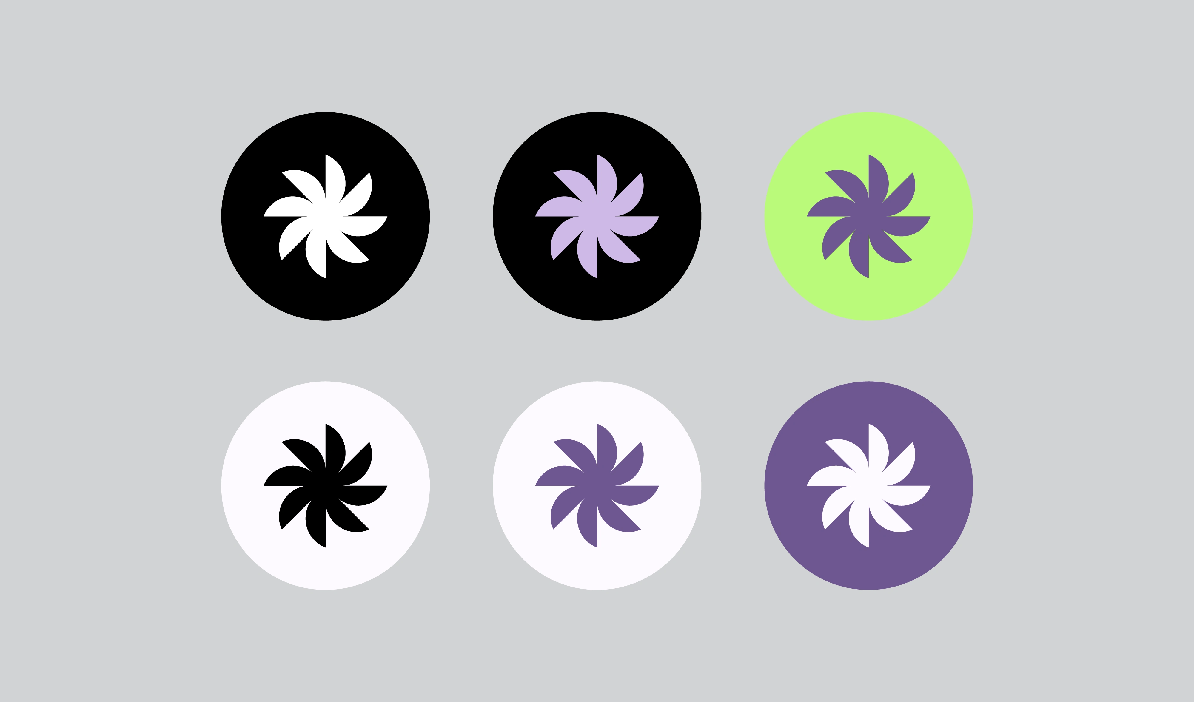
Various iterations of the Prismatica icon, demonstrating its adaptability across light and dark backgrounds and showcasing its potential within the vibrant brand palette.
Color Palette: Illuminating Connections
Our chosen color palette for Prismatica Studio is deliberately vibrant, reflecting energy and creativity, while maintaining a versatile balance for professional applications. Each color was selected to evoke specific emotions and reinforce the studio's forward-thinking approach, from the foundational Obsidian Black and Pure White to the dynamic Royal Amethyst and Electric Lime.
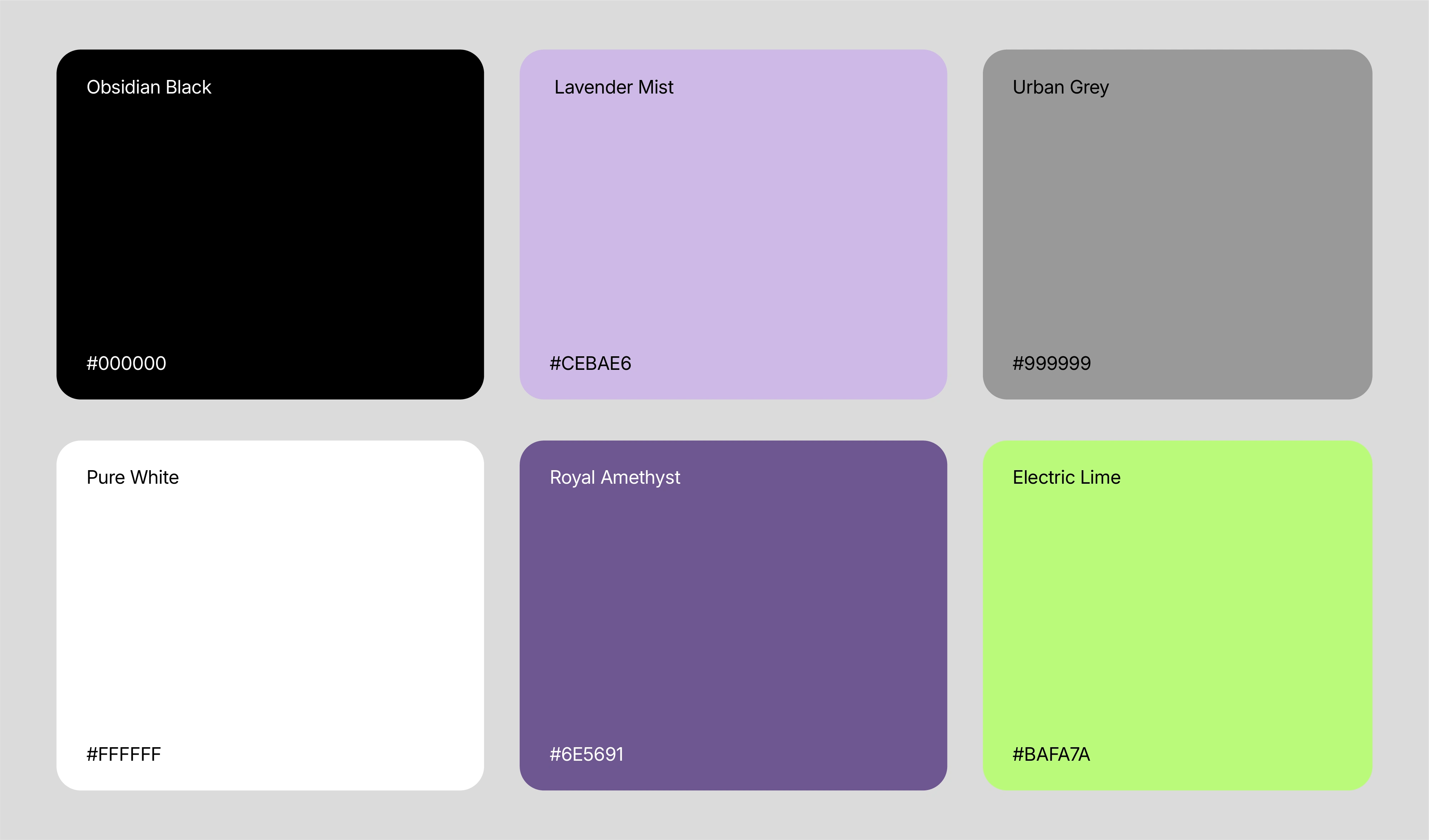
The complete color palette for Prismatica Studio, detailing the hex codes and names for each hue, designed to be both bold and adaptable.
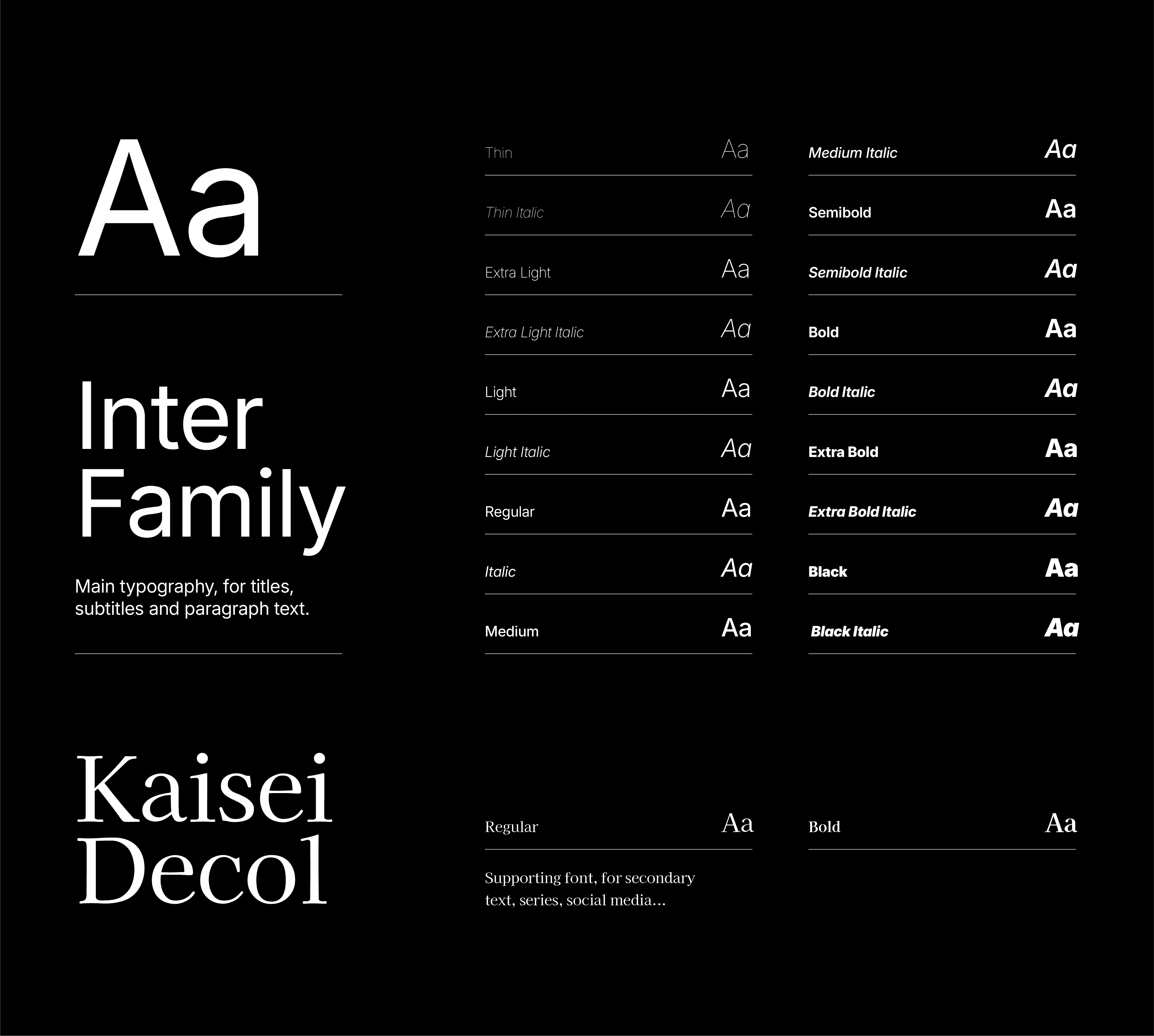
Typography: The Voice of Authority and Approachability
The selected typefaces for Prismatica Studio balance modern sophistication with clear legibility. Inter Family serves as the main typography, chosen for its extensive range of weights and styles that allow for both commanding titles and readable body text, making it visionary in its contemporary feel. Kaisei Decol, a supporting font, adds a touch of distinct elegance for secondary text, series, and social media, enhancing the brand's versatility.
Collaboration & Future Impact
This project was a fantastic collaborative effort with Sofia di Stefano, bringing together our shared vision for what a truly impactful branding agency could be. The development of Prismatica Studio's brand identity is not just a design exercise; it's the blueprint for a future where brands don't just exist, but truly connect and leave a lasting impression.
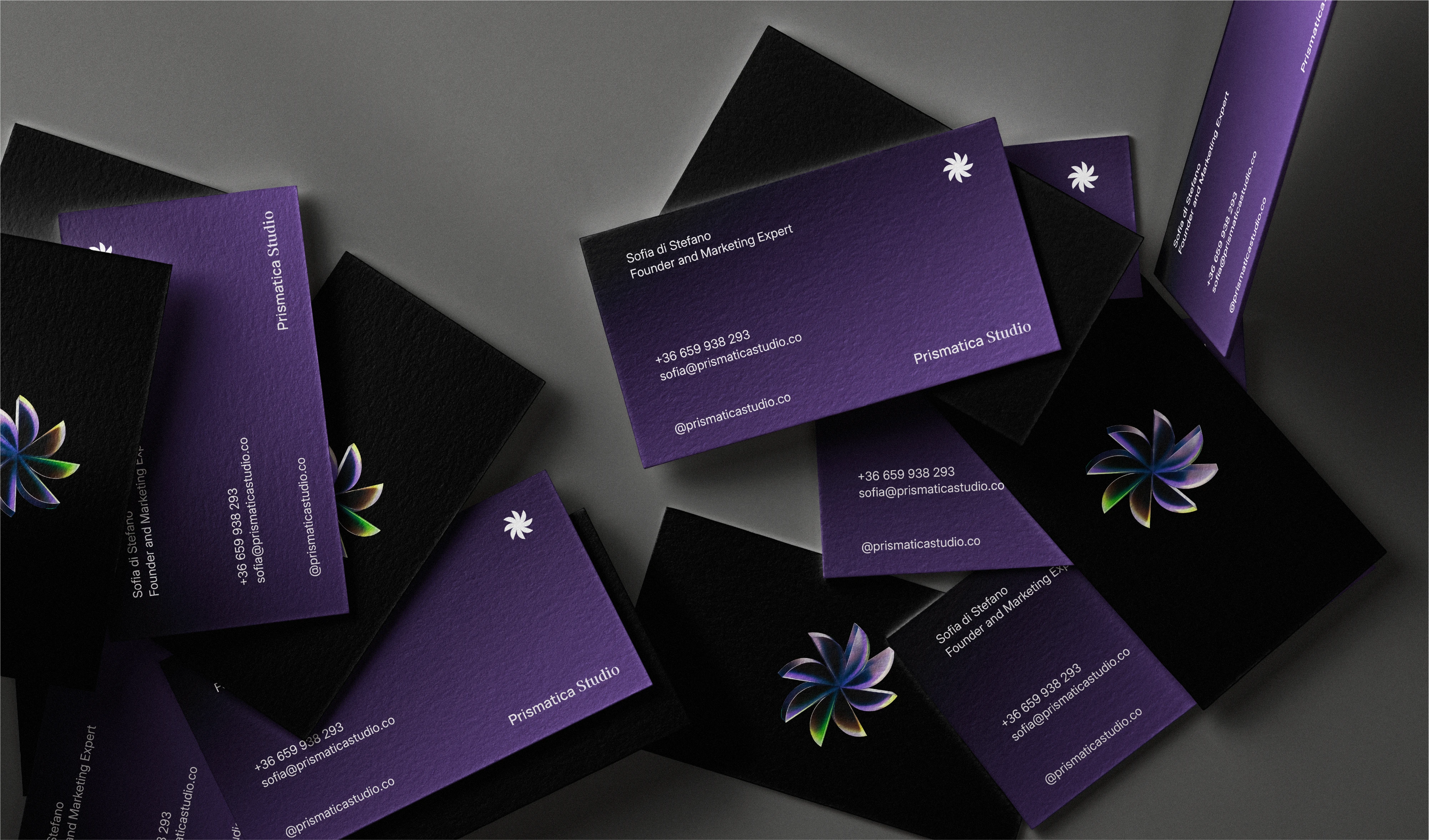
A close-up of Prismatica Studio business cards, highlighting the texture and vibrant purple alongside the black, showcasing the elegant and tangible brand experience.
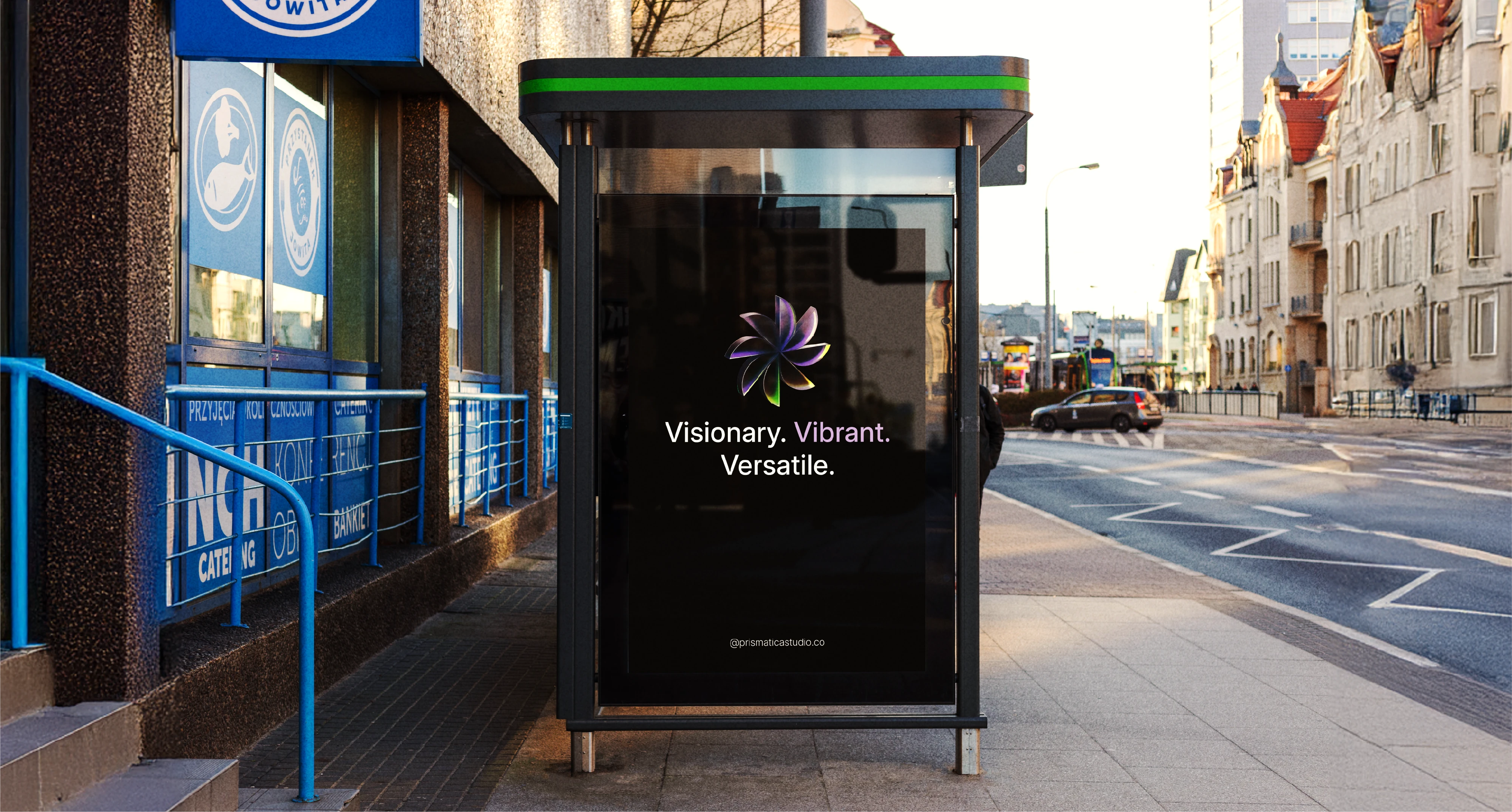
The Prismatica Studio branding on a bus stop advertisement, demonstrating its impactful presence in an urban environment, embodying the "Visionary. Vibrant. Versatile." tagline at scale.
Like this project
Posted Jul 24, 2025
Collaborative branding for Prismatica Studio, an agency set to redefine how brands genuinely connect with the world. Visionary. Vibrant. Versatile.
Likes
16
Views
99