An unused logo concept exploring

Dalibor Pajic

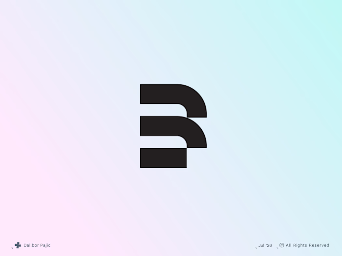
An unused logo concept exploring the letter N through a clean, geometric construction. The mark balances simplicity with a distinctive silhouette, creating a versatile identity that feels modern, confident and memorable.
Although it never made it into a final brand, it's a reminder that strong ideas don't always need a client to exist. Sometimes the best concepts are the ones waiting for the right opportunity.
Like this project
Posted Jul 20, 2026
An unused logo concept exploring the letter N through a clean, geometric construction. The mark balances simplicity with a distinctive silhouette, creating a...
Likes
0
Views
7