Crowdfunding Platform on Framer - Microfon.co
Overview
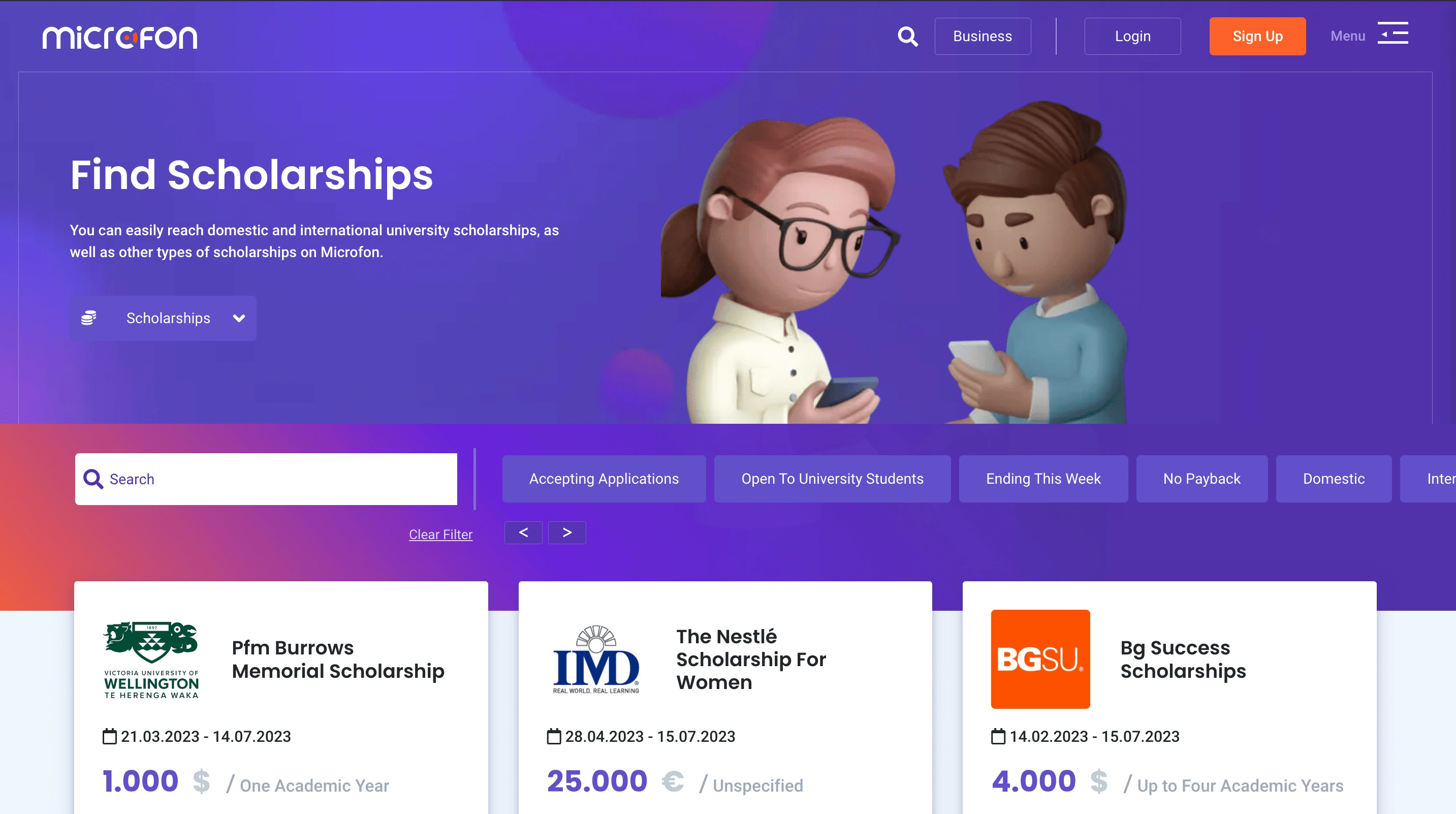
The project scope covered UX and UI design for Microfon.co. The client is a crowdfunding platform focusing on students and new graduates, they have numerous sponsors, scholars and grantors who were used to the old version of the website, called "E-bursum" at the time.
3 Months
2 Workshops
Deliverables
⚡️The Challenge
The greatest challenge in this project was to come up with an easy-to-use user experience that is both familiar to the existing users and also navigates easily on mobile too. Considering the Microfon product is a huge search, filter and application engine, this was particularly challenging to tackle.

🧩 Approach
We conducted multiple workshops with the client and also the users to understand each stakeholder's needs and pain points. Then an extensive information architecture was created to see the overview of the website. With its guidance, UX wireframes and finally UI designs were created using Figma.

🚀 Result
Over the past years Microfon platform has
Reached more than 1.5 Million scholars 👥
Granted over $4 Million 💰 in grants.
Like this project
Posted Jul 14, 2023
UX and UI design for Microfon.co, crowdfunding and career development platform for students.
Likes
0
Views
81


