Gospel Library App: Home Screen Redesign for iOS and Android
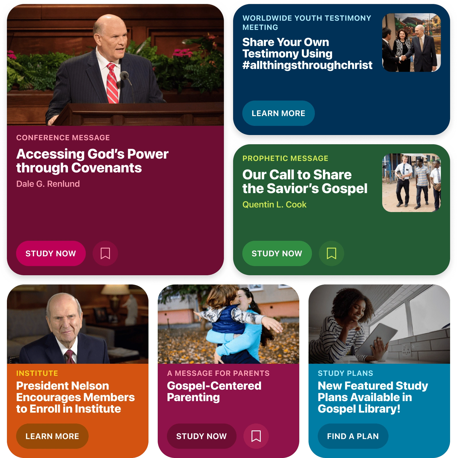
I created this mockup detail to help the team envision how the featured item's layout could be adapted for tablets, depending on the number of items currently being featured.
I began contracting with for the Gospel Library app in April 2023 and one of the first projects they asked me to do was to reimagine the home screen. My task was to come up with a redesign that would be more engaging, more useful, and more beautiful.
Over the course of the next several months (only working about 15 hours a month) I created a comprehensive set of mockups that spanned both iOS and Android and included designs for phone and tablet (portrait and landscape). Light and dark modes were also designed.
The Home Screen consists of multiple sections of content, and designs were needed for each:
Featured Items
This is content that the Church features from time to time. Content ranges from upcoming events and announcements to past addresses given by leaders of the Church.
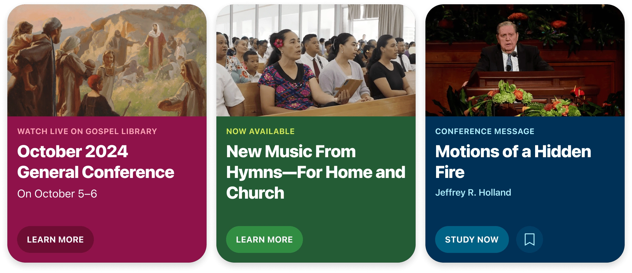
On phones, featured items are paginated and only show one at a time. On tablets the featured items' layout depends on the number of items.
Sacrament Meeting Hymns
Members who are signed into their accounts will see the hymns their specific congregations are planning to sing in sacrament meeting. This specific section is only visible on Sundays.
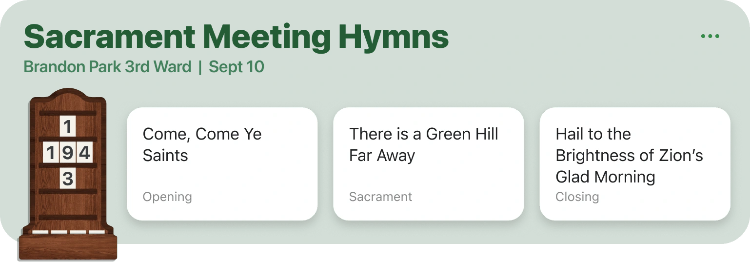
This is the iPad version of the Sacrament Meeting Hymns section.
Account/Sign In
This section only shows when the current user is not signed it. Its intent is to help remind people that they are not signed in and to help them understand the added benefits and features available to signed in individuals.
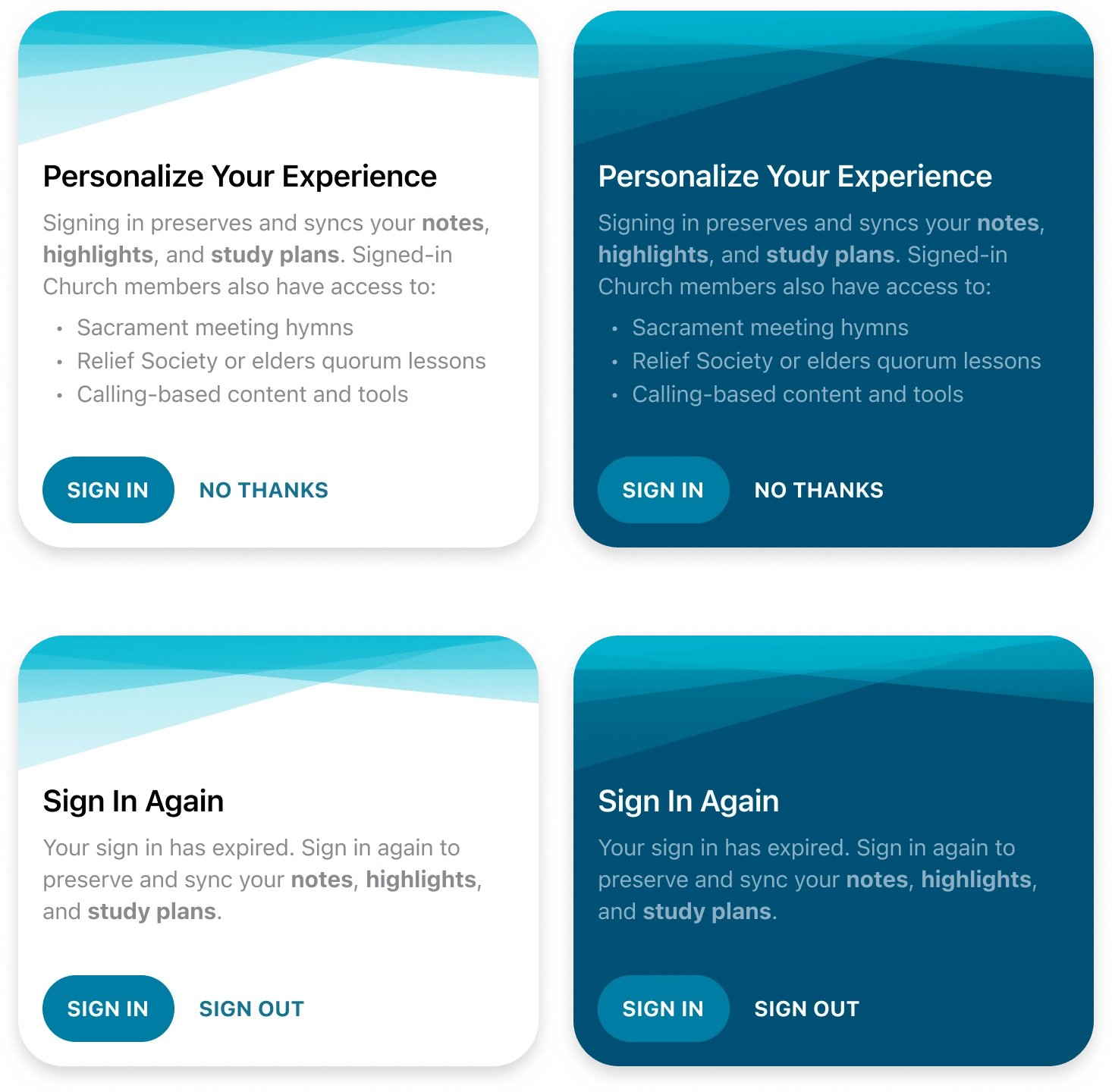
Showing both light and dark modes as well as both required states because occasionally a user's account is timed out and they are automatically signed out. That's when they'd see the Sign In Again version.
Continue Reading and Quick Links
These sections are there to help people quickly find the content they care about.
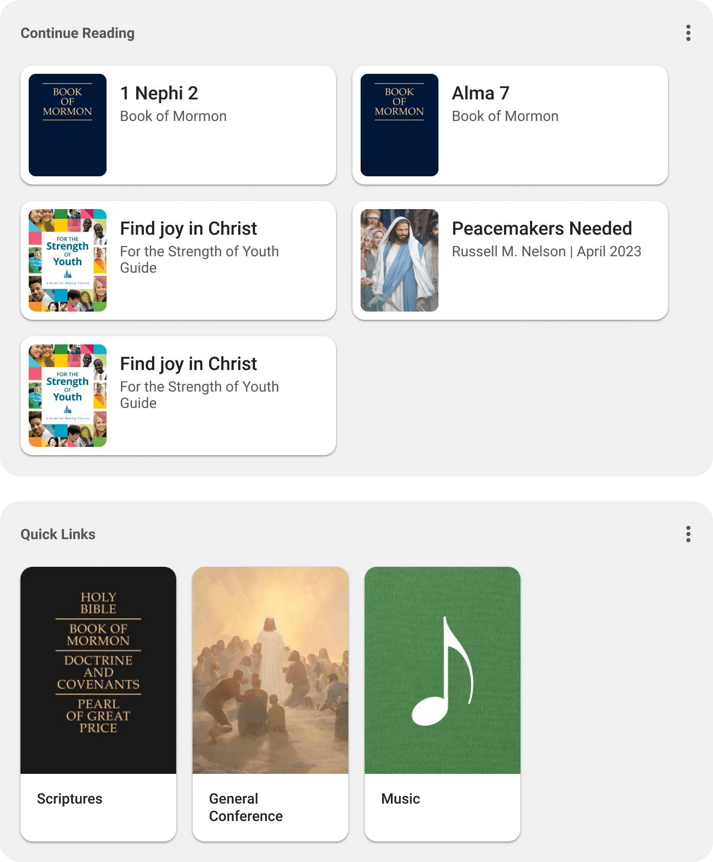
These are the sections as designed for Android tablets.
Weekly Study Manual Lesson
Each week the entire membership of the Church is assigned to study the same block of scriptures. The purpose of this section is to make it simple to know what scriptures are being studied in the current week. So, this section updates weekly.
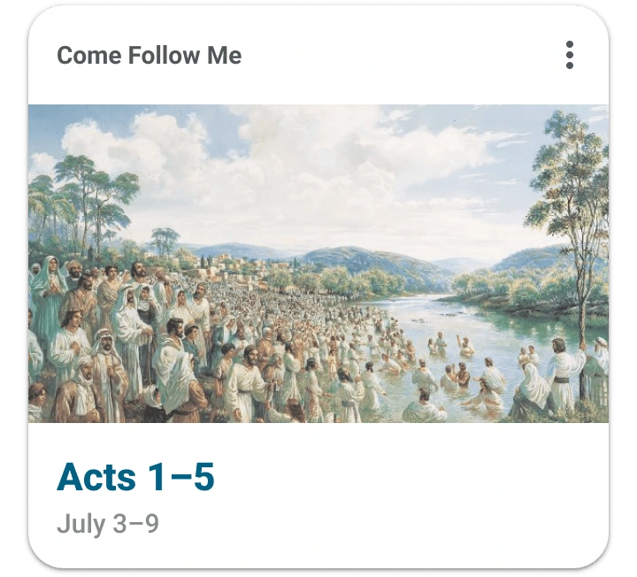
Android version of the Come Follow Me lesson card.
Quote of the Day and Verse of the Day
This was one of the first parts of the design that I was asked to approach. Prior to this redesign, these items were extremely bland.
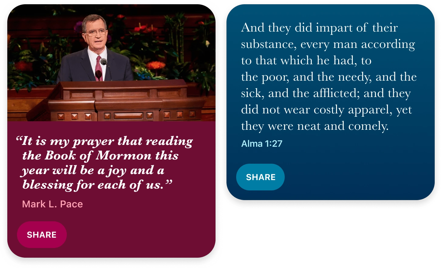
These two sections are updated daily. These are the iOS versions of the designs.
Study Plans
A study plan is essentially a list of content that can be checked off as the user studies it, and it comes with the ability to schedule and set notifications. This updated visual for a person's active study plans is a horizontally scrolling list of cards like these, each showing it's respective progress bar.
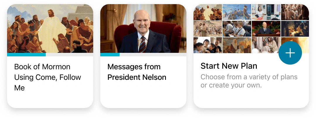
iOS versions of the Study Plan items on the Home Screen.
And Much More…
Every section of the Home Screen needed a redesign to form a cohesive experience. Lessons, Tip of the Week, Patriarchal Blessings, Study Tools, Daily Study Streaks, and Callings all needed various levels of love.
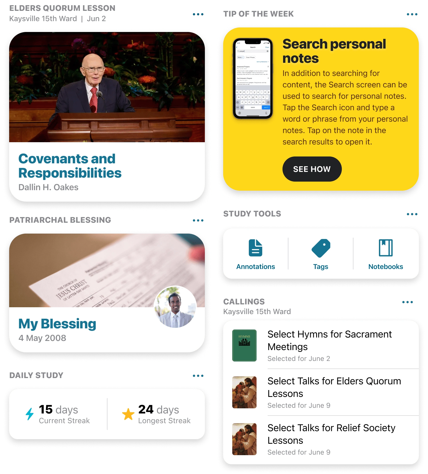
Figma Prototype
Not much to this prototype, but it will help you see how all of these design came together for the new and improved Home Screen.
Like this project
Posted Jan 2, 2025
Native mobile designs for iOS and Android, including phone and tablet, for an updated and refreshed take on the Home Screen of the Gospel Library app.
Likes
1
Views
33


