TECCO / Brand Identity
Talat Aliyev
TECCO carries its functional role (Tech Company and Tech Consulting) and its core promise (High-Tech + Low-Cost). Short and dynamic, it replaces heavy terms like “Tech Consulting” with something far more approachable.

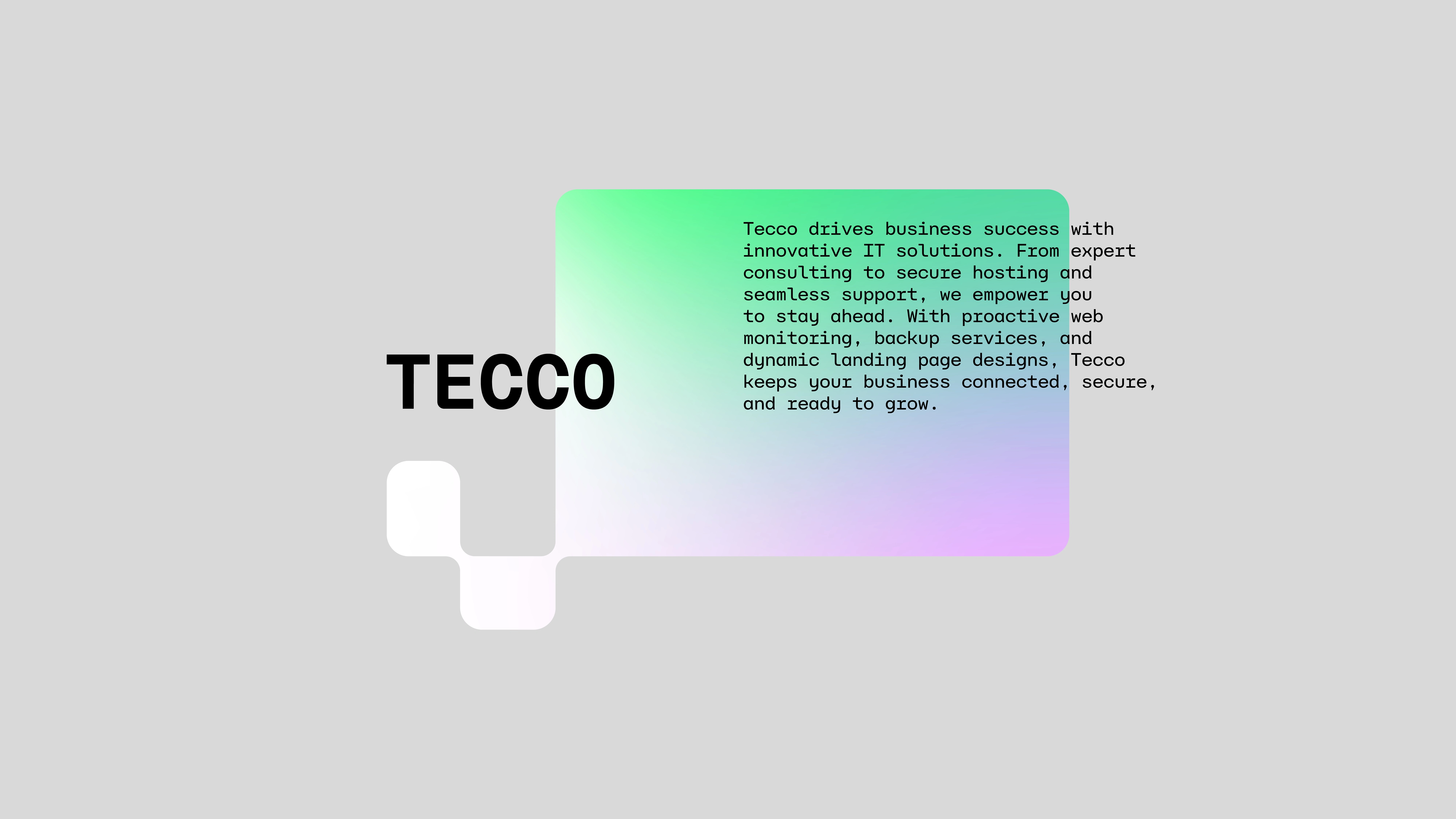
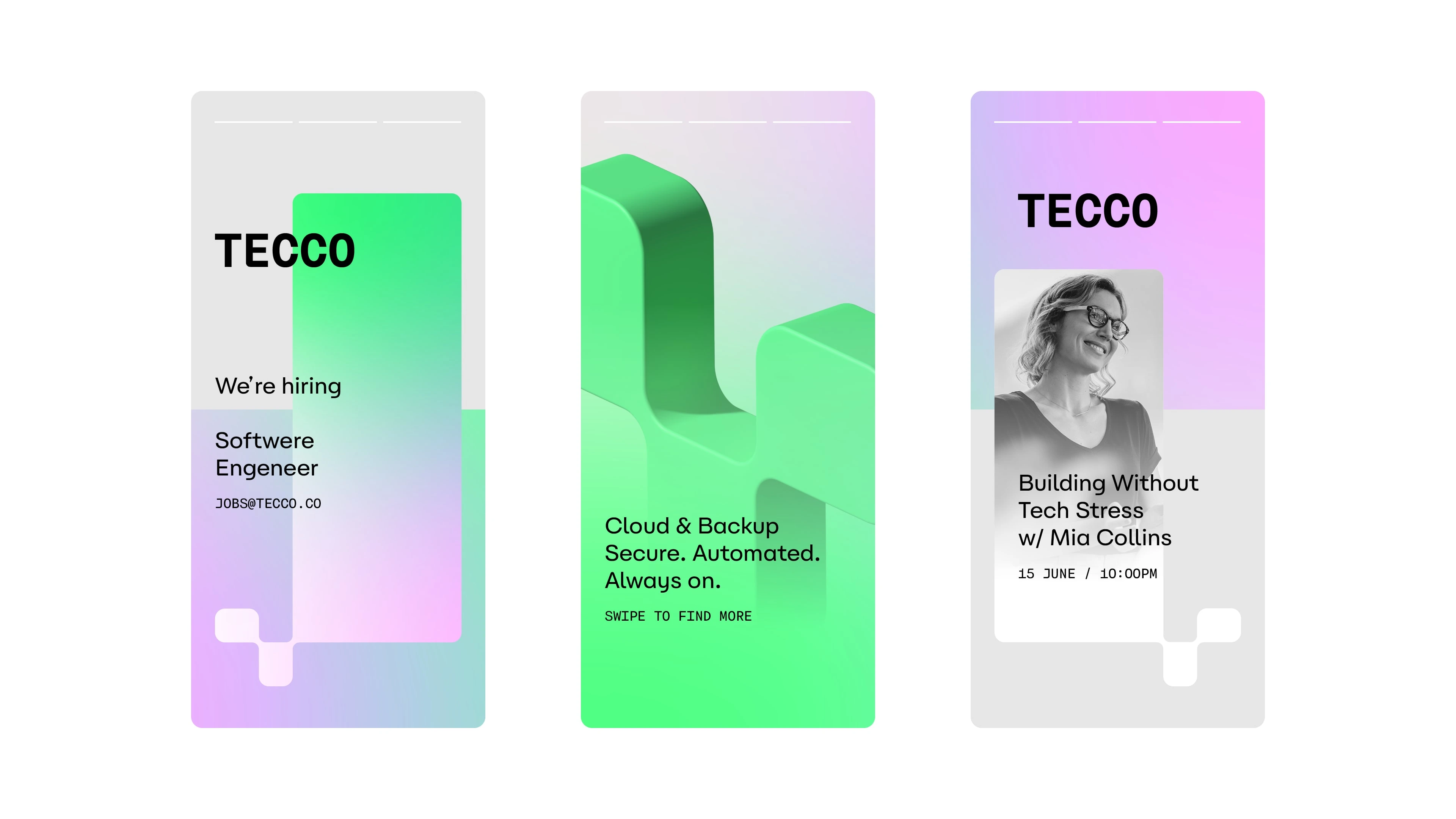
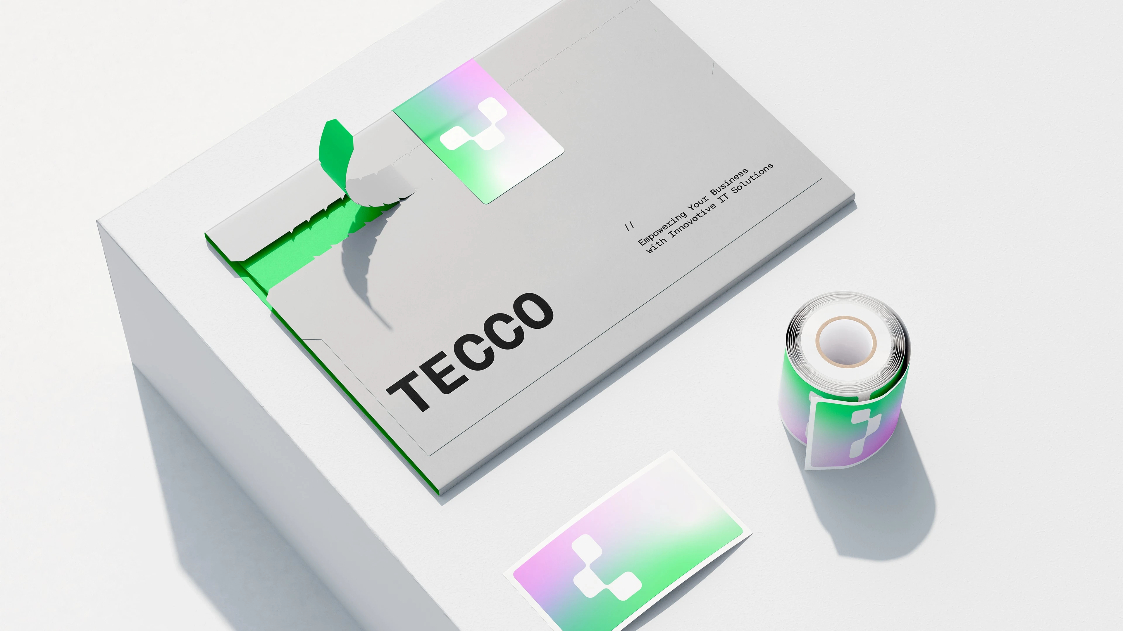
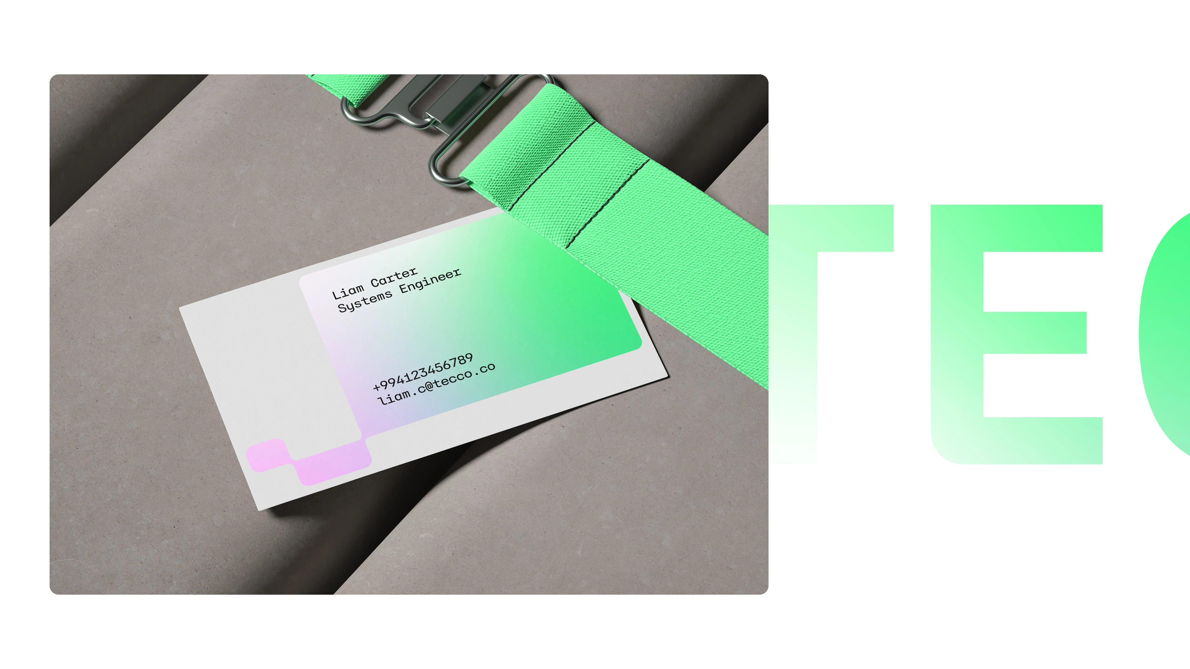
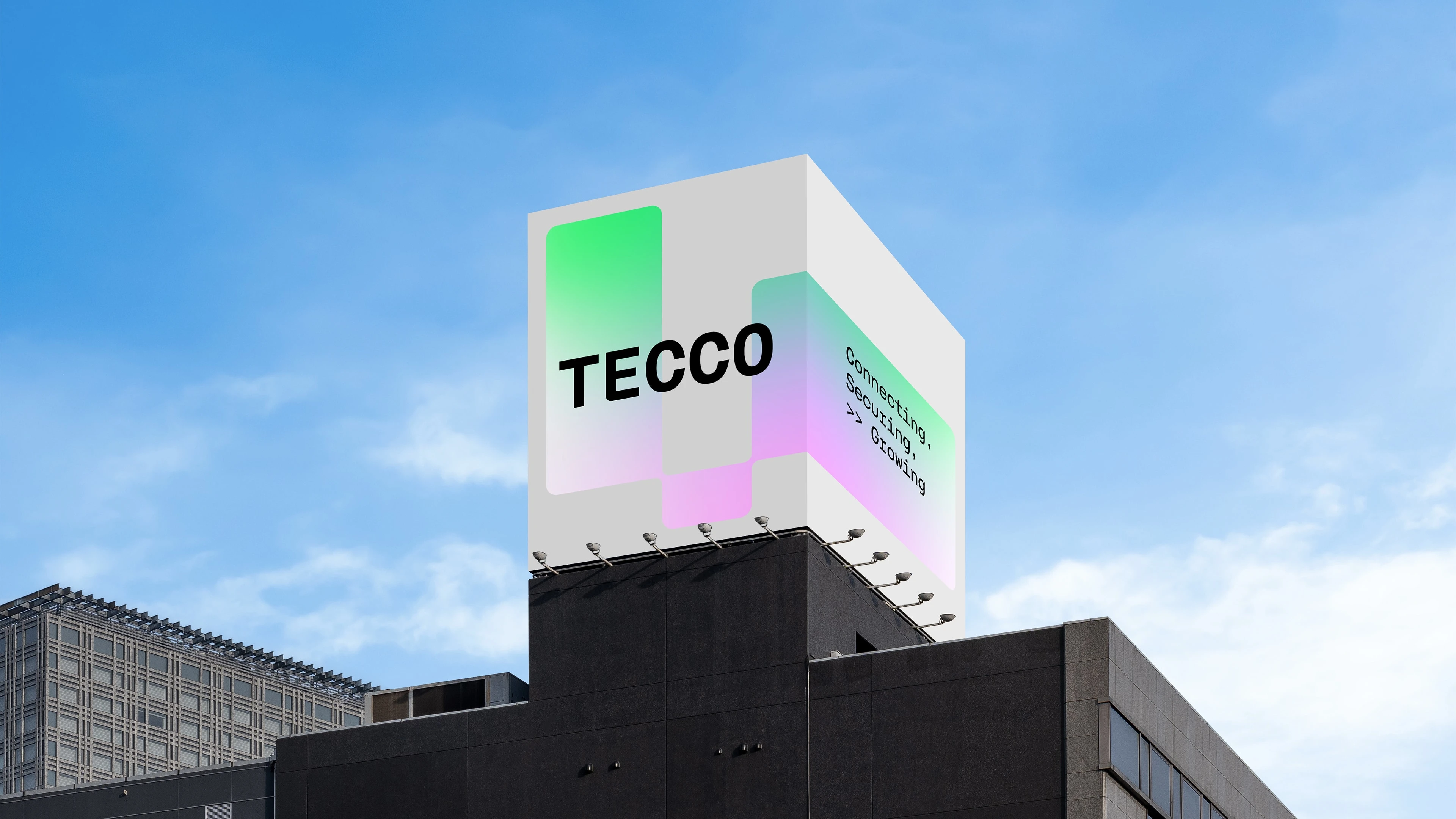
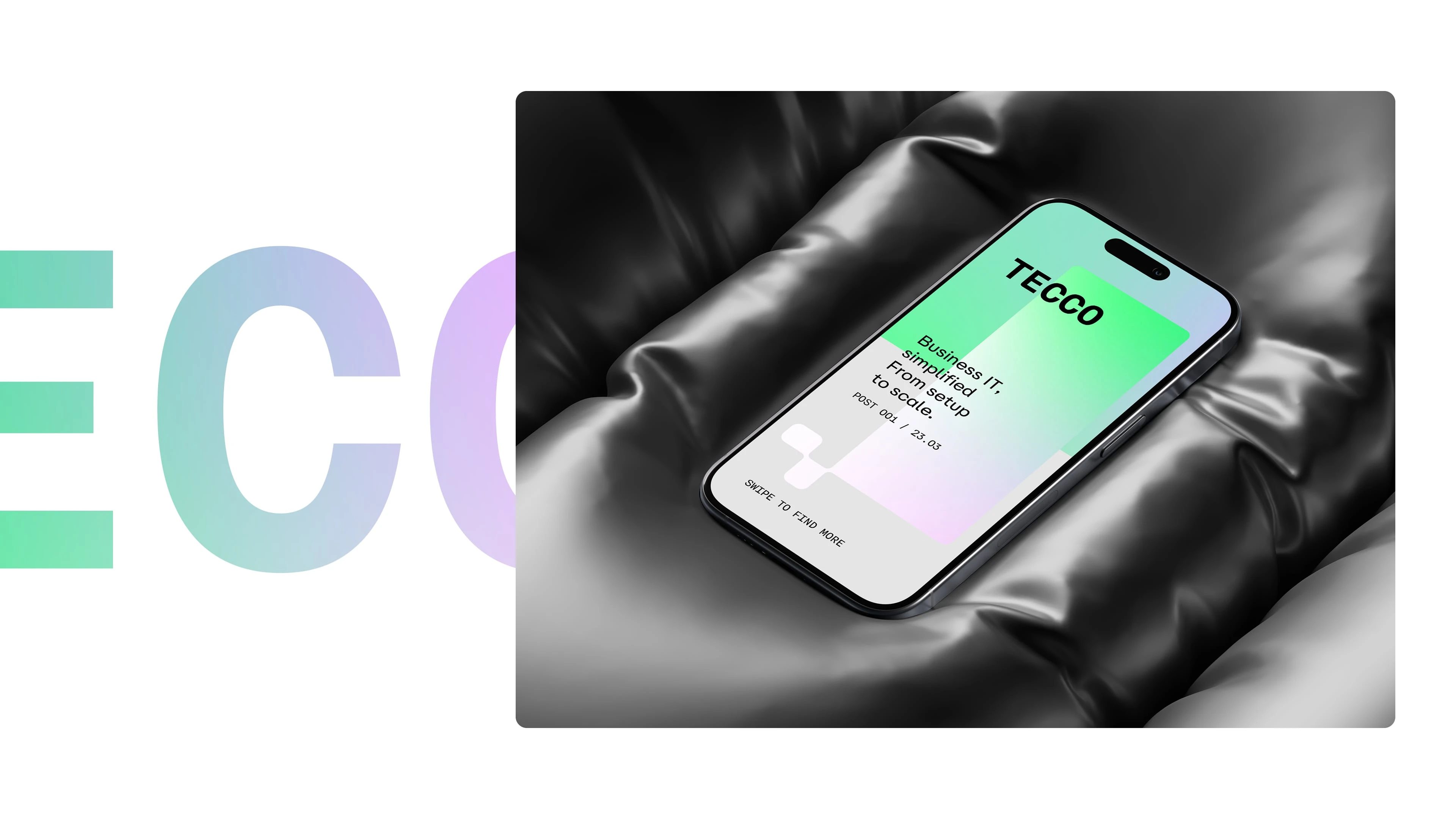
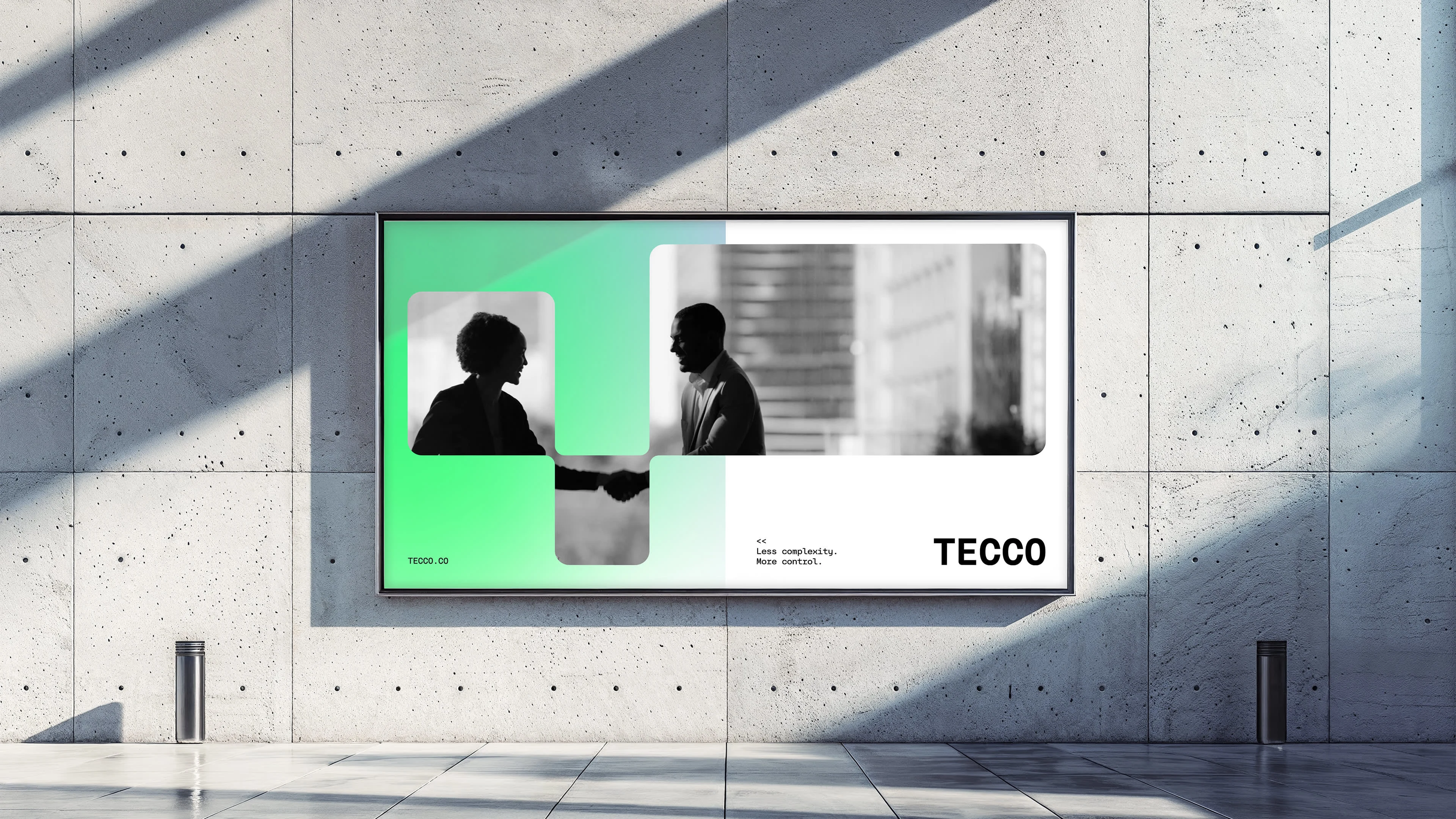
The mark is a modular T designed to lock together like a puzzle piece. It symbolizes the seamless integration of technology into a business ecosystem. This logic adapts to digital and physical environments with equal agility. The typography balances technical precision with a human touch to reflect the brand's core position.
The color system follows a 'Thermal Analysis' logic. We traded the diagnostic alarm of green and red for warmth. A vibrant gradient from neon green to lilac provides a pulse check on IT health: a living business reading.
Every decision looked aesthetic. Each one was strategic.

Like this project
Posted Mar 20, 2026
Tecco is an IT solutions company built around connectivity, security, and growth.